Quick Styled Headlines, Text Content, Buttons and Shadows
Slider Revolution includes a collection of 60+ quick styles. Let’s see how to use them.
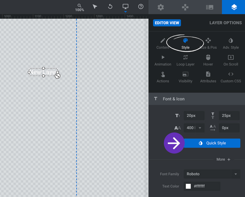
To access the Quick Style button, create and select the layer and navigate to Layer Options > Style:
The Quick Style button allows you to quickly insert or apply one of several text, button or shadow styles. After clicking the Quick Style button a panel will open on the right side of the module [?]
editor showing all the available styles:
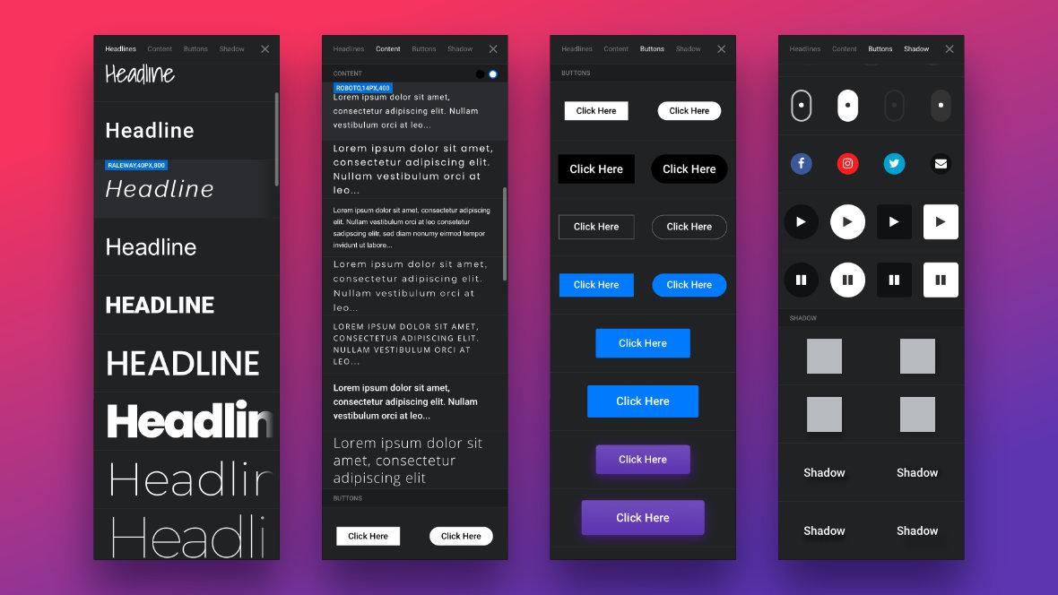
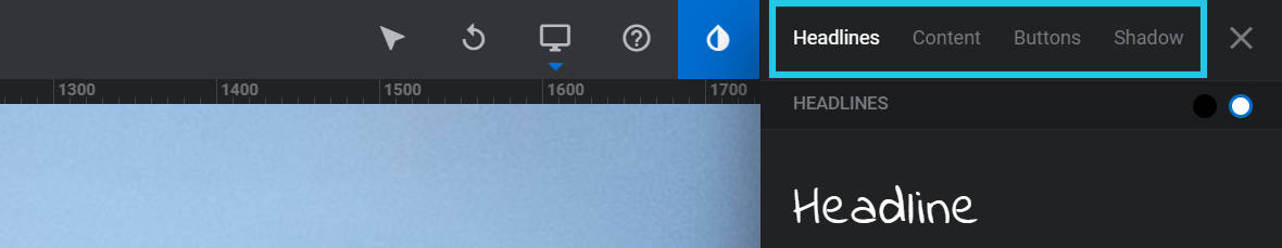
You can either scroll through them all vertically, or click on one of the four tabs along the top of the panel to jump to a particular type of style: Headlines, Content, Buttons and Shadow:
Note: If you already have a layer selected prior to clicking the Quick Styles tear-drop button, the tabs displayed along the top right will only be those that have quick-styles that can be applied to that layer. To see all four tabs you should have no layers selected when clicking the Quick Styles tear-drop button. For example, if you have a button layer selected and you click the Quick Styles tear-drop button, you will only see the styles that can be applied to that button.
Headlines
Headline styles can be used to either add a new text layer [?]
with headline styling, or to change the styling of an existing layer. These styles are great for large text elements or titles.
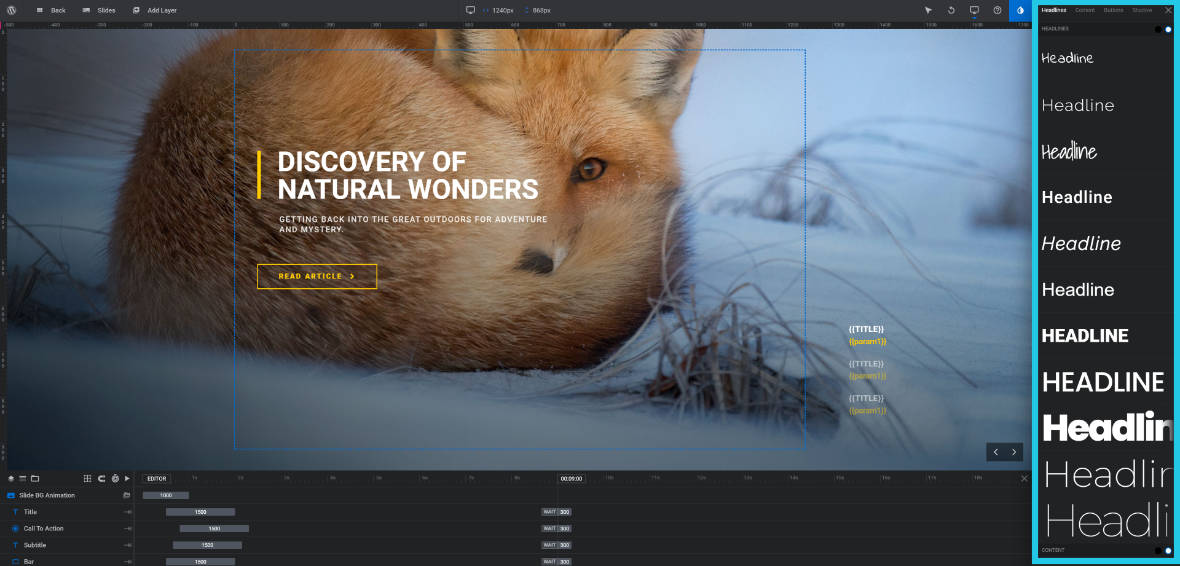
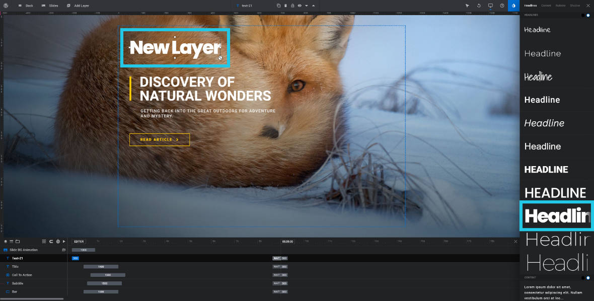
To add a new headline first make sure you don’t have an existing layer selected and that you are on the Headlines tab, then click on a headline style of your choosing from the Quick Styles panel. A new layer will be created with that style and you can then modify its text as required:
Example showing a new layer inserted automatically in the text style chosen from the Quick Styles panel.
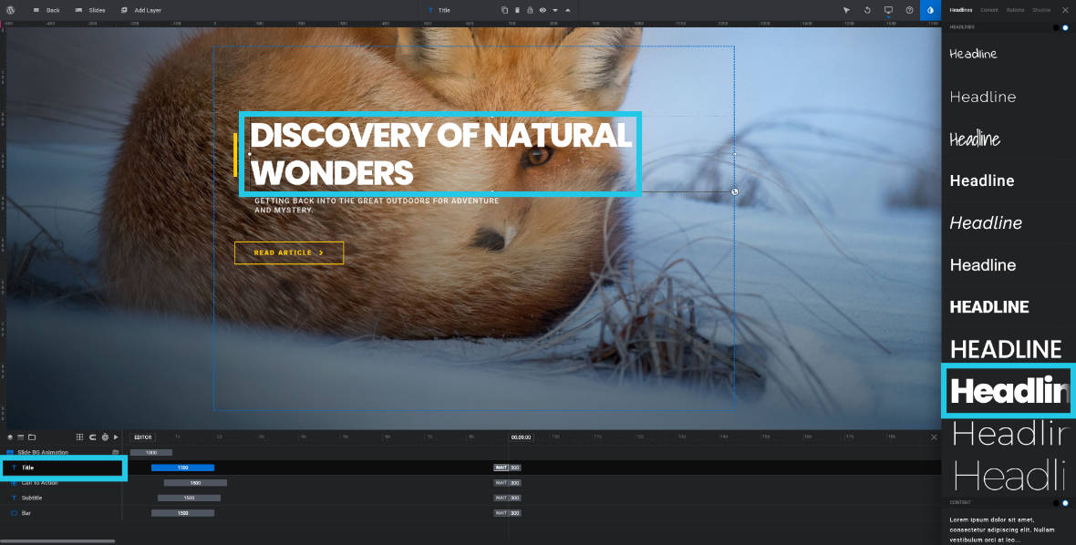
Alternatively, select an existing text layer and then click one of the headline quick styles. The layer’s text content will remain the same but its styling will be updated:
Example showing an existing headline modified to the text style chosen from the Quick Styles panel.
Content
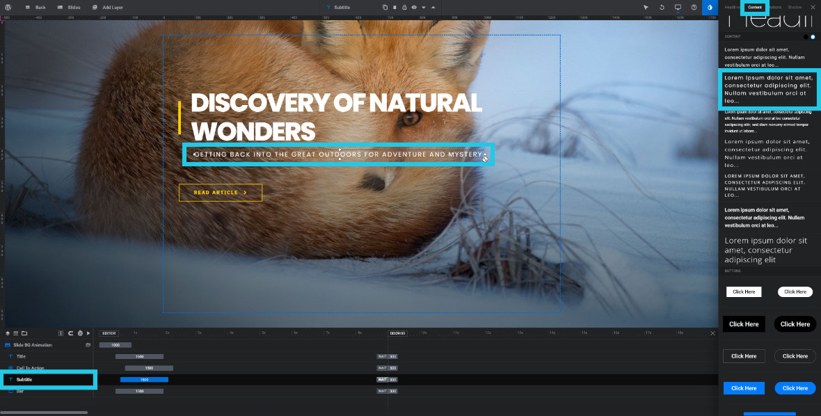
Content styles work in exactly the same way as headline styles, whereby they can be used to add a styled text layer, or to apply a style to an existing text layer.
The only difference is that content styles are more suited to paragraphs and smaller text elements such as subtitles:
Example showing an existing subtitle modified to the text style chosen from the Quick Styles panel.
Buttons
In the buttons section you will find quite a variety of styles, all intended to be used with button type layers. Scroll through the list of buttons and you will see generic buttons, hamburger menu buttons, page scroll indicators, social media buttons, and media control buttons:
Again, clicking one of the styles while you have no layer selected will create a styled button layer:
Example showing a new button inserted automatically in the button style chosen from the Quick Styles panel.
Whereas selecting a button layer first then clicking a style will apply that style to your selection:
Example showing an existing button modified to the button style chosen from the Quick Styles panel.
Note: When changing an existing button style the text on your original button will be overwritten with the default text for the button style chosen. To update the text on the button, click the “X” button to close down the Quick Styles panel, then go to the Layer Options tab and Content sub-section, then type the text you want into the Text/Button LayerContent panel:
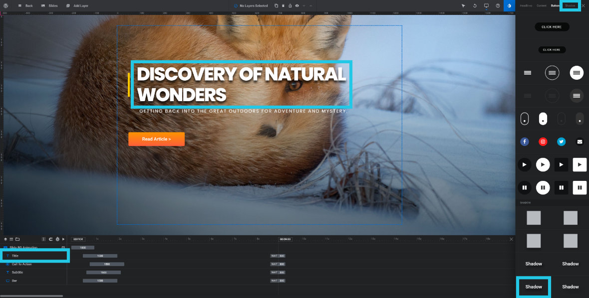
Shadows
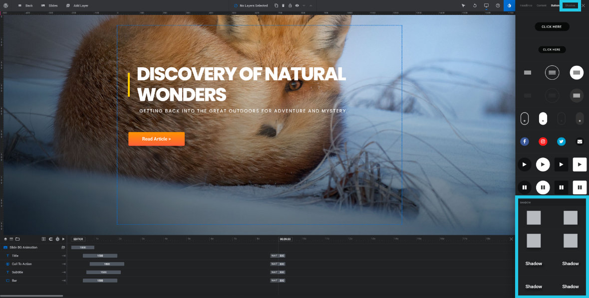
Shadow styles come in two types: box shadows and text shadows. They are a little different to headlines, content and buttons in that they are intended to be used in conjunction with other styles:
For example, you might create a headline layer then choose a text shadow to apply to it as well:
Example showing the title with a shadow applied from the Quick Styles panel.
Or you might create a button quick styled layer and choose a box shadow style to go with it:
Example showing a button with a shadow applied from the Quick Styles panel.
Note: The process for modifying styling that has already been applied to your layer elements will be covered in more depth in an upcoming section of the manual.
Up Next: Modifying Animations
That completes our section on using pre-made content to kickstart your module creation.
Coming up next we’re moving on to probably the most important part of working with Slider Revolution [?]
, and that is animation.
We’ll focus on getting you productive quickly by stepping you through the fundamentals of working with animations.


