You're now across all the most important concepts that will drive your use of Slider Revolution. With this knowledge under your belt, you're ready to start getting more practical with the software.
This section of the manual is designed to get you up and running quickly, teaching you the aspects of Slider Revolution you’ll use most often, in a brief and concise fashion.
We’ll break things into three parts.
Creating Modules
Here you’ll learn how to create new modules, either blank or from templates.
Basic Editing
This part is dedicated to equipping you with all the tools you need for basic editing of pre-made module content. Modifying existing content, such as template based modules, is the fastest way to get great looking content published on your site, and build your Slider Revolution skills in the process.
Publishing Modules
In the final part of this section you’ll learn about publishingmodules, including how to get your modules showing up on the front end of your site. We will cover using the Slider Revolution block, shortcodes, and the blank page template that comes built-in with the plugin.
First Up: Creating Blank Modules
Let’s kick off by learning how to create blank modules.
Create a Blank Module
There are two ways to create new modules in Slider Revolution. Let's take a look at the first of those two ways: creating a blank module.
There are two ways to make new modules [?] in Slider Revolution. In this guide we’re going to be covering the first of those two ways: creating blank modules.
Why Create a Blank Module?
Creating a blank module allows you to create a design space with nothing inside it except the bare bones essential defaults. You should choose this way of creating a module when you want to build your design up from scratch.
How to Create a Blank Module
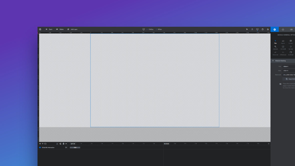
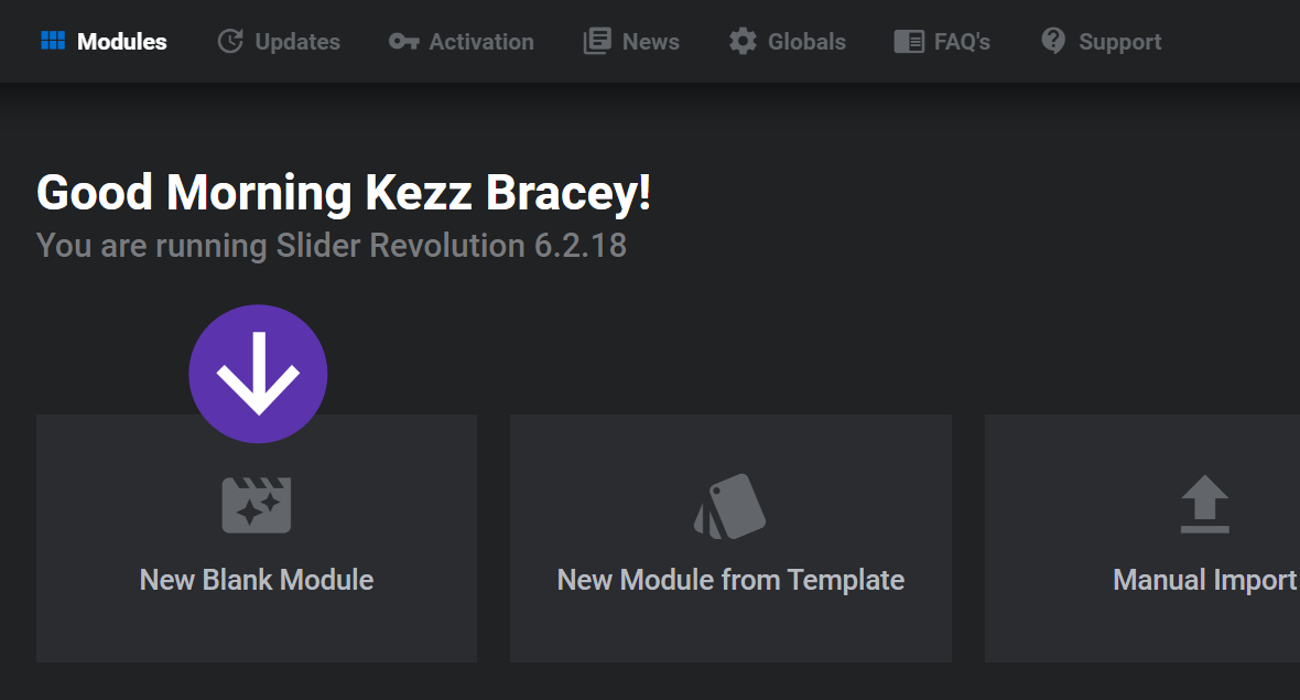
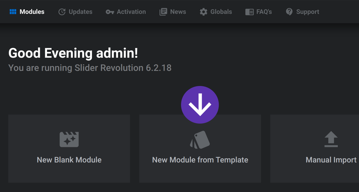
In the main Slider Revolution interface click the button labeled New Blank Module.
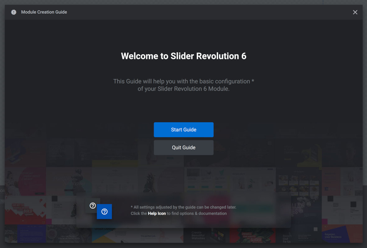
After clicking the New Blank Module button you’ll be taken into the Slider Revolution moduleeditor [?]. Once there, the Module Creation Guide will automatically launch to help you with basic configuration of your new module.
If you don’t need any assistance with initial settings you can click the Quit Guide button. Otherwise click the Start Guide button to proceed.
The Module Creation Guide
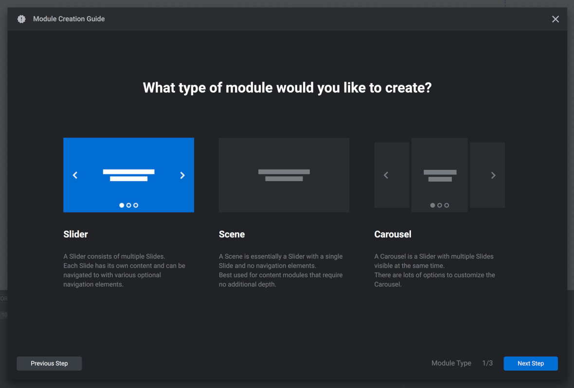
The module creation guide has three pages each of which helps you choose one of three important initial settings.
Let’s take a look at these three settings and which option you should select for each.
Setting 1: Module Type
What Module Type Controls
On the first page of the creation guide you can choose which type of module you would like to create: Slider[?], Scene[?] or Carousel[?].
Here’s a quick summary of what each of these module types are:
A slider has multiple slides with only one visible at a time
A scene has just a single slide
A carousel also has multiple slides but more than one can be seen at a time
And here’s a full definition overview of what each of these module types are:
Slider
A slider is a type of module[?] that contains multiple slides[?]. You can only see one slide at a time, a distinguishing features that makes sliders different from carouse[?].
The slides of a slider can be panned through either by using navigation controls such as arrows and tabs, or by clicking and dragging. They can also be set to automatically transition from one slide to the next.
Example slider. Note the arrow and tab navigation controls.
Scene
A scene is a type of module[?] that has only a single slide[?]. Because it has only one slide that also means it doesn’t have any navigation elements.
Scene type modules are a great way to create more static type content like website headers, menus and text content displays. For example, if you want to build full sites and landing pages with Slider Revolution, you will probably stack many scene type modules on top of each other.
An example of a site built entirely with scene type modules
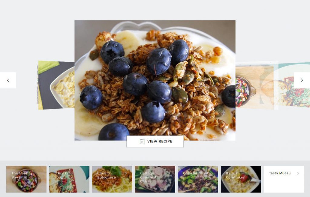
Carousel
A carousel is a type of module[?] that contains multiple slides[?]. However, unlike a slider[?], you can see multiple slides at the same time.
Carousel slides appear next to each other horizontally and can be panned through either by using navigation controls such as arrows and tabs, or by clicking and dragging. They can also be set to automatically transition from one slide to the next.
An example of a carousel module
Which Module Type Option to Choose
Choose Slider or Carousel when you want to make rotating, slideshow type content.
Choose Scene to make non-rotating content such ashero units [?] , headers, navigation bars, post displays or video players.
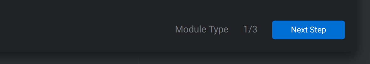
Once you’ve chosen your module type, click the Next Step button in the bottom right corner of the Module Creation Guide window to continue.
Setting 2: Module Size
What Module Size Controls
The second page of the creation guide allows you to control the default width and height of your module. There are three options to choose from: Auto, Full-Width, and Full-Screen.
Option 1: Auto
If you choose the auto option your module will widen or narrow to fit the container in which it’s posted. For example, if the articles on your site are 800 pixels wide and you post your module in one of these articles, it too will be constrained to a width of 800 pixels.
The height of an auto sized module will automatically adjust along with the width, maintaining its aspect ratio.
When to Choose Auto
Auto size is great for modules meant to be used inline, such as slideshows or videos added to posts.
Option 2: Full-Width
If you choose full width the module will always break out of the container in which it’s posted, regardless of that container‘s size, and take up the full width of the browser viewport.
The height of a full width module is typically fixed, however it can optionally be configured to maintain its aspect ratio in layout settings.
When to Choose Full-Width
Full width size is excellent for things like headers and banner style content. For example, hero units across the top of your site or product showcases part way down the page.
Option 3: Full–Screen
With the full screen size option your module will set itself to the exact width and height of the browser viewport.
Note: In this context full screen doesn’t mean you‘ll only be able to see the module and nothing else, like when you set a YouTube video to full screen for example. Rather, it just refers to the initial width and height of the module. Visitors will still be able to scroll up and down in order to view content above or below the module.
When to Choose Full–Screen
Full screen size is perfect for creating strong visual presentations that capture attention when a visitor first lands on your site. For example, large video backgrounds or image based portfolio displays.
Once you’ve chosen your module type, click the Next Step button in the bottom right corner of the Module Creation Guide window to continue.
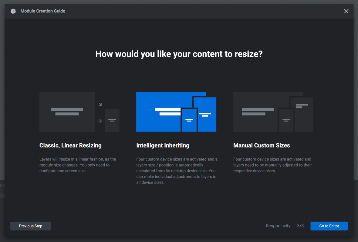
Setting 3: Content Resizing
What Content Resizing Controls
On the third and final page of the module creation guide you can decide how your content should resize depending on the dimensions of a visitor’s browser viewport. These are the settings that help you make sure your designs look great on computers, tablets and phones regardless of their screen size.
Once again there are three options: Classic Linear Resizing, Intelligent Inheriting, and Manual Custom Sizes.
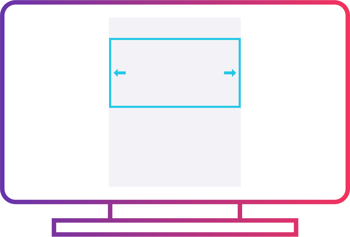
Option 1: Classic, Linear Resizing
This is the simplest of the three options for resizing, because your module will maintain its aspect ratio and simply shrink or grow depending on browser viewport size. Nothing about the layout of the layers within the module will change.
While this is the easiest way to handle resizing, be aware that shrinking every layer proportionally may make them hard to see on smaller screens.
When to Choose Classic, Linear Resizing
Choose this option if your module contains content that will still be functional if proportionally shrunk to a small size. For example, simple video playing modules, audio players, or basic image slideshows.
Example of a layout remaining the same across different screen sizes.
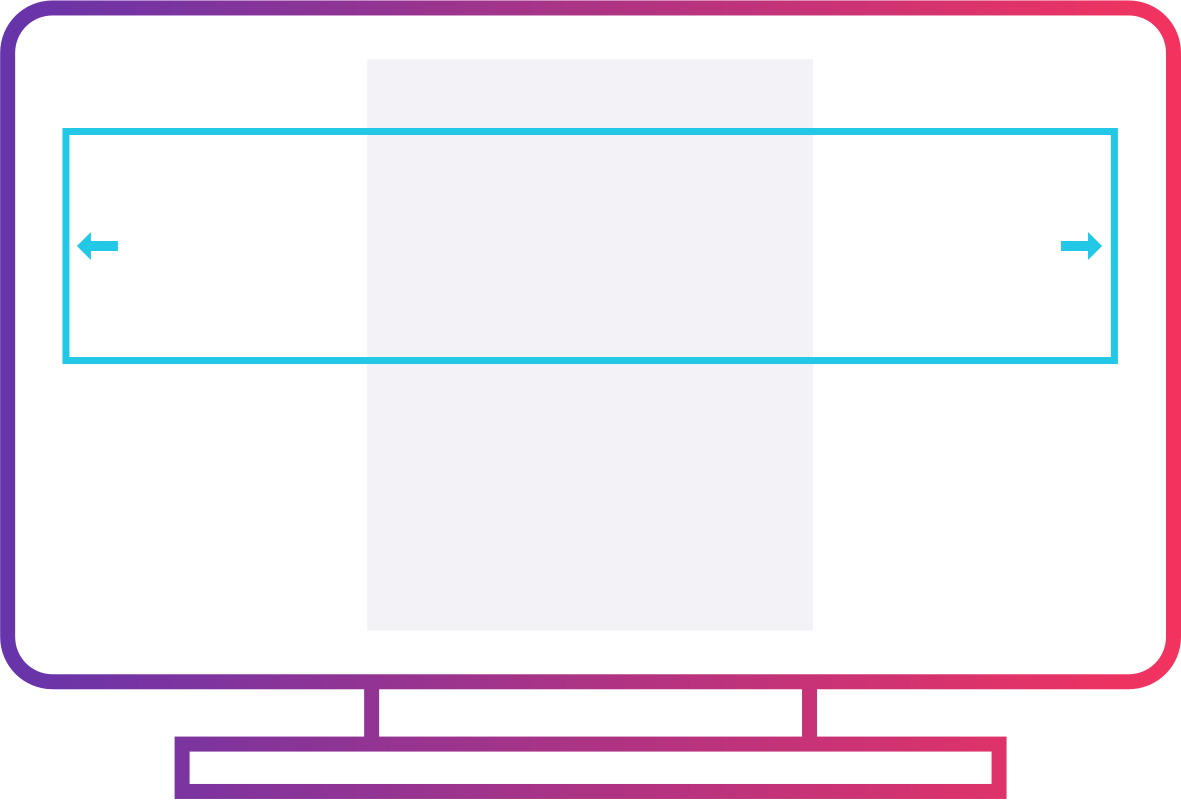
Option 2: Intelligent Inheriting
With the intelligent inheriting resizing approach Slider Revolution will automatically create four different sized versions of your module, each with a layout adjusted to suit progressively smaller screen sizes.
Example of a layout adjusted to suit different screen sizes.
When to Choose Intelligent Inheriting
Choose this option if you would like layers to stay as large and visible as possible on smaller screens, but would prefer to automate the majority of the required layout adjustments.
Note: even when using intelligent inheriting you may still wish to make some manual tweaks to the automatically generated layouts.
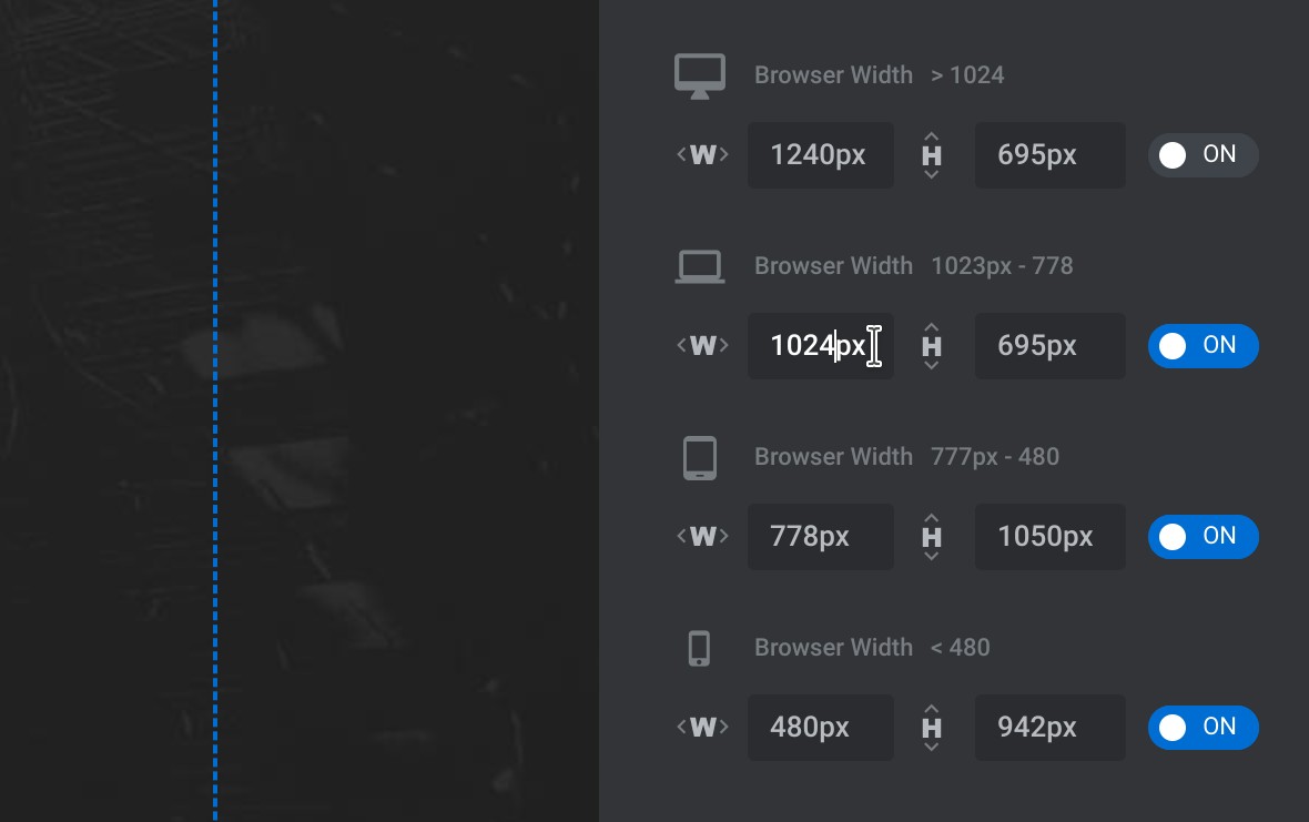
Option 3: Manual Custom Sizes
Like intelligent inheriting, the manual custom sizes option activates four different sized versions of your module, but the difference is it will be up to you to create the layouts for each of these four versions.
Example of some of the settings available for you to create responsive layouts.
When to Choose Manual Custom Sizes
Choose this option if you would like to take an extra thorough approach and specify the exact size and position of the module’s layers in each of its four layouts.
And You’re Ready to Start Designing
Once you complete the module creation guide you’ll see your blank module with an empty slide all ready for you to start the design process.
Up Next: Creating Modules from Templates
What if you don’t want to start your module from scratch? What if instead you want to hit the ground running and start with one of the many templates included with Slider Revolution?
That’s what we will cover in the next part of the manual, where you’ll learn how to Create a Module From a Template.
Create a Module From a Template
The second way to create a module in Slider Revolution is from a template. Let's learn why, and how, you should make a template based module.
In the previous page of the manual we covered the first of two ways you can create modules[?] in Slider Revolution, that being creating blank modules.
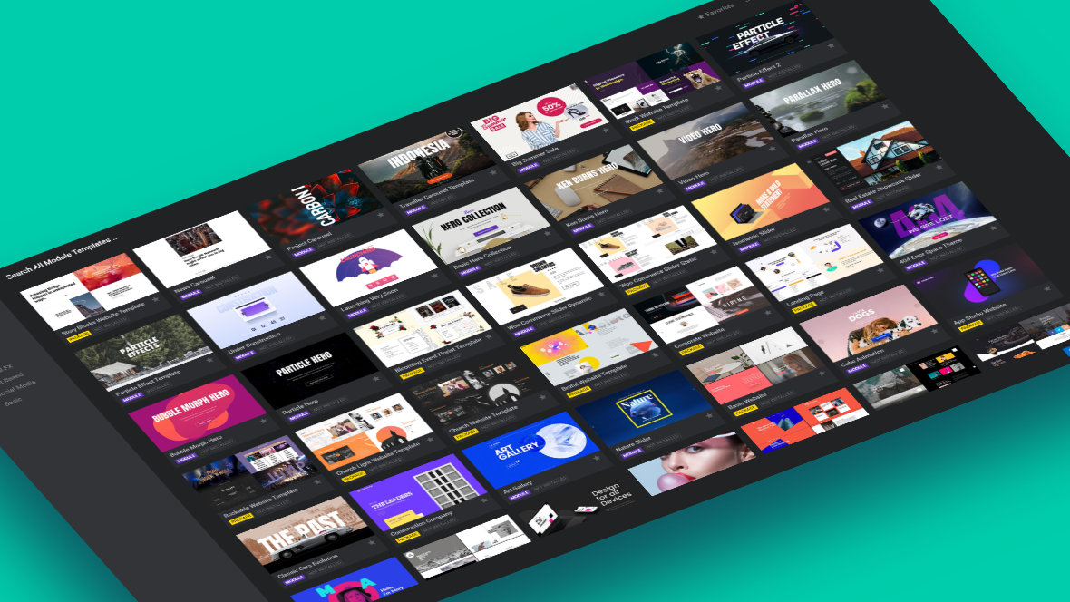
The second way, creating modules from templates[?] , allows you to take advantage of the library of over 200 pre-made, ready to use designs that come bundled with Slider Revolution.
Slider Revolution has over 200 pre-made templates ready for use.
Why Use a Template
There are two reasons to create a module from a template instead of starting from scratch:
1
You want to create content quickly by leveraging a template to give you a head start.
2
You found something you love in the library of templates included with Slider Revolution and want to use it on your site.
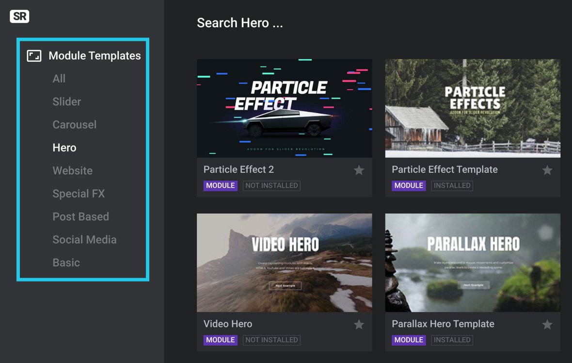
Browsing Templates
In the main Slider Revolution interface, the button to create a module from a template is labeled New Module From Template.
When you click this button a gallery of premade module templates will open for you to browse.
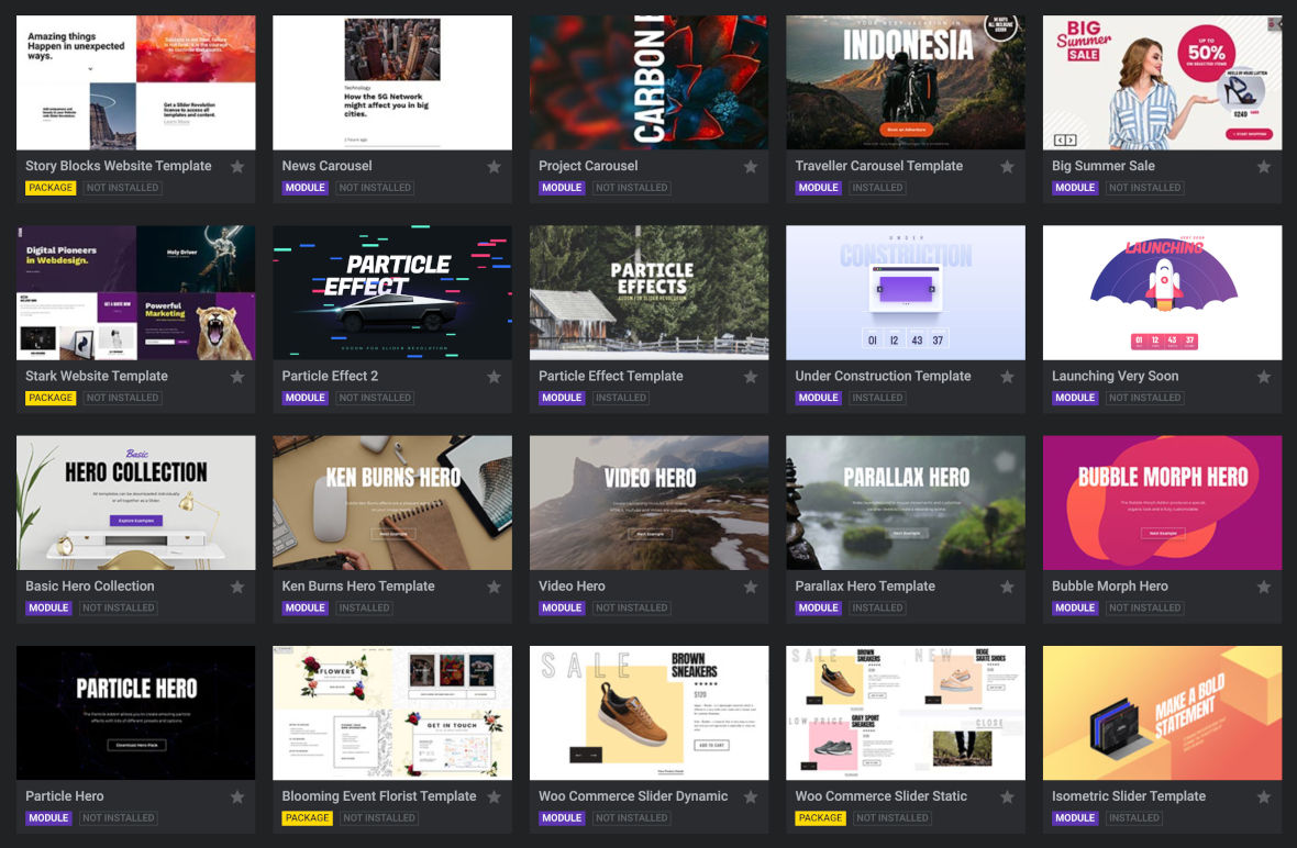
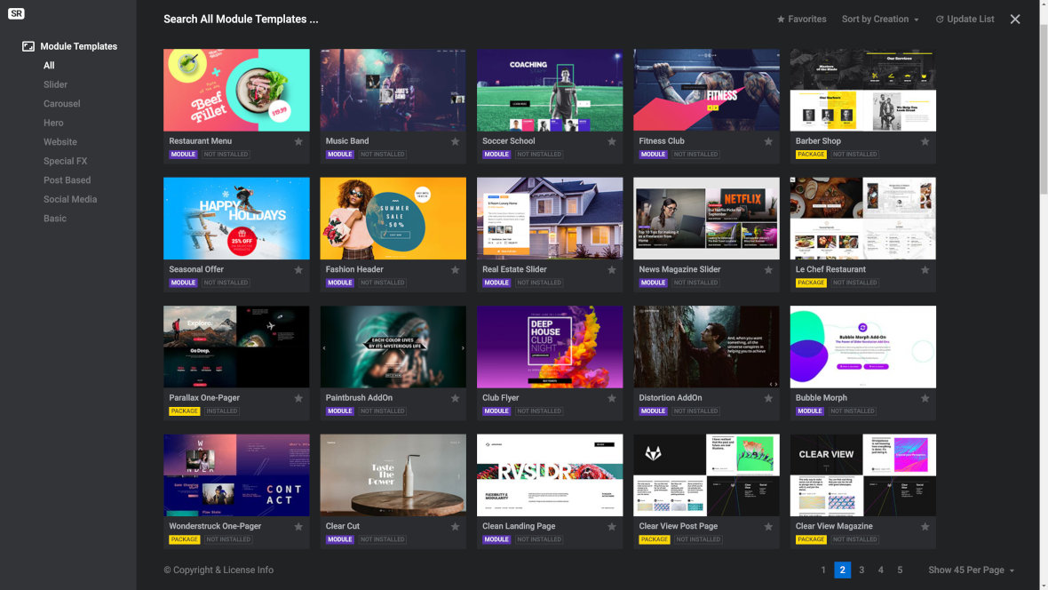
You can filter which templates you are looking at by selecting from the Module Templates category list on the left.
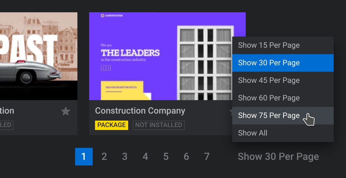
You can also increase or decrease the number of template thumbnails being displayed by changing the number at the bottom right.
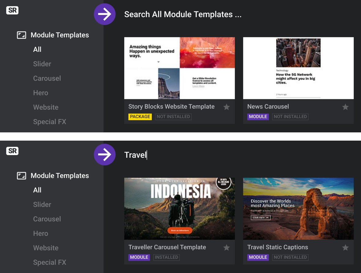
Along the top of the gallery is a search field you can use to find templates by keyword.
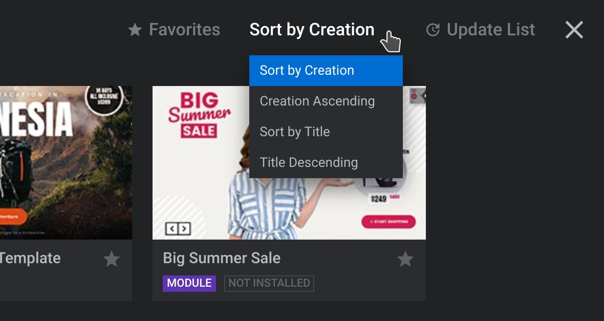
You can change the order in which templates are sorted by changing the setting at the top right.
Find sorting options at the top right.
Favorite Templates
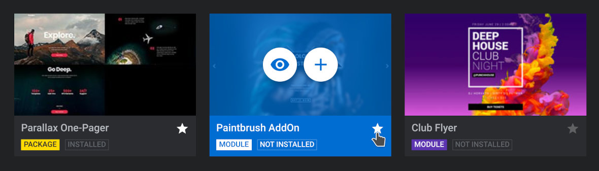
To add a template to your favorites click the small star icon at the bottom right of its thumbnail.
A white star means the template has been added to your favorites.
You can have the gallery show just your favorite templates by clicking Favorites at the top right.
Click Favorites again to switch back to the normal gallery view.
Previewing Templates
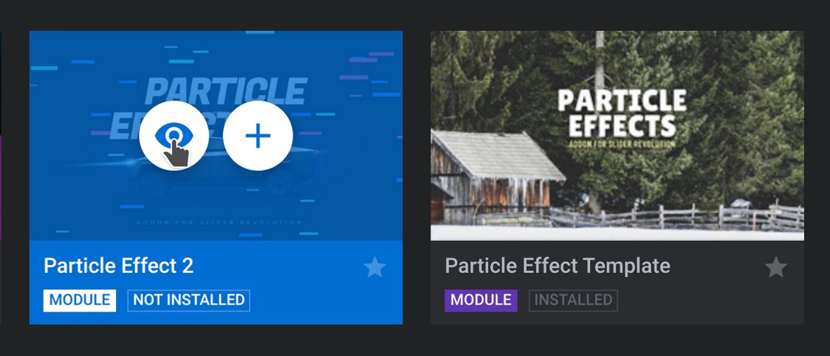
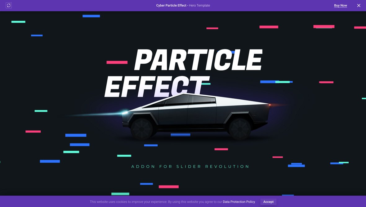
When you see a template you like you can hover over it and click the icon that looks like an eye to preview it.
Click the icon of the eye to preview the template.
A full-size preview will open up in a new browser tab.
Creating a Module From a Template
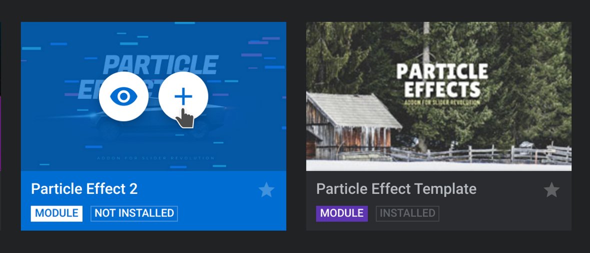
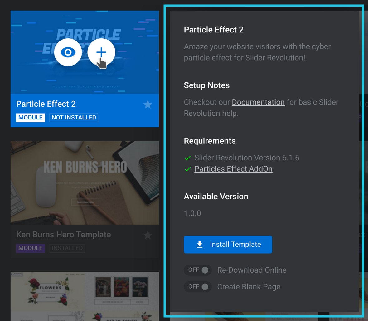
Once you’ve chosen a template hover over its thumbnail and click the “+” symbol icon.
Click the “+” symbol to display more information about the template.
A panel displaying information about the template will appear.
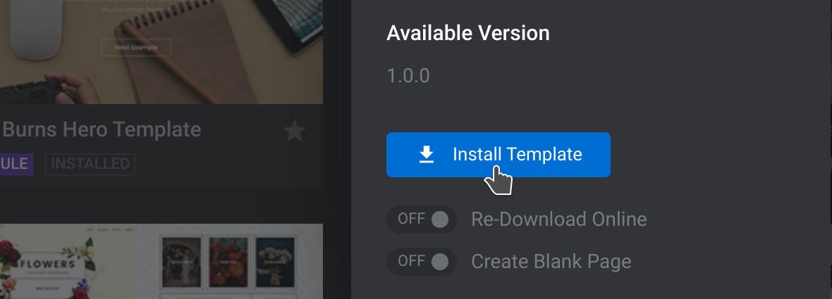
Click the Install Template button at the bottom of the information panel to proceed.
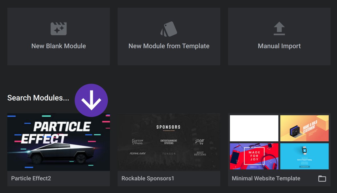
Slider Revolution well then download the template’s contents and make a module with all of its layers, animations and settings. When this process has been completed the newly created module will be visible in the Search Modules area.
Find your newly installed template under “Search Modules…”
Template Requirements
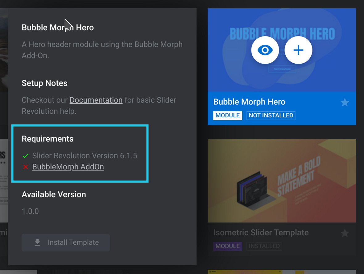
Some templates make use of add-ons[?] to enhance their design with things like special effects and extra functionality. If a template you wish to use requires a particular add-on, you will need to install and activate that add-on before you proceed. Until you do so the template cannot be installed.
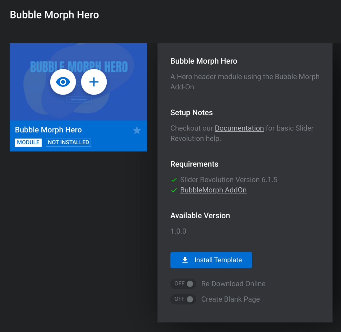
To find out if any add-ons are needed, check the Requirements section in the information panel that appears when you click the plus button for the template in question. If an add-on is missing you will see a red cross next to its name.
Example showing a template that requires a specific add-on (marked by the red cross).
Installing Required Add-Ons
In a moment you will need to exit the template gallery in order to install the required add-on(s) for the template you’ve chosen. Before you do, make a note of the name of the template you’ve selected so you can easily search for it when you come back. Also make a note of the name of the add-on(s) you need to install.
In our example (pictured above) we’ll note down ‘Bubble Morph Hero” as the name of the template and ‘BubbleMorph” as the name of the add-on it requires.
Once you’ve noted down the template and add-on(s) names, exit the gallery by clicking the “X” button at the top right.
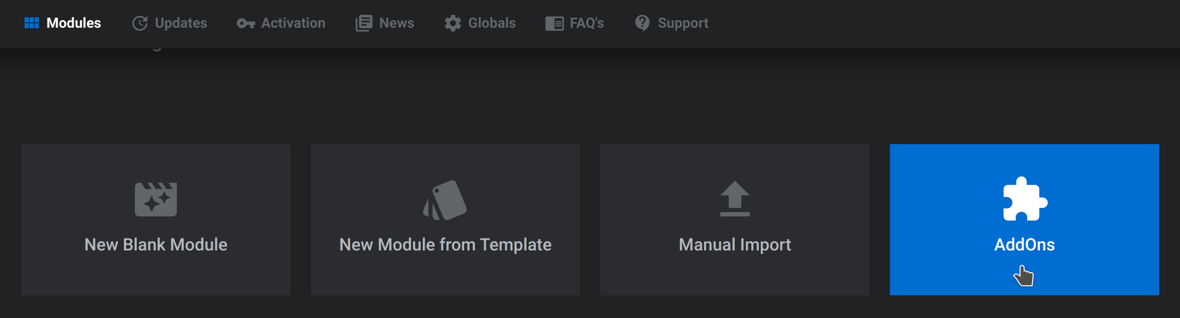
After exiting the gallery, click the AddOns button in the main Slider Revolution interface.
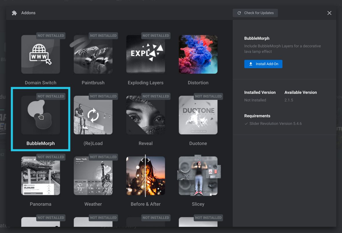
The available add-ons will appear in a dialog box. Look for the add-on you noted down earlier and click it to display installation details in the right sidebar.
Clicking the ‘BubbleMorph’ add-on shows its installation details.
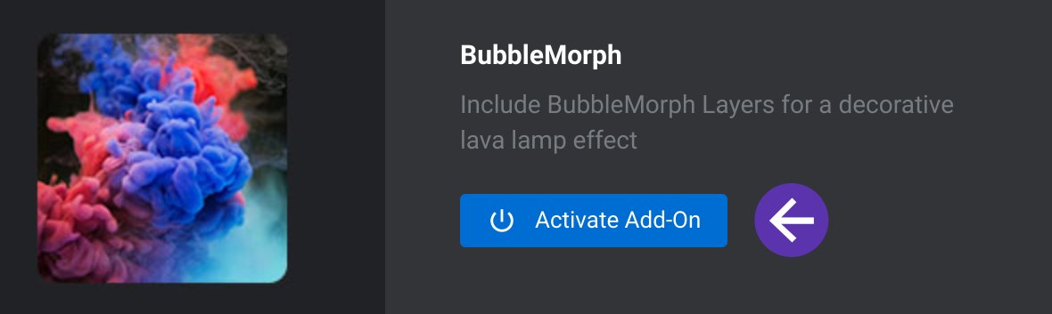
In the installation details sidebar, click the Install Add-On button.
The add-on will be automatically downloaded and installed.
Once this process has completed, click the Activate Add–On button in the right side bar of the dialog box.
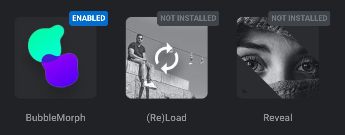
Once activated, the add-on thumbnail will change from black & white to color to let you know it’s enabled and ready for use.
BubbleMorph addon now installed and activated/enabled.
Repeat this process for any additional add-ons that are required.
Once you have installed the add-ons needed by your chosen template click the New Module From Template button once again. In the template gallery, locate your selected template by searching for the template name you noted down earlier. You can now proceed with creating a module from it by clicking the “+” button and then Install Template.
Note that the add-on requirement for the template now has a green tick.
Up Next: Basic Editing
Now that you know the two ways to create a module, it’s time to learn how to edit what you’ve created.
In the next section of the manual you’ll learn five key editing techniques that will help you modify premade content for use on your own site.
Note that while these techniques will also be frequently used while creating modules from scratch, the next section of the manual is focused on equipping you with the skills needed to take advantage of Slider Revolution’s library of premade designs.
Let’s begin with a quick overview of what’s going to be included in the basic editing section.


