Checking to Ensure Modified Content is Still Responsive
What is responsiveness, how do you check if you have it, and what do you do if you don't?
What Does “Responsive” Mean?
The word “responsive”, in the world of website creation, means ensuring your content is able to respond to any device type its viewed on, providing an equally good experience to all viewers.
This typically means having multiple layout versions made to fit nicely on various screen sizes, ensuring images can be seen clearly, checking that text is legible & readable, and so on.
Responsiveness in Template-Based Modules
Slider Revolution [?]
has several built-in tools and settings to help you make your modules [?]
responsive, and the vast majority of Slider Revolution templates [?]
are created with responsive layouts already is place. So when you start with a template as a base, the vast majority of the requirements for responsiveness will have already been met.
However, after you make customizations to template-based modules, the size and position of layers [?]
may end up slightly different, altering the way the module looks at different screen sizes. For this reason, after modifying pre-made content you may find it’s necessary to tweak a few things to make sure your layouts remain fully responsive.
To help you in doing so, in this section of the manual we’ll show you how to check through your customized modules, identify any issues with responsiveness, and solve any problems you find.
A Foundation in Responsive Design
Through learning how to check for responsiveness in template-based modules, you’ll get a solid foundation in the core principles of what responsiveness is, and how to work with it in Slider Revolution.
This foundation will later help you to design responsive content of your own. Given setting up all the responsive behavior yourself can be a somewhat in depth process, we won’t be stepping through it just yet. Rather, we’ll tackle it in full in the upcoming “Modules from Scratch” section of the manual.
Up Next: Previewing & Editing Different Screen Sizes
For now, on the next page of the manual we’ll get the ball rolling by learning about the four layout size variants available in Slider Revolution, and how you can preview & edit them as part of ensuring your modules are optimally responsive.
Desktop, Laptop, Tablet and Phone Size Variants
In this guide, learn about the four layout size variants available in Slider Revolution, and how to preview & edit them.
Table of Contents
Introduction
The Four Layout Size Variants
Working with the Four Layout Size Variants
Preview and Editing Methods
On Canvas Preview
On Canvas Edit
Main Popup Preview
Coming Up: Adjusting for Responsiveness
Introduction
Slider Revolution [?]
allows you to make up to four differently sized variants of a modules [?]
, in turn allowing you to adjust its layout to suit progressively smaller screens.
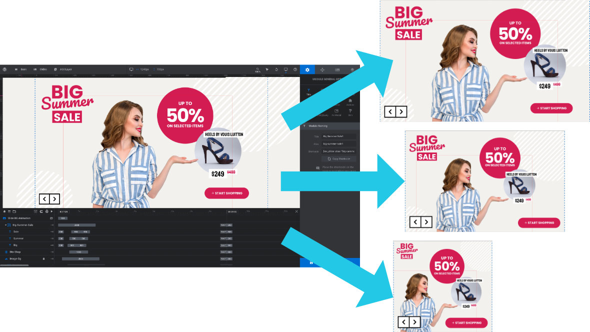
Once your module is published, Slider Revolution will then dynamically select one of those size variants to show a visitor, depending on which best fits the screen dimensions of their device.
On this page of the manual we’ll learn what these four size variants are, how they are typically worked with in Slider Revolution, and the methods you have available to preview how they look.
The Four Layout Size Variants
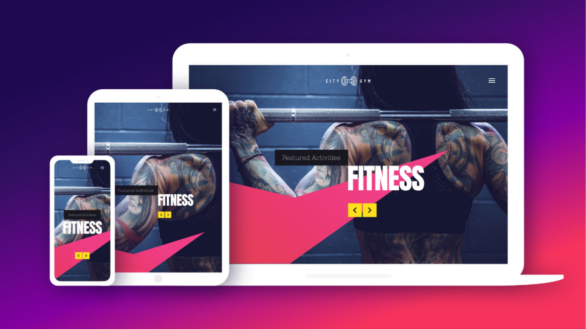
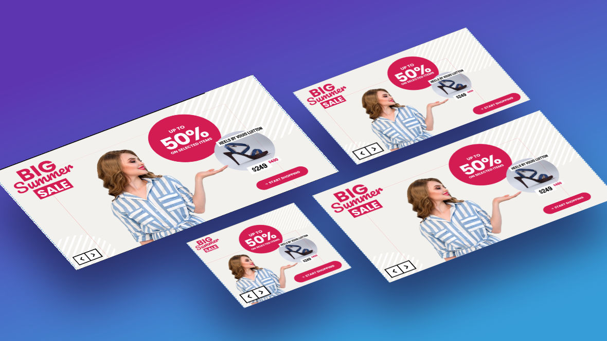
The four layout size variants in Slider Revolution broadly correspond with four categories of device, progressively decreasing in screen size: desktops, laptops, tablets and phones.
In practice, the separation between these device categories can be somewhat blurred. For example, an iPad Pro tablet is bigger, at 12.9 inches, than an Asus VivBook laptop, at 11.6 inches.
So don’t worry too much about each layout strictly being only for one type of device. Instead, think of using your four layouts to cover a broad range of sizes, and leave it down to Slider Revolution to show the right layout at the right time.
You might find your “desktop” or “laptop” layout gets shown on large tablets, and your “tablet” layout on small laptops or even large phones. And that’s totally fine, we just need to make sure that no matter the device size, one of our four layouts is going to fit it nicely.
Working with the Four Layout Size Variants
Typically a module is first designed at desktop size, which is the largest and in effect the “default” layout in Slider Revolution. Modified versions are then made at each of the remaining three progressively smaller sizes.
Even when you are working with template [?]
based modules, rather than designing from scratch, you will use essentially the same process.
First, you will make your customizations to the module’s desktop size layout, which may in turn effect how it looks at the three smaller sizes. So you will then check on those other sizes, making further modifications wherever necessary to ensure they are still laid out optimally.
Preview and Editing Methods
In order to work with the four layout size variants and ensure they are optimally responsive you will need to know how to preview and edit them.
Slider Revolution gives you two ways to preview layout variants:
1) On the canvas [?]
, which is also where you will take care of editing.
2) In the main popup preview.
On Canvas Preview
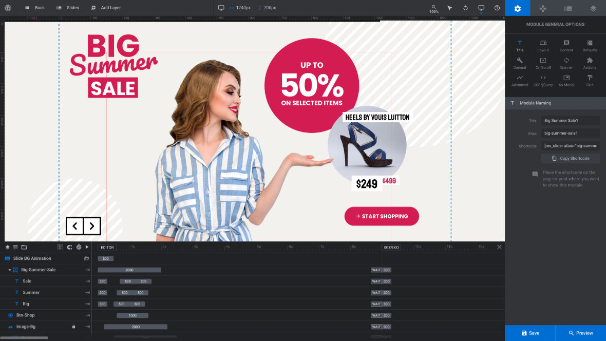
By default, when you open up a module in the module editor [?]
you will see its desktop layout on the canvas.
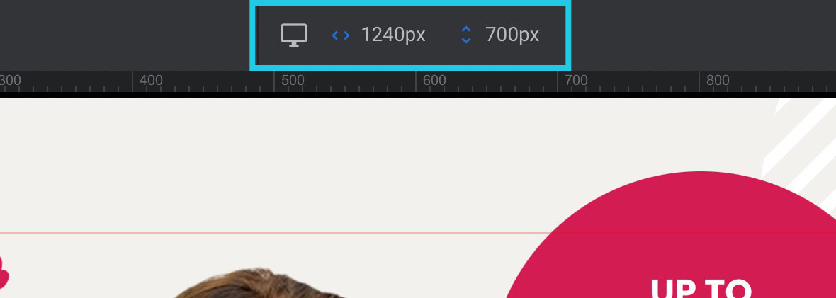
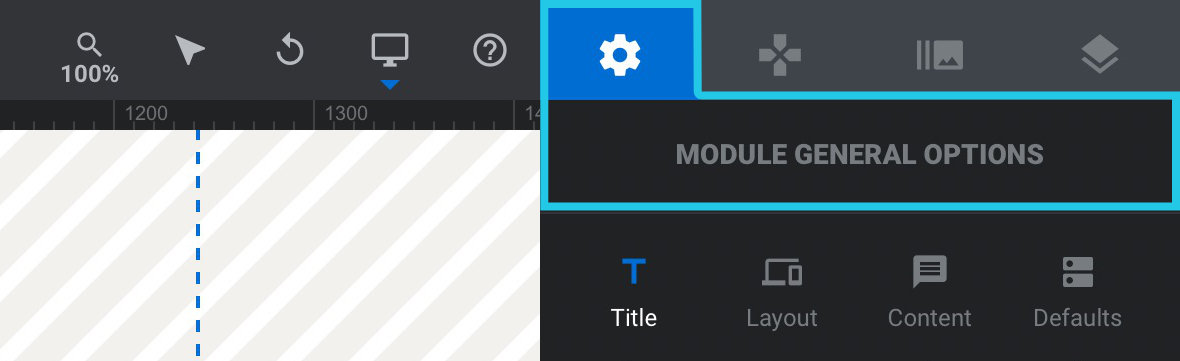
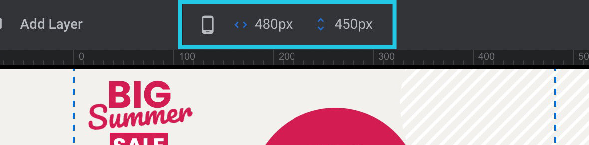
If you look in the center of the the top toolbar, you will see a little display showing a desktop monitor icon to reflect this. (On smaller screen devices the display may appear towards the left end of the toolbar). To the right of the icon you will also see a readout of the width and height of this layout, respectively.
Note: You will need to have the Module General Options tab open, signified by a gear icon, in order to see the layout version display in the top toolbar. This is because other options tab will replace that area with readouts related to them.
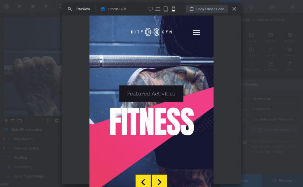
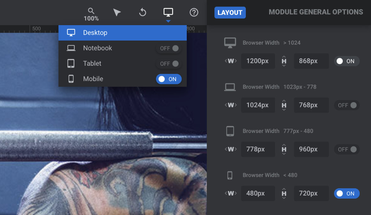
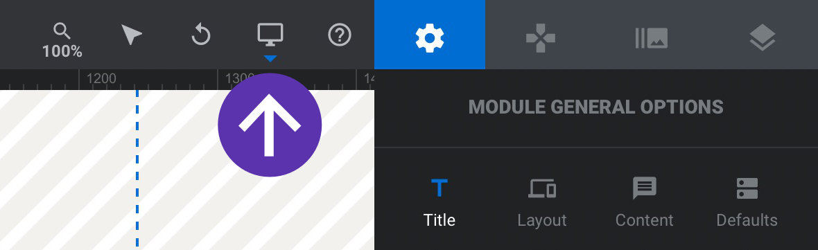
To switch into another layout and show it on the canvas, use the device switcher on the right end of the top toolbar.
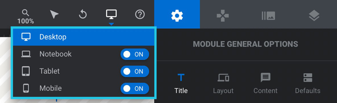
Click the device switcher and a dropdown will appear, showing toggle switches and icons representing the other three layout sizes: laptop, tablet and phone.
If the template on which the module was based has ready-made responsive layouts, which most do, you will see one or more toggles here set to ON.
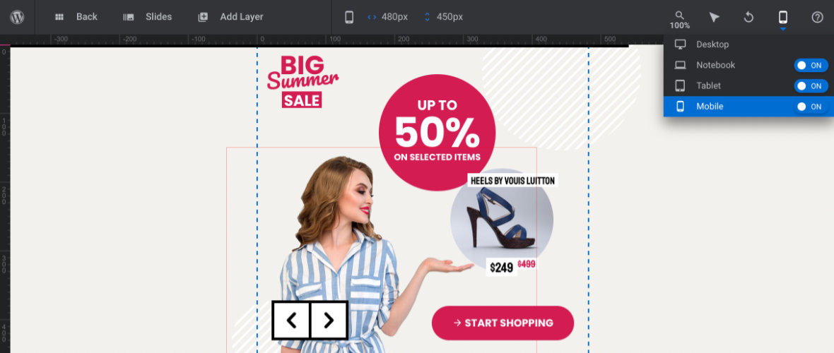
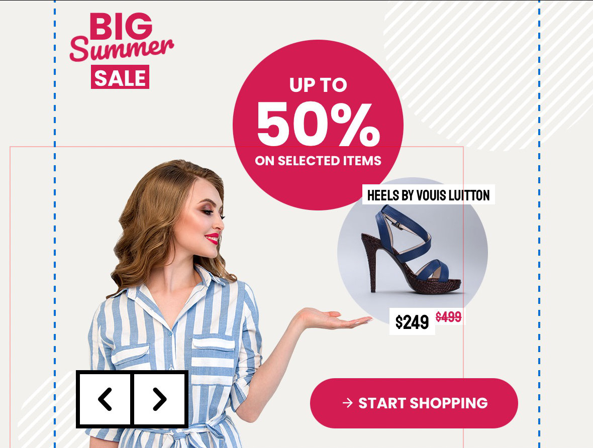
For every toggle switched to ON, you will find a corresponding layout has been made and optimised for that size. Click on the name next to that toggle and the on-canvas preview will switch to show you that layout. In the image below you can see we have switched into the phone (aka mobile) layout:
When you switch layouts, the icon and dimensions in the center of the top toolbar will update as well.
You will then also see the blue dashed borders on the canvas has changed size, indicating the boundaries of the currently shown layout.
You can now preview your animations playing through at this smaller size.
On Canvas Edit
While you have a particular size showing on the canvas, any layout edits you make will be applied to that size, and not to any size larger than it.
So if you are making changes to the phone size layout, the tablet layout will be unaffected. If you modify the laptop layout, the desktop layout won’t change.
In some cases changing larger size layouts will effect smaller size layouts through a process called “inheritance”, but we’ll discuss that more on the next page of the manual when we learn how to make adjustments for responsiveness.
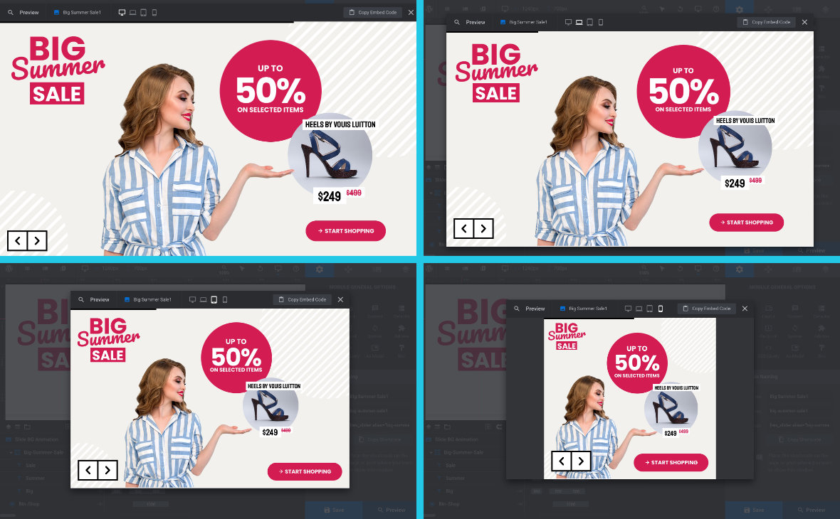
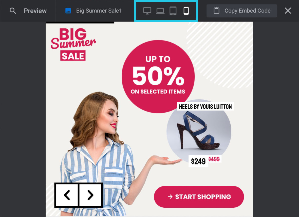
Main Popup Preview
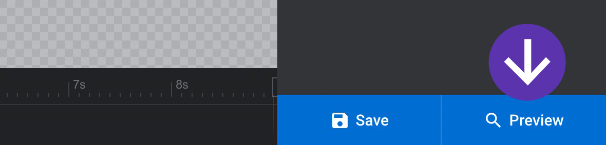
The regular popup preview can also show you all four size layout variants. Click the Preview button at the bottom right corner of the module editor to see the popup preview:
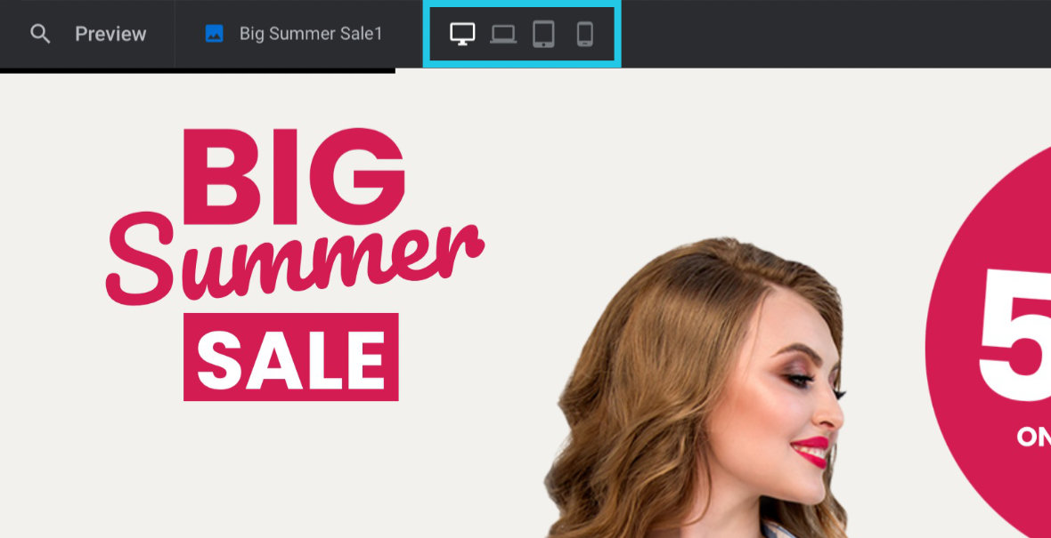
This will show you the desktop layout by default, as indicated by the white color applied to the desktop icon at the top of the toolbar, next to the three grey colored icons representing the other layout variants:
Click any of these icons to switch the layout size being previewed. The currently previewed layout’s icon will always be white in color:
Coming Up: Adjusting for Responsiveness
In the next guide we’ll check out some of the major things to watch out for when checking on responsiveness in customized template-based modules, and learn how to modify your layouts to correct any issues you find.


