Get in Touch With Us
For business inquiries, collaboration, jointly work or want to say hi, Contact us by Email: [email protected]
In this part of our Closer Look section we’re going to get into a breakdown of Slider Revolution’s all important tool: the Module Editor.
We’ll be looking at each of the four main sections of the editor, so to give you some context before we jump in let’s start with a quick image showing where they all are in the interface:
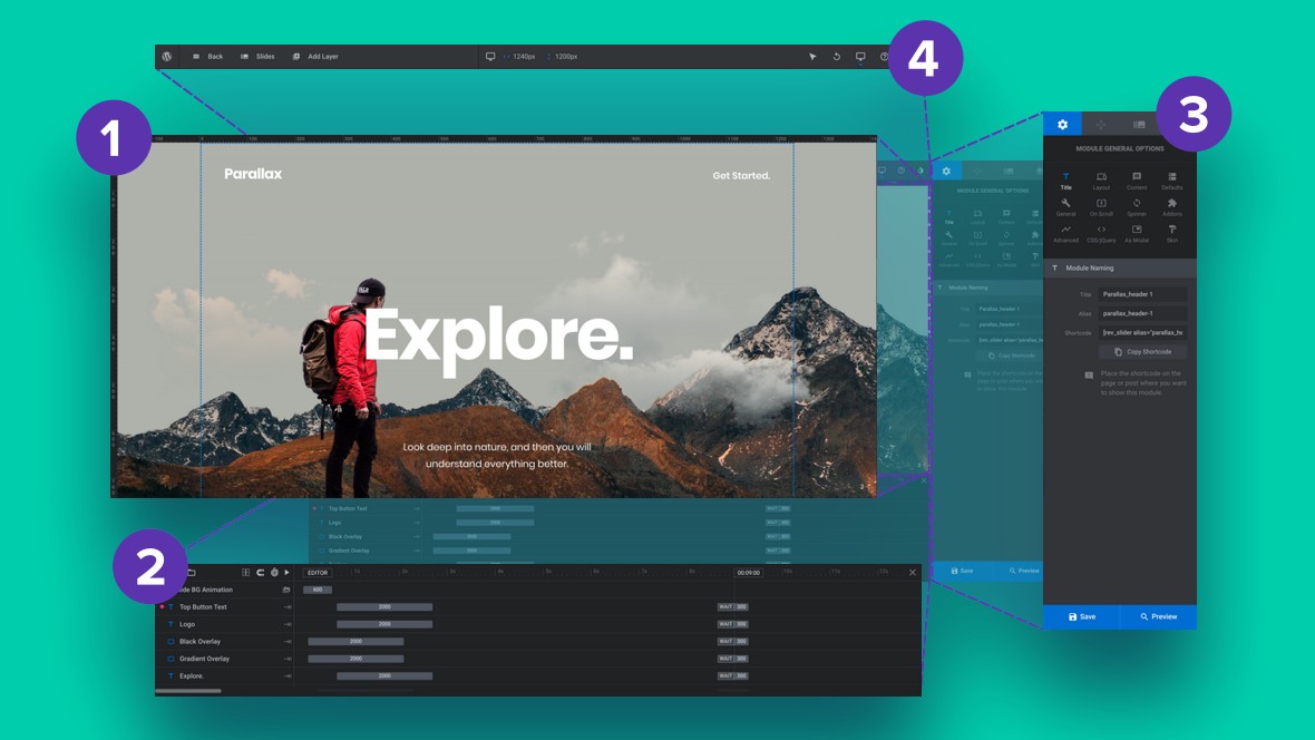
1. Canvas, 2. Timeline, 3. Sidebar, 4. Top Toolbar.
Okay, now that you have your bearings, let’s take a closer look at The Canvas: Slider Revolution’s Drag & Drop Visual Workspace.
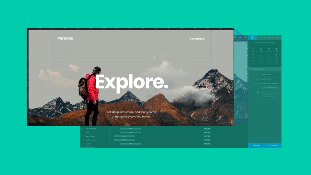
The canvas is the largest space in Slider Revolution’s module editor, taking up most of the left side. It is positioned below the top toolbar and above the timeline.
Within the canvas area there’s a whole lot you can do, but the primary tasks are as follows:
Point and click to select any layer directly from the canvas. As you hover your mouse around the canvas a blue line will appear, indicating which layer will be selected when you click.
Once a layer is selected you can modify it by altering its settings, moving & resizing it, or simply deleting it.
Click and drag any layer to move it.
Or alternatively point and click to select a layer then use arrow keys.
When a layer is selected you will see transform handles that can be dragged in order to change the size of layers such as images.
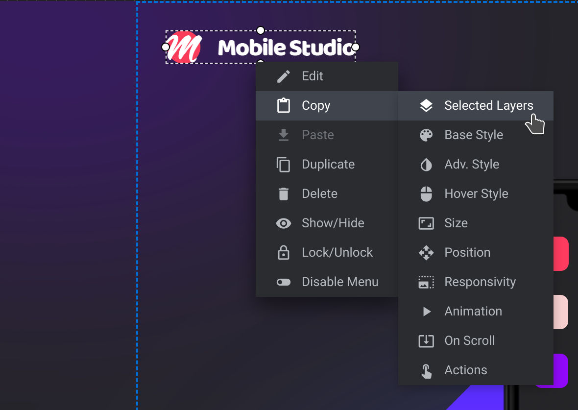
Right click a layer and you’ll see a context menu appear. From here you can copy, paste and duplicate the layer itself, or attributes of the layer such as its animations or style.
Hit the space bar to start a slide’s animations and you’ll see them play out in the canvas area.
That covers the key functionality of the canvas. In the next part of the module editor we’ll take a closer look at the timeline, which is responsible for animation and layer control.
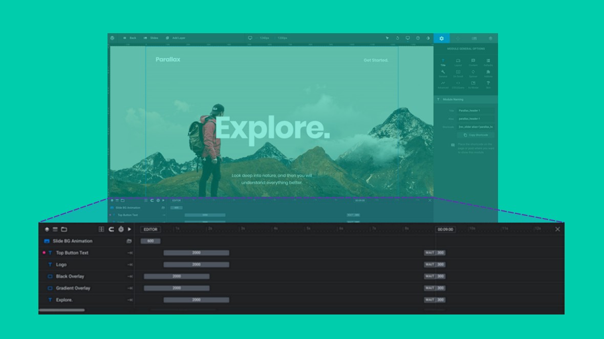
When you play a slide’s [?] animation you’ll see a purple playhead moving from left to right in the timeline, showing you the state of the slide’s layers [?] at different time markers, e.g. the 1 second mark, 3 second mark and so on.
The actual “time” part of the layers being animated is shown horizontally from left to right.
In the example screenshot below you can see a “0” at the top left and “00:09:00” at the top right. The “0” informs you where the animation time begins; the “00:09:00” informs you where the animation ends. i.e. the animation lasts for 9 seconds.
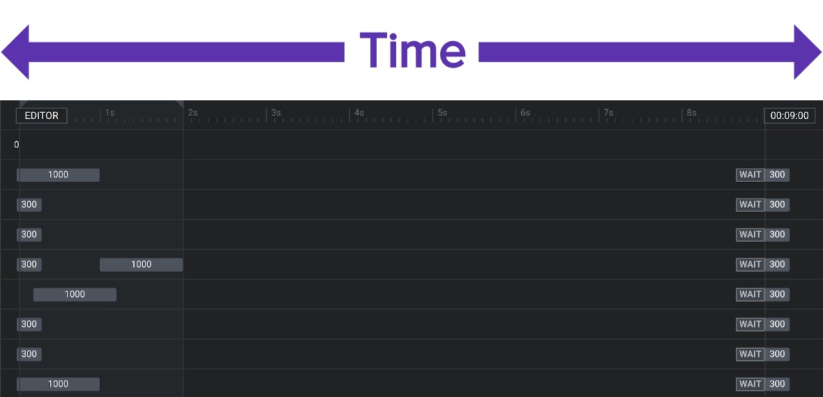
Left to right = time
The grey bars with numbers on them are animation strips [?] – we’ll talk about those in a moment.
From top to bottom in the timeline is your stack of layers. Each track [?], i.e. each horizontal line in the timeline corresponds with a layer.
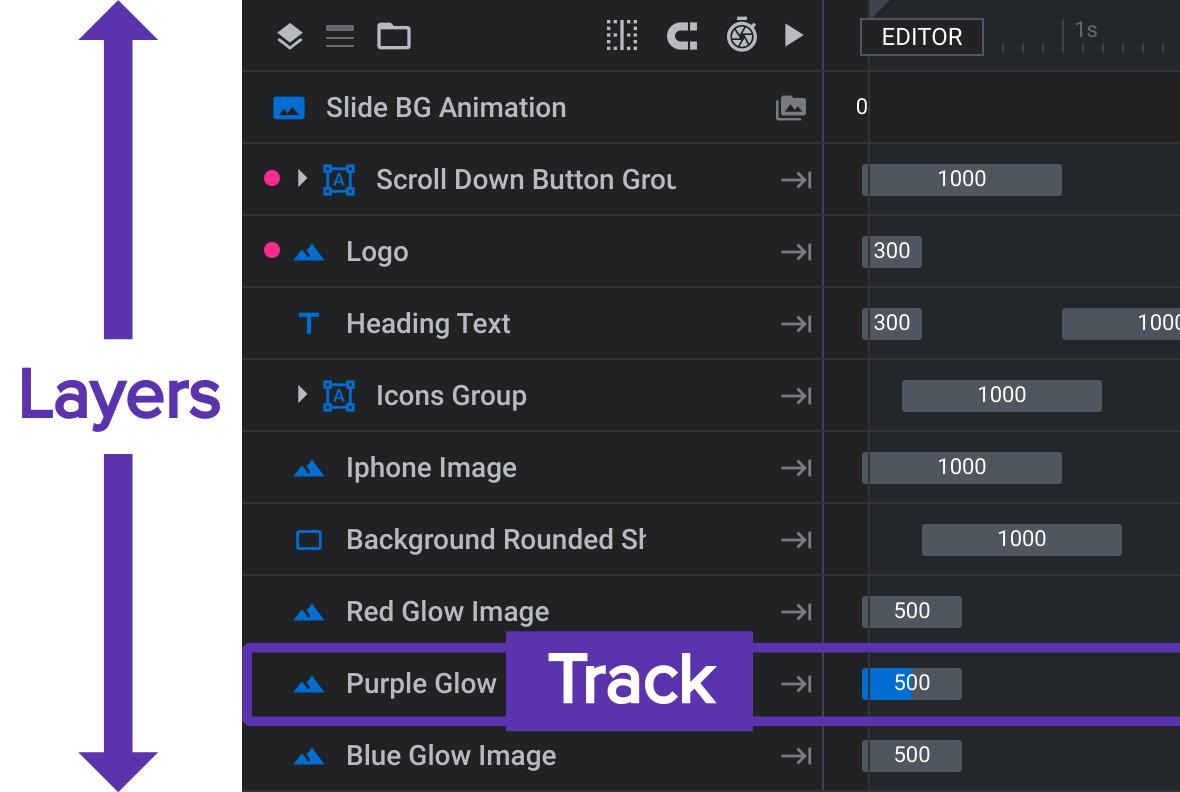
We discussed earlier how you can select layers by clicking them on the canvas [?] . The layer stack in the timeline gives you an additional way to select layers: just click on the name area at the left end of the track for a given layer and it will be selected in both the timeline and on the canvas.
When you have a slide with several layers this can be the easiest way to select the specific layer you want to modify.
The order of layers from top to bottom in the timeline layer stack corresponds with their sorting order on the canvas. The higher a layer is in the timeline stack the further in front it will appear on the canvas; the lower it is in the stack the further behind it will appear on the canvas.
Sometimes you will need to modify this sorting order. To do so, click and drag the track for a layer and move it either up or down in the timeline’s layer stack. As you drag you’ll see a blue line indication where in the stack the layer will be inserted if you drop it.
Moving a layer up will make it appear further in front, and moving it down will make it appear further behind.
The only exception is the special background layer which, despite being locked in position at the very top of the layer stack, will always be displayed behind all other layers on the canvas.
For each layer you will see at least two little grey animation strips [?] , one at the beginning and one at the end.

These strips represent something about the layer changing over time, for example, changing from being completely transparent to fully opaque.
The left end of a strip signifies when the change to the layer begins, and the right edge represents when the change ends. For this reason, the wider the strip is the longer the change will take.
That covers the main functions of the timeline. Next up we’ll look at the third section of the module editor, that being the sidebar, where we find settings & saving controls.
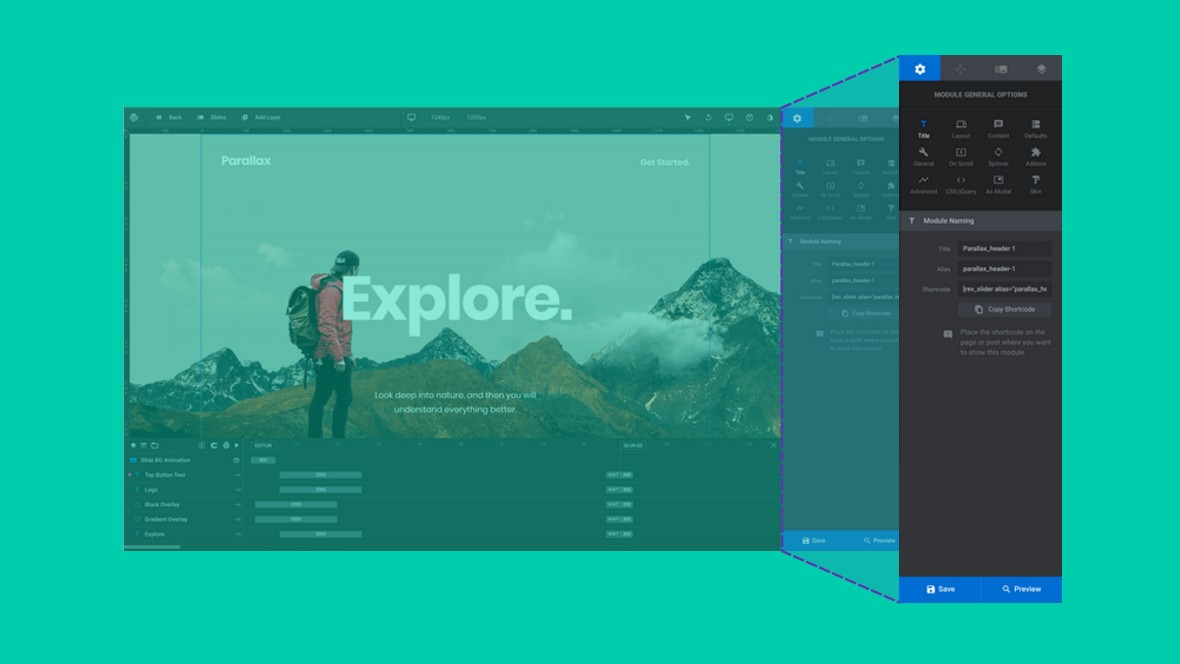
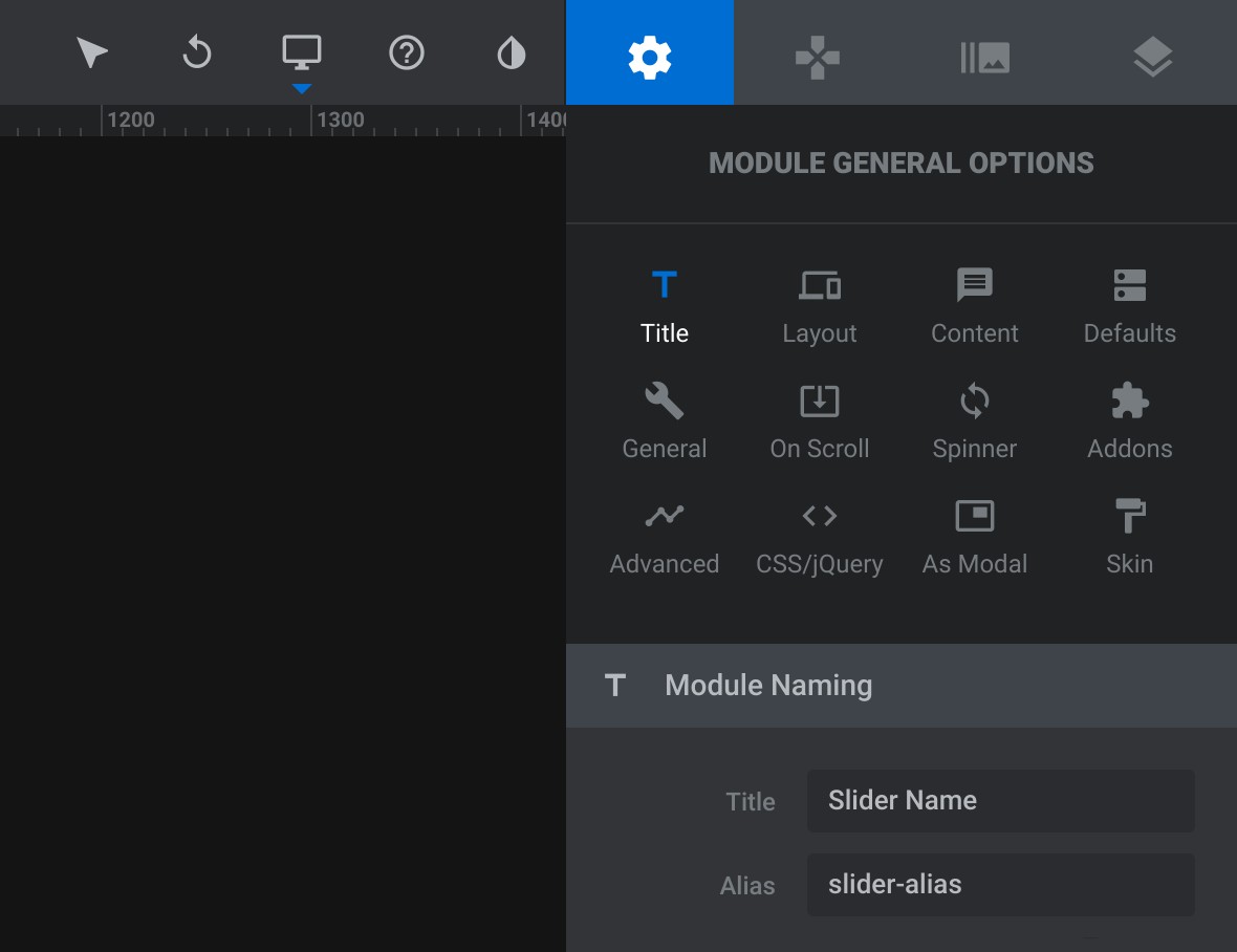
In the Module [?] General Options tab you’ll find controls that effect the whole module. Here you can do things like giving your module a name, controlling overall layout, setting slide defaults and other global level settings.
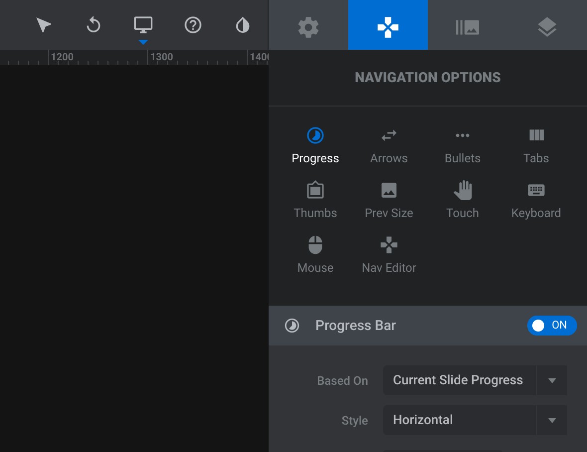
The Navigation Options tab lets you determine how people can navigate between one slide [?] and another. You get to choose whether to use arrow, bullets or tabs, whether you want to show slide thumbnails, and how interaction will work with mouse, keyboard and touch.
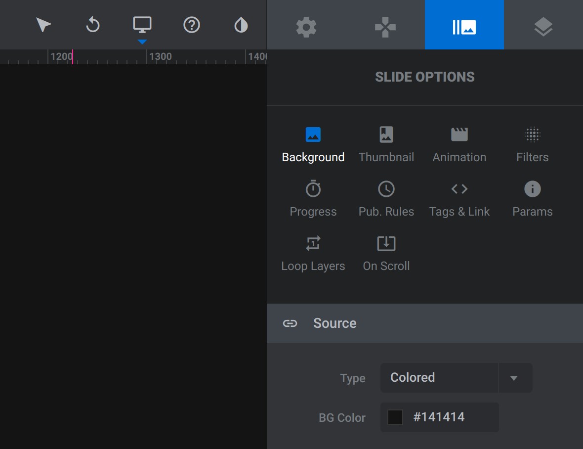
The Slide [?] Options tab lets you control things that might differ from slide to slide, such as a slide’s background, thumbnail image and transition animation. You can also add cool effects here, such as parallax movement and Instagram-like color filters.
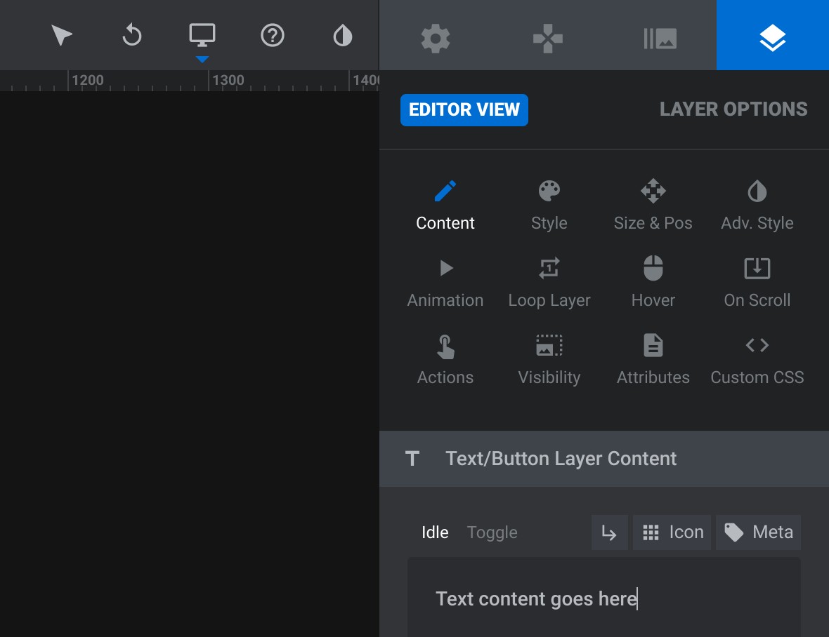
Every single individual layer [?] has settings you can control through the Layer Options tab. For that reason, any time you select a layer the sidebar will automatically switch to the Layer Options tab. Here you can change several things about the way the layer looks, the content of the layer, and what happens when someone interacts with the layer.
Saving the changes you’ve made to your module can be done by clicking the blue Save button at the bottom of the sidebar, and when you click the Preview button next to it a window will appear showing how your module will look when published.
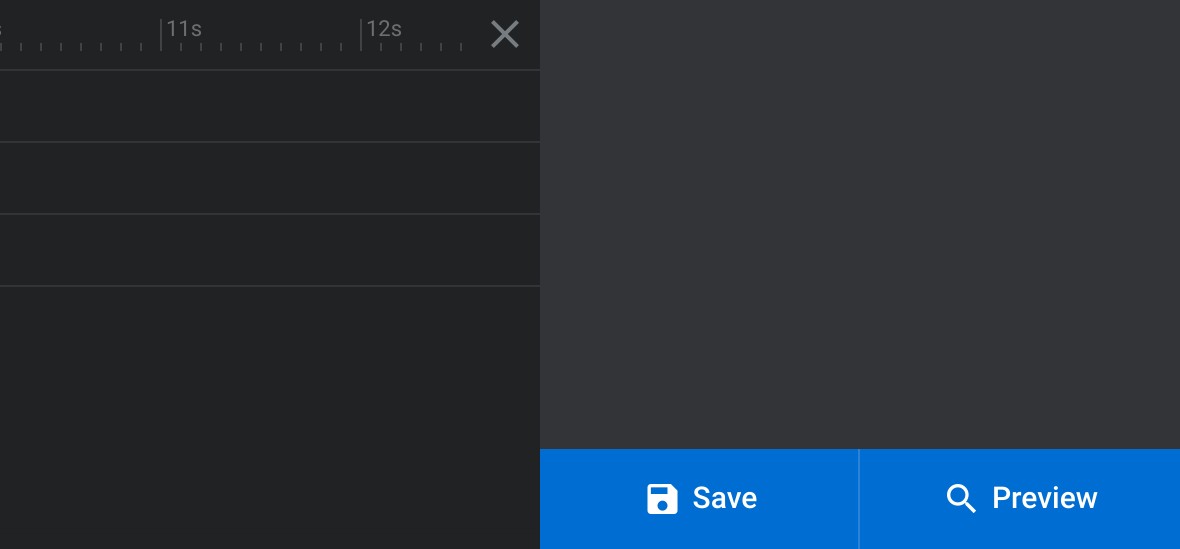
It’s good practice to always save before you preview, to ensure you’re seeing an up to date version of your module.
We have just one section left in our module editor breakdown, the top toolbar where we’ll find some extra controls and tools.
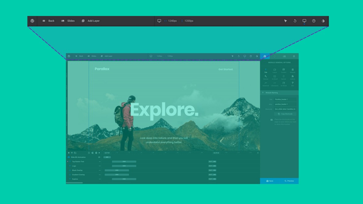
The top toolbar runs along the top left of the module editor, ending where the sidebar begins. There are three main groupings of tools on this bar:

You’ll use this section of the top toolbar, located at the left end, when you want to add new slides [?] or layers [?] to your module. In each case just hover over Slides or Add Layer and choose from the dropdown options that appear.

There is also a Back button you can use to exit the module editor [?] .
The top toolbar’s layer tools, located in the middle, give you extra ways to work with layers, providing buttons to duplicate, copy, delete, lock, hide and change sorting positions.

The right most section of the toolbar contains a few assorted bonus tools. You have alternative layer selection tools, an undo history, control over responsive sizes, activation of inline help, and a button to add pre-styled content.

So far in our Closer Look we’ve taken a look at modules and the module editor. Next, we have just one more core concept to break down in order for you to have a really solid foundational understanding of Slider Revolution.
In the next section we’ll be taking a closer look at layers, the smallest building blocks of Slider Revolution modules. Let’s start with a quick overview of what we’ll be covering.
For business inquiries, collaboration, jointly work or want to say hi, Contact us by Email: [email protected]
We use cookies to improve your experience on our site. By using our site, you consent to cookies.
Manage your cookie preferences below:
Essential cookies enable basic functions and are necessary for the proper function of the website.
These cookies are needed for adding comments on this website.
Statistics cookies collect information anonymously. This information helps us understand how visitors use our website.
Google Analytics is a powerful tool that tracks and analyzes website traffic for informed marketing decisions.
Service URL: business.safety.google (opens in a new window)
Marketing cookies are used to follow visitors to websites. The intention is to show ads that are relevant and engaging to the individual user.
Facebook Pixel is a web analytics service that tracks and reports website traffic.
Service URL: www.facebook.com (opens in a new window)