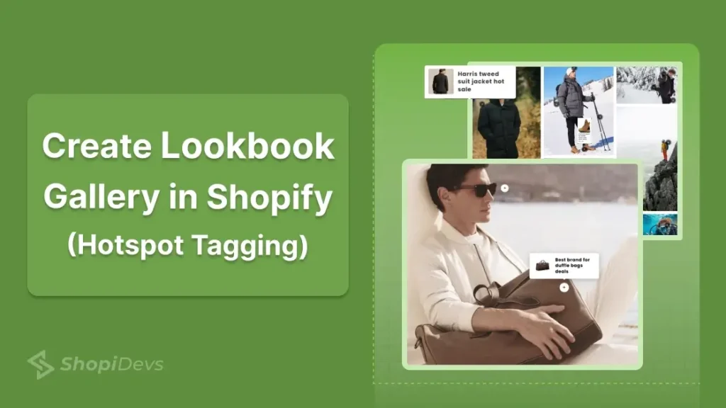
A lookbook is not a product gallery. A product gallery shows items on a white background. A lookbook places those same items in real-life scenes and makes them directly shoppable. The difference in conversion rate between the two is measurable: shoppable lifestyle images reduce purchase hesitation because customers can see how a product looks in context before they buy.
Shopify supports three distinct ways to create a shoppable lookbook. The Dawn theme includes a built-in “Shop the Look” section that requires no app and no code. The Essential Grid Gallery app provides a full lookbook builder with hotspot product tagging, multiple layout options, and advanced customization. And for developers, a custom Liquid section can produce a basic lookbook with image maps using only theme code. Each method has different limits on the number of products per image, layout flexibility, and cost.
This guide covers all three methods with exact steps, the right image sizes for each, and a troubleshooting section for the issues that commonly break lookbooks after setup.
The fastest way to create a lookbook in Shopify without an app is to go to Online Store > Themes > Customize, click Add section, and choose Shop the Look. Upload a lifestyle image, then click Add product to place hotspot dots on the image and link them to products. This is free and available in Dawn and most Shopify OS 2.0 themes, but it is limited to 4 tagged products per image and one image per section.
For a full shoppable lookbook gallery with multiple images, custom layouts, and more than 4 hotspots per image, use the Essential Grid Gallery app. Install it, choose the Lookbook category template, replace demo images with your lifestyle photos, tag products using the Hotspot tab, publish the gallery, then add the app block in the theme editor using the Gallery ID.
Key Takeaways
- Shopify’s Dawn theme has a built-in “Shop the Look” section. It’s free, requires no app, and supports up to 4 tagged products per lifestyle image.
- Essential Grid Gallery is the best app for a full lookbook gallery. It supports unlimited images, multiple layout styles, and hotspot product tagging with popup previews.
- The best image ratio for a Shopify lookbook is portrait (4:5) at 800×1000px or 1000×1250px. Keep each image under 500 KB using WebP format for fast loading.
- Use 2 to 3 hotspot tags per image. More than 4 tags per image creates visual clutter and makes it harder for mobile users to tap the right one.
- Lookbook hotspots work on mobile when the app or theme supports responsive positioning. Always test on a phone after publishing.
- A lookbook gallery does not slow down your store if lazy loading is enabled. Essential Grid Gallery supports lazy load, load more, and infinite scroll options.
- To make a banner image clickable without a full lookbook setup, see How to Make a Shopify Image Banner Clickable .
What Is a Shopify Lookbook (and What It Is Not)
A Shopify lookbook is a curated gallery of lifestyle images where products are tagged with clickable hotspot markers. When a visitor taps or hovers on a hotspot, a product card appears showing the product name, price, and an “Add to cart” or “View product” button. The shopper can buy directly from the image without navigating to a separate product page.
This is different from a standard Shopify photo gallery, which displays images in a grid without product linking. It is also different from a Shopify product slider, which shows product cards in a horizontal scroll. A lookbook focuses on the scene first and treats products as elements within that scene, not the primary subject.
The term “shoppable lookbook” and “shop the look” are used interchangeably. Both describe the same format: lifestyle image plus product hotspot tags plus inline purchase option.
Lookbooks are most effective for fashion, home decor, beauty, and lifestyle brands where the context of a product (how it looks in a room, worn as an outfit, or used in a setting) directly influences the purchase decision. They work best when placed on the homepage, collection pages, or a dedicated “Inspiration” or “Lookbook” page.
Method Comparison: Free vs App vs Custom Code
| Feature | Dawn Theme (Free) | Essential Grid Gallery | Custom Liquid |
|---|---|---|---|
| Cost | Free | Free plan available; paid from $5.95/month | Free (developer time) |
| Code required | None | None | Yes (Liquid + CSS) |
| Hotspot product tags | Yes (up to 4 per image) | Yes (unlimited) | No (link only, no popup) |
| Multiple images in one gallery | No (one image per section) | Yes (unlimited) | Yes (custom) |
| Product popup card | Yes | Yes | No |
| Layout options | Basic (image + sidebar) | Grid, masonry, carousel, slider | Fully custom |
| Video support | No | Yes | Custom |
| Mobile responsive | Yes | Yes | Depends on build |
| Best for | Simple “Shop the Look” on homepage | Full branded lookbook, multiple collections | Highly custom brand experiences |
Everything built in. No apps to install.
Bundles, promos, a shoppable lookbook and a mega menu ship with the theme. Five EU languages, one-time payment, lifetime updates — and no monthly app fees eating your margin.
Get Snazzy →
How to Create a Lookbook in Shopify (3 Steps)
There are 3 main ways to create a lookbook gallery for your Shopify store, which allows direct buying options.
- Method 1: Dawn Theme Shop the Look (Free, No App)
So, in this guide, I will show you the easiest way to create a lookbook gallery with flexible options using a Shopify app.
Method 1: Dawn Theme Built-In Shop the Look: Zero Cost, Zero Code
Shopify’s Dawn theme (and most OS 2.0 themes, including Craft, Sense, Refresh, and Crave) includes a built-in “Shop the look” section. It supports one lifestyle image per section, up to 4 product hotspots, and renders a product popup card when a visitor clicks a hotspot dot. No app, no code, no monthly fee.
Theme compatibility: This method works on Dawn, Craft, Sense, Refresh, Crave, and most Shopify-built OS 2.0 themes. If you are using a third-party theme that does not include a “Shop the Look” section, use Method 2 (Essential Grid Gallery) instead.
- Open Theme Customizer: Go to Online Store > Themes > Customize. Navigate to the page where you want to add the lookbook (homepage, collection, or a custom page).
- Add the Shop the Look section: Click Add section in the left sidebar. Search for Shop the look and click to add it. If you do not see it in your theme, your theme does not natively support this section, and you need Method 2.
- Upload your lifestyle image: Click on the section in the editor. In the right sidebar, click Select image and upload your lifestyle photo. Recommended size: 1200x1500px (portrait, 4:5 ratio) in WebP format under 500 KB.
- Add product hotspots: Click Add product in the section settings. Search for and select a product. A hotspot dot will appear on the image. Drag it to position it over the product in the photo. Repeat for up to 4 products.
- Customize section settings: In the right sidebar, set the section heading, choose the desktop layout (image left or image right), and enable or disable the section heading. Adjust text color if needed for readability against your image.
- Save and preview: Click Save. Open the live page on both desktop and mobile to verify hotspot positions are correct. On mobile, hotspot dots may shift slightly due to responsive image scaling. Reposition in the editor if needed.
Limit: Dawn’s Shop the Look supports one lifestyle image per section. To display multiple lookbook images, add multiple Shop the Look sections on the same page. Each section is independent.
For a full multi-image shoppable lookbook with gallery layouts, pagination, and more than 4 products per image, move to Method 2. See the dedicated Shopify lookbook app guide for a deeper comparison of apps that extend this functionality.
Method 2: Essential Grid Gallery App (Full Lookbook Builder, 8 Steps)
Essential Grid Gallery is a Shopify app that provides a complete lookbook builder with 70+ templates, including dedicated lookbook layouts with hotspot product tagging. Each hotspot shows a product popup with an image, name, price, and a direct purchase button.
The app supports unlimited images per gallery, multiple grid and carousel layouts, lazy loading, and responsive hotspot positioning across all devices. As of 2026, it also supports shoppable video galleries (YouTube Shorts, Instagram Reels, Shopify-uploaded video) alongside image lookbooks, making it the most versatile option for stores that mix video and photo content.
This is the right method when you need more than one image per lookbook, more than 4 products tagged per image, or a gallery layout (grid, masonry, slider) rather than a single-image section.
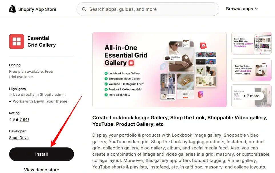
Step 1: Install Essential Grid Gallery
Go to the Shopify App Store, search for Essential Grid Gallery, and click Install. Open the app from your Shopify admin after installation.
Step 2: Choose a Lookbook Template
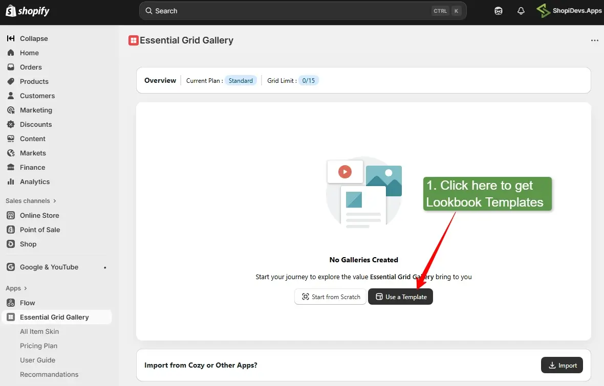
In the app dashboard, you have two options: start from scratch or use a template. For most stores, starting with a template is faster and produces a more polished result. Click Templates, then select Lookbook from the left category menu to filter to lookbook-specific templates only.
Step 3: Install the Template
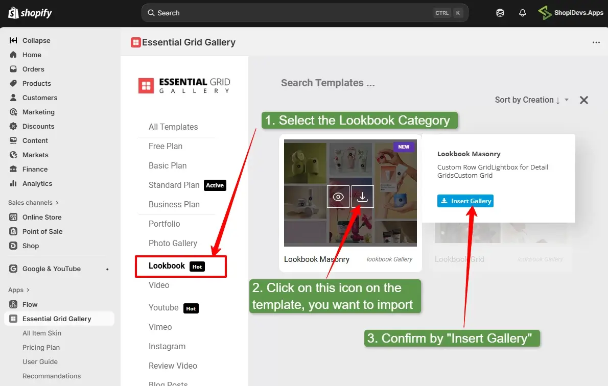
Hover over the template you want and click the View button to preview it or the Install icon to add it to your store. After installing, click Open to enter the gallery editor.
Step 4: Open the Image Editor
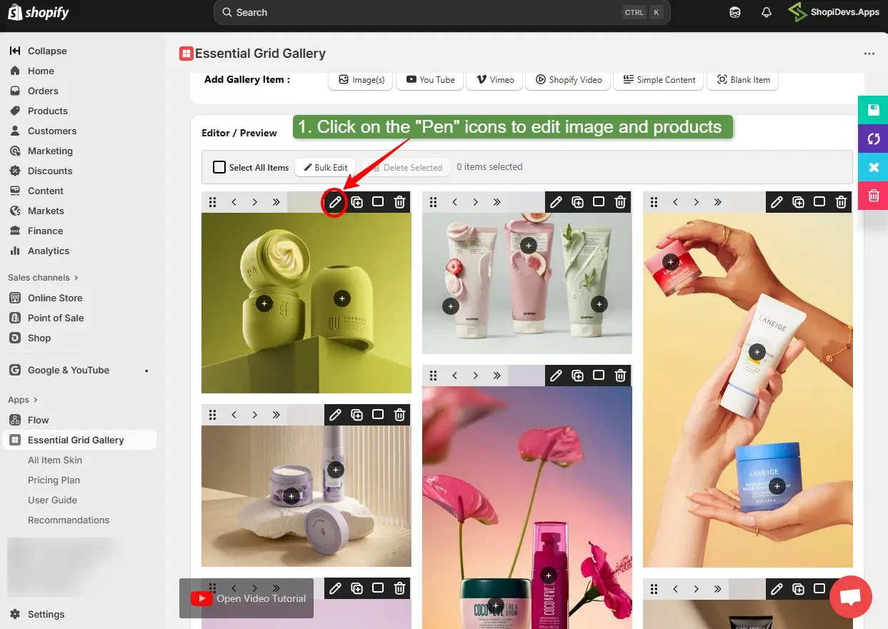
Inside the gallery editor, you will see the template populated with demo images. To replace a demo image with your own lifestyle photo, locate the Edit (pen) icon on any image in the preview area and click it.
Step 5: Replace the Demo Image
Click Choose image to upload your lifestyle photo from your device or Shopify Media Library. After uploading, click the Lookbook tab in the same panel to move to hotspot tagging.
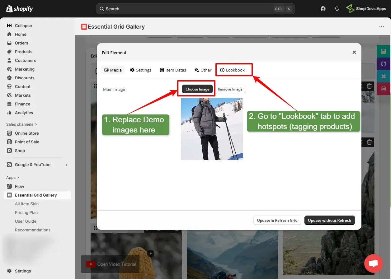
Image size for Essential Grid Gallery: Upload images at 1000×1250px (portrait, 4:5 ratio) or 1200×900px (landscape, 4:3 ratio) in WebP format. Keep each image under 500 KB. The app automatically handles display sizing, but uploading at these dimensions helps maintain image quality during full-screen previews.
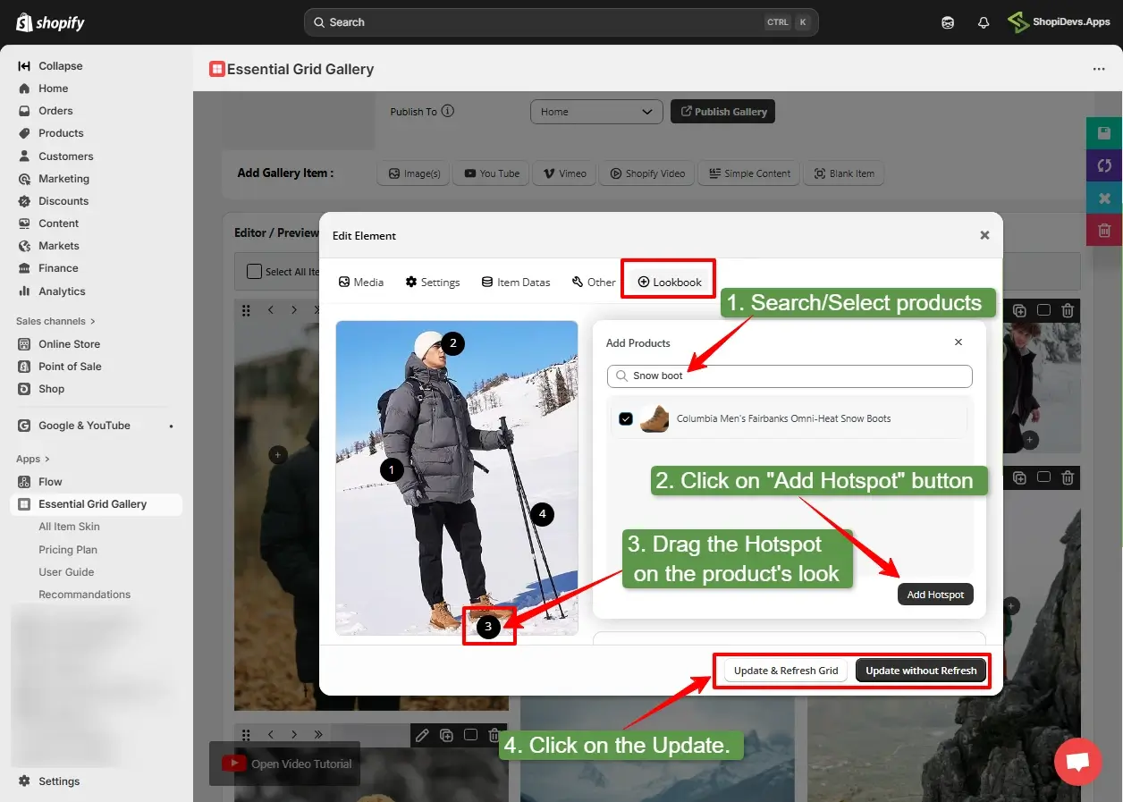
Step 6: Add Hotspot Product Tags
In the Lookbook tab, the hotspot setup has three steps:
- Search and select a product by name. The product must already exist in your Shopify store.
- Drag the hotspot dot on the image preview to position it over the product in the photo.
- Click Update and Refresh Grid to save the hotspot position and preview the result.
Repeat this for each product you want to tag. Best practice: 2 to 3 hotspots per image. More than 4 hotspots creates visual clutter and overlapping tap targets on mobile.
Step 7: Save and Publish the Gallery
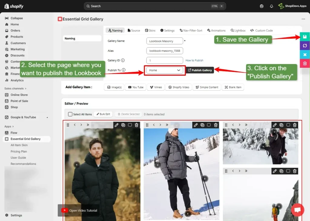
After editing all images and hotspots, click the Save button to save your gallery. Then go to the Naming tab, select the page where you want to publish the lookbook, and click Publish Gallery. The app will redirect you to the Shopify theme editor.
Step 8: Add the App Block and Gallery ID in Theme Editor
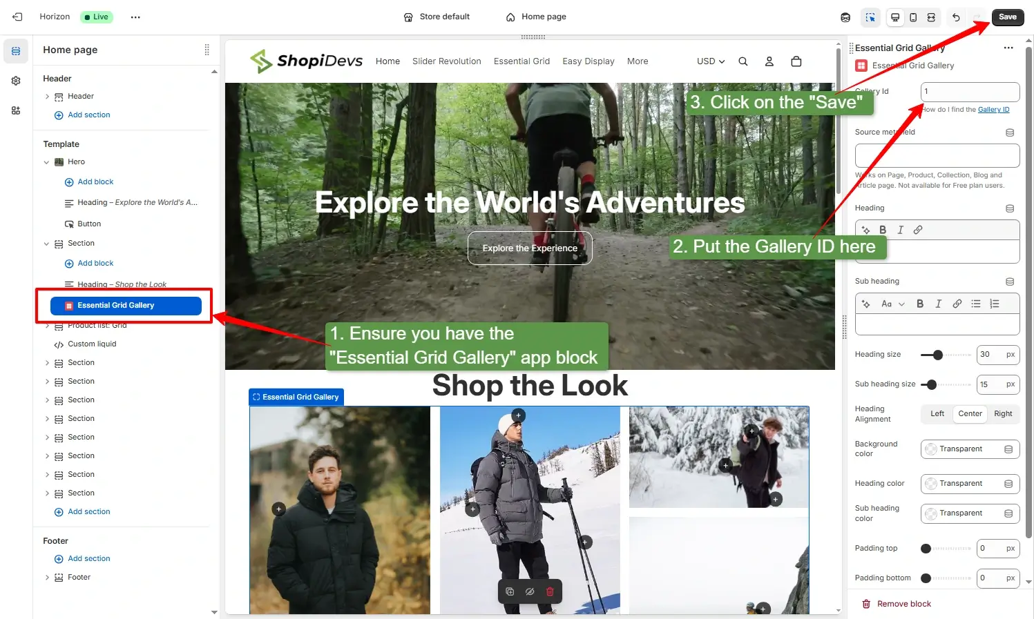
In the Shopify theme editor, verify that the Essential Grid Gallery app block is placed in the correct position on the page. Then enter the Gallery ID in the app block field. You can find the Gallery ID in the Naming tab of the app, displayed above the Publish button. Click Save in the theme editor.
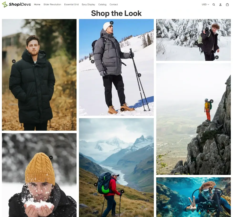
Result: Your shoppable lookbook gallery is now live. Visitors can hover over or tap any hotspot dot to view a product popup with the product image, name, price, and a direct purchase button.
For a full comparison of Shopify lookbook apps including pricing and feature differences, see the Shopify lookbook app comparison guide. If you want to add video to your lookbook alongside static images, see how to add video to a Shopify banner section for the setup pattern.
Method 3: Custom Liquid Lookbook (Developer Method)
This method creates a basic lookbook using a Custom Liquid block in the theme editor. It does not support clickable hotspot dots or product popups. Instead, it displays a lifestyle image alongside a product list with links. It is the right choice for developers who need full control over the layout and do not want to add an app dependency.
Result: Your shoppable lookbook gallery is now live. Visitors can hover over or tap any hotspot dot to view a product popup with the product image, name, price, and a direct purchase button.
Add a Custom Liquid block via the theme editor and paste the following code. Replace the image URL and product URLs with your actual values:
<style>
  .sd-lookbook {
    display: grid;
    grid-template-columns: 1fr 1fr;
    gap: 32px;
    align-items: center;
    padding: 40px 0;
  }
  @media (max-width: 640px) {
    .sd-lookbook { grid-template-columns: 1fr; }
  }
  .sd-lookbook img {
    width: 100%;
    border-radius: 8px;
    display: block;
  }
  .sd-lookbook-products h3 {
    font-size: 1.2em;
    font-weight: 700;
    margin-bottom: 16px;
    color: #1a1a1a;
  }
  .sd-lookbook-item {
    display: flex;
    align-items: center;
    gap: 14px;
    padding: 10px 0;
    border-bottom: 1px solid #f1f5f9;
  }
  .sd-lookbook-item:last-child { border-bottom: none; }
  .sd-lookbook-item img {
    width: 60px;
    height: 60px;
    object-fit: cover;
    border-radius: 6px;
    margin: 0;
  }
  .sd-lookbook-item-info a {
    font-weight: 600;
    color: #1a1a1a;
    font-size: 14px;
    text-decoration: none;
  }
  .sd-lookbook-item-info .price {
    font-size: 13px;
    color: #6b7280;
  }
</style>

<div class="sd-lookbook">
  <img src="YOUR_LIFESTYLE_IMAGE_URL" alt="Shop the look" />
  <div class="sd-lookbook-products">
    <h3>Shop This Look</h3>
    <div class="sd-lookbook-item">
      <img src="PRODUCT_THUMBNAIL_URL" alt="Product name" />
      <div class="sd-lookbook-item-info">
        <a href="/products/your-product-handle">Product Name</a>
        <div class="price">$XX.XX</div>
      </div>
    </div>
    <!-- Repeat .sd-lookbook-item for each product -->
  </div>
</div>To upload this as a full theme section file instead of a Custom Liquid block, save it as a .liquid file in your theme’s sections/ folder via Edit Code, then add the schema block to make it configurable from the theme editor.
What to Prepare Before You Build Your Lookbook
A poorly planned lookbook undermines the concept. The goal is to create a cohesive visual narrative, not a random collection of lifestyle photos. Before opening the app or theme editor, have these elements ready:
1. Define a single theme per gallery. Each lookbook should have a unified visual concept: a season, a color palette, an occasion, or a use-case (home office, beach, evening out). Mixing themes in one gallery confuses the visual story. When you need to organize your Shopify products into coherent groups, that same grouping logic applies to lookbook curation.
2. Collect lifestyle images, not product shots. Lookbook images must show products being used or worn in a real setting. White background product images do not work in a lookbook context. If you are using UGC (user-generated content), get explicit permission before using it in a shoppable gallery.
3. Select 2 to 3 featured products per image. Decide which products to tag before you open the editor. Tagging too many products in one image clutters the hotspot layer and creates overlapping tap targets on mobile screens. The 2 to 3 rule keeps each image clean and purposeful.
4. Plan hotspot positions on paper. For each lifestyle image, note which product is in which part of the frame. Hotspot placement should match the actual product position in the image, not be placed arbitrarily. A hotspot on the left side of a jacket pointing to a shoe is a usability failure.
5. Optimize images before upload. Unoptimized images are the most common reason a lookbook gallery slows down a store. See the image size guide below before uploading.
Lookbook Image Sizes for Shopify
Image dimensions affect how lookbook images display across layouts and devices. The following sizes are optimized for Shopify’s rendering pipeline and the most common lookbook aspect ratios used in Essential Grid Gallery and Dawn’s Shop the Look section.
| Specification | Recommended | Why It Matters |
|---|---|---|
| File format | WebP | 30 to 40% smaller than JPEG at similar quality. Shopify serves WebP automatically in supported browsers. |
| Max file size | Under 500 KB per image | Files larger than 500 KB noticeably increase gallery load time. Enable lazy loading in Essential Grid Gallery to reduce the impact. |
| Resolution | 72 DPI (screen resolution) | Higher DPI does not improve screen quality and only increases file size. |
| Color profile | sRGB | Non-sRGB profiles (Adobe RGB, ProPhoto) can display inaccurate colors in many browsers. |
| Alt text | Descriptive and product-inclusive | Example: “White linen shirt and navy trousers styled in a coastal lookbook for Shopify.” Helps accessibility and AI search indexing. |
For full image size specifications across all Shopify sections including banners, hero images, and product thumbnails, see the complete Shopify image size guide. For banner-specific dimensions, see the Shopify image banner size reference.
Best Practices for Shopify Lookbooks
Keep 2 to 3 hotspots per image. This is the single most important usability rule for lookbooks. More than 3 hotspots crowd the image, make it harder for mobile users to tap the correct target, and dilute attention. If you have 6 products in a scene, feature 3 in the image and list the rest below it.
Use consistent image dimensions across the gallery. Mixed portrait and landscape images in the same grid layout create visual imbalance. Decide on one ratio (portrait 4:5 is the most common for fashion lookbooks) and shoot or crop all images to that ratio before uploading.
Test every hotspot on mobile before publishing. Hotspot dots are positioned as percentages of the image width and height. Responsive image scaling on mobile can shift these positions. Always open the published gallery on an actual phone (not just the mobile preview in the theme editor) to verify tap accuracy.
Enable lazy loading. Essential Grid Gallery supports lazy loading, load more, and infinite scroll. Enable lazy loading in the grid settings to prevent all images from loading simultaneously on page open. This is the primary performance control for lookbook galleries.
Include video when possible. A static lookbook of 10 images is good. A lookbook that mixes still images with short product videos is better. Essential Grid Gallery supports video items alongside image items in the same grid. For the video setup pattern, see the guide on Shopify video carousels.
Link the lookbook to a campaign or collection. A lookbook without a linked campaign is just a gallery. Pair it with a Shopify sale banner or a product banner at the top of the page to give the lookbook context (a seasonal launch, a promotion, a new collection arrival).
Write descriptive alt text for every image. Alt text on lookbook images should describe the scene and mention the products visible, not just say “lookbook image 1.” Descriptive alt text improves accessibility and helps search engines (and AI systems) understand what the image depicts, which directly supports discoverability in image search and AI-generated shopping recommendations.
Troubleshooting Common Shopify Lookbook Issues
Essential Grid Gallery app block shows but gallery is blank
Fix: The Gallery ID in the app block field is missing or incorrect. Open the gallery inside Essential Grid Gallery, click the Naming tab, and copy the Gallery ID shown above the Publish button. Paste it into the Gallery ID field in the theme editor app block exactly as shown, then click Save in the theme editor.
Hotspot dots are in the wrong position after publish
Fix: Hotspot positions are stored as percentages based on the image dimensions when you created them. If you replace the image with a different crop or aspect ratio, the hotspot locations will shift. Open the image editor, go to the Lookbook tab, reposition each hotspot, then click Update and Refresh Grid after every adjustment.
Hotspot tags are not saved after refreshing
Fix: After placing or moving a hotspot, always click Update and Refresh Grid before leaving the image editor. Closing the editor without updating discards hotspot positions. The main Save button only stores gallery settings, not hotspot placement.
“Shop the Look” section is missing in the Dawn theme
Fix: Not every Shopify theme includes the Shop the Look section. It is available in Dawn, Craft, Sense, Refresh, and several other Shopify-built themes. If you do not see it under Add section, your current theme does not support it. Use Essential Grid Gallery instead.
Lookbook gallery loads slowly
Fix: Most slow galleries are caused by oversized images or loading too many images at once. Compress every image to under 500 KB in WebP format, enable Lazy Load in Grid Settings → Loading Options, and use Load More or Pagination instead of loading every image on page load.
Product popup appears but the “Add to Cart” button is missing
Fix: The tagged product may be out of stock or require variant selection (such as size or color). Enable Show variant selector in popup in the gallery skin settings so customers can choose a variant before adding the product to the cart.
Lookbook images appear stretched or cropped incorrectly
Fix: The gallery’s aspect ratio does not match your uploaded images. In Item Settings, set the aspect ratio to 4:5 for portrait images or 4:3 for landscape images. Alternatively, choose Auto to display images using their original proportions.
Frequently Asked Questions
How do I create a lookbook in Shopify for free?
Use the built-in “Shop the Look” section in Shopify’s Dawn theme or other OS 2.0 themes. Go to Online Store > Themes > Customize, click Add section, and search for “Shop the look.” Upload a lifestyle image, then click Add product to place hotspot dots and link them to products in your store. This is completely free, requires no app, and supports up to 4 tagged products per image. If your theme does not include this section, you need a lookbook app.
What is the best Shopify app for creating a lookbook?
In 2026, the top Shopify lookbook apps are Essential Grid Gallery, Lookfy Lookbook, and Byte Lookbook and Shop The Look. Essential Grid Gallery is the most feature-complete option: 70+ templates including dedicated lookbook layouts, unlimited images per gallery, hotspot product tagging with popup cards, video support, and lazy loading. It has a free plan and paid plans starting at $5.95 per month. Lookfy Lookbook offers deep gallery customization and multiple hotspot styles. Byte Lookbook combines a lookbook gallery with a “Shop the Look” widget on product pages. See the full Shopify lookbook app guide for a detailed comparison and pricing breakdown.
What image size should I use for a Shopify lookbook?
The recommended size for portrait lookbook images (most common for fashion and lifestyle) is 1000x1250px at a 4:5 ratio. For landscape lookbook images (home decor, room scenes), use 1200x900px at a 4:3 ratio. Upload in WebP format and keep each image under 500 KB to avoid load speed issues. Avoid mixing portrait and landscape images in the same gallery unless the layout specifically supports mixed ratios. For all Shopify image size specifications, see the Shopify image size guide.
Will a Shopify lookbook gallery slow down my store?
A lookbook gallery will not slow your store if you optimize images and enable lazy loading. The most common cause of lookbook-related slowdowns is unoptimized images (over 500 KB each) loading all at once. Compress images to WebP under 500 KB before uploading, and enable lazy loading in Essential Grid Gallery’s grid settings. For image carousels and product sliders, the same image optimization rules apply.
Are Shopify lookbook hotspots mobile-friendly?
Yes, when using a theme or app that supports responsive hotspot positioning. Dawn’s Shop the Look section is responsive. Essential Grid Gallery positions hotspots as percentages of the image dimensions and scales them responsively. Always test on an actual mobile device after publishing, not just the mobile preview in the theme editor. Hotspot dots should be large enough to tap (minimum 44x44px tap target per accessibility guidelines) and should not overlap with each other on small screens.
Need a Custom Lookbook or Shoppable Gallery for Your Shopify Store?
ShopiDevs builds custom Shopify sections, shoppable lookbooks, gallery integrations, and Liquid features tailored to your brand. Whether you need hotspot product tagging, custom layouts, or advanced gallery functionality, our team can build it without compromising performance.

Jakaria is an SEO Content Writer in Shopify, Ecommerce, WordPress, and Tech Industry with 5+ years of experience. He specialises in developing engaging, helpful content by simplifying complex topics into an amazing story for B2B, SaaS, and Shopify businesses. He’s also passionate about staying updated on growth marketing strategies and Shopify trends.