Wrong image dimensions cost you speed, rankings, and conversions. Most Shopify stores don’t know about it.
A product photo too small to zoom. A hero banner that crops badly on mobile. A slideshow pushing load time past 3 seconds. The store looks fine on the builder’s laptop and breaks on the customer’s phone.
Image sizing is not a design detail. It’s a performance variable. Get it wrong, and you pay in three ways: slower load times, lower Google rankings, and a storefront that looks unprofessional on any device you didn’t test on.
This is the complete 2026 reference for every Shopify image type, with exact dimensions, the right file formats, and compression targets that keep your store fast.
Start with the Quick Reference table below. Every spec you need, in one place.
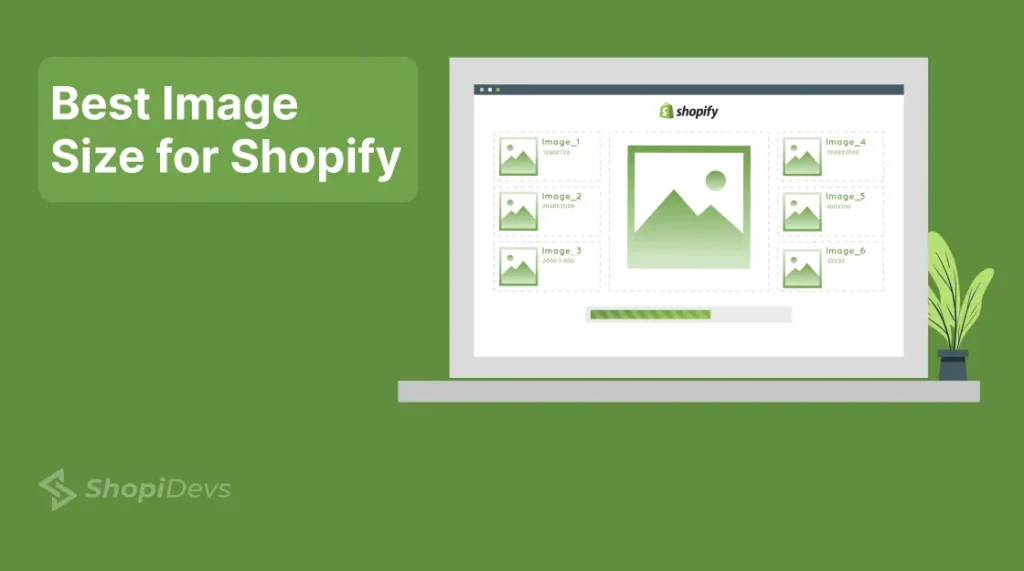
Quick Reference: Shopify Image Sizes 2026
| Image Type | Desktop (px) | Mobile (px) | Ratio |
|---|---|---|---|
| Product Image | 2048 × 2048 | 2048 × 2048 | 1:1 |
| Lifestyle Image | 2048 × 2048 | 2048 × 2048 | 1:1 |
| Banner Image | 1200–2000 × 400–600 | 1200 × 600 | 16:9 |
| Hero Banner | 1280 × 720 | 360 × 200 | 16:9 |
| Slideshow Image | 2000 × 800 | 1000 × 1600 | 16:9 / Flexible |
| Collection Image | 1024 × 1024 | 550 × 550 | 1:1 |
| Blog Featured Image | 1200 × 800 | 360 × 240 | 3:2 |
| Square Logo | 100 × 100 | 60 × 60 | 1:1 |
| Rectangle Logo | 400 × 100 | 160 × 40 | 4:1 |
| Favicon | 16 × 16 (or 32 × 32) | 16 × 16 | 1:1 |
| Social Media Icons | 32 × 32 | 48 × 48 | 1:1 |
Note: Sizes vary by theme. Always verify against your specific theme requirements.
Target file size: Under 300KB
Preferred format: WebP
- Shopify banner size: 1200–2000px wide, 400–600px tall (desktop). Use 1200×600px for mobile.
- Product images: 2048×2048px at 1:1 ratio. Minimum 800×800px, maximum 5000×5000px.
- Hero images: 1280×720px desktop, 360×200px mobile. Full-bleed themes need up to 2000×800px source.
- File size target: Under 300KB per image. Shopify’s max is 20MB but that hurts page speed.
- Best format in 2026: WebP. Shopify’s CDN automatically serves WebP when supported.
- Theme matters: Image dimensions vary by theme. Dawn, Debut, and Sense render images differently.
Why Image Sizes Directly Impact Your Store’s Performance
Most Shopify merchants focus on traffic, ads, and product copy. Image sizing gets ignored, until page speed drops, mobile layouts break, or product photos look blurry on a customer’s retina display.
Here is what wrong image sizing actually costs you:
Beyond speed, image sizing affects five things most store owners do not connect directly:
1. Zoom Quality on Product Pages
Shopify’s native zoom requires images to be at least 2048×2048px to work properly. If you upload a 600×600px product image, customers cannot zoom in. That is a direct drop in purchase confidence, especially for apparel, jewelry, and home goods where texture and detail drive the buy decision.
2. Mobile Layout Integrity
A banner sized only for desktop will crop awkwardly on mobile, cutting off your headline or CTA. With 74–78% of Shopify traffic coming from mobile devices in 2026, a desktop-only image strategy is a conversion problem, not a design preference.
3. Core Web Vitals and SEO Rankings
Google uses Largest Contentful Paint (LCP) as a ranking signal. On most Shopify stores, the hero image or banner is the LCP element. An oversized, unoptimized hero image pushes LCP over 2.5 seconds — the threshold that triggers a ranking penalty. Getting image sizes right is directly tied to your organic search rankings.
4. Consistent Product Presentation
Inconsistent image sizes across a collection grid look unprofessional; different aspect ratios create jagged rows; some images stretch, and others show white bars. The right sizes enforce visual consistency without relying on CSS hacks.
5. Shopify App Compatibility
Slider apps, gallery apps, and image optimization tools all have dimension requirements. Feeding them incorrectly sized images creates display errors that are hard to diagnose. Getting the source dimensions right means your apps work as designed, every time.
Product Image Size for Shopify
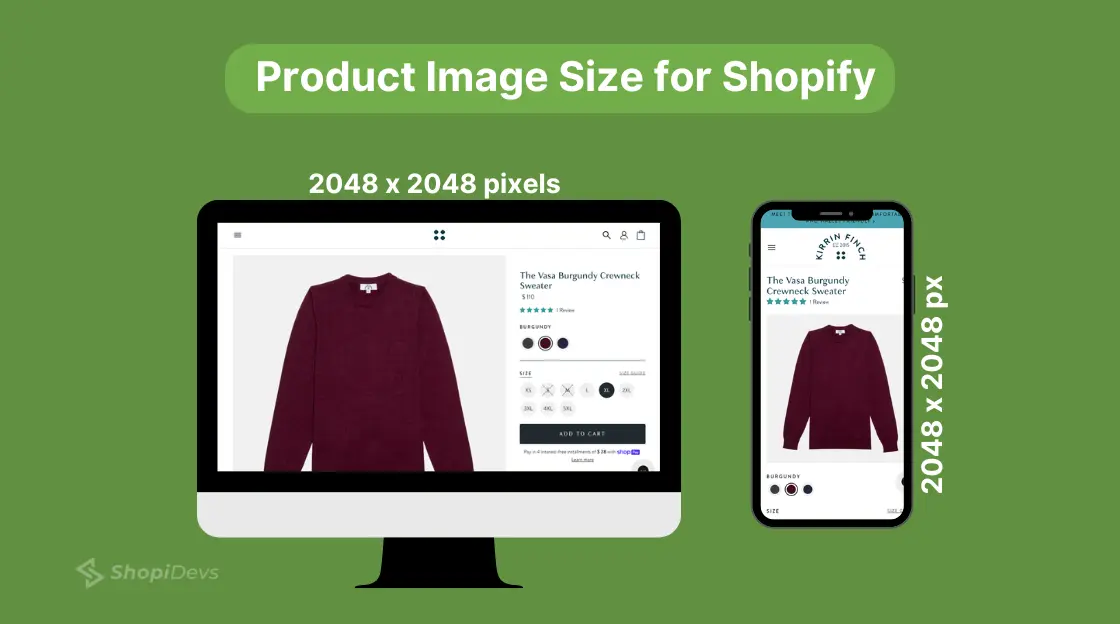
Your product images are the digital equivalent of holding the item in your hands. If they are blurry, small, or incorrectly cropped, purchase confidence drops.
Recommended size: 2048×2048px at 1:1 (square) aspect ratio.
Here is the full breakdown:
| Spec | Value | Why It Matters |
|---|---|---|
| Recommended Size | 2048 × 2048px | Enables full zoom quality on all devices |
| Minimum Size | 800 × 800px | Below this, zoom breaks on mobile |
| Maximum Allowed | 5000 × 5000px | Shopify accepts it, but file size becomes a problem |
| Aspect Ratio | 1:1 (Square) | Ensures consistent product grids across collection pages |
| Max File Size | 20MB (Shopify Limit) | Target under 300KB for faster page loads |
| Best Format | WebP or JPEG | WebP delivers 30–35% smaller files than JPEG at similar quality |
Shopify automatically resizes product images for different devices via its CDN. But the source image quality is what Shopify works from. Start high, 2048×2048px, and let Shopify handle the downscaling.
For product photography guidance, see our Shopify product photography guide.
Lifestyle image size for Shopify
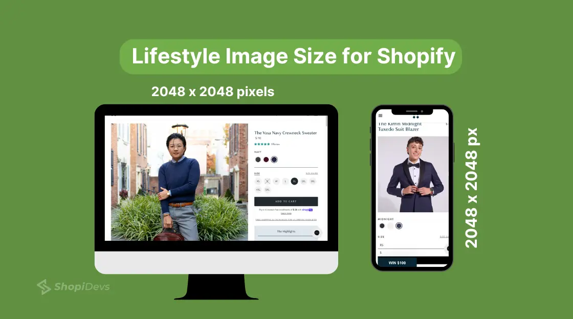
Use the same 2048×2048 px at a 1:1 ratio for lifestyle images. They sit alongside product images in the same gallery, so consistent dimensions prevent layout mismatches. Lifestyle images typically show the product in context, on a person, in a room, or in use, and the 1:1 ratio works well across both desktop and mobile carousels.
Shopify Banner Image Size
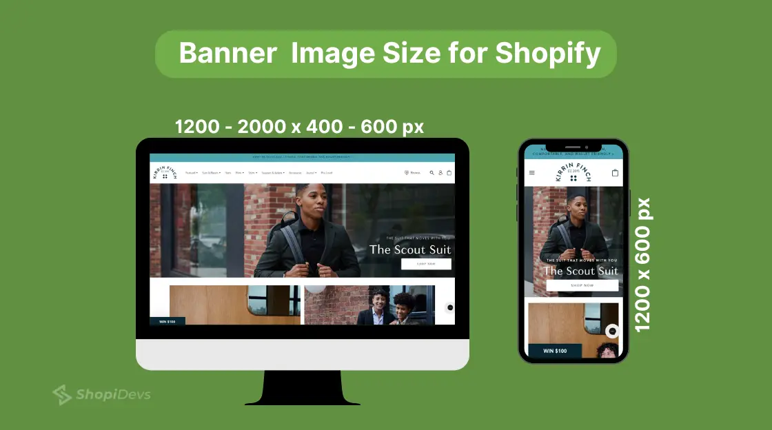
Banner images are the highest-visibility real estate on your store. They are also the most commonly misconfigured image type, either too narrow (causing stretch), too tall (breaking the layout rhythm), or too heavy (crushing page speed).
Desktop: 1200–2000px wide, 400–600px tall. Aspect ratio: 16:9.
Mobile: 1200×600px. Keep headlines and CTAs in the center-safe zone to avoid cropping.
“The Shopify banner size” is the most searched image spec on this site, 1,195 impressions in 28 days alone. Get this right and your storefront immediately looks more professional.
For a full walkthrough of banner placement options, see our guide on how to add a banner on Shopify. For specific banner dimension variations by use case, check Shopify image banner size.
Once you have the right banner in place, making it clickable is the next conversion lever to pull.
Shopify Header (Hero) Image Size
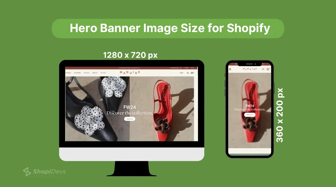
The hero image is not the same as a general banner. It is the full-width, above-the-fold image that loads first on your homepage, and in most themes, it is also the Largest Contentful Paint (LCP) element Google measures for Core Web Vitals.
Getting the hero image size wrong has two consequences: layout breakage on mobile and a direct hit to your page speed score.
Recommended Shopify hero image size:
- Desktop: 1280×720px (standard 16:9)
- Mobile: 360×200px
- Full-bleed themes (Dawn, Sense): Use a 2000×800 px source image, the theme scales it down, but you need the high-res source for retina displays
- Aspect ratio: 16:9
- File size target: Under 200KB (hero image has the highest LCP impact of any element)
Common mistake: Uploading a 4000×3000px JPEG hero image and expecting Shopify to handle it cleanly. Shopify compresses it, but a large source file still increases Time to First Byte (TTFB) and LCP. Resize before uploading.
Keep your hero image text-safe. Any text or CTA overlay should sit in the center 60% of the image width. Edge content will be cropped on mobile viewports.
Shopify Slideshow Image Size
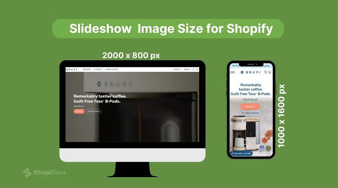
Slideshow images rotate through multiple promotions, products, or seasonal campaigns. They need to look sharp across every slide, which means consistent dimensions are non-negotiable. One slide at a different aspect ratio will cause the entire section to jump in height as it transitions.
Recommended Shopify slideshow dimensions:
- Desktop: 2000×800px
- Mobile: 1000×1600px (portrait-oriented for phone screens)
- Aspect ratio: 16:9 for desktop, flexible for mobile
- File size: Under 300KB per slide — multiple slides loading at once can stack the performance cost
For setting up a high-quality slideshow, follow our step-by-step slideshow setup guide. If you are using a dedicated slider app for more advanced controls, compare the best Shopify slider apps to find the right fit. You can also explore how a Shopify product slider gives you more display control beyond the native slideshow section.
Collection Banner Image Sizes for Shopify
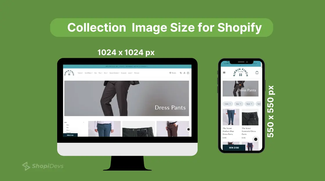
Collection images represent a group of products, they appear on the main collections page and category navigation. Inconsistent collection image sizes create a broken grid where some thumbnails are portrait and others are square, destroying visual hierarchy.
Recommended Shopify collection image size:
- Desktop: 1024×1024px at 1:1 ratio
- Mobile: 550×550px
If you are using a gallery app to display collections in a masonry or custom grid layout, the source size requirements may differ. The Essential Grid gallery app handles responsive scaling, but your source images still need to be high-resolution to avoid pixelation at larger viewport sizes. For more display options, browse the best Shopify gallery apps.
Shopify Blog Image Size
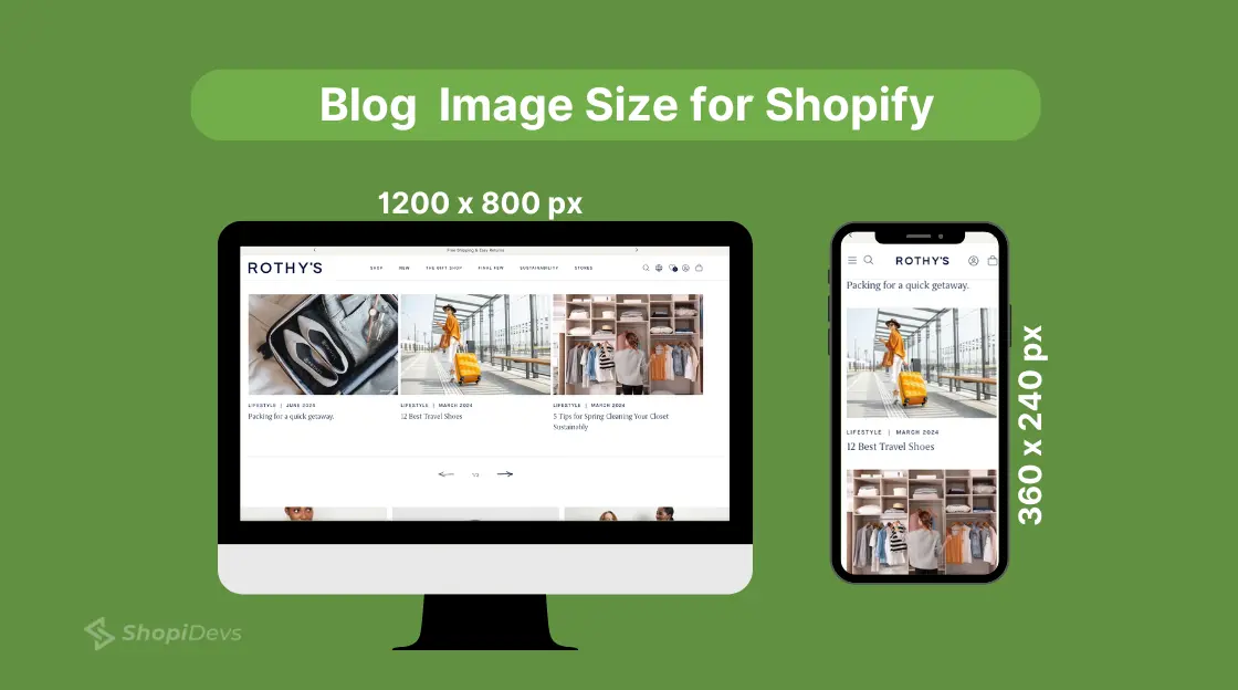
Blog featured images appear in two places: the blog index page (as a thumbnail) and at the top of each article. The dimensions need to work in both contexts, a heavily portrait image will either crop badly in the index grid or display too tall in the article view.
Recommended Shopify blog image size:
- Desktop: 1200×800px at 3:2 ratio
- Mobile: 360×240px
The 3:2 ratio gives you enough horizontal real estate for a headline overlay while keeping the image height reasonable on mobile. For anyone using Shopify as a content platform, our guide on whether Shopify is good for blogging covers the full publishing workflow.
Logo and Favicon Sizes for Shopify
Logo sizing often gets overlooked because it looks “fine” at small sizes until someone opens your store on a 4K display and the logo is visibly blurry.
| Element | Size | Ratio | Format |
|---|---|---|---|
| Square Logo | 100 × 100px | 1:1 | PNG (transparent background) |
| Rectangle Logo (Header) | 400 × 100px | 4:1 | PNG (transparent background) |
| Favicon | 32 × 32px (or 16 × 16px) | 1:1 | PNG or ICO |
| Social Media Icons | 32 × 32px (desktop), 48 × 48px (mobile) | 1:1 | PNG or SVG |
Use PNG for all logo variants; it supports transparent backgrounds, which JPEG does not. Keep the file size under 50KB for logos since they load on every page. SVG is ideal if your logo is vector-based: it is infinitely scalable, has a small file size, and is crisp on any display.
Shopify Image Sizes by Theme (Dawn, Debut, Sense)
Shopify recommends standard sizes, but your theme is what actually renders those images. A 2000×800px hero image displays differently in Dawn than in Debut. If you are seeing stretching, excessive white space, or blurry images even after using the “correct” dimensions, your theme is the variable to check.
Dawn Theme
Full-bleed sections. Hero renders at 100% viewport width. Use 2000×800px source images for sharpness on large screens.
Product images display at 1:1. Collection grids show 3 columns on desktop and 2 on mobile. Images crop to fill grid cells, so center your subject.
Debut Theme
Maximum content width is approximately 1200px.
Hero banners perform best at 1200×600px. Wider sources often get cropped.
Slideshow sections typically work best with 1440×600px images.
Sense Theme
Clean, product-focused layout with 1:1 product images displayed in a two-column grid.
Hero images render at approximately 1440px wide on desktop.
Featured collection banners use a 2:1 ratio. Size them around 1200×600px.
Always verify: Go to Online Store → Themes → Customize. Click on each image section and check whether the theme displays a “recommended image size” note. That recommendation should take priority over any general guideline.
Best Image Formats for Shopify in 2026
Shopify supports JPEG, PNG, GIF, WebP, HEIC, and AVIF. In 2026, WebP is the clear choice for products and banners, it delivers 30–35% smaller file sizes compared to JPEG at the same visual quality.
Shopify’s CDN automatically converts and serves your images in WebP for browsers that support it (which covers virtually all modern browsers as of 2026).
| Format | Best Use | Advantage | Watch Out For |
|---|---|---|---|
| WebP Recommended | Products, banners, hero images | 30–35% smaller than JPEG at the same quality. Full browser support in 2026. | Older email clients may not support WebP. Use JPEG for email marketing images. |
| JPEG / JPG | Products, banners (fallback) | Universal compatibility. Good quality-to-size ratio. | Quality degrades with each save. No transparency support. |
| PNG | Logos, icons, transparent overlays | Lossless compression. Supports transparent backgrounds. | Larger file sizes than JPEG or WebP for photos. |
| GIF | Animated graphics only | Supports animation. | 256-color limit. Poor quality for photos. Heavy files. |
| AVIF | Emerging — not yet mainstream | Even smaller than WebP. Superior quality at low bitrates. | Limited Shopify theme support. Test before deploying. |
| HEIC | iPhone photos (upload format) | Shopify accepts HEIC uploads from customer review photos. | Do not use HEIC as your primary product image format. Convert to WebP first. |
As of 2026, Shopify automatically converts uploaded images to WebP on delivery for supported browsers. You do not need to manually convert every image, but uploading in WebP gives you more control over quality settings before Shopify recompresses.
How to Compress Shopify Images Without Losing Quality
Uploading a 3MB product image is one of the most common Shopify mistakes. The target is under 300KB per image. Here is how to get there without sacrificing visual quality.
Option 1: Compress Before Uploading
Use a dedicated compression tool to reduce file size before the image touches Shopify:
- TinyPNG / TinyJPG: Free, browser-based. Reduces PNG and JPEG by 60–80% with minimal visible quality loss. Use for batch compression of product images.
- ShortPixel: WordPress plugin and standalone web tool. Supports WebP conversion. Good for processing large image libraries.
- Squoosh (by Google): Free, browser-based. Gives you side-by-side quality comparison and precise control over compression level and output format.
Option 2: Let Shopify’s CDN Do the Work
Shopify uses a global CDN (powered by Fastly and imgix) to automatically resize and compress images based on the visitor’s device, screen resolution, and browser. When a customer on a mobile device loads your store, Shopify serves a smaller, optimized version of your image, not the full source file.
This is powerful, but it does not replace pre-upload compression. Shopify compresses from whatever source you give it. A 5MB source image will still take longer to process and cache than a 400KB source image.
Option 3: Use Shopify Magic (Built-In AI)
Shopify’s built-in image editor now includes AI-powered background removal and image enhancement. For simple product photography on white backgrounds, this can replace third-party tools entirely, and it outputs images already sized for Shopify’s requirements.
File size targets by image type: Hero images: under 200KB. Product images: under 300KB. Banner images: under 250KB. Blog featured images: under 150KB. Logo files: under 50KB.
Compressing images is a direct input to Shopify conversion rate optimization, faster loading directly lifts purchase rates.
Expert Tips to Optimize Shopify Images for Customers and Search Engines
Getting the dimensions right is step one. Here is what separates stores that rank and convert from those that just look correct:
- Use the correct size per image type: Product at 2048×2048px, banner at 1200–2000px wide, hero at 1280×720px. The reference table at the top of this guide covers every type.
- Match format to use case: WebP for products and banners. PNG for logos and transparent overlays. Avoid GIF for any static image.
- Compress before upload: TinyPNG for quick batch compression. Target under 300KB per image.
- Write descriptive alt text: Alt text tells search engines what your image contains. It directly supports Shopify SEO, and it is the primary accessibility mechanism for screen readers. Be specific: “Navy blue women’s running shoe, side view” not “shoe image 1.”
- Enable Shopify’s responsive images: Shopify’s CDN serves appropriately sized images per device. This is on by default in modern themes but verify it is active in your theme settings.
- Use a consistent naming convention: File names are part of image SEO. “product-name-color-angle. webp” outperforms “IMG_4823.jpg” every time.
Optimizing images this way enhances search visibility and customer engagement, which can boost your conversion rates.
How to Upload & Resize Images on the Shopify Store (In-Built Resizer)
Shopify has a built-in image editor that handles basic resizing, cropping, and AI enhancement without leaving the admin. Here is the full workflow:
Step 1: Log in to Your Shopify Store Admin Panel
Go to your Shopify store URL, sign in, and land on the admin dashboard.
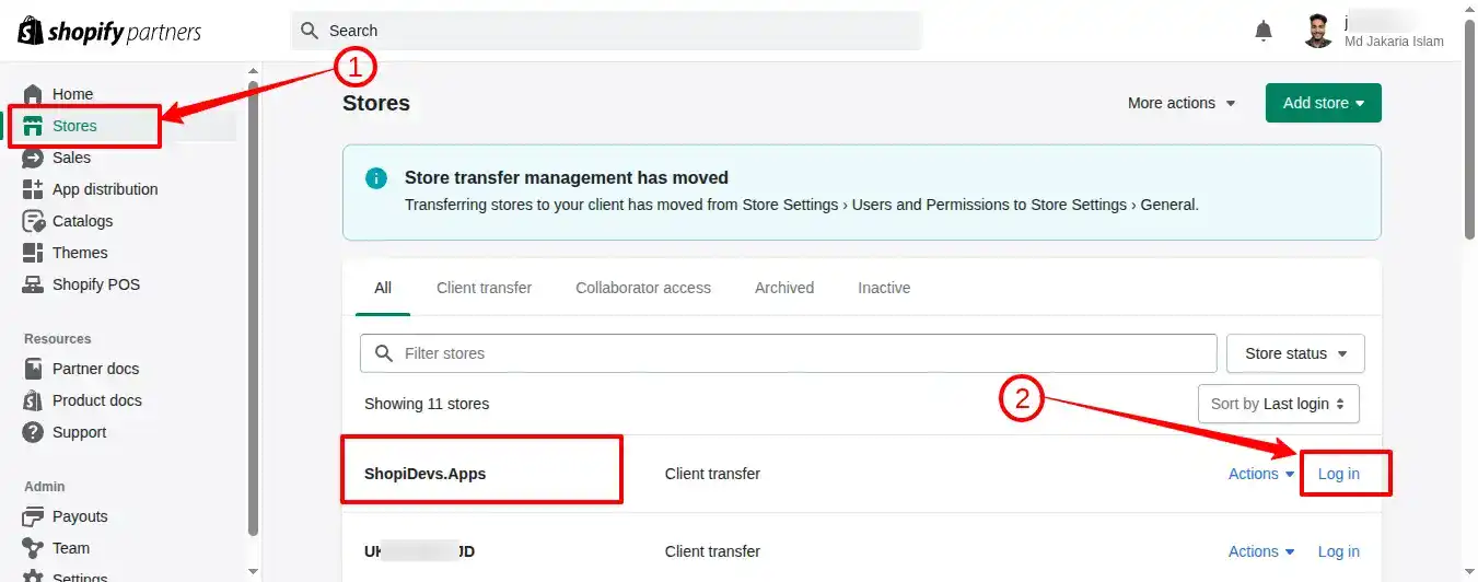
Step 2: Upload the Image File to the Shopify Store
On the left sidebar, you have a list of different sections like products, collections, online stores, etc. If you want to add a banner image on Shopify or a blog image, then you need to click on the “Online Store” section.
We’re going to add a new image to the Shopify library to use anywhere in the store, that’s why we have clicked on the “Content” section. Then go to “Files” and click on the “Upload Files” button to add the image to your Shopify store.
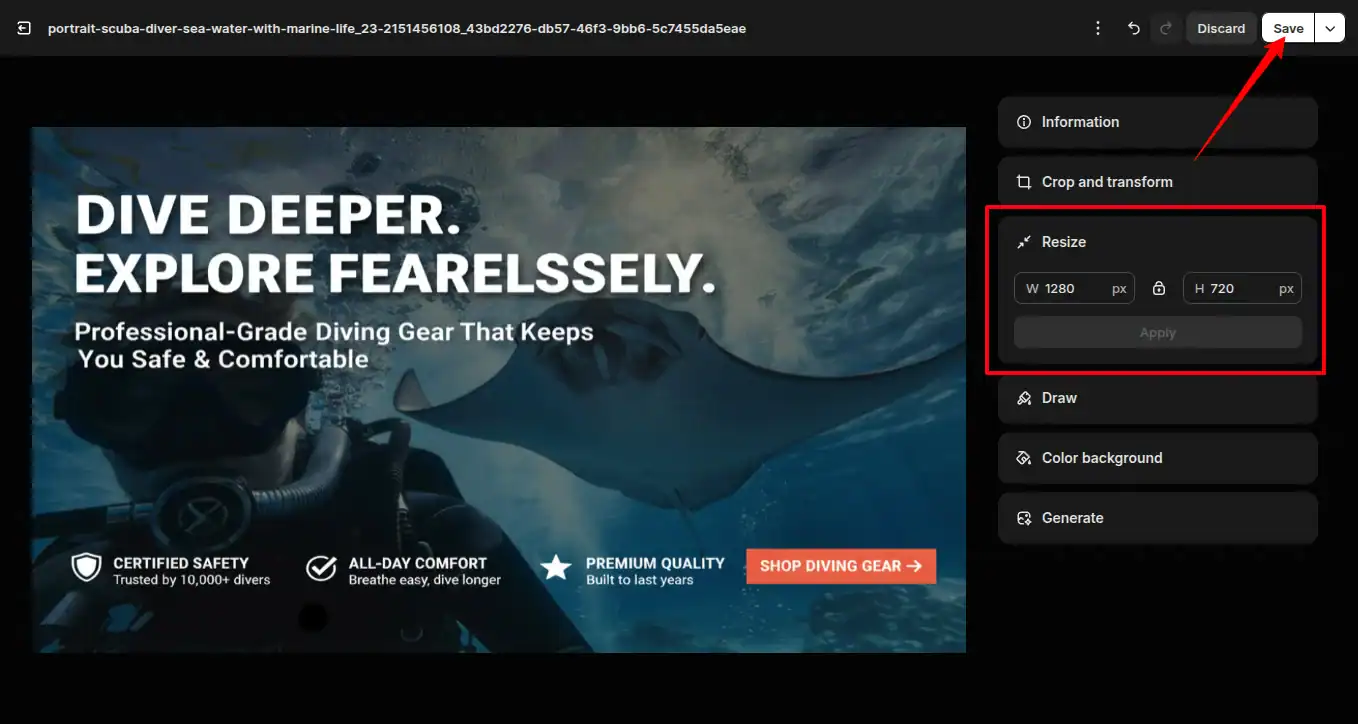
- After successfully uploading the image, click on the image to resize it to the best size for Shopify.
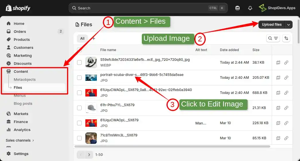
Step 3: Customize with Generate AI & Adjust the Image Settings
Click the uploaded image to open the editor. From here you can:
- Crop and set dimensions for desktop and mobile separately (Crop & Transform)
- Add or edit alt text for SEO
- Use Generate AI (Shopify Magic) — write a text prompt to modify the image, remove backgrounds, or reframe the composition
We will change the image file size based on my theme’s requirement, which is not available here; that’s why we have clicked on “Resize“.
Step 4: Resize with Standard Size and Save the Image
Click Resize. If the lock icon is active, the aspect ratio stays fixed as you resize. Click the lock to unlock it for custom dimensions. Enter your target width and height, then click Save.
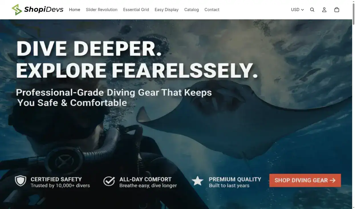
Step 5: Add the Image to the Section & Review it on Storefront
Navigate to the section where you want to add the image (Online Store > Themes > Customize). Insert the image from your Files library. Then open your storefront and check how it renders on both desktop and mobile view.
How to Check the Shopify Image Size on a Web Page
Need to verify what dimensions a live image is actually rendering at — or check what your competitors are using? Three steps, under 30 seconds:
- Right-click the image on any Shopify storefront.
- Click Inspect (opens Chrome DevTools or equivalent).
- In the Elements panel, hover over the image source URL. A tooltip appears with the rendered dimensions, intrinsic dimensions, file size, and aspect ratio.
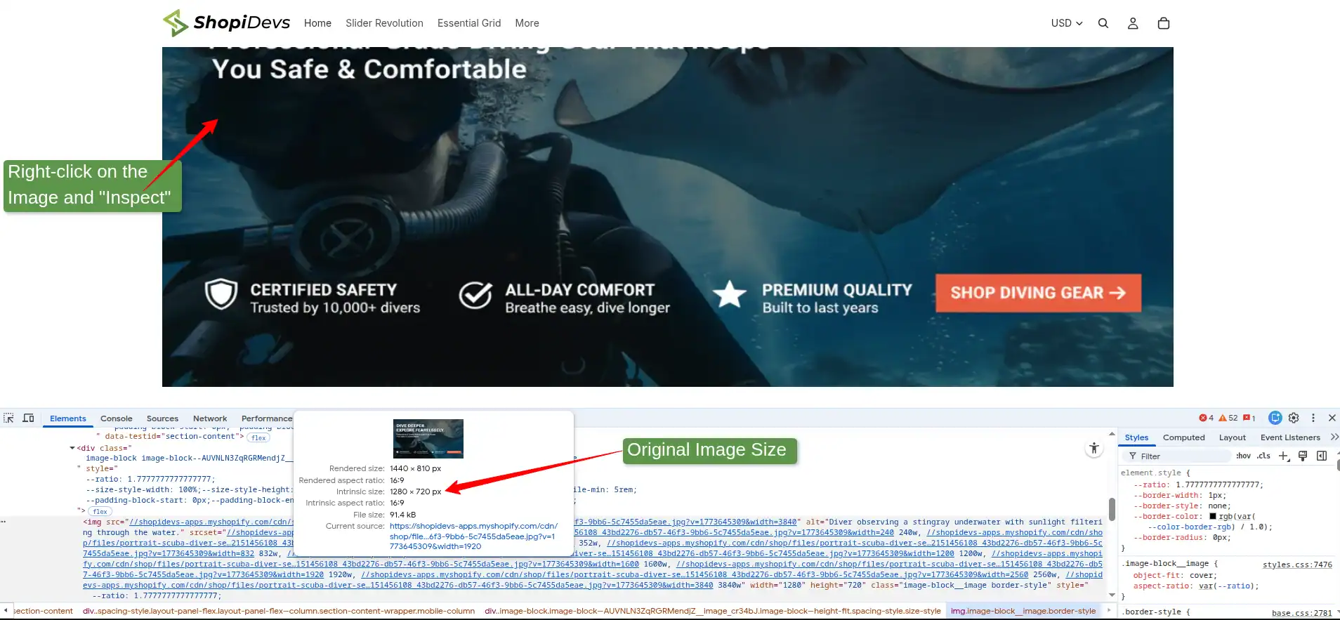
The “intrinsic” size is the source file dimensions. The “rendered” size is what is actually displayed on screen. If the rendered size is significantly smaller than the intrinsic size, you are serving an oversized image, a direct page speed issue.
Why Shopify’s Default Theme Is Not Enough for Image Control
Shopify’s built-in image tools cover basic resizing and cropping. That is enough for a simple store with standard layouts. Here is where it falls short for brands that need precision:
- No per-device dimension control for sliders: The native slideshow section does not let you serve a different image crop for mobile vs. desktop. You get one image, scaled by the theme. That means your desktop hero either crops badly on mobile or you make layout compromises.
- No layout-independent image sizing: Resize an image in Shopify’s default editor and it changes globally — every section using that image gets the new dimensions. Slider Revolution handles image sizing per-module, so changes stay isolated to where you made them.
- Limited quality control: Shopify’s automatic compression is a good baseline. Specialized tools give you control over compression aggressiveness and output format quality.
- No animation or layer control: For hero images with text overlays, entrance animations, or parallax effects, the native editor offers nothing. You need a dedicated slider or section builder.
After getting information about the limitations of the Shopify default theme, we hope you have realized your shortcomings. So, you need to upgrade your store with a range of customizations using the best theme for Shopify.
Edit and Optimize Shopify Images with Slider Revolution
Slider Revolution is one of the most powerful apps for the Shopify store to make it visually appealing. When it comes to Shopify images, you have a lot of amazing features and advanced customization options. Here is how you can edit image sizes for Shopify and optimize them for SEO:
Step 1: Install & Login Slider Revolution & Section App
- Log in to your Shopify store dashboard > Go to the Apps section (Shopify App Store)
- Search for “Slider Revolution & Slider” App.
- Click on the “Install” button to install the app, and then it will redirect you to the Slider Revolution’s dashboard.

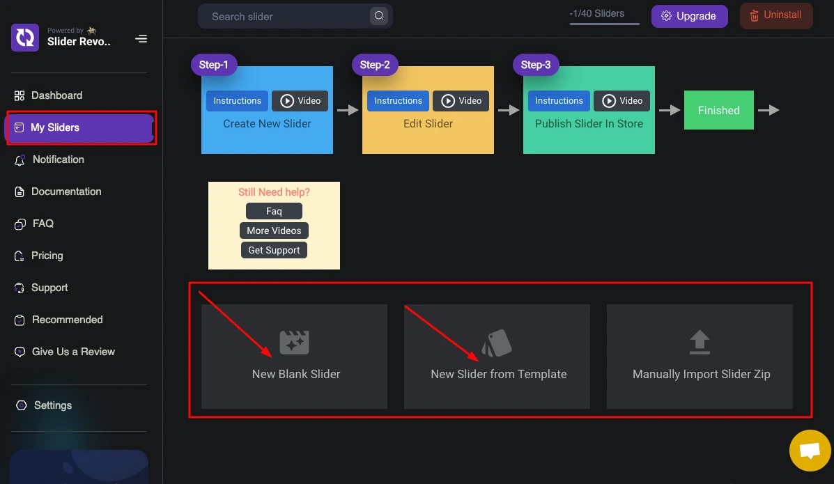
Step 2: Create a Blank Slider or Choose a Template
- From the left sidebar, click on “My Slider”.
- Here you will have 3 options: ‘New Blank Slider’, ‘New Slider from Template’, and ‘Manually Import Slider Zip’.
- We don’t have ZIP files right now. You need to choose “New Blank Slider” or “New Slider from Template”.
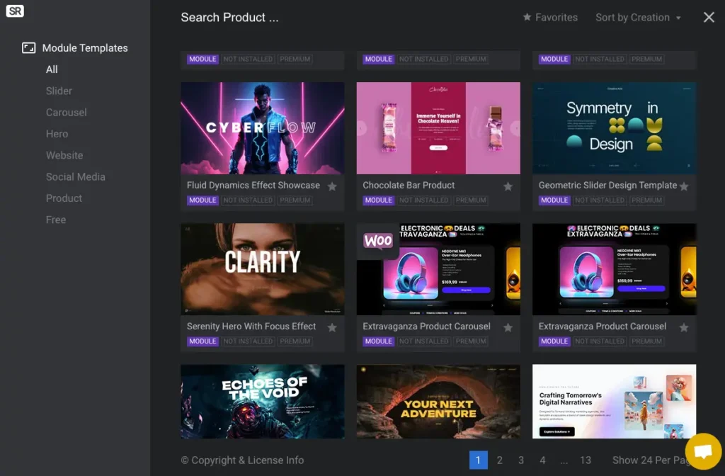
- Now, we will customize an image dimension for Shopify, so we don’t need to add “Templates”. We have chosen the “New Blank Slider”, but you can explore the extraordinary templates from Shopidevs.
Wait, you can also explore and use 300+ ready templates with amazing images to use in different sections of your store.
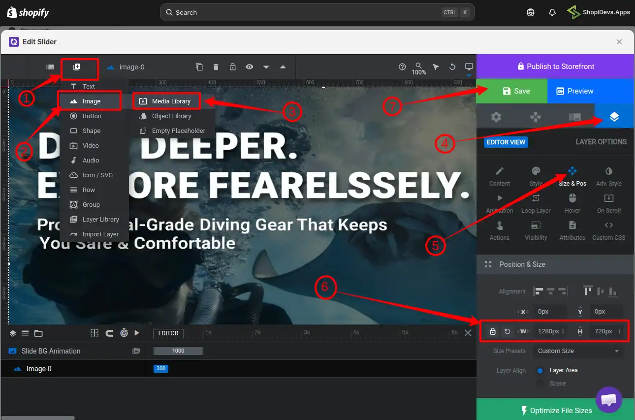
Step 3: Edit Image with the Best Image Size for Shopify
- Click on the “Add Layer” from the layer icon, which we have shown by the arrow sign, and add the image you want to edit and customize the size.
- From the “Layer option,” you need to click on “Size & Pos” to explore all settings for this image.
- Here you can adjust the alignment, set the minimum and maximum image size, enable responsive, and more.
- Also, you can set different dimensions for mobile, tablet, desktop, and other devices to ensure 100% responsiveness from the “Layout” option.
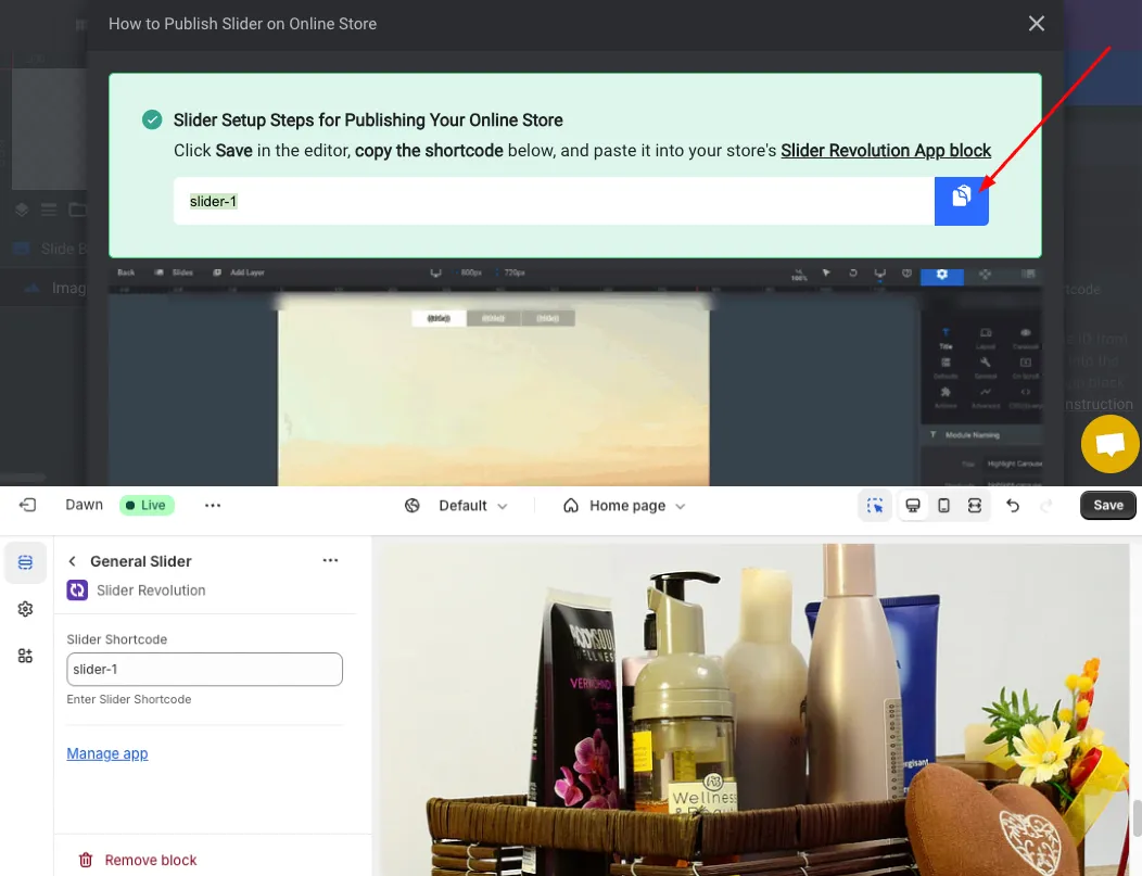
Step 4: Connect the Image Slider to the Shopify Store
- “Save” the image setting and“Preview” this image. If you find everything is okay, then click on the “How to Publish” button.
- Now you can see a shortcode like ‘slider-1’ (it could be different for you), “Copy the Shortcode”.
- Go to the Shopify store dashboard > Navigate to the Section where you want to add the image.
- Add Section > Apps > Select your Slider > Paste the Shortcode (you have copied from Slider Revolution).
- Go to the “Apps Embeds” icon > then activate the Slider Revolution App.
- “Save” it.
Step 5: Test the Storefront Image
- Now check your storefront, where you have added the image. Hope everything will be fine.
- If you have any issues with the image size on Shopify or any other issues related to the Slider Revolution app, feel free to contact our Support Team.

Key difference from Shopify’s built-in editor: image size changes in Slider Revolution are module-specific. They do not affect your global store images. Ideal when you need one image sized for a slider section while using the same source image at different dimensions elsewhere on your store.
FAQs
What is the best Shopify banner size?
1200–2000px wide and 400–600px tall for desktop, with a 16:9 aspect ratio. For mobile, use 1200×600px. Keep file size under 300KB and use WebP format for the fastest load time.
What is the best Shopify hero image size?
1280×720px for desktop and 360×200px for mobile, at a 16:9 ratio. For full-bleed themes like Dawn, use a 2000×800px source image to stay sharp on retina displays. Keep the hero image under 200KB — it is typically your LCP element.
What size should Shopify product images be?
2048×2048px at 1:1 aspect ratio is the Shopify recommendation. Minimum is 800×800px. Maximum is 5000×5000px. Target file size: under 300KB.
What are the recommended Shopify slideshow image dimensions?
2000×800px for desktop, 1000×1600px for mobile. Use consistent dimensions across all slides mixed ratios cause the slideshow section to shift in height between transitions.
What image format should I use on Shopify?
WebP for products, banners, and hero images. PNG for logos and transparent graphics. Shopify’s CDN automatically converts images to WebP for supported browsers (virtually all modern browsers in 2026), but uploading in WebP gives you more quality control over the source.
What is the maximum image file size Shopify allows?
Shopify allows up to 20MB per image. In practice, target under 300KB for product and banner images. Large file sizes slow down your store even after Shopify’s CDN processes them, because the original file affects caching and Time to First Byte (TTFB).
What is the best Shopify collection image size?
1024×1024px at 1:1 ratio for desktop. 550×550px for mobile. Consistent dimensions across all collection images prevent jagged rows in the collection grid.
How do I check what image dimensions a Shopify store is using?
Right-click any image on the storefront, click Inspect, then hover over the image source URL in the Elements panel. Your browser shows the intrinsic (source) dimensions and rendered (displayed) dimensions, plus file size and aspect ratio.
Getting Image Sizes Right Is a One-Time Fix with Long-Term Payoff
Every size in this guide exists for a reason — zoom quality, mobile layout integrity, Core Web Vitals compliance, or visual consistency across your store. None of these are design preferences. They are directly tied to how fast your store loads, how your products look on a customer’s phone, and how Google evaluates your pages.
Start with the quick reference table at the top of this guide. Audit your current images against those specs using the inspect method described above. Fix the highest-traffic pages first hero image, product pages, banner.
If you need per-device image control beyond what Shopify’s native editor provides, Slider Revolution handles the precision sizing and responsive behavior without touching your global store images. Questions on the setup? Get in touch with our support team.
Want Full Control Over Your Shopify Image Display?
Slider Revolution gives you per-device image sizing, 300+ ready templates, and advanced controls that Shopify’s native editor simply doesn’t offer.
Jakaria is an SEO Content Writer in Shopify, Ecommerce, WordPress, and Tech Industry with 5+ years of experience. He specialises in developing engaging, helpful content by simplifying complex topics into an amazing story for B2B, SaaS, and Shopify businesses. He’s also passionate about staying updated on growth marketing strategies and Shopify trends.