
You uploaded a banner and it looks fine on desktop. Then a customer opens it on mobile and half the text is cropped. Or the image is technically the right size but still looks blurry because Shopify had to upscale it.
Wrong banner dimensions cause blurry images, cropped text on mobile, slow page loads, and layout shifts that kill conversions.
This guide gives you the exact pixel sizes for every Shopify banner type: hero, slideshow, mobile, Dawn theme, collection, checkout, and blog, plus the file size limits and format rules that keep your store fast. No padding, just the numbers.
The recommended Shopify banner size is 2048 × 1024 px for desktop hero banners and 1200 × 1600 px for mobile banners. Keep image files under 500 KB and upload them as JPEG or PNG. Shopify automatically serves WebP to supported browsers. For the Dawn theme, use 1600 × 1050 px for the desktop image banner section.
- Desktop hero banner: 2048 × 1024 px (2:1) or 1920 × 1080 px (16:9).
- Mobile banner: 1200 × 1600 px for the best coverage across devices.
- Dawn theme image banner: 1600 × 1050 px on desktop.
- Slideshow banners: 1920 × 1080 px. Keep every slide the same size.
- Collection images: 1024 × 1024 px (1:1 square).
- Checkout logo: up to 250 px wide with a transparent PNG.
- Keep banner images under 500 KB and product images under 200 KB.
- Upload JPEG or PNG. Shopify automatically delivers WebP when supported.
Complete Shopify Banner Size Reference Table
Use this table as your go-to cheat sheet. All dimensions are in pixels (px). Aspect ratios and file size targets are post-compression targets, not Shopify upload limits (Shopify allows up to 20 MB and 5000 x 5000 px, but those ceilings are not targets).
Shopify platform limits: The maximum upload size is 20 MB and the maximum image dimensions are 5000 × 5000 px. Larger images are automatically resized. To improve page speed, always compress images before uploading.
Shopify Hero Banner Size
The hero banner is the first visual element visitors see. It sets the tone for your entire store and directly impacts bounce rate. Getting the size wrong causes one of three problems: blurry images on retina displays, aggressive mobile cropping that hides your CTA, or bloated file sizes that tank your Largest Contentful Paint (LCP) score.
Desktop Hero Banner
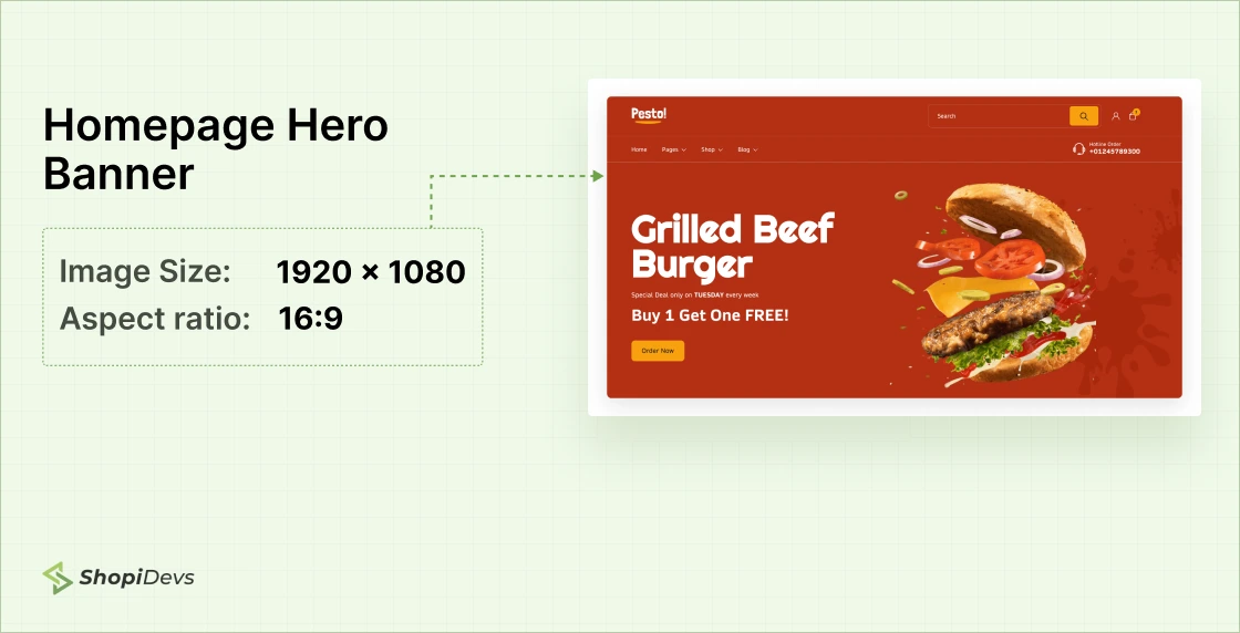
The standard recommended Shopify hero banner size for desktop is 2048 x 1024 px (2:1 aspect ratio). This renders sharp on most desktop monitors including high-DPI screens. A common alternative is 1920 x 1080 px (16:9), which mirrors the most common desktop resolution.
Mobile Hero Banner
Over 70% of Shopify traffic comes from mobile. If your theme uses one image for both desktop and mobile, your banner gets cropped automatically. Keep all critical content (text, CTA buttons, product) centered in the middle 60% of the image. Anything near the edges risks being cut off on small screens.
If your theme supports a separate mobile image upload (most Shopify 2.0 themes do), use a portrait-oriented image. The recommended size is 1200 x 1600 px or 800 x 1200 px.
Dawn Theme Banner Size
Dawn is Shopify’s default free theme and the most widely used OS 2.0 theme. Its Image Banner section has specific rendering behavior that differs from other themes.
The recommended Shopify Dawn theme banner size is 1600 x 1050 px for desktop. Dawn uses an “Adapt to image” option in the Banner section settings that preserves your original aspect ratio. It also auto-crops more aggressively on mobile than most other themes, which makes the safe zone rule more important here.
1. Set banner dimensions to 1600 x 1050 px
This is the aspect ratio Dawn’s Image Banner section was designed around. Using this size prevents letterboxing and unnecessary whitespace on desktop.
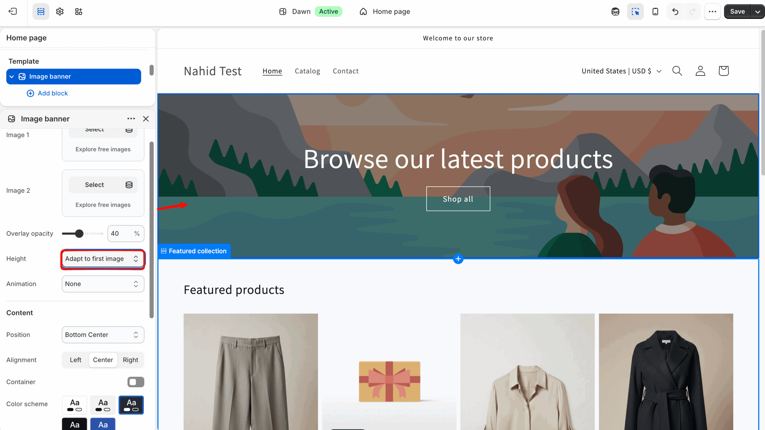
2. Enable “Adapt to image” in the Banner section
In your Dawn theme editor, go to the Image Banner section. Set the Banner height option to “Adapt to image.” This tells Dawn to match the banner height to your image’s natural aspect ratio instead of forcing a fixed height.
3. Upload a separate mobile image
Dawn’s banner section has a dedicated mobile image upload field. Use a portrait image at 800 x 1200 px for mobile. Dawn displays mobile images below the 750 px breakpoint.
4. Use the “Image overlay” for text
Dawn’s Image Banner section has overlay controls for text and buttons. Use these instead of embedding text in the image itself. Text embedded in images does not render on screen readers and creates extra work every time you need to update your messaging.
sections/image-banner.liquid,
check that the primary hero image uses
loading="eager"
and
fetchpriority="high".
This directly improves your LCP score.
Shopify Slideshow Banner Size
Slideshow banners let you rotate multiple promotions in one section. The most common mistake with slideshows: uploading slides with different dimensions. Even a 10 px height difference between slides causes a visible layout shift on every transition. That layout shift hurts both user experience and your CLS (Cumulative Layout Shift) Core Web Vitals score.
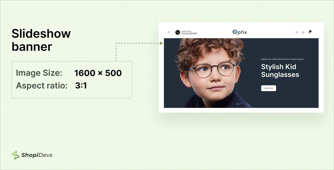
The recommended Shopify slideshow banner size is 1920 x 1080 px (16:9). All slides in a slideshow must share identical dimensions.
Need a high-performance slideshow that handles responsive sizing automatically? Slider Revolution for Shopify serves device-appropriate image sizes without manual uploads for each breakpoint.
How to Add a Shopify Slideshow Banner Using Slider Revolution
Search for Slider Revolution in Shopify Apps
Log in to your Shopify admin. Click Apps in the left sidebar, then search for Slider Revolution & Sections. Click the result to go to the App Store listing.
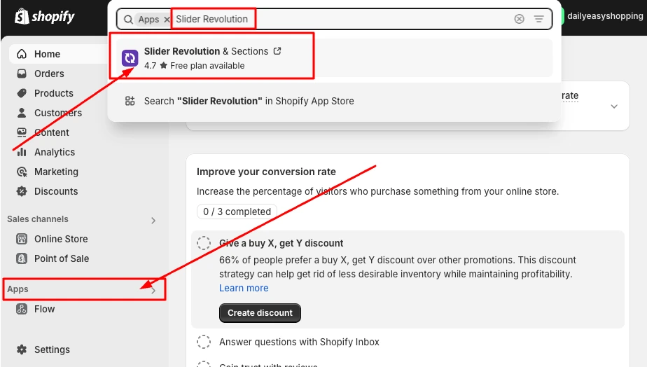
On the App Store page, click Install. The app has a free plan and works with all Shopify 2.0 themes including Dawn.

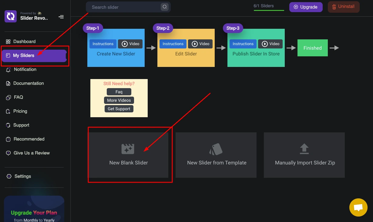
In the Slider Revolution dashboard, go to My Sliders and click New Blank Slider. This gives you a clean canvas sized for your banner dimensions.
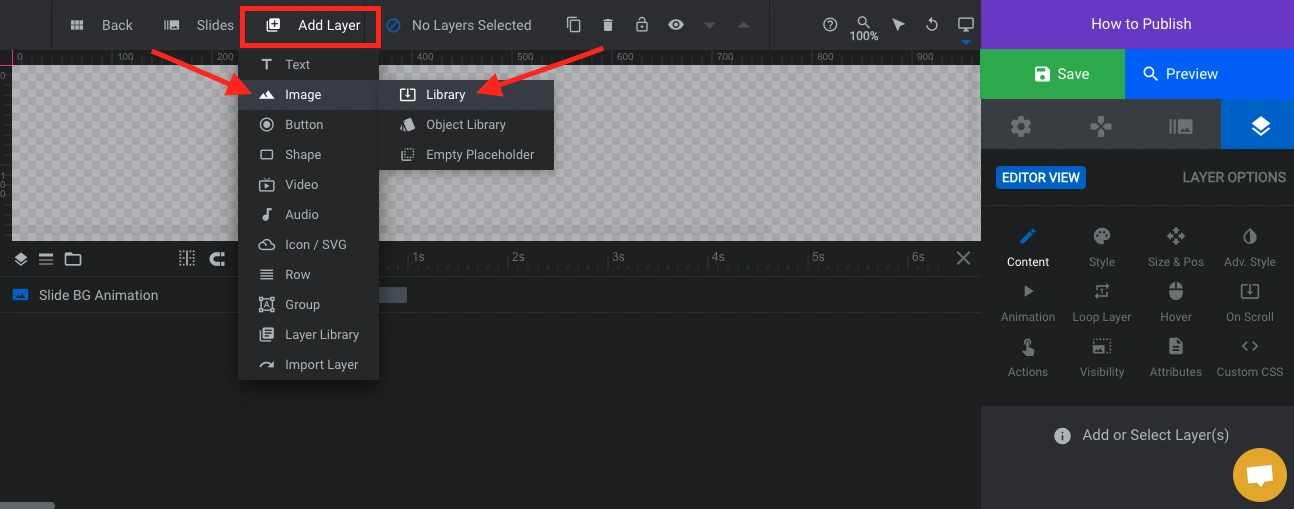
In the slider editor, click Add Layer > Image > Library to open the image picker.
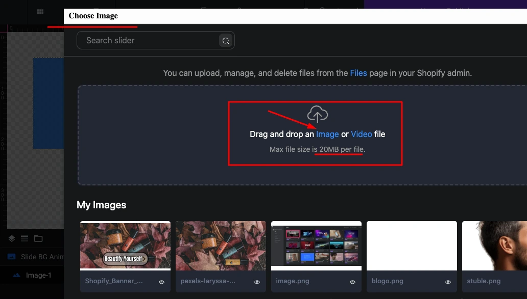
Drag and drop your banner image (1920 x 1080 px for slideshows) into the upload area. Max file size per image is 20 MB.
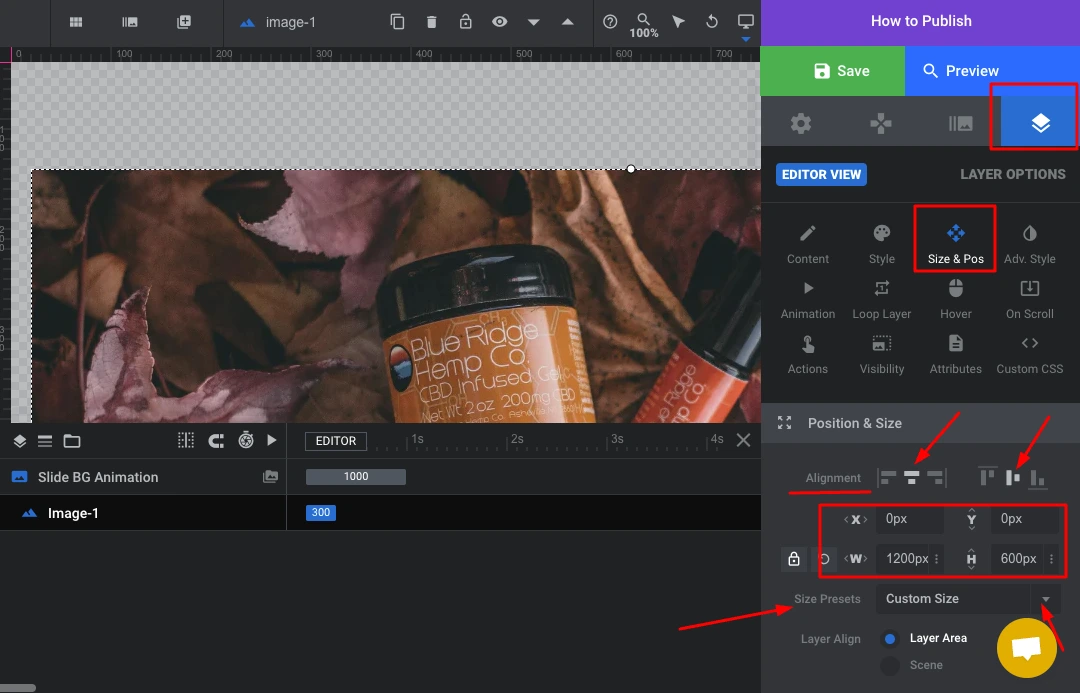
Select your image layer, click the Size & Pos tab on the right panel, and set Width and Height to match your banner dimensions. For a standard slideshow banner use W: 1920, H: 1080.
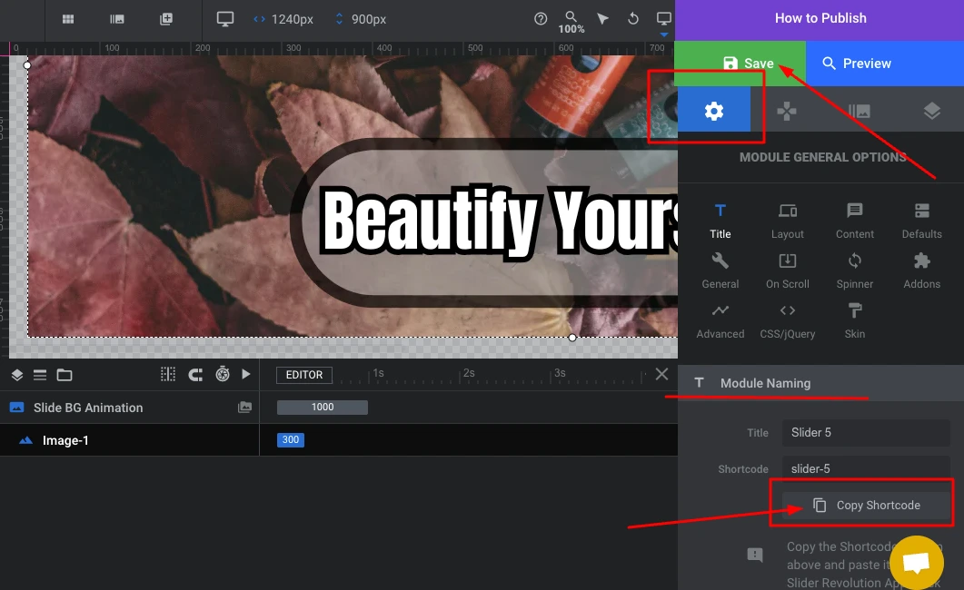
Click Save, then open Module General Options (the gear icon). Click Copy Shortcode to copy your slider shortcode.
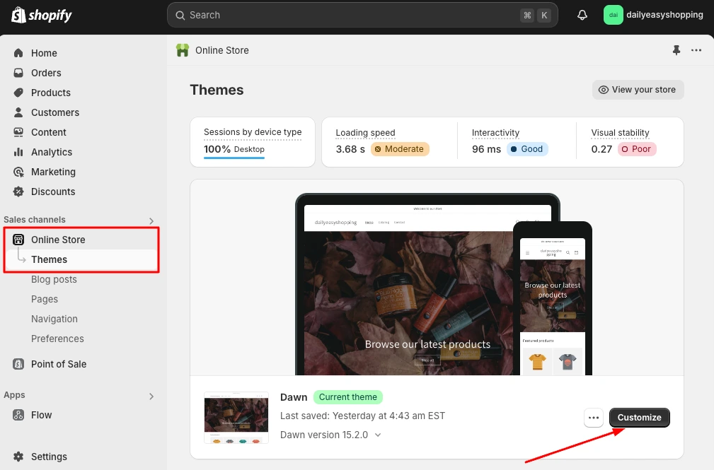
Back in Shopify admin, navigate to Online Store > Themes and click Customize on your active theme.
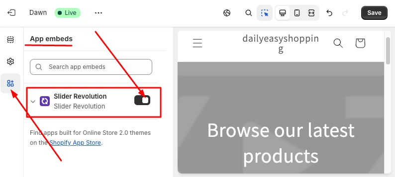
In the theme editor, click the puzzle piece icon (App Embeds), find Slider Revolution in the list, and toggle it on. Click Save.
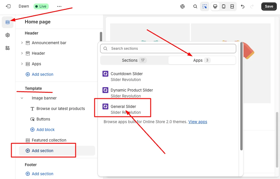
Go back to the sections panel, click Add section, switch to the Apps tab, and select General Slider from Slider Revolution.
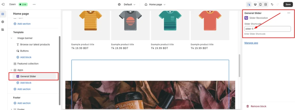
Click the General Slider block in the left panel. Paste your copied shortcode into the Slider Shortcode field. Click Save.
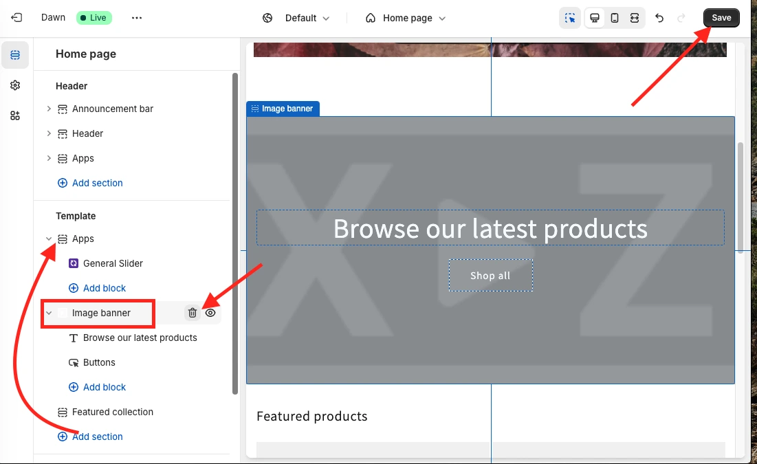
The Image Banner section will now show your Slider Revolution slideshow. Visit your storefront to verify it renders at the correct dimensions on both desktop and mobile.
Shopify Mobile Banner Size
Mobile banner sizing has one core principle: portrait always beats landscape on small screens. A landscape 1920 x 1080 px banner displayed on a 390 px wide phone viewport renders at roughly 390 x 219 px: barely visible, and the text is usually unreadable without zooming.
The recommended Shopify mobile banner size is 1200 x 1600 px in portrait orientation (3:4 ratio).
Mobile Banner Quick Reference
How Shopify Handles Mobile Images
Shopify’s CDN automatically generates multiple image sizes from your upload. When a mobile browser requests a page, the CDN serves a smaller version matched to the screen width.
This means you do not need to upload separate mobile and desktop product images. For hero banners, though, uploading a separate mobile image gives you precise control over the composition: cropping, text placement, and subject focus.
Shopify Collection Page Banner Size
Collection banners are the featured images that appear at the top of your category pages or in collection grid layouts on your homepage. They are not the same as your hero banner, and they should not be sized the same way.
The recommended Shopify collection image size is 1024 x 1024 px (1:1 square). Using a square aspect ratio across all collection images prevents the uneven grid layouts that make stores look unprofessional.
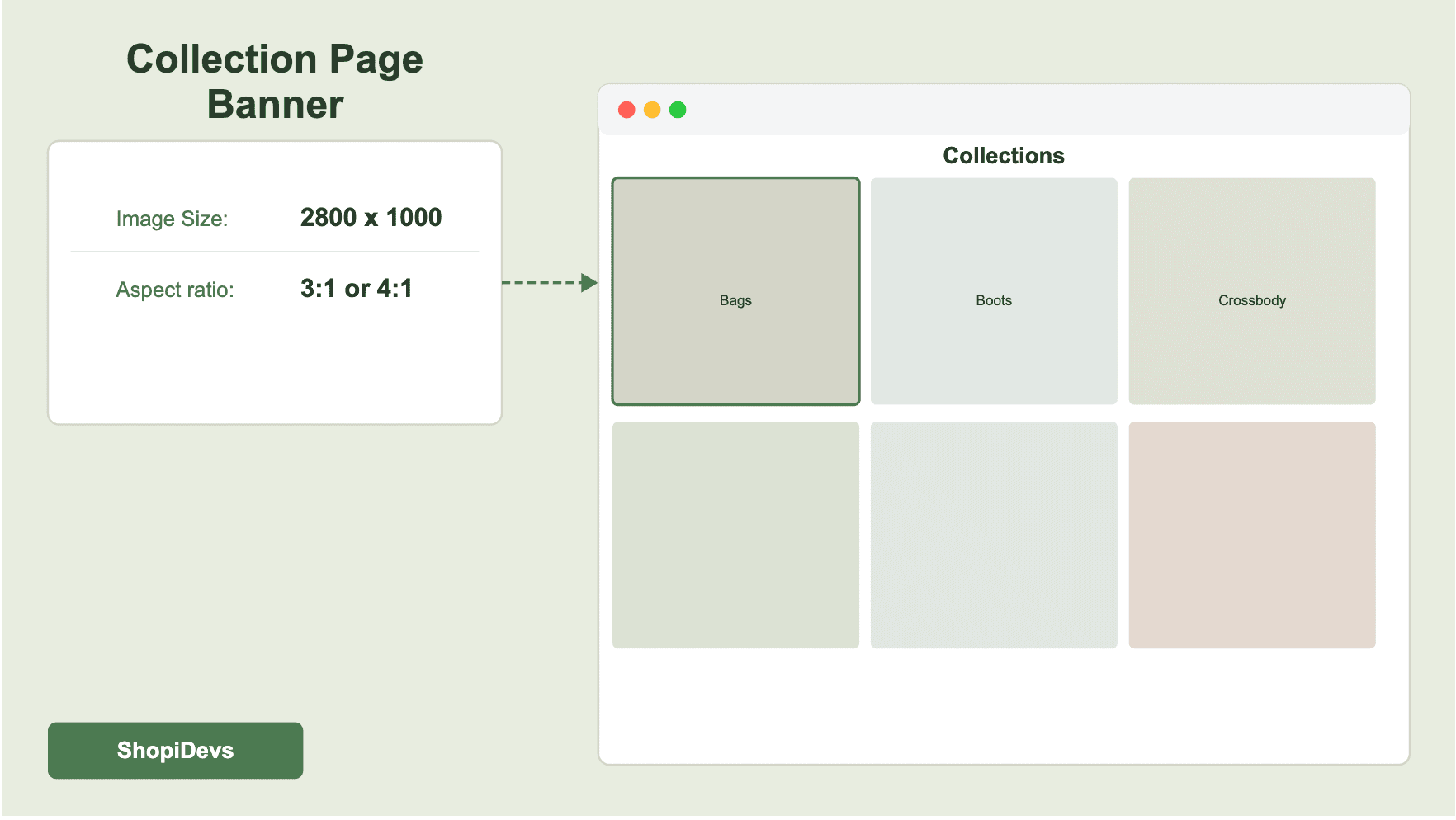
If your theme displays collection images as wide horizontal banners at the top of each collection page (common in OS 2.0 themes), use 1920 x 400 px to 1920 x 600 px depending on your theme’s section height setting.
For collection thumbnails in homepage grids and navigation menus. A 1:1 ratio keeps layouts aligned.
For the banner displayed at the top of collection pages in Shopify OS 2.0 themes.
Minimum recommended size for collection thumbnails displayed in mobile grids.
Looking to build visually engaging collection pages? See how to use an image carousel on Shopify to showcase collection images with more visual impact than a static banner.
Shopify Checkout Banner Size
The Shopify checkout page has limited visual customization compared to the rest of your store. What you can control depends on your Shopify plan.
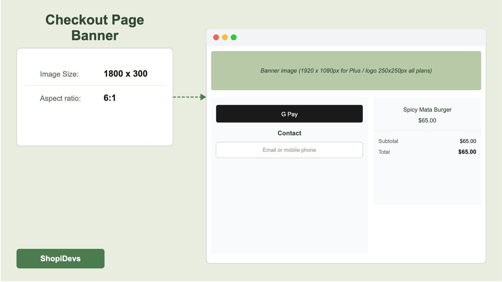
Standard Shopify Plans (Basic, Shopify, Advanced)
On standard plans, the main visual element you can add to the checkout page is a logo. The recommended checkout logo size is 250 x 250 px maximum, saved as a PNG with a transparent background. Shopify displays the logo at the top left of the checkout page.
Shopify Plus Checkout Customization
Shopify Plus merchants get full checkout customization via the checkout editor. You can upload a full-width background image. Use 1920 x 1080 px for desktop and 750 x 1334 px for mobile. Keep the design minimal: the checkout page should reduce friction, not add visual noise. A clean, lightly branded background outperforms a heavily designed one every time.
Shopify Blog Image Banner Size
Blog featured images serve two functions: they display at the top of each blog post and appear as thumbnails in your blog listing page. The recommended Shopify blog featured image size is 1200 x 800 px with a 3:2 aspect ratio.
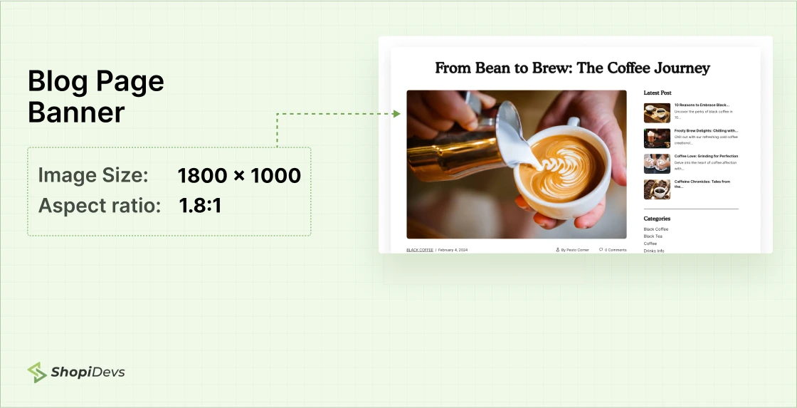
This size works across most Shopify blog layouts and renders cleanly when articles are shared on social media (Twitter, LinkedIn, Facebook all use 1200 x 628 px as their Open Graph display size, which is close to 3:2).
Best Image Format for Shopify Banners
The format you upload affects file size, image quality, and load speed. Shopify automatically handles one key optimization for you: it converts your images to WebP format and serves WebP to browsers that support it (which is now the vast majority of browsers). You do not need to upload WebP files.
How to Optimize Shopify Banner Images
Getting the pixel dimensions right is step one. Dimensions tell Shopify how large the image is. Compression tells Shopify how much data to transmit. An uncompressed 2048 x 1024 px JPEG can weigh 3-5 MB. A compressed version of the same file at 80% quality often comes in under 300 KB: and the visual difference is invisible to the human eye.
1. Compression Before Upload
Shopify applies light automatic compression, but it does not compress aggressively enough to compensate for oversized uploads. Compress your images before uploading using TinyPNG (free, handles batch compression) or Squoosh (browser-based, gives you precise control over quality settings).
File size targets to hit before uploading:
- Hero banners: under 400-500 KB
- Slideshow slides: under 200-300 KB each
- Collection images: under 150-200 KB
- Blog featured images: under 100-150 KB
- Logos and icons: under 50-100 KB
2. Lazy Loading
Lazy loading delays image loading until the user scrolls to that part of the page. For banners below the fold, lazy loading reduces initial page load time. Most Shopify 2.0 themes enable lazy loading by default via the loading=”lazy” attribute on image elements.
Critical exception: your above-the-fold hero banner should NOT be lazy-loaded. Lazy loading a hero image delays the Largest Contentful Paint (LCP), which is a direct ranking factor in Google Search. For hero images, use loading=”eager” and add fetchpriority=”high” to tell the browser to prioritize it.
HTML: Hero banner image (correct attributes)
<img
  src="{{ section.settings.image | image_url: width: 2048 }}"
  alt="{{ section.settings.image.alt }}"
  width="2048"
  height="1024"
  loading="eager"
  fetchpriority="high"
>3. Core Web Vitals and Banner Images
Google uses three Core Web Vitals metrics as ranking factors. Banner images directly affect two of them:
- Largest Contentful Paint (LCP): Usually your hero banner. Google targets under 2.5 seconds. Oversized banners are the most common cause of poor LCP scores on Shopify stores.
- Cumulative Layout Shift (CLS): Unmatched slideshow dimensions, images without declared width/height attributes, and late-loading banners all cause layout shifts that hurt CLS. Always declare width and height on img tags to prevent content jumping.
Run your store through Google PageSpeed Insights to identify which banner images are causing performance issues. Check both mobile and desktop scores.
srcset, converts supported images to WebP, and delivers them from the server closest to each visitor. In most cases, you do not need a separate image CDN app unless you operate a very high-traffic store with specialized performance requirements.
How to Check Banner Size on Any Shopify Store in 3 Steps
Want to see what dimensions a competitor uses, or verify the actual rendered size of your own banner? Three steps:
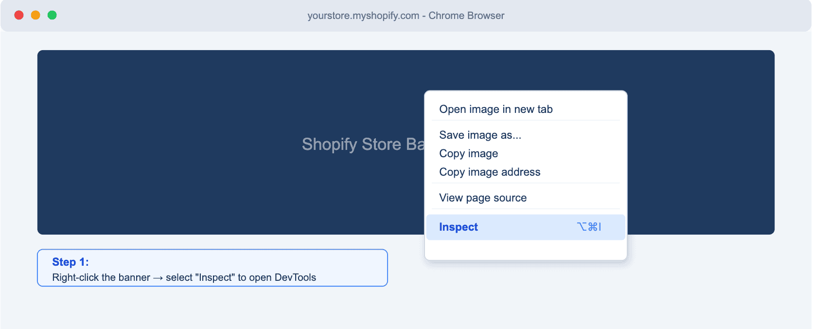
Step 1. Right-click the banner image and select “Inspect”
This opens browser DevTools with the image element highlighted in the HTML panel. Works in Chrome, Firefox, Safari, and Edge.
Step 2. Find the img element in the HTML panel
Look for the <img> tag. The src attribute URL usually contains the image dimensions in Shopify’s format (e.g., image_url: width: 2048). The width and height attributes show the declared dimensions.
Step 3. Hover over the element or check the Styles panel
Hovering over the img tag in DevTools highlights the element on the page and shows a tooltip with its rendered dimensions (width x height in px). This shows you the actual rendered size, not the source file size. The “naturalWidth” and “naturalHeight” in the console tell you the original file dimensions.
To get the original file dimensions: open your browser console (F12 > Console tab) and run:
Console: Get natural image dimensions
document.querySelector('img.banner-image').naturalWidth
document.querySelector('img.banner-image').naturalHeight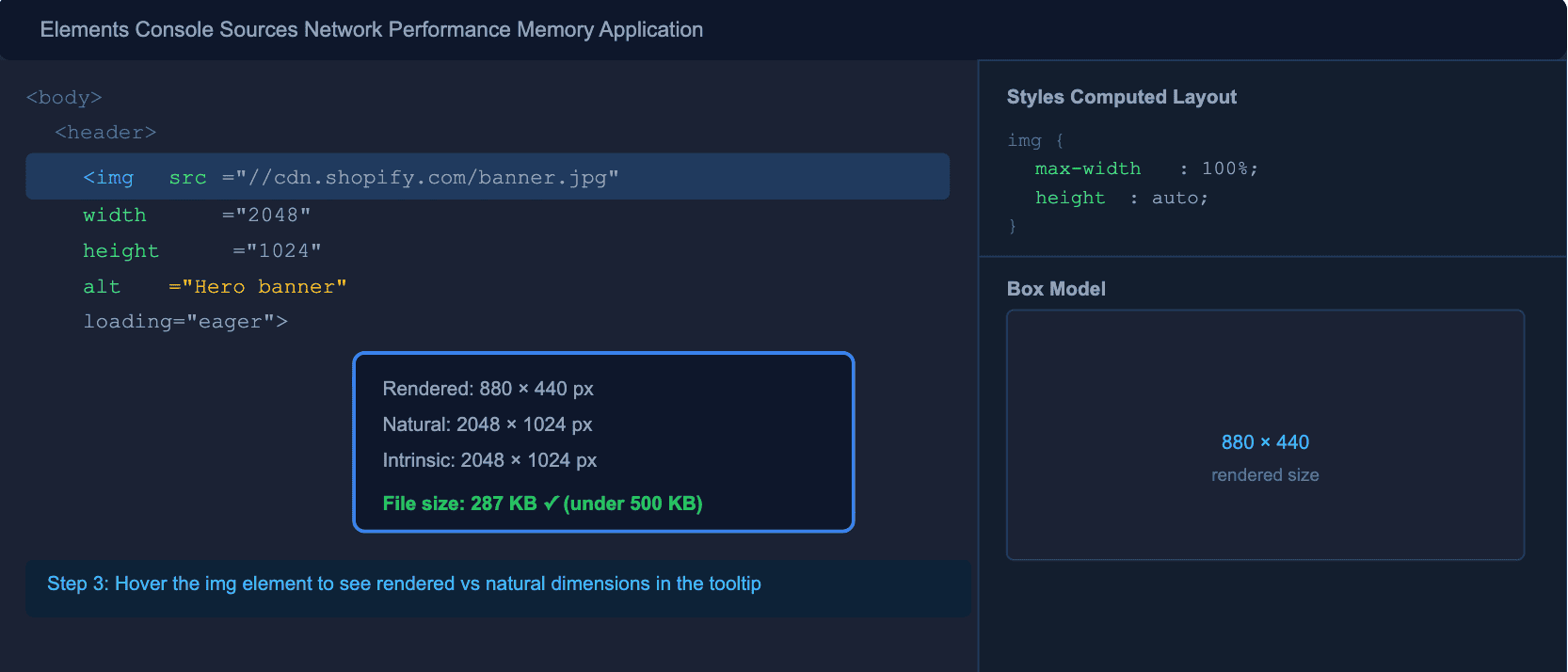
6 Common Shopify Banner Size Mistakes
Here are some common mistakes that you need to know before making them on your project or store.
1. Using one image for both desktop and mobile without checking crop
A 1920 x 1080 px landscape banner looks fine on desktop. On a 390 px wide mobile screen, it renders at 390 x 219 px: tiny. If you have text or a CTA near the edges, it gets cropped entirely. Always preview on mobile before publishing, and upload a separate portrait image when your theme supports it.
2. Uploading slideshow slides with different heights
If Slide 1 is 1920 x 1080 px and Slide 2 is 1920 x 1000 px, the page layout shifts every time the slide changes. This causes a measurable Cumulative Layout Shift (CLS) penalty in Google Search ranking. Every slide in a slideshow must have identical dimensions.
3. Uploading raw camera files or screenshots
Modern camera files can be 4000 x 6000 px at 8 MB or more. Uploading directly to Shopify forces the CDN to process and compress an unnecessarily large file. Resize to your target dimensions and compress to under 500 KB before uploading. Your LCP score will improve noticeably.
4. Embedding text in banner images
Text embedded in images cannot be read by screen readers, is not indexed by search engines, and requires a new image file every time the text changes. Use your theme’s overlay text fields instead. If you must embed text, also add the text as alt text on the image element.
5. Lazy-loading the hero banner
Applying loading=”lazy” to your above-the-fold hero image delays the Largest Contentful Paint. This is a direct Google ranking signal. Your hero banner should use loading=”eager” and fetchpriority=”high”.
6. Skipping alt text on banner images
Alt text does two things: it tells screen readers what the image shows (accessibility), and it tells Google what the image is about (image SEO). Banner images without descriptive alt text miss both benefits. Write a short, accurate description for every banner image. Include your target keyword if it fits naturally.
These same optimization principles apply to all visual content types. If you are working with a Shopify product banner, a sale banner, or a countdown banner, the size and optimization rules remain the same.
For more advanced visual options like interactive sliders, see our guides on before after sliders, photo galleries, and video carousels for Shopify.
Most Common Queries from the Users
What is the Shopify banner size in pixels for the Dawn theme?
The recommended Shopify Dawn theme banner size is 1600 x 1050 px for desktop. Dawn’s Image Banner section was designed around this aspect ratio. For mobile, upload a separate portrait image at 800 x 1200 px using the mobile image upload field in the banner section settings. Enable “Adapt to image” in the banner height settings to prevent letterboxing.
What is the Shopify checkout banner size?
The Shopify checkout logo (available on all plans) should be a maximum of 250 x 250 px, saved as PNG with a transparent background. For Shopify Plus merchants with full checkout editor access, checkout background images should be 1920 x 1080 px for desktop and 750 x 1334 px for mobile. Keep checkout page visuals minimal: the goal is reducing friction, not visual impact.
Does Shopify automatically resize banner images?
Shopify generates multiple image sizes from your upload and serves them via a global CDN. It also converts images to WebP format for browsers that support it. However, Shopify’s automatic compression is conservative. If you upload a 5 MB raw file, the CDN still has to serve that large source. Always resize to your target dimensions and compress to under 500 KB before uploading for best results.
Why is my Shopify banner blurry on desktop?
Banner blurriness on desktop is almost always caused by one of three things: the source image is smaller than the rendered width (e.g., uploading a 800 px wide image to a 1920 px wide banner section), the image was over-compressed and lost too much quality, or a retina/HiDPI display is rendering the image at 2x size from a 1x source. Fix by uploading a source image at least 2048 px wide and compressing at 80-85% quality instead of lower settings.
How do I add video to a Shopify banner section?
Most Shopify 2.0 themes support video in the banner section natively. Go to your theme editor, select the banner section, and look for a video option in the media settings. You can embed from YouTube or Vimeo, or upload an MP4 directly. For more advanced video banner options, see our guide on how to add video to a Shopify banner section and add video to your Shopify store.
Everything built in. No apps to install.
Bundles, promos, a shoppable lookbook and a mega menu ship with the theme. Five EU languages, one-time payment, lifetime updates — and no monthly app fees eating your margin.
Get Snazzy →
Need a High-Performance Shopify Banner?
Slider Revolution helps you create responsive hero banners, slideshows, product sliders, and video sections with 600+ professionally designed templates. It automatically handles responsive layouts, image optimization, and smooth animations without coding.

Jakaria is an SEO Content Writer in Shopify, Ecommerce, WordPress, and Tech Industry with 5+ years of experience. He specialises in developing engaging, helpful content by simplifying complex topics into an amazing story for B2B, SaaS, and Shopify businesses. He’s also passionate about staying updated on growth marketing strategies and Shopify trends.