Shopify may be more straightforward than other website builders, but that doesn’t necessarily mean it’s easy to make a handsome Shopify website design. Optimizing a site always takes some effort, especially in eCommerce where your sales strategy and design decisions have to fit together. Even if you’ve created a Shopify website before, you may have missed a few options that you didn’t know existed.
Whether this is your first time building a Shopify website or not, it is always helpful to have a good battle plan on hand. In this article, we’ll explain some useful Shopify website design tips to create a handsome-looking Shopify store.
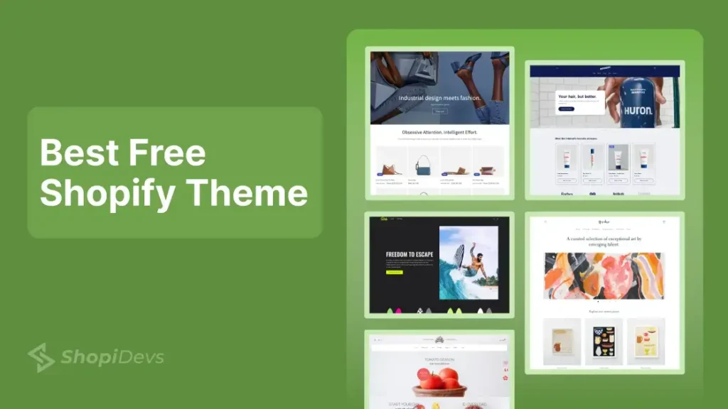
1. Choosing the right Shopify theme
The basis for a Shopify shop is a Shopify theme, a design template that is available in the Theme Store for free or for a maximum of 180 USD. Shopify offers dozens of these templates that differ in style variations and customization options.
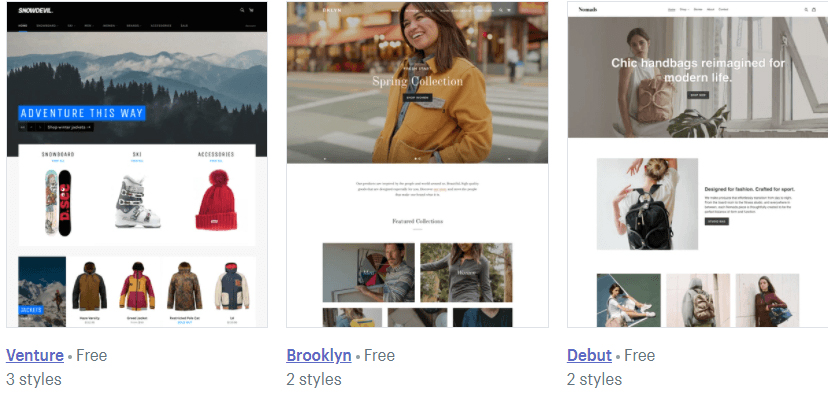
The decision for the right theme and thus for the basic building block of the design is one of the most difficult things. In order to be able to meet them, you should therefore ask yourself a few questions beforehand in order to find out what is important to you:
- Which products do you offer and how should they be presented? Do these products need a lot of visualization through videos and large images?
- Who is your target audience ? Do you sell B2B or B2C?
- What kind of experience do you want to create for your customers? – The layout, image sizes, placement of text, etc. all contribute to the atmosphere that ultimately shapes the overall user experience.
- Which functions would you like for your shop? Do you need a broad Instagram feed?
- How are your competitors performing? Keep an eye on their online stores to get things done better than they do.
- What is the budget for the Shopify website design? – Additional plugins and apps can also cost more money, so plan your overall budget before committing to an expensive theme.
2. Plan the Structure of the Page
The structure of your online shop is essential. Customers always love to use pretty and handsome websites and it will help you to make your conversion rate level in a high position. On the other hand, dysfunctional sites can lower your conversion rate.
So think about coherent navigation. This is an umbrella term for all elements that allow users to reach certain information on your website. This includes the header navigation menu, product and category pages, filters, and the footer. Think about which elements and pages need to be in the main menu and which pages and links can be a little more hidden in the footer.
Keep one thing in mind: you don’t have to reinvent the wheel. Let’s get a little more drastic: You mustn’t reinvent the wheel! Most users who shop online are used to certain placements. For example, nobody would think of looking for the main categories in the footer. Nor do your visitors expect the terms and conditions in the main menu. So take a look at how other successful shops divide their navigation and subdivision into main and sub-categories and learn from them!
The following pages play an important role in your online shop:
- Home page, as the first point of contact between your products and the visitor, has large hero images (or videos), the main product or current offers, recommended products or special categories as well as attractive offers for customer loyalty (e.g. newsletter, Instagram feed).
- Category pages, as a thematic organization of your individual products and for quick discovery for the customer, should have descriptive texts and an SEO-friendly URL and ideally contain filters for sorting the products.
- Product pages are critical to selling your products. Therefore, make sure you have good product photos in multiple perspectives, all features, and specifications, possible buttons for saving on wish lists, and related products (up-sell and cross-sell).
- Checkout page, this is where most visitors get out and leave your shop without buying. Usually, this is due to sudden costs and complications. Therefore, enable the purchase as a guest, reduce the number of required fields to a minimum, display all accepted means of payment and use a banner to inform you of the value from which free shipping is possible.
- About us page, one of the most important pages for building trust and picking up the customer on an emotional level. Here you should tell a story about your product, your team, your creation, your values , and your visions as well as your partners and initiatives. This is not about sales plateaus, but about a look into the heart of your brand!
- Contact page, give customers the opportunity to contact you! Just the fact that there is such a site creates trust.
Of course, you can also integrate other pages into your shops, such as a lookbook or FAQ page. However, these are primarily the pages that you absolutely must not neglect.
3. World of Images and Colors
You should design your shop according to the motto “Show, don’t tell”. Of course, your texts must also be convincing, whereby your shop visitors get stuck, but your design is first and foremost. Without further ado, here is a checklist for images, colors, and fonts in your online shop:
- Use sharp, high-resolution but compressed images.
- Create product images from multiple perspectives – both atmospheric and isolated.
- Use uniform image sizes and formats.
- Enable a 360 photo tool on product pages so buyers can see the full view of a product.
- Activate a zoom function on product photos so that buyers can view your items in more detail.
- If possible, use videos about your products or companies.
- Use your logo as a guide – both in terms of the colors to be used and the fonts -> the fonts and weights used here should be reflected in the shop design
- Stick to the existing corporate design or existing design templates in order to create a uniform and coherent image on all channels.
- In the best-case scenario, use only two different fonts and no more than three different colors.
- Use color-coded call-to-action buttons to navigate customers.
- Don’t be afraid of white space! Place elements calmly with gaps. The following applies: create spatial proximity for what belongs together and distance for things that cover new content.
If you draw wireframe for yourself before starting your implementation in order to decide which element is to be placed where you will save yourself the feeling of being overwhelmed once you get started. However, Shopify is a very flexible shop system that enables quick changes in most cases with little effort.
You May Also Read: The Easiest Methods To Sell On Instagram With Shopify
4. About the Usability
Good navigation and structure of the site is half the battle in terms of user-friendliness. There are a few other things to keep in mind, however. In any case, make sure that your online shop is responsive. Most users nowadays access websites via their smartphones. Elements, images, and fonts must therefore not be cut off, but must automatically adapt to the mobile device.
Provide a fast load time are not frustrated the page so that potential buyers and jump off. You can help by:
- Compress Images – Free online tools like tiny PNG can reduce the file size by around 50% without noticeably degrading image quality
- Remove unnecessary apps and code
- Avoid carousels with lots of large pictures
To increase user-friendliness, you should also integrate a search bar in your shop. It should be easy to find, ideally have an automatic completion function, and deliver results even if words are misspelled.
5. Integrate Trust-Building Elements
What use is it to you if your shop looks flawless, but users don’t trust you enough to actually make purchases? A contact and about us page can relieve you of some of the work, as already described. But there are other elements that will secure the trust of online shoppers. Therefore, think about the following points:
- Customer ratings on your product pages
- Seal of Trusted Shops, the Händlerbund, and Co. always visible in your footer
- A live chat function that works 24/7 and helps your customers with any questions or problems
- Customer support by mail or phone
- The most common payment providers as well as a selection of popular shipping service providers
Conclusion
Hopefully, you have got full Shopify tips about how to design a Shopify website. A key factor in creating an effective eCommerce site lies in the way your products and services are presented to visitors. Website design is incredibly important when it comes to visualizing and communicating brand messages. It can help meet user expectations of your business and convey the story behind your brand.
Ultimately, it is not just a question of colors and fonts, but of the interplay of several factors. Once you have completed your shop, you should let friends and colleagues do some test shopping to find out whether they can navigate the shop as you thought up and whether there are any obstacles that bother them or do not understand.
I’m a digital marketing expert and mobile app developer with a deep understanding of Shopify App Store optimization. I contribute insightful articles on Shopify to help businesses thrive online.

Hmm is anyone else enountering problems with the
images on this blog loading? I’m trying to determine if
its a problem on my end or if it’s the blog. Anny suggestions would be greatly
appreciated.
Wonderful site. A lot of useful information here.
I’m sending it tto several pals ans additionally sharing in delicious.
And certainly, thanks on your effort!