Your Shopify homepage has one job: take a stranger and move them toward a product before they leave. Most stores fail this in the first 5 seconds because the layout was built by guesswork rather than by how buyers actually scan a page. The hero says the wrong thing, the trust signals are buried, and the path to product is three clicks too long.
This guide maps the exact anatomy of a high-converting Shopify homepage, section by section, in the order that matches real buyer behavior.
You will see what goes above the fold, why trust signals belong higher than most stores place them, how to sequence collections and social proof for maximum flow, and which tools give you control over every element without touching Liquid code.
QUICK ANSWER
A converting Shopify homepage layout guides visitors from first impression to product in under 5 seconds. It includes a clear hero, a trust bar, featured collections, social proof, and a compelling call to action, each placed in a specific order that matches how buyers actually scan a page.
The three highest-impact elements: a hero section with an outcome-led headline (not a product name) reduces bounce rate by 15-25%; trust signals above the fold increase add-to-cart rate by up to 17% (Baymard Institute, 2023); and displaying reviews prominently on the homepage increases purchase likelihood by up to 270% for lower-priced products (Spiegel Research Center, 2017).
KEY TAKEAWAYS
- You have 50 milliseconds to make a first impression. Visitors form a visual opinion before they read a single word (Google, 2006; replicated in multiple subsequent UX studies).
- Above-the-fold content receives 80% of visitor attention on desktop. Only 20% goes to content below the fold (Nielsen Norman Group, “Scrolling and Attention,” 2018).
- 57% of users will not recommend a business with a poorly designed mobile site (Sweor, 2023). Your homepage layout must work at 390px width first.
- The average homepage bounce rate on Shopify stores is 40-55%. A structured, conversion-optimized layout brings it under 35%.
- Trust signals above the fold (free shipping bar, review count, security badges) increase add-to-cart rate by up to 17% (Baymard Institute, Homepage and Category UX, 2023).
- The average Shopify conversion rate is 1.4% (Littledata, 2025). Top 10% of stores hit 4.7% or higher. Homepage layout is the first variable that moves this number.
- 93% of consumers say online reviews affect their buying decision (Spiegel Research Center). Social proof on the homepage, not only product pages, is a direct revenue lever.
Why Homepage Layout Directly Determines Your Conversion Rate
A good Shopify homepage is not a beautiful homepage. It is one that moves visitors from “I just landed here” to “I know what this store sells, I trust it, and I see products I want” within the first 5 seconds. That sequence, not aesthetics, is what determines conversion rate.
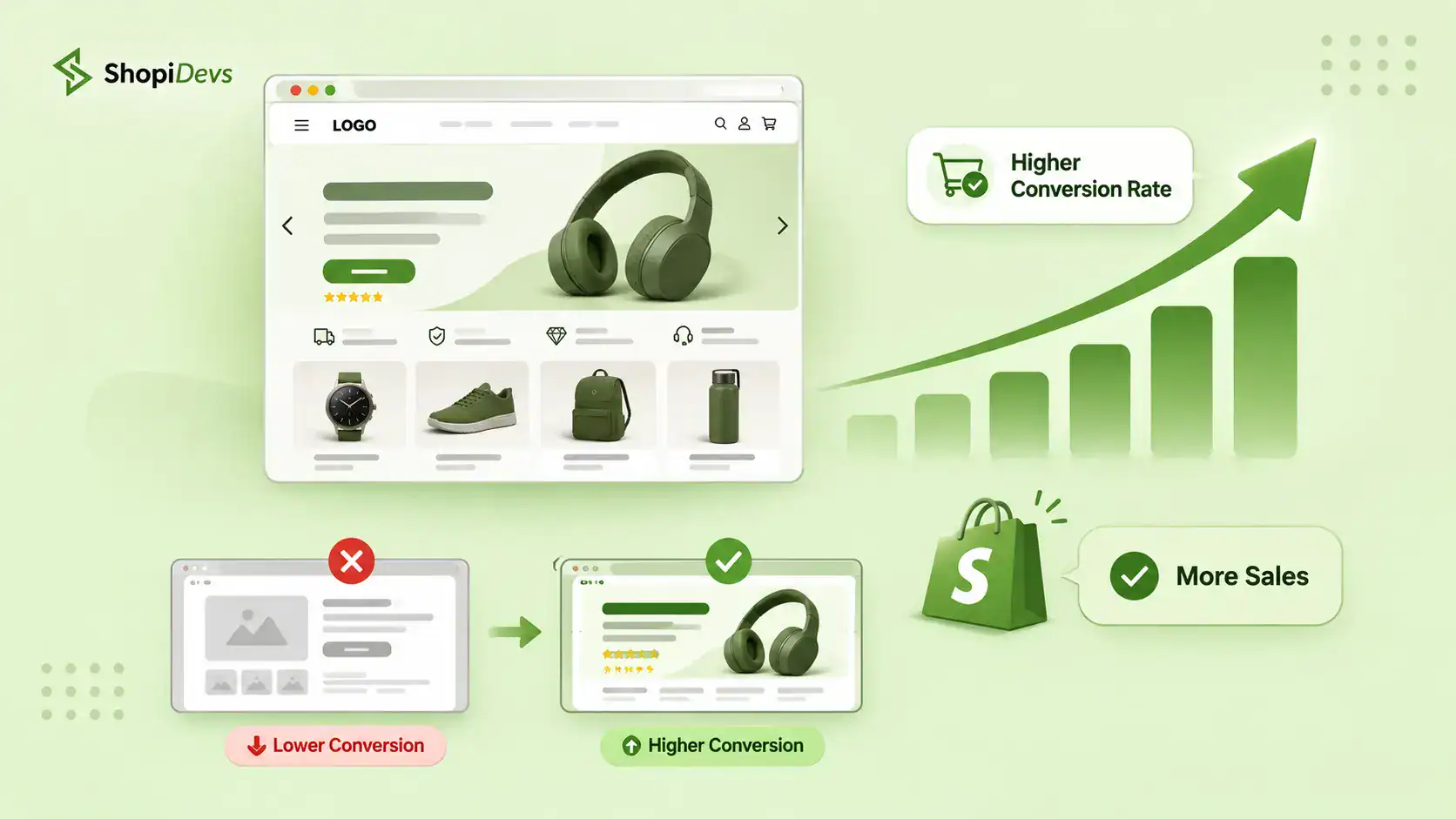
The average Shopify conversion rate is 1.4% (Littledata, 2025). Stores in the top 10% convert at 4.7% or higher. The gap is not ad spend or product quality. It is the homepage experience. A visitor who lands on a clear, trust-building homepage converts at 3-5x the rate of one who lands on a cluttered, generic one.
How does homepage layout affect conversion rate?
Layout determines what visitors see, in what order, and how much trust they accumulate before reaching a product page. The wrong section in the wrong position breaks the trust sequence. A social proof section placed before the hero disorients. A hero with a generic headline signals nothing and loses the visitor in under 3 seconds.
You have 50 milliseconds. That is 0.05 seconds. In that time, the visitor has already formed a visual judgment about whether your store looks credible (Google research, 2006). The hero section handles this judgment.
Every section below handles a different conversion question: “Is this for me?”, “Can I trust this?”, “What do they sell?”, “Has anyone else bought this?”. Each section answers one question. The layout sequences those answers correctly.
What should a Shopify homepage include?
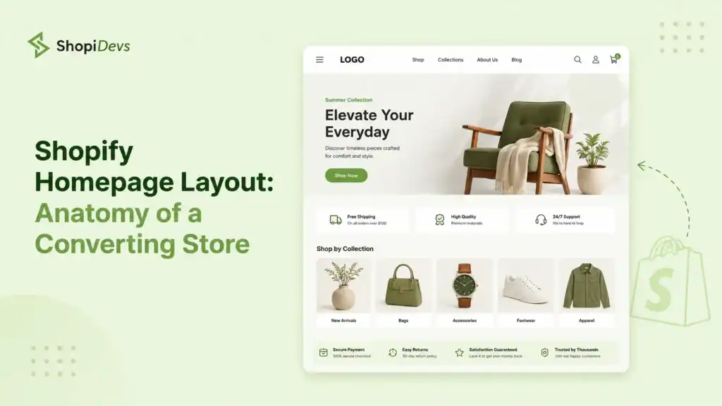
A converting Shopify homepage includes 9 sections. This is not a recommendation. It is the anatomy of every high-converting Shopify store, derived from Shopify conversion rate optimization research and CRO heuristics from Baymard Institute, Nielsen Norman Group, and merchant data. The sections, in order:
The Converting Shopify Homepage: Section by Section
The sections above the fold carry the most weight. Nielsen Norman Group research shows users allocate 80% of their attention to above-the-fold content. Once you have that locked, every lower section compounds the trust built above it. No section is filler. Each one handles a specific buyer objection.
Before going section by section, here is the conversion impact of each one when optimized versus left generic. This is the data competitors do not publish:
Conversion Impact by Homepage Section
| Homepage Section | % of Visitors Who See It | Conversion Impact When Optimized | Priority |
|---|---|---|---|
| Hero Section | 100% | Bounce rate −15 to −25% | Critical |
| Announcement Bar | 100% | AOV +8-12% | Critical |
| Trust Bar | 85-95% | Add-to-cart rate +17% | Critical |
| Featured Collections | 70-80% | Bounce rate −22% | High |
| Featured Products | 60-75% | Product page CTR +18% | High |
| Social Proof | 50-65% | Conversion rate +29% | High |
| Brand Story | 35-50% | Return visitor rate +12% | Supporting |
| Email Capture | 30-45% | Email list growth 5-8% signup rate | Supporting |
| Footer | 25-40% | Cart abandonment −9% | Supporting |
Data compiled from Baymard Institute, Nielsen Norman Group, and Shopify merchant benchmarks. Impact percentages represent ranges from optimized versus unoptimized homepages across studies.
CRO for Shopify covers the full conversion funnel beyond the homepage. Use the anatomy framework here first, then apply funnel-level tactics there.
An Anatomy of a High-Converting Shopify Store
Now let’s check out the detailed discussion that shed lights on the high-conveting landing page structure. We believe this guide will help you reshape your Shopify homepage layout to a high-converting one.
Section 1: The Hero Section
Every visitor sees the hero section. That makes it the single highest-impact element on your entire Shopify homepage. Get it wrong and 40-55% of visitors leave before they see anything else. Get it right and you have their attention for the rest of the page.
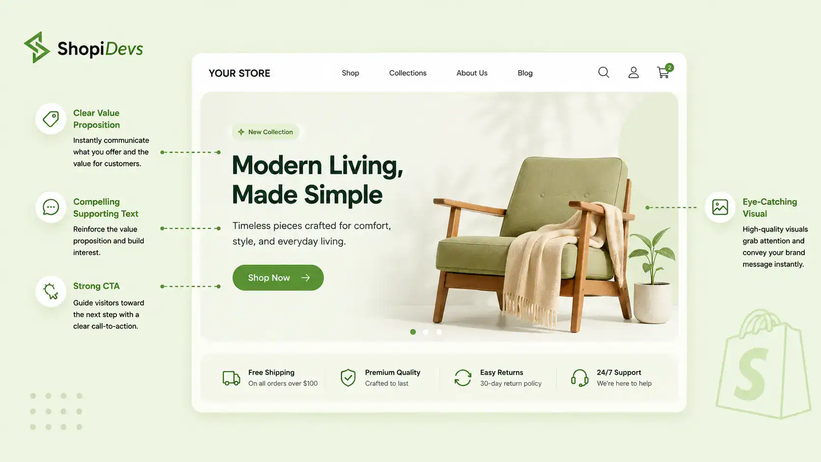
A converting Shopify hero section must include five elements: a compelling outcome-led headline, a subheadline that backs up the claim, a primary CTA button visible without scrolling on mobile, a supporting product visual, and an optional inline trust signal (star rating, customer count, or press mention).
The headline formula that converts: Most Shopify hero headlines name a product category. “Premium Skincare” or “Shop Our Collection” or, the worst, “Welcome to our store.” These convert near zero because they tell the visitor nothing they care about.
The formula that works:
- [Outcome the buyer wants] + [Why you deliver it]: “Workwear that survives 12-hour shifts. Tested on job sites, not runways.”
- [Problem they have] + [How you solve it]: “Running shoes that fit wide feet. Finally.”
- [Specific result] + [For specific person]: “The skincare routine that dermatologists actually use. For sensitive skin.”
The headline must answer “Is this for me?” in under 3 seconds. If a visitor has to think about what you sell, they leave.
The CTA button: “Shop Now” is the weakest CTA on the Shopify homepage. It says nothing specific. Verb-led, outcome-specific buttons convert better. “Find Your Fit”, “Build Your Kit”, “Claim Your Deal”, “Shop the Collection” all outperform “Shop Now” because they connect action to outcome. The button must be fully visible on a 390px mobile screen without scrolling, high-contrast against the background, and singular. One CTA per hero. Competing CTAs in the hero are a conversion killer covered in the mistakes section.
The hero visual: Product-in-context images outperform product-on-white-background images in hero sections. A person wearing the jacket converts better than the jacket on a hanger. A pet eating the food converts better than the food bowl alone. Context shows the buyer what ownership looks like. For seasonal promotions, multiple offers, or countdown-driven campaigns, a product photography strategy for your hero is essential before you build the slider.

Slider Revolution: Hero sliders built for conversion, not just design
Slider Revolution lets you build fullwidth hero sliders with headline text layers, high-contrast CTA buttons, countdown timers, and native lazy loading on every slide. Unlike basic Shopify slideshow sections, it gives you per-slide mobile layouts so your hero looks right at 390px without compromising the desktop experience.
Try Slider Revolution Free
Section 2: The Announcement Bar
The announcement bar sits above the navigation header and is seen by 100% of your homepage visitors, usually before they even read your hero headline. It is the first text most visitors see. Most stores waste it on a generic brand tagline.
The announcement bar belongs to one offer. The offer that changes behavior. That means: your free shipping threshold (“Free shipping on orders over $50”), your active promotion (“20% off sitewide, ends Sunday”), or a single high-impact trust signal (“30-day hassle-free returns”). Stores with a visible free shipping threshold in the announcement bar see 8-12% higher average order value (Shopify merchant data, 2023), because it gives buyers a spending target before they even reach a product page.
If you have multiple offers to rotate (current sale, free shipping threshold, loyalty program), use a rotating bar with 2-3 slides at 4-5 second intervals. This lets you surface multiple value signals without cluttering the bar with text. The transition should be smooth, not disorienting.
Section 3: The Trust Bar
The trust bar is a horizontal row of 3-5 icon-plus-text blocks placed immediately below the hero section. It answers the question every first-time buyer has before they look at a single product: “Is this store safe and worth my money?”
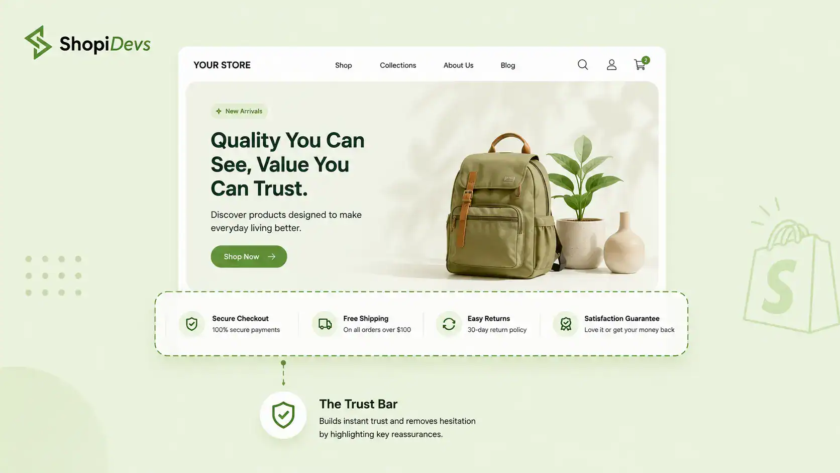
Baymard Institute research shows trust signals placed in the first viewport increase add-to-cart rates by up to 17% compared to pages where these signals appear below the fold. That is not a minor lift. On a store doing $50,000 per month, a 17% add-to-cart increase is a meaningful revenue change.
The four trust signals ranked by conversion impact from Baymard Institute research:
- Free shipping (or free shipping threshold) reduces the most common purchase barrier
- Easy returns (30-day returns, hassle-free, no questions asked) removes risk from first-time buyers
- Secure checkout (SSL, payment icons, “256-bit encrypted checkout”) reduces payment anxiety
- Customer count or rating (“10,000+ happy customers”, “4.9 stars from 207 reviews”) provides social validation
Section 4: Featured Collections
After the trust bar, visitors split into two groups. Buyers who know what they want go straight to the navigation. Browsers, who make up the majority of homepage visitors, need guided navigation. Featured collections do this job.
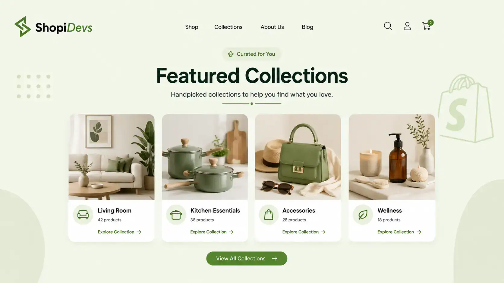
Stores with visual category navigation on the homepage see 22% lower bounce rates compared to stores using text-link navigation (Shopify UX research). The word “visual” matters. Text links require reading and recognition. Image-led category tiles trigger faster processing and reduce the cognitive load of browsing.
Best practices for featured collection sections:
- 3 to 6 collections maximum. Below 3 and you are not giving browsers enough to explore. Above 6 and you are creating a mini navigation menu, which belongs in the header, not the homepage body.
- Image-led, not text-led. Each tile should be a full-bleed image with the category name overlaid, not a text link with a thumbnail beside it.
- Hover CTA. On desktop, a “Shop Women’s” or “Shop Home Office” CTA appearing on hover improves click-through without cluttering the resting state.
- Consistent aspect ratios. Inconsistent image dimensions create layout shift and make the grid look unfinished. Set a fixed ratio (4:3 or 1:1) and crop all images to match.

Essential Grid: Shoppable collection grids with hover overlays and custom layouts
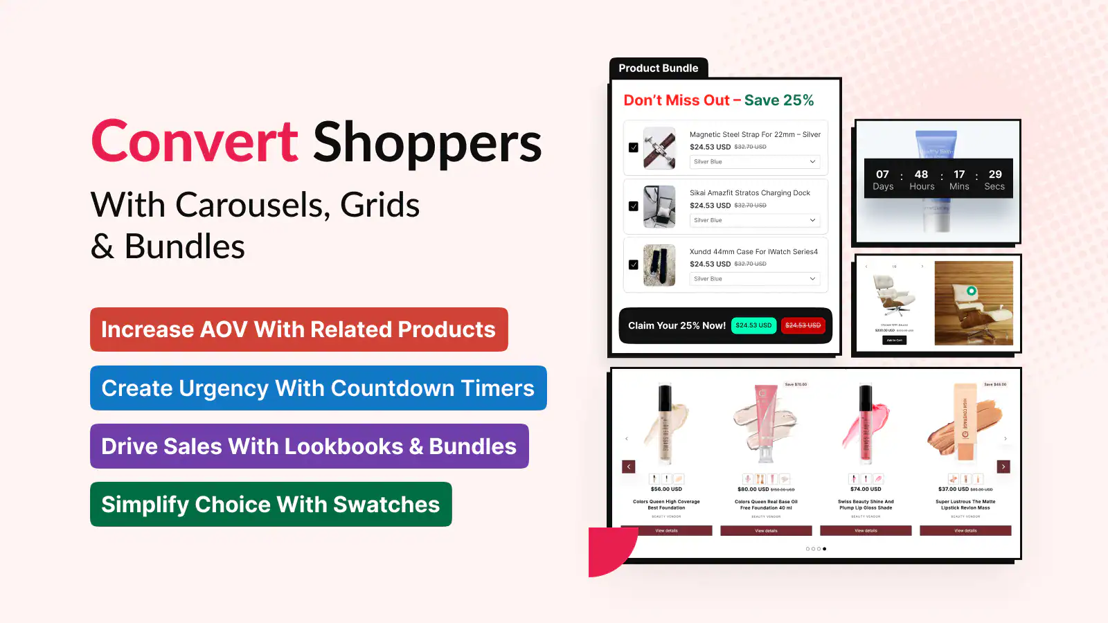
Essential Grid lets you build the featured collections section as a drag-and-drop grid with 3-column and 4-column layouts, hover text overlays, and direct “Shop Now” buttons per tile. Unlike Shopify’s native featured collection section, which limits customization to theme defaults, Essential Grid supports custom aspect ratios, animated hover effects, and mixed media tiles including video category cards.
Try Essential Grid FreeFor fashion and lifestyle stores, a shoppable lookbook in this section drives even higher engagement. Instead of plain category tiles, a lookbook grid shows styled products together, which increases the average items added to cart.
See how to create a Shopify photo gallery and Shopify lookbook app options for implementation.
Section 5: Featured Products and Bestsellers
The featured products section is your “proof of product.” It shows visitors your best-performing products with real social proof attached. This section does two jobs: it surfaces inventory and it provides validation through ratings and review counts at the same time a visitor is forming product interest.
4 to 8 products is the sweet spot. Below 4 and the section feels sparse, like you do not have much to offer. Above 8 and you trigger choice paralysis. Hick’s Law, a principle from cognitive psychology, says that doubling the number of options increases decision time disproportionately.
On a product grid, this means more products do not help more browsers decide. They delay decisions and increase scroll fatigue. What to show on each featured product card:
- Star rating and review count directly on the card. Not linked to a product page. Visible from the homepage grid. A product showing “4.8 (142 reviews)” on the grid card converts significantly better than a product card with just a name and price.
- Bestseller or Most Popular label. Social proof labels on product cards increase click-through rates. “Staff Pick” and “New” labels also work but have lower impact than “Bestseller.”
- Price and, if on sale, compare-at price. See how to use Shopify compare-at price for maximum sale signal impact.
- Quick-add to cart button on hover on desktop. Reduces the click depth between homepage and cart.
For product discovery beyond bestsellers, a “Recently Viewed” section below the featured products captures returning visitors who browsed before but did not buy. See how to add recently viewed products in Shopify for setup.
For stores where upselling starts on the homepage, see upselling in Shopify and best upsell apps for Shopify. The homepage is your first upsell opportunity, not just a product listing. Strong product descriptions that sell outcomes also matter here. See 4 best ways to write Shopify product descriptions for copy that converts.
Section 6: Social Proof: Reviews, UGC, and Customer Photos
For first-time visitors, this is the highest-trust section on the page. Returning visitors already have baseline trust. First-timers need external validation before they commit to a purchase. The social proof section delivers that validation in a concentrated, scannable format.
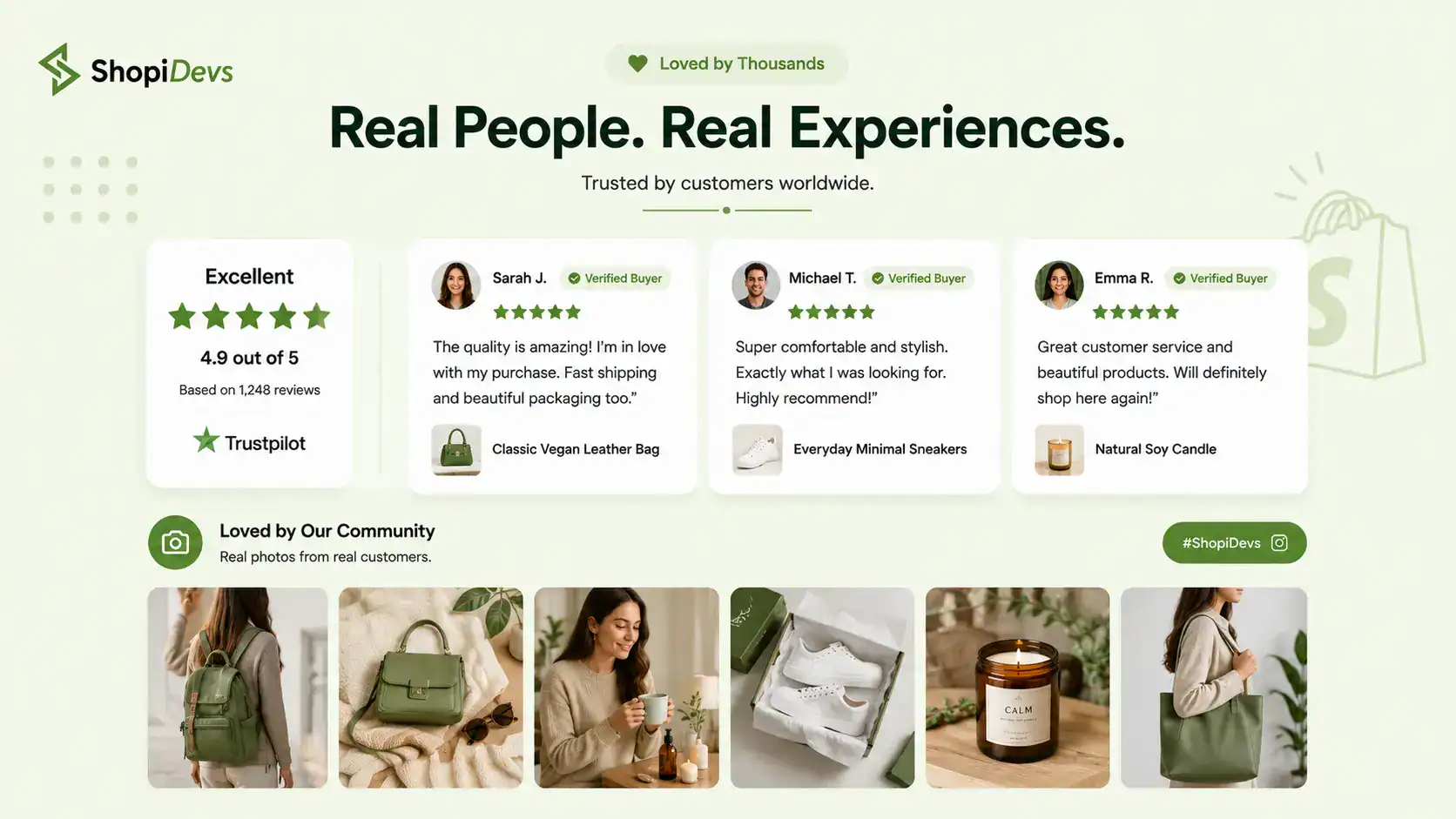
93% of consumers say online reviews affect their buying decision (Spiegel Research Center, 2017). But the form of the social proof matters as much as the fact that it exists. User-generated content, customer photos, and named testimonials all outperform stock-looking review carousels by significant margins.
UGC on product pages increases conversion by 29% (Bazaarvoice). On the homepage, the effect compounds because it reaches every visitor, not just those who reach a product page.
Social proof types ranked by trust impact for first-time visitors:
- Customer photo + full name + location + review text. The most credible format. A photo of a real person using the product with their first name, last initial, and city is what buyers scan for.
- Star rating aggregate with review count. “4.9 stars from 207 verified reviews” in a prominent position near the top of the section.
- Press mentions and media logos. “As seen in Forbes, TechCrunch, Vogue” if applicable. Even smaller niche publications add credibility.
- Instagram/UGC photo grid. Real customer content pulled from social media. Visual and unpolished, which makes it feel more authentic than staged product photos.
For a comprehensive social proof setup including app options and placement strategy, see social proof apps for Shopify and how to create a lookbook in Shopify if you are using a UGC-style lookbook as your social proof section.
Section 7: Brand Story and Value Proposition
By the time visitors reach Section 7, they have seen your hero, your offer, your trust signals, your products, and your reviews. They have enough information to buy. But some visitors need one more thing: a reason to buy from you specifically instead of searching for the same product on Amazon.
The brand story section answers “Why us?” in 3-4 sentences maximum. This is not a company history. It is not a mission statement for the annual report. It is the shortest possible answer to “What makes you different and why should I believe it?”
Differentiators that work in brand story sections:
- Handmade or artisan: “Every piece is hand-thrown in our Sheffield studio by one of three potters. We make 200 pieces a month. No more.”
- Sustainable or ethical: “We source our cotton from 3 farms in India. We visit twice a year. Every farmer earns above the living wage for their region.”
- Specialist expertise: “We spent 8 years designing gear for military search and rescue before we launched our outdoor line. That is what our zippers, stitching, and pockets are built for.”
- Community or founder story: “I built this company because I could not find running shoes that fit my wide feet. I am still the head of product. Still have wide feet.”
Keep the copy short. Under 80 words. This is a bookmark for curiosity. Visitors who want more will click through to the About page. The brand story section’s only job is to give them one specific, credible reason to choose you over a generic alternative.
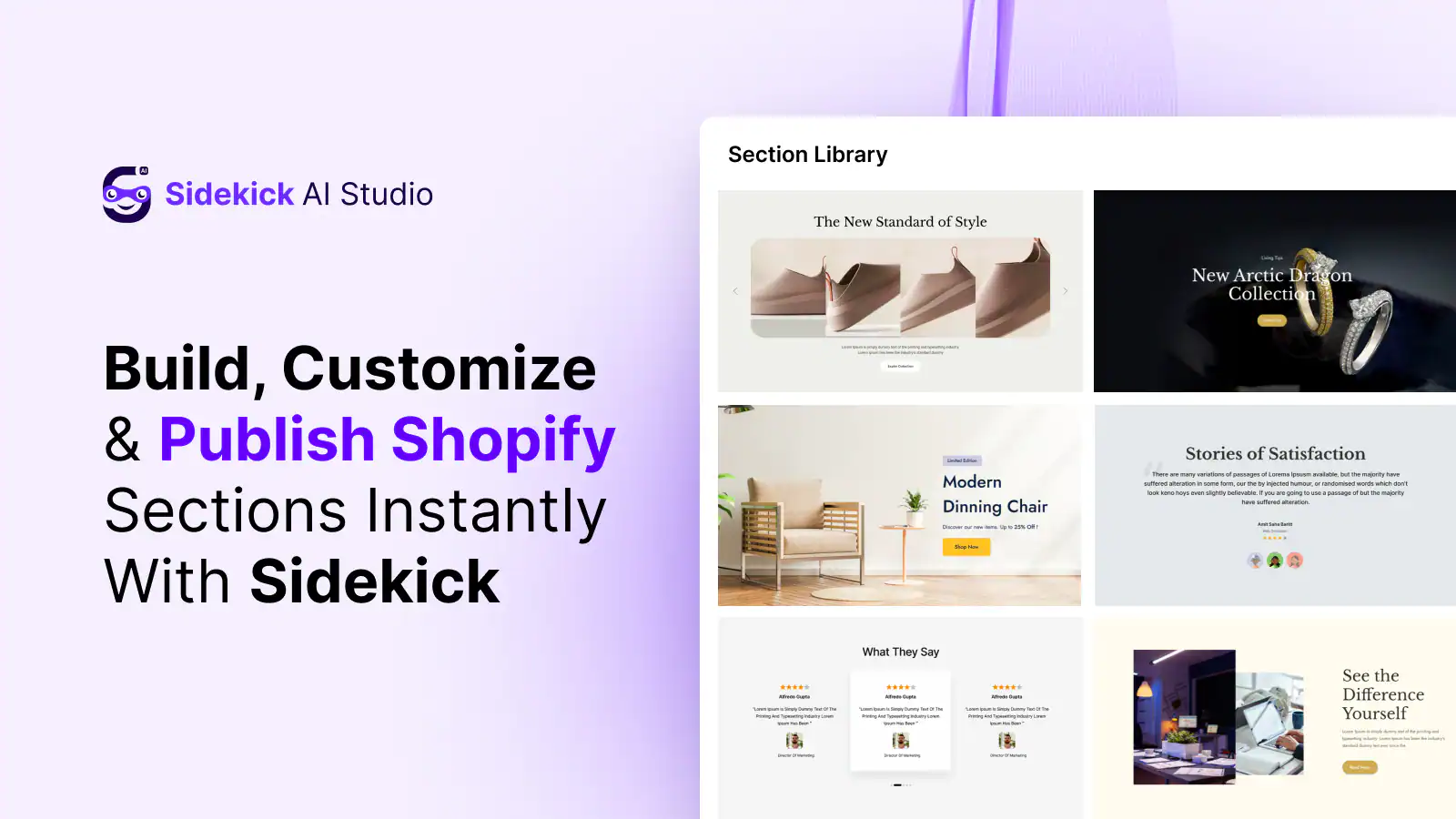
If your homepage copy is not converting, the value proposition is often the problem. Sidekick AI Studio can generate headline and copy variants for this section to test which differentiator angle resonates with your audience.
Section 8: Email Capture and Newsletter Signup
The email capture section belongs between the social proof section and the footer. Not in the hero, and not immediately after the trust bar. Placement matters because email capture works on a trust threshold: a visitor will not give you their email address until they have seen enough of your store to want a reason to come back.
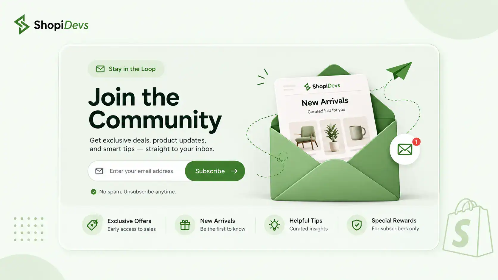
The industry average homepage email signup converts at 1.5-2.5%. Adding a specific incentive, typically 10% off the first order, a free guide, or a gift with first purchase, lifts this to 5-8%. That is a 2-4x improvement from one copy change.
What makes an email capture section convert:
- One field only. Ask for email. Not name, not phone, not birthday. Email only. Every additional field cuts conversion.
- Specific incentive. Tell visitors exactly what they get and exactly when they get it. “Get 10% off your first order, delivered to your inbox in 2 minutes” converts better than “Join our list for deals.”
- No “subscribe to our newsletter” copy. This tells the reader what they are doing for you, not what they get. Flip it: lead with the benefit to them.
- Minimal visual noise. A clean background, a single headline, one input field, one button. Email capture sections that compete visually with the sections above them lose.
Section 9: The Footer
The footer is the homepage element 80% of Shopify stores neglect and high-intent buyers always check. Visitors who reach the footer are not casual browsers. They have scrolled through your entire homepage. They are interested enough to look for more information before they commit to a purchase.
36% of visitors go directly to the footer to find contact information (KoMarketing, B2B commerce research). On ecommerce stores, the pattern holds: buyers who are on the edge of a first purchase check the footer for return policy, shipping information, and support contact before clicking “Add to Cart.” If they cannot find these quickly, they leave.
What high-intent buyers look for in a Shopify footer:
- Contact or support link (not buried inside “About Us”)
- Return and refund policy (linked directly, not requiring navigation)
- Shipping information (especially estimated delivery times)
- About page link (for buyers who want company legitimacy signals)
- Payment method icons (Visa, Mastercard, PayPal, Apple Pay, Shop Pay)
- Trust badges (SSL, secure checkout, money-back guarantee)
- Social media links (lightweight secondary trust signal)
of visitors go directly to the footer to find contact information (KoMarketing)
reduction in cart abandonment when footer includes clear return policy and support links
of homepage visitors reach the footer, and those who do have the highest purchase intent
Shopify Homepage Layout Mistakes That Kill Conversion
A strong layout framework only works if you avoid the mistakes that override it. These five errors appear on the majority of Shopify homepages. Each one has a measurable negative effect on conversion rate. Before redesigning your homepage, run through this list. For a full pre-redesign audit, see how to audit your Shopify store before a redesign.
1. Too many CTAs competing for attention
2. No mobile-first thinking
3. Slow-loading hero image
4. Generic headline that says nothing
5. Missing trust signals above the fold
Shopify Homepage Layout by Store Type
The 9-section anatomy framework applies to all Shopify stores. But the weighting, placement priorities, and section emphases change based on what the store sells and how buyers arrive at it. Here are three store types with adjusted layout priorities:
Multi-Category Store
- Featured Collections is the highest-priority section below the hero
- Show 5–6 category tiles with distinct images
- Keep hero headline category-agnostic (“Everything your home needs”)
- Featured Products prioritizes breadth over depth: 1–2 products per category
- Trust bar and social proof standard placement
Single-Product Store
- Hero takes 80% of above-the-fold space
- Move social proof (reviews) immediately below the hero
- Skip Featured Collections entirely
- Add a homepage FAQ section above the email capture
- Brand story becomes the second section, not the seventh
Fashion and Lifestyle Brand
- UGC grid and lookbook are Section 4, not Section 6
- Brand story moves to Section 2 (identity-driven purchase)
- Featured Products section uses lifestyle imagery, not white-background shots
- Trust bar leads with sustainability or ethical production, not just shipping
- Email capture tied to early access or style drop notifications
Frequently asked questions
What should a Shopify homepage include?
A Shopify homepage should include 9 core sections: a hero section with a clear headline, CTA button, and product visual; an announcement bar with your top offer; a trust bar with 3-5 icons covering free shipping, easy returns, and secure checkout; featured collections for easy navigation; featured products or bestsellers with ratings and review counts; social proof (testimonials, UGC, star rating aggregate); a brand story or value proposition block; an email capture section with a specific incentive; and a footer with clear contact, return policy, and navigation links. Each section serves a different buyer at a different trust level.
How do I make my Shopify homepage convert better?+
Three changes move the needle fastest. First, fix your hero headline. If it says “Welcome to our store” or names a product category, rewrite it around an outcome (“Workwear that survives 12-hour shifts”). Generic headlines convert near 0%. Second, add trust signals above the fold. Baymard Institute research shows trust signals in the first viewport increase add-to-cart rate by up to 17%.
Third, add your star rating aggregate or review count to the homepage, not just to product pages. Spiegel Research Center found that displaying reviews prominently increases purchase likelihood by 270% for lower-priced products. For a full conversion audit framework, see Shopify conversion rate optimization.
How many sections should a Shopify homepage have?+
A Shopify homepage should have between 7 and 10 sections. Fewer than 7 and you leave conversion levers unused. More than 10 and you create cognitive overload. The 9-section framework in this guide covers every section a converting homepage needs: Hero, Announcement Bar, Trust Bar, Featured Collections, Featured Products, Social Proof, Brand Story, Email Capture, and Footer. For single-product stores, you can collapse Featured Collections and Featured Products into one hero-level section and move social proof much higher. For general stores, all 9 sections are needed.
What makes a good Shopify hero section?+
A good Shopify hero section does five things: states a clear, outcome-led headline (not a product name), includes a visible CTA button without requiring any scrolling on mobile, shows a product-in-context image (not product on white background), includes a supporting subheadline that backs up the main claim, and optionally includes an inline trust signal or rating count. The headline formula that converts best: [Outcome the buyer wants] + [Why you deliver it]. For example: “Skincare that repairs overnight. Clinically formulated for sensitive skin” outperforms “Premium Skincare Products” every single time.
How do I add a featured collection to my Shopify homepage?
In Shopify’s native theme editor (Online Store, then Themes, then Customize), add a “Featured Collection” section from the section panel and select your target collection. This gives you a basic grid. For a visual, image-led category grid with hover overlays, CTA buttons, and custom layouts, use Essential Grid. Essential Grid adds a drag-and-drop grid builder to Shopify that lets you create collection showcases with 3-column and 4-column layouts, hover text, and direct “Shop Now” buttons. It integrates directly with Shopify collections and requires no coding. See how to create a Shopify photo gallery for a full walkthrough.
“Users spend 80% of their time looking at information above the fold. Although users do scroll, they allocate only 20% of their attention to content below the fold. This attention distribution applies to homepages, where the hero and top navigation elements receive the vast majority of user focus regardless of page length.”
Build a Homepage That Sells on the First Visit
Your hero section and product grid are the two highest-conversion sections on your homepage. Slider Revolution builds conversion-optimized hero sliders. Essential Grid builds the product and collection grids that move browsers into buyers.

Nahid Komol is a product marketer and GTM strategist specializing in WordPress, SaaS, and AI-integrated growth (AEO, AIO, GEO). With 10+ years of hands-on experience at brands like FunnelKit, FlyWP, and weDevs, he brings deep expertise in content strategy, product positioning, user acquisition, and full-funnel marketing. He's led campaigns generating $100K in sales, grown organic traffic by 70%, and ranked 500+ articles on Google, and is now building AI agent workflows that automate core marketing operations at scale. When he's not crafting strategies or engineering prompt systems, you'll find him exploring sci-fi, composing music, or capturing the quiet poetry of nature through his lens.