Configure and Customize Grid Lightboxes
Table of Contents
- Lightboxes and Essential Grid
- Shown Media Orders
- Lightbox Gallery
- Gallery Mode
- Single Mode
- All Items
- Filter Based on All Pages
- Filter Based on Current Page
- Content based
- Content Gallery based
- Exclude Original Media
- Group Name
- Play Videos Auto
- UI Colors
- Overlay Color
- UI Background Color
- UI Color
- UI Hover Background Color
- UI Hover Color
- Text Color
- Title / Spacings
- Strip Tags
- Position
- Show Title
- Title Source
- Grid Item – Title
- Grid Item – Caption
- Grid Item Media – Title, Caption, Alt
- Show Description
- Description Source
- Grid Item – Description
- Grid Item – Post Excerpt
- Grid Item – Post Content
- Grid Item Media – Alt, Description
- Item Margin
- Effects
- Open / Close Animation
- Next / Prev Animation
- Auto Rotate
- Auto Rotate Delays
- Slideshow
- Navigation Arrows
- Loop Items
- Item Numbers
- Mouse Wheel
- Toolbar Buttons
- Post Content
- Content Minimum Width
- Content Max Width
- Content Overflow
- Post Content Padding
- Show Preloader
- Include Featured Image
- Featured Image Position
- Featured Image Max Width
- Featured Image Margin
- Prepend Post Title
- Post Title HTML Tag
- Up Next: Spinners
Lightboxes and Essential Grid
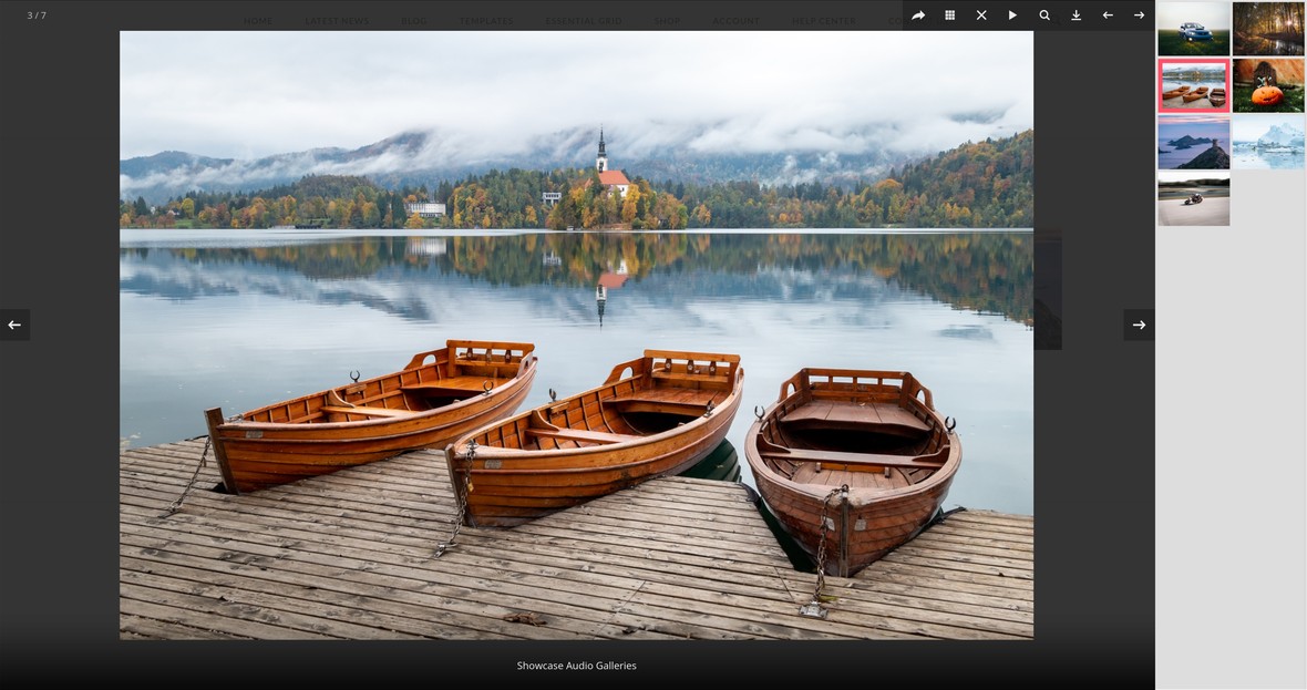
There are several different ways a lightbox can be used in Essential Grid, and in this guide we’ll cover all of the related configuration options.
Note: All the options covered in this guide can be found in the Lightbox tab:
Shown Media Orders
In the Shown Media Orders panel, the Set Source Order option determines what type of media will appear in a lightbox, such as images, videos, iframes etc.
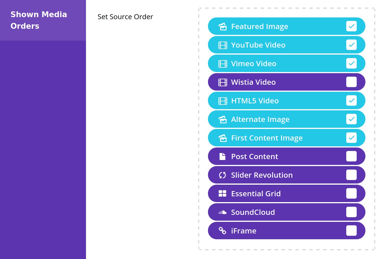
Through checking the source types you want, and sorting them into your order of preference, you can create a system of preferences and fallbacks for your lightbox media.
Note: If you check Post Content, all the other media types will be disabled, and a new Post Content panel will appear at the bottom of the page. We’ll cover that panel later in the article.
Lightbox Gallery
In the Lightbox Gallery panel you decide the way in which content will be displayed in the light box.

Gallery Mode
Use the Gallery Mode option to control what your lightbox shows, choosing from the following settings.
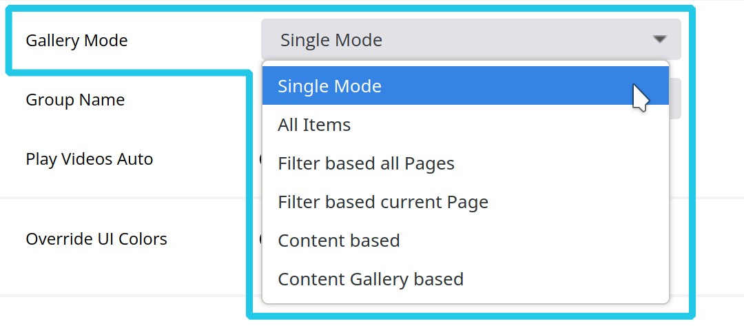
Single Mode
Clicking an item in the grid will open that item, and only that item, in a lightbox. To view any other item the lightbox has to be closed and another item clicked on.
All Items
Clicking an item will still open it in a lightbox, but from there it’s also be possible to directly navigate through all the other grid items without closing the lightbox.
Filter Based on All Pages
The Filter Based on All Pages setting is similar to All Items, in that it allows direct navigation between multiple items. However it allows the collection of items shown to be reduced to match any filters the visitor may have applied to the grid.
Filter Based on Current Page
The Filter Based on Current Page setting is just like the Filter Based on All Pages setting, in that only items matching currently applied filters will be shown. However, if the grid is paginated, only items from the current page will be shown.
Content based
The Content based setting is designed for use with post based grids. In the lightbox for each grid item, a gallery will be shown of all the images from the content of the related post.
Note: For this setting to work, Featured Image and/or First Content Image needs to be checked in the Shown Media Sources panel.
Content Gallery based
The Content Gallery based setting is also designed for use with post based grids. With this mode, if you use the classic editor, (as opposed to the Guterberg block editor), you can add a gallery into a post and it will be picked up and shown in the related lightbox.
If you don’t want to use the classic editor you can instead just insert a classic block, click Add Media, then Create gallery, and select the images you wish to use.
Note: If multiple galleries are added to the post, only the first will appear in the lightbox.
Exclude Original Media
The Exclude Original Media option becomes available if the Gallery Mode option is set to Content based or Content Gallery based.
Group Name
The Group Name option determines the text tag that gets attached to the end of the page’s URL when you open the lightbox.
Play Videos Auto
Set the Play Videos Auto option to On if you would like video play back to commence as soon as the lightbox is opened.

UI Colors
In UI Colors panel, set the Override UI Colors option to Override if you would like to customize the colors of the user interface:

After changing this option, a collection of new options will appear:
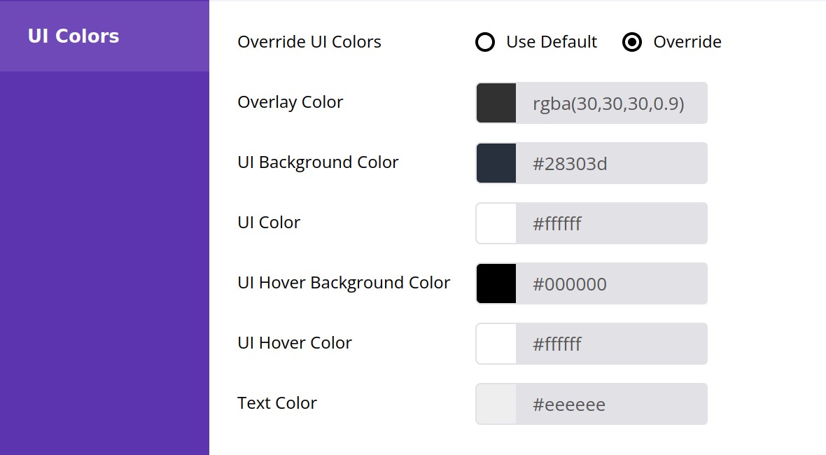
Overlay Color
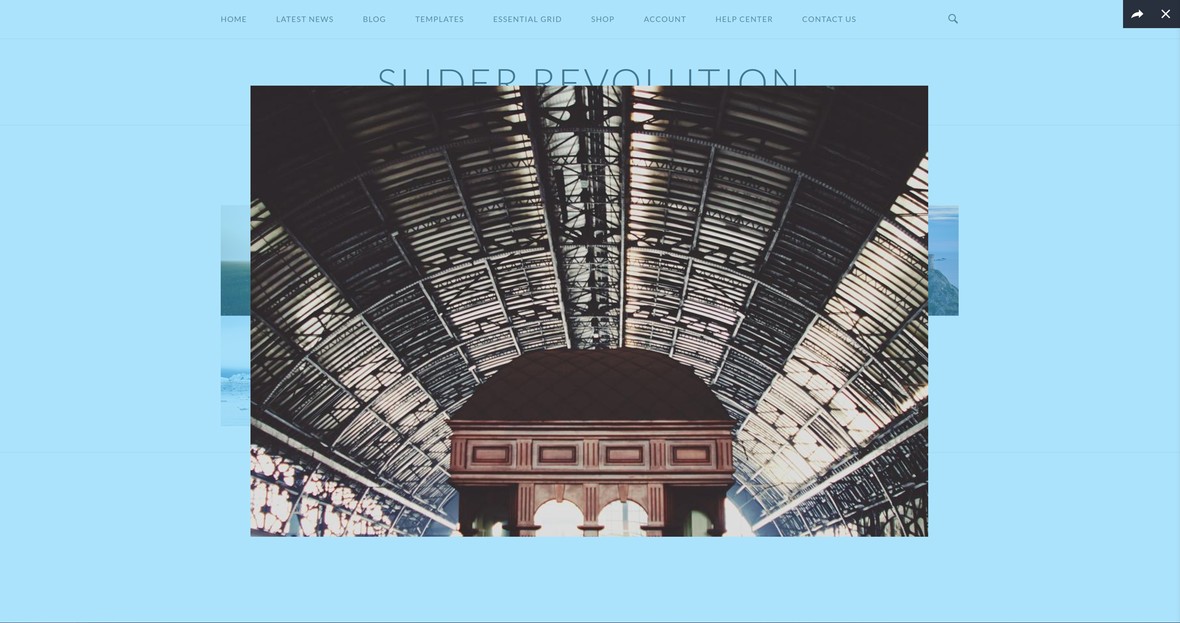
Overlays the entire screen area, and sits behind the media and navigation UI.
UI Background Color

UI Color

UI Hover Background Color

UI Hover Color

Text Color

Title / Spacings
In the Title / Spacings panel you can configure titles, descriptions, and spacing around items:

Strip Tags
Set the Strip Tags option to On if you’d like to remove any HTML tags from an item’s title or description.

Position
If you are going to be displaying a title or description, use the Position option to control whether they appear at the top or bottom of the lightbox.

Show Title
If you’d like to display an item’s title set the Show Title option to On.

Title Source
The Title Source option appears only if Show Title is set to On, and is used to configure where the title comes from. You can select from the following settings.
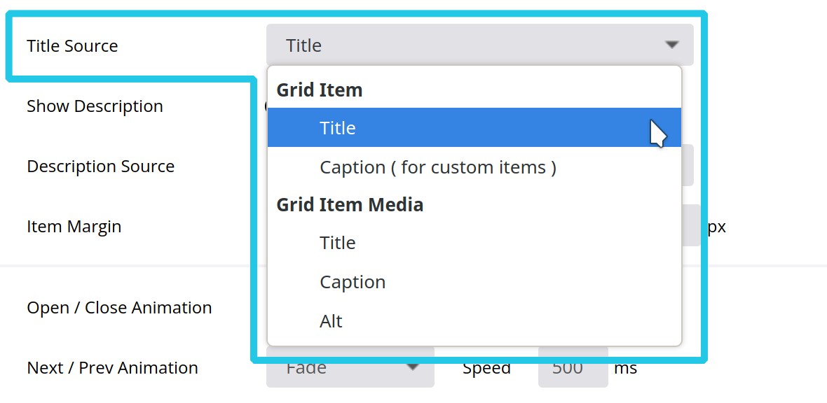
Grid Item – Title
This setting will draw from the title of the grid item. If the grid item is a post, the post title will be used. If the item comes from a stream then the title will be drawn from the stream data. If it’s a custom grid item the title will be drawn from the Title option in its Item Data.
Grid Item – Caption
This setting is intended for use only with custom grids. In this case and item’s title will be drawn from the Caption option in its Item Data.
Grid Item Media – Title, Caption, Alt
Show Description
If you’d like to display an item’s description set the Show Description option to On.

Description Source
The Title Description option appears only if Show Description is set to On, and is used to configure where the description comes from. You can select from the following settings.
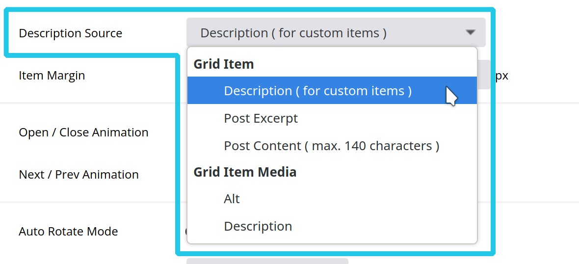
Grid Item – Description
This setting is intended for use only with custom grids. In this case an item’s description will be drawn from the Description option in its Item Data.
Grid Item – Post Excerpt
This setting is intended for use with post content sources. In this case the description will be drawn from the post’s excerpt field.
Grid Item – Post Content
Grid Item Media – Alt, Description
With either of these to settings the description will be drawn directly from the grid item media itself. For example, an image’s alt or description information.
Item Margin
The Item Margin fields determine the space (in pixels) around the top, right, bottom and left of the lightbox, respectively.

Effects
In the Effects panel you can choose animations to use when the lightbox opens and closes, and when it moves to the next or previous item.

Open / Close Animation

Then set the period of time you would like that animation to last, in milliseconds, in the Speed field:

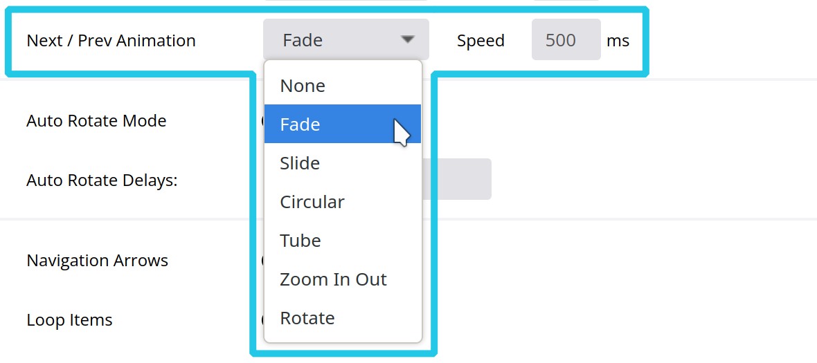
Next / Prev Animation
The Next / Prev Animation controls the transition when paging between one item and the next.
The configuration process is the same as with the Open / Close Animation – select an animation and then set the speed you would like it to run at:
Auto Rotate
Set the Auto Rotate Mode option to On in order to have the lightbox play through the grid items in slideshow style.

Auto Rotate Delays
If using Auto Rotate Mode, use the Auto Rotate Delays option to enter the amount of time, in milliseconds, you’d like to elapse before progressing to the next item:

Slideshow
If you have Gallery Mode set to anything other than Single Mode, you can use the options in the Slideshow panel to help with navigating between items.
Navigation Arrows
Set Navigation Arrows to On to display navigation arrows a visitor can click to progress between items.

Loop Items
Set Loop Items to On to have the slideshow go back to the beginning after the last item.

Item Numbers
Set Item Numbers to On to display a count of the number of items in the slideshow, and which item is currently active.

Mouse Wheel
Set Mouse Wheel to On to allowed the user to navigate between items by scrolling their mouse.

Toolbar Buttons
In the Toolbar Buttons panel you can use the Set Button Order option to decide which buttons should appear in the toolbar at the top of the lightbox:
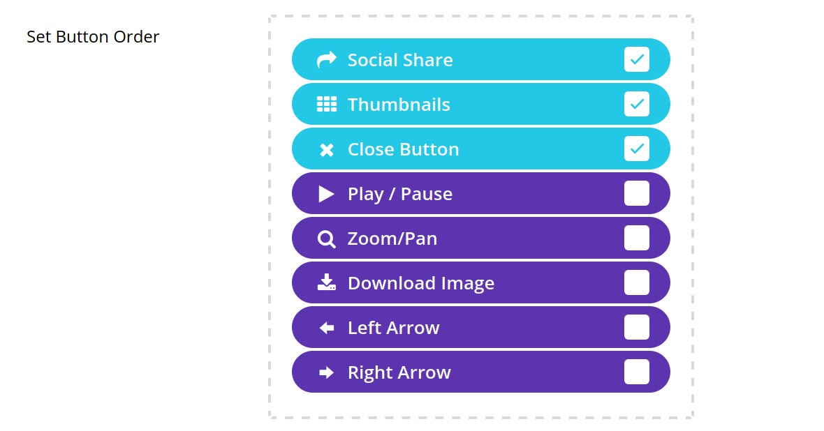
Check the box for each button you want to use, then drag and drop to sort them into the order you’d like them displayed. If all the buttons are active your toolbar will look something like this:

Post Content
If your grid content is coming from posts, you can select Post Content in the Shown Media Orders panel, which will disable the other media types.

Doing so allows visitors to read the entire post related to each item in a lightbox. For example:
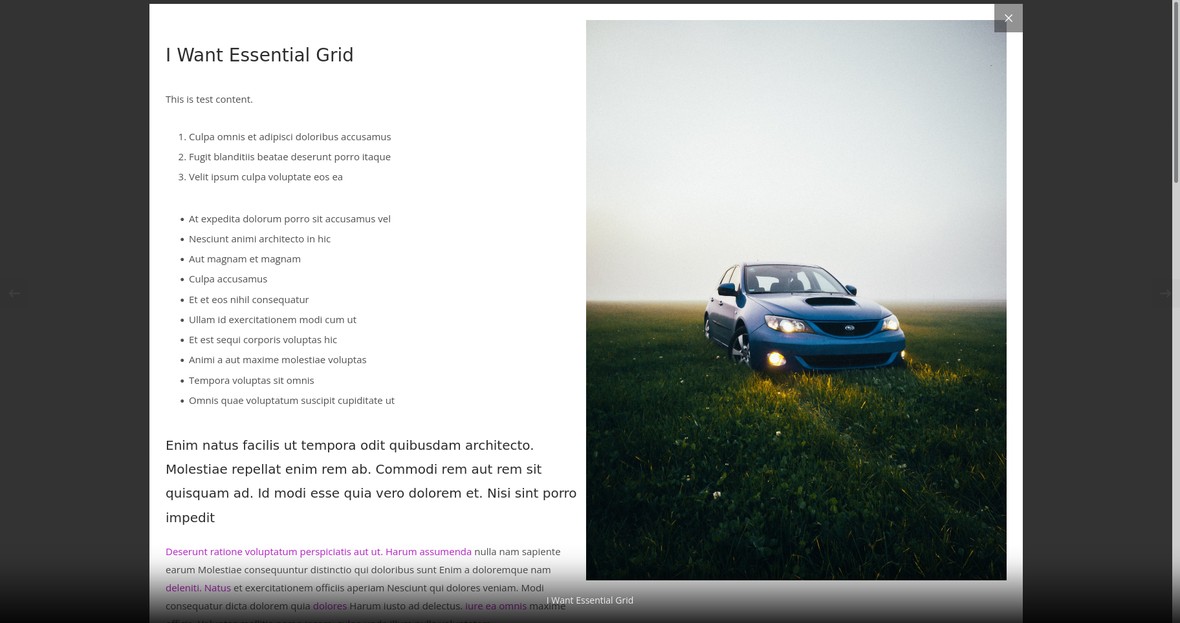
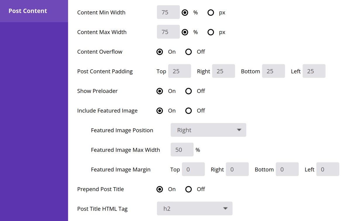
Choosing this source type will make the Post Content panel appear toward the bottom of the page, where you can control the appearance of post content in lightboxes:
Content Minimum Width
Set the minimum width that the content will take up inside its parent container, as either a percentage or a pixel value.

Content Max Width
Set the maximum width that the content will take up inside its parent container, as either a percentage or a pixel value.

Content Overflow

Post Content Padding
Set the amount of space, in pixels, around the top, right, bottom and left sides of the content, respectively.

Show Preloader
Determine whether a preloader animation should play while the content is being loaded.

Include Featured Image
Set the Include Featured Image option to On to include the post’s featured image alongside its content in the lightbox.

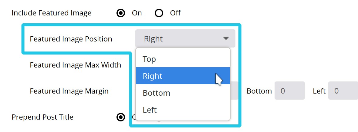
Featured Image Position
Decide whether to position the featured image on the top, right, bottom or left side of the content:
Featured Image Max Width
The option becomes available if Featured Image Position is set to top or bottom. It allows you to decide the percentage of the available space the featured image will occupy.

Featured Image Margin

Prepend Post Title
Set the Prepend Post Title option to On to insert the post title at the top of the light box. Alternatively leave it set to Off in order to show only the post content.

Post Title HTML Tag
