Configuring Grid Skins
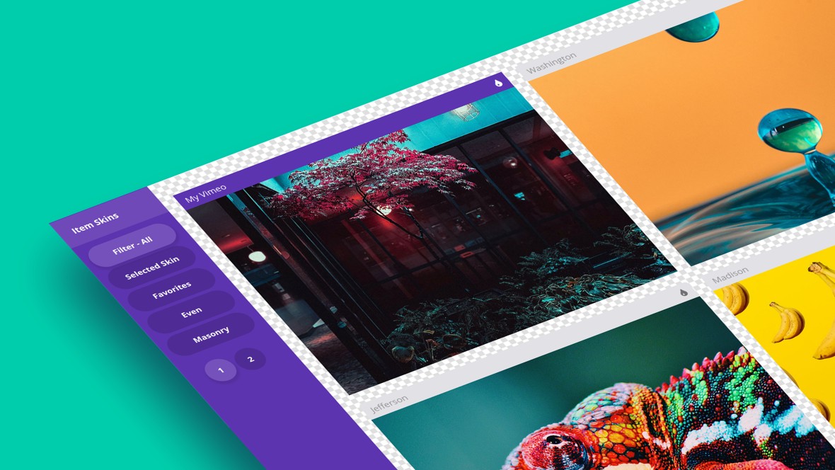
Table of Contents
- Skins
- Background
- Navigation
- Choose Skin
- Preview BG
- Item Skins
- Selecting a Skin
- Filter Skins
- Up Next: Animations
Skins
The Skins tab in Essential Grid allows you to control several aspects of the way your grid looks:

In this guide we’re going to see how to use its options to configure the appearance of your grid background, navigation controls, and individual grid items.
Background
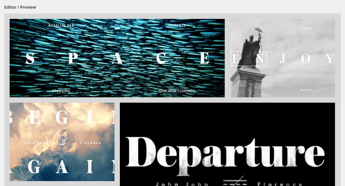
The Background panel contains the Main Background Color option, which sets the background color of the entire grid:

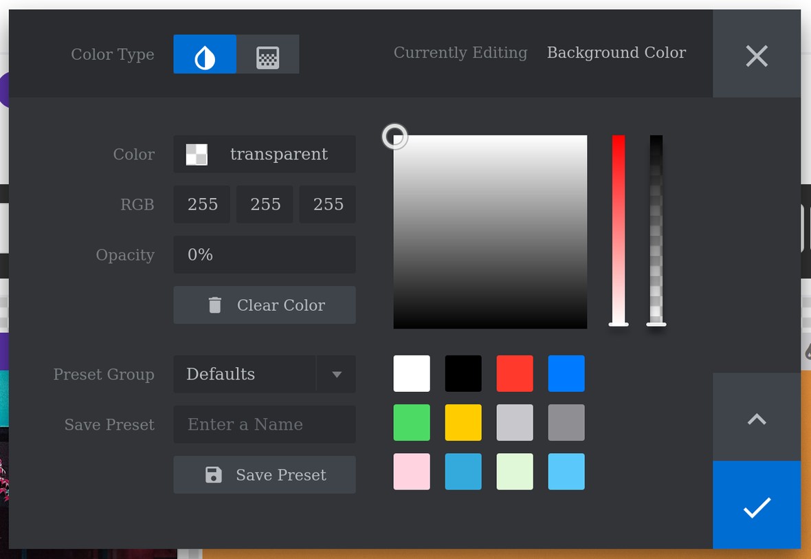
Note: For more information on how to select colors check out our article “The Tools of the Color Selection Dialogue”.
Navigation
The Navigation panel contains options for configuring the appearance of any navigation controls such as filtering, sorting and pagination so on:

Choose Skin
You can use the Choose Skin option to select from any of the navigation skins installed on your site:
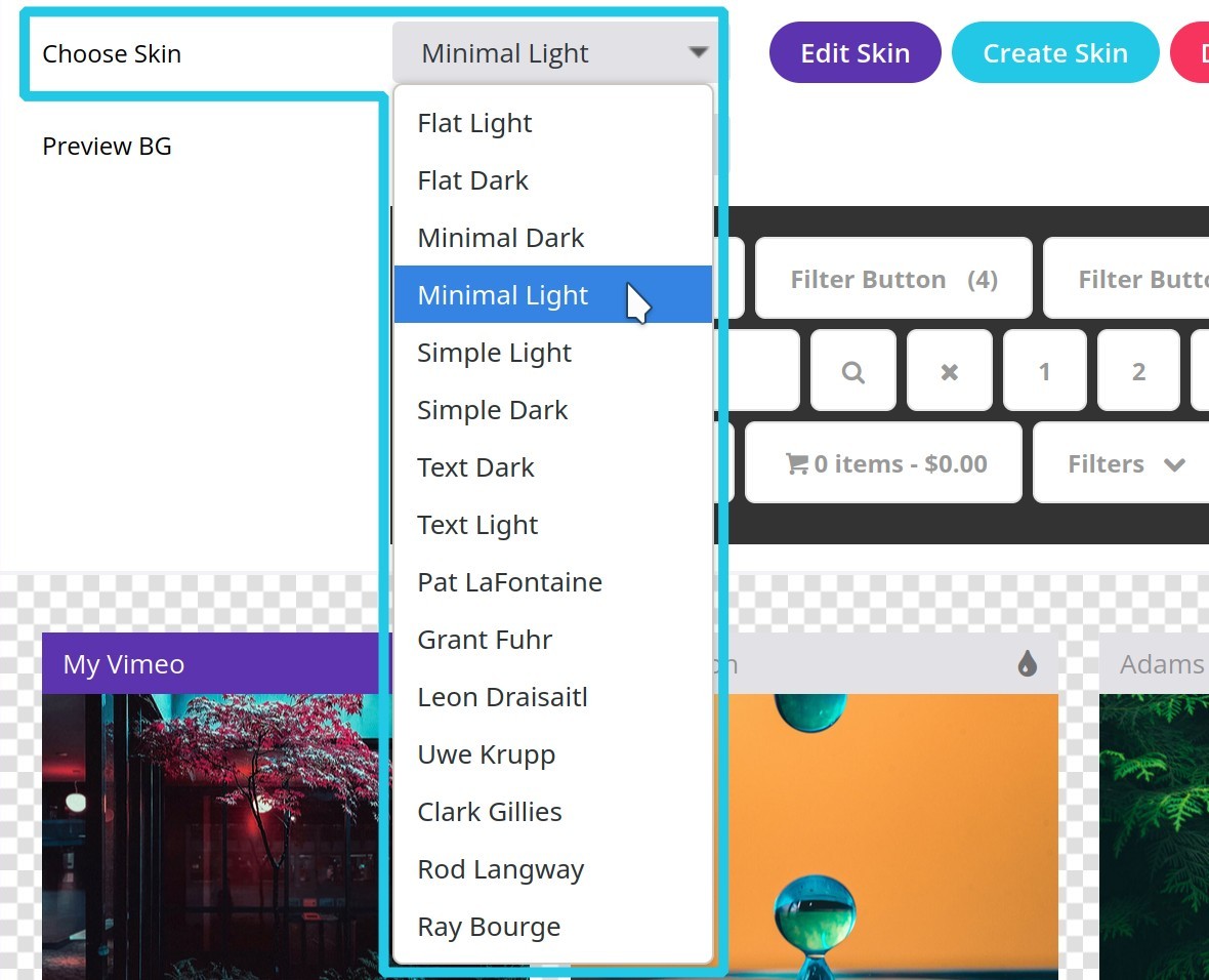
Note: You may notice buttons next to the Choose Skin option enabling you to edit, create, and delete navigation skins. These buttons relate to working with custom skins, which we will cover in a later article.
Preview BG
You can then use the Preview BG option to see how the skin will look on different backgrounds, choosing between dark, light, transparent and your selected main background color:

Note: You can only preview the main background color if it’s a flat color, not a gradient.
Navigation
Selecting a Skin
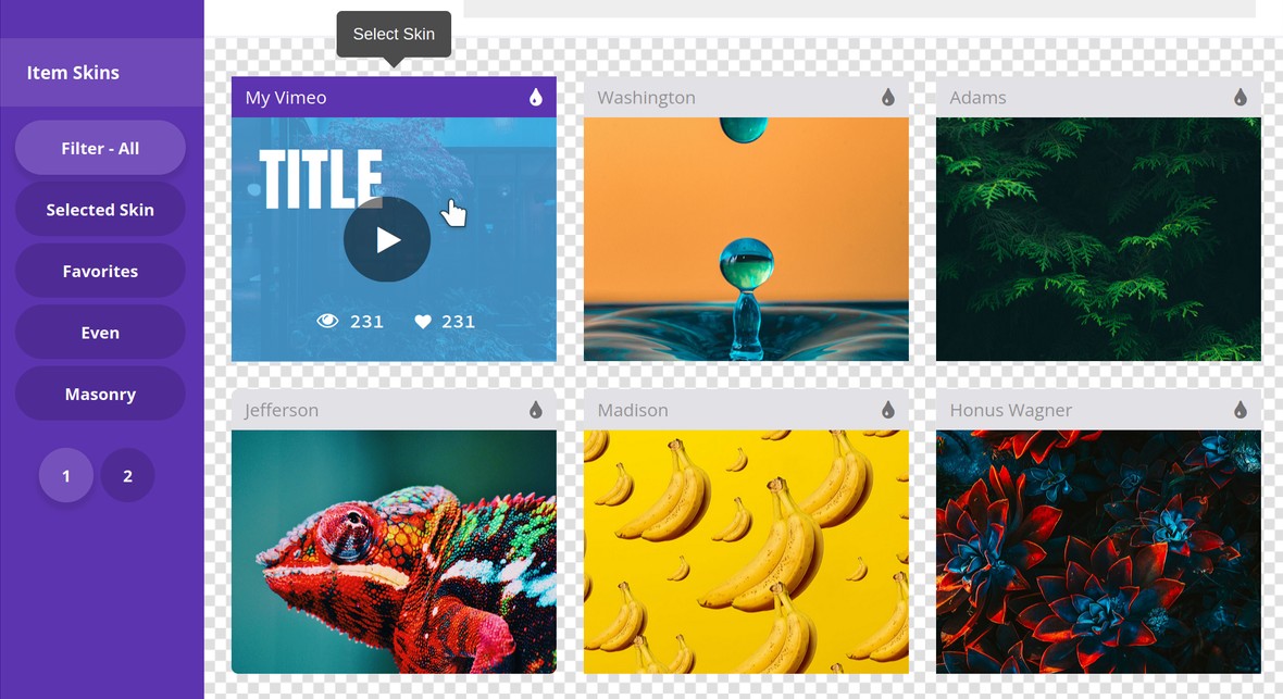
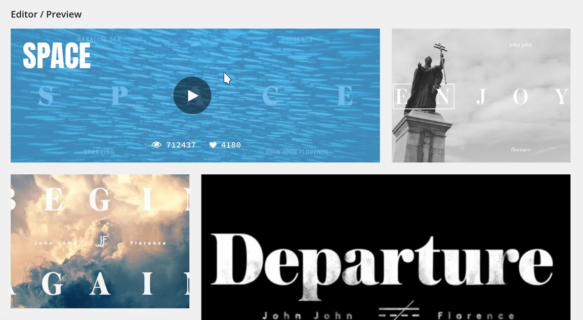
The main area of the Item Skins panel displays a preview of each available item skin. You can hover over any of these previews to to see the hover effect for that skin:
Filter Skins
To do so just click one of the filter buttons in the left column of the Item Skins panel. You can choose from Selected Skin, Favorites, Even and Masonry:
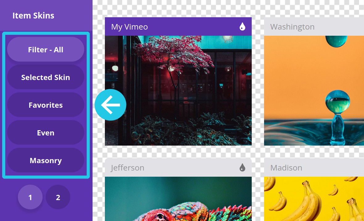
To remove any filtering click the Filter-All button.
Up Next: Animations
On the next page of the manual we’ll learn how to handle animations in three areas: start animations, filter/pagination animations, and hover animations.


