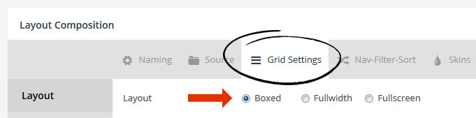
The most common main layout is “Boxed”, which means the grid will always inherit the same width as the rest of the page’s main content.
The actual width of the items will be based on the total width of the grid itself (for “Boxed”, this would be the same width as the rest of the page’s content), divided by the number of columns chosen.
For example, if your theme’s main content area is normally 1000px at full size (i.e. “Desktop Large”), and the grid’s “Desktop Large” columns were set to “4”, each grid item’s width would be 250px wide.
- Grid Item Width = Total Grid Width / Number of Columns
Columns can be set per screen size, as shown in the following screenshot:

There are three main “Grid Layouts” that can be chosen from. “Even”, “Masonry” and “Cobbles”:
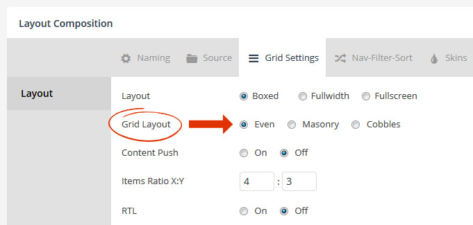

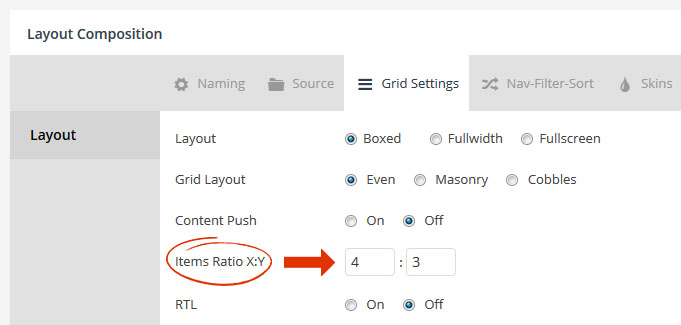
For an “Even” grid layout, the height of the grid item is based on the individual grid item’s width, in relation to the “Items Ratio X:Y” setting.
So if our individual grid items have a width of 250px, and an “Items Ratio” of “4×3”, the grid item’s height would be around 188px tall.
Calculations used to determine the grid item’s actual size for an “Even” grid layout:
- Grid Item Width = Total Grid Width / Number of Columns
- Grid Item Height = Grid Item Width * (Items Ratio Y / Items Ratio X)

The main difference between an “Even” grid layout and a “Masonry” grid layout, is that “Even” layouts use the “Items Ratio X:Y” to determine grid item height. But “Masonry” layouts have the option to use the image’s original size ratio instead, via the “Media Ratio X:Y -> Auto” option:
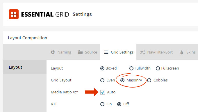
For example, let’s say an image is originally sized at 1000×500 (which would be a 2×1 ratio). When a “Masonry” layout is combined with “Media Ratio: Auto”, the grid item will always conform to this exact ratio. And because different images sized differently to begin with, this is how “Masonry” layout grid items end up with varying heights.
Special Note
Image cropping will never occur when using a “Masonry” grid layout combined with an “Auto” Items Ratio.
Calculations used to determine the grid item’s actual size for a “Masonry” grid layout with an “Auto” Items Ratio.
- Grid Item Width = Total Grid Width / Number of Columns
- Grid Item Height = Grid Item Width * (Image Original Height / Image Original Width)
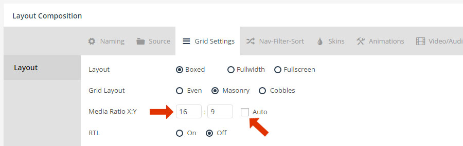
Quick Tip
To achieve “Even” sized grid items with a Masonry Layout, uncheck “Auto” for the Items Ratio, and then enter a fixed ratio to be used for the Grid’s image sizing as shown below.

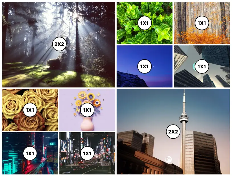
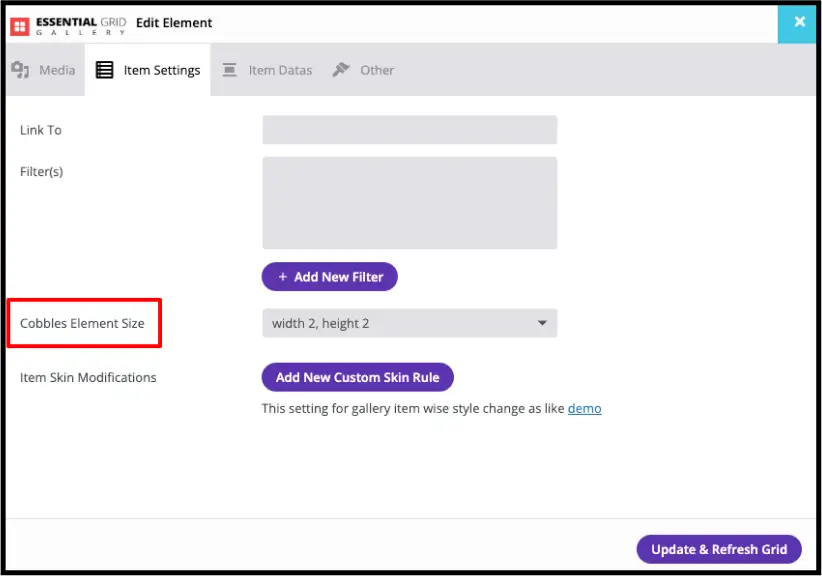
When “Cobbles” is chosen as the grid’s layout, you can assign a “Cobbles Pattern” in two ways. The first is to create a global pattern (global pattern shown below is the exact pattern used to create the example above).
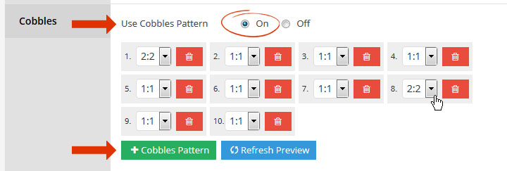
Or you can assign a pattern manually to each individual item:
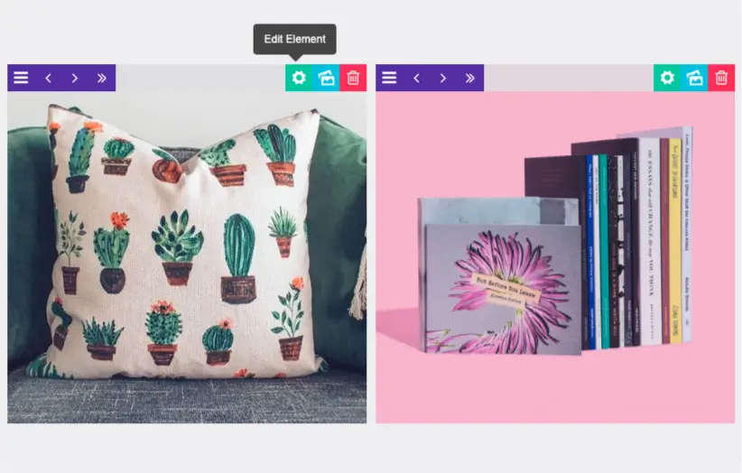
Here’s a visual of each Cobbles pattern applied to our original example:
Special Note
Similar to an “Even” layout, image cropping will also sometimes occur when a “Cobbles” layout is used.


