
The global beauty ecommerce market reaches $97 billion in 2026. Shopify powers a significant share of it, from billion-dollar names like Fenty Beauty and Glossier to indie brands like GITTI carving out a niche with clean ingredients and a focused product line.
Most beauty stores on Shopify look fine. The ones that convert well do specific things: photography that eliminates buying uncertainty, shade navigation that works without a page reload, trust signals placed before the buy button, and on the top tier, AI-powered personalization tools like shade finders and skin quizzes. This list covers 15 stores worth studying, with a breakdown of exactly what each one gets right.
The best Shopify beauty stores combine premium product photography, clear shade selection, ingredient transparency, and a frictionless mobile buying experience. Brands like Fenty Beauty, Glossier, Rare Beauty, Kylie Cosmetics, and The Honey Pot consistently use high-resolution imagery, trust badges, customer reviews, and fast page performance to increase conversions.
Indie brands such as Gitti, Bears with Benefits, and Smile Secret prove that focused product collections, authentic storytelling, and clean UX can compete successfully against much larger beauty brands.
- Top-performing beauty stores prioritize close-up product photography that clearly shows texture, finish, and shade across multiple skin tones.
- AI-powered skin quizzes and shade finders have become standard conversion tools for premium beauty brands.
- Ingredient transparency, cruelty-free badges, and sustainability messaging increase shopper confidence and reduce purchase hesitation.
- Mobile-first UX wins. Sticky add-to-cart buttons, swipeable galleries, and fast-loading pages dominate successful Shopify beauty stores.
- Shopify themes such as Sense, Refresh, and Prestige remain popular because they are optimized for product storytelling and high-quality imagery.
What Makes a Great Shopify Beauty Store?
Beauty is one of the hardest product categories to sell online. Customers can’t test texture, smell, or see how a shade looks on their actual skin. The stores that close this gap win. The ones that don’t convert browsers into abandoners.
Five things separate a Shopify beauty store that converts from one that just looks good:
1. Product photography that answers questions without a review. Close-up macro shots showing texture, shade swatched on at least 3 different skin tones, and lifestyle imagery showing how the product looks in natural light. The goal is to make the customer feel like they’ve already tried it.
2. Shade and variant navigation without a page reload. Swatches that update the main product image on click. Filtering by undertone (cool, warm, neutral) for foundation categories. How you organize products at the collection level determines whether customers find what they’re looking for or leave.
3. Trust signals placed before the buy button. Certifications (cruelty-free, vegan, B-Corp), dermatologist-tested claims, and review counts need to be visible above the add-to-cart button, not buried in a tab at the bottom of the page.
4. AI personalization or a quiz. Shade finders, skin type quizzes, and routine builders reduce purchase uncertainty for customers who don’t know their exact shade or skin type. Brands using these tools report 15 to 30% higher conversion on the products recommended through the quiz.
5. Mobile-first layout. Sticky add-to-cart button, swipeable shade swatches, and CTAs placed within thumb reach. A beauty store that works beautifully on desktop but requir
15 Best Shopify Beauty Stores in 2026
1. GITTI (Sustainable nail care | Berlin, Germany)
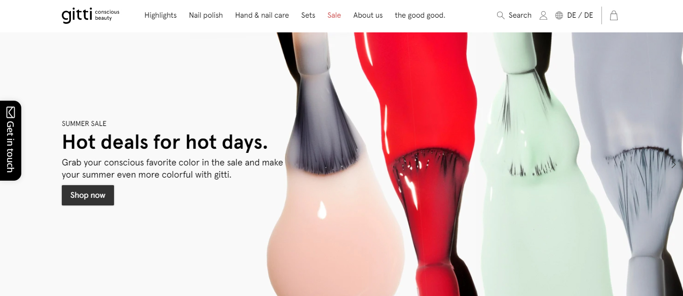
GITTI makes vegan, cruelty-free nail polish with a formula that strips out 10 standard harmful ingredients. Their Shopify store matches the product’s clean positioning with a minimalist layout that puts the color front and center.
What they do right
- Page backgrounds shift to match the dominant color of the selected shade, making every product page feel custom without any development work
- Shade swatches update the main product image instantly, with a close-up nail shot for every color
- Ingredient transparency is visible on the product page without clicking into a tab, not buried in a FAQ
- “10-free formula” callout appears before the price, framing the product as a premium-but-safe choice
2. Bears with Benefits (Beauty supplement gummies | Germany)
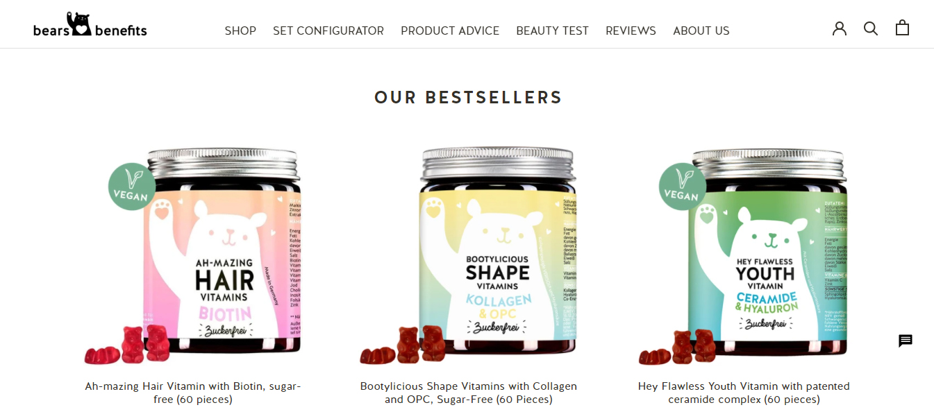
Bears with Benefits sells gummy supplements targeting hair, skin, and nails. Their store competes in a crowded supplement space by leading with humor and clinical proof simultaneously, which is harder to pull off than it sounds.
What they do right
- Each product page opens with a single benefit statement in large type (“90 days to longer hair”) before any product detail
- Certifications (dermatologist tested, gynecologist tested) placed in a trust strip immediately below the buy button
- Playful packaging photography paired with clinical language creates a brand voice that feels credible and approachable at the same time
- Subscription discount offer is shown before the one-time price, which anchors the customer to the lower recurring cost
3. Smile Secret (Teeth whitening | Single-product focus)
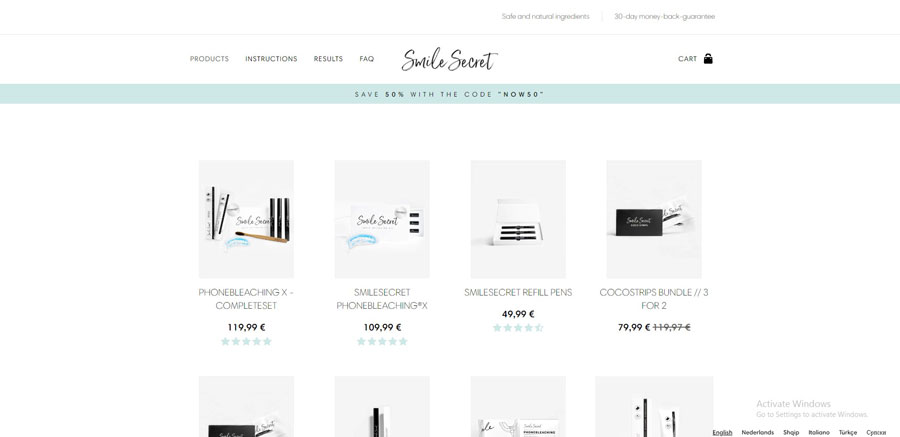
Smile Secret runs a focused single-product store for teeth whitening. The store is a good example of what happens when a beauty brand commits to one problem and one solution without distraction. If you’re building something similar, the Shopify one product store template approach works especially well in this category.
What they do right
- Before-and-after slider in the hero section removes the need to read any claims, the visual does the selling
- No navigation to distract from the single conversion path: scroll, read, buy
- Social proof (review count + star rating) visible in the first scroll without clicking to reviews section
- Clear guarantee messaging (“30-day money-back”) placed next to the add-to-cart button
4. Bobbi Brown (Professional makeup | Global brand)
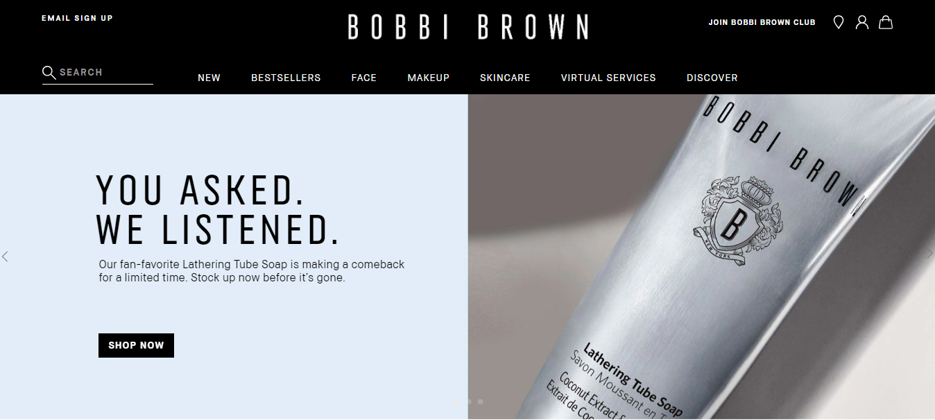
Bobbi Brown is one of the most product-photography-focused beauty stores on Shopify. The brand has built its reputation on skin-first formulas and editorial photography that shows makeup as enhancement rather than transformation.
What they do right
- Foundation shade finder with a full-face preview before purchase, reducing the main reason foundation gets returned
- Editorial photography shot in natural light rather than studio conditions, which reads as more trustworthy to modern shoppers
- Loyalty program status visible without logging in (tier benefits shown in navigation), which incentivizes account creation
- Shade comparison tool lets customers see two foundation shades side by side on a model with similar skin tone
5. M*A*C Cosmetics (Professional makeup | Global)
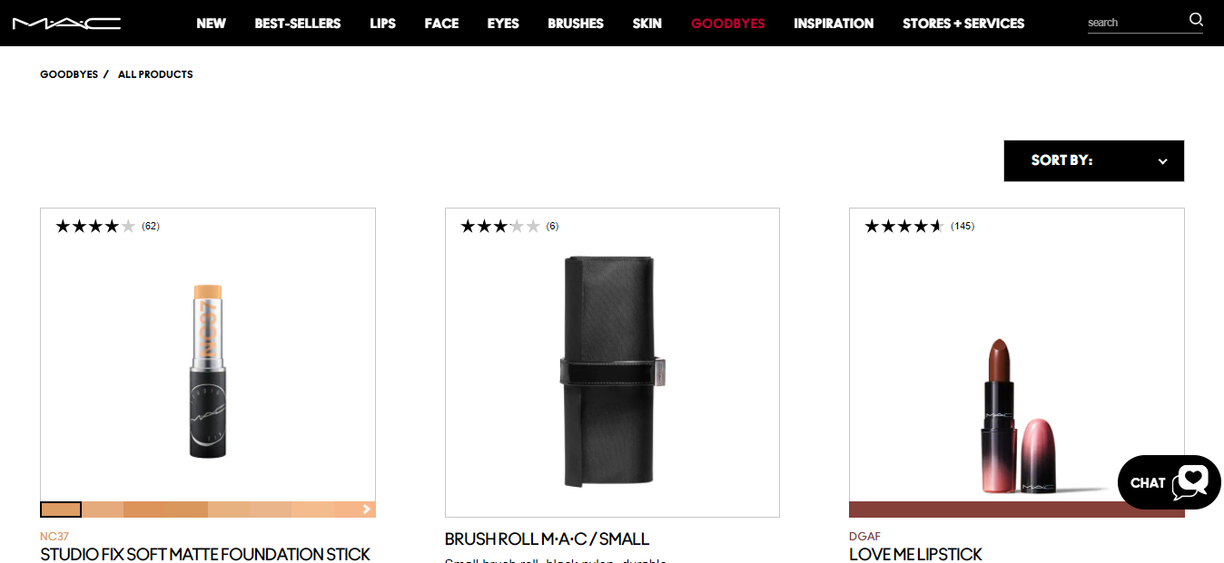
MAC’s Shopify store manages a massive SKU count without overwhelming customers. Their collection architecture is the standout feature: organized by look and finish, not just by product type, which matches how makeup buyers actually think.
What they do right
- Collections organized by look (“bold lip”, “glass skin”, “everyday wear”) alongside traditional category navigation
- Artist collaboration product drops use countdown timers and dedicated landing pages to create urgency without discounting
- Virtual try-on integration on the product page reduces shade uncertainty without leaving the store
- Back-in-stock notification built into sold-out variants, turning a dead end into a lead capture
6. Mankind (Men’s grooming and skincare | UK)
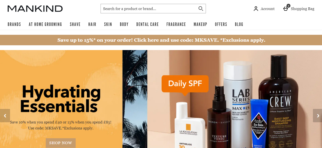
Mankind is one of the few multi-brand beauty stores on Shopify that successfully targets men without defaulting to aggressive dark-mode aesthetics. Their store proves that the “men don’t buy skincare online” assumption is a product and UX problem, not a customer behavior problem.
What they do right
- Navigation uses outcomes (“anti-aging”, “clear skin”, “beard care”) rather than ingredients or brand names
- Editorial content (“what is hyaluronic acid”) is paired directly with product recommendations, turning a blog into a conversion path
- Subscription replenishment prompts appear on products with a clear reorder cycle (moisturizer runs out in 60 days), making the decision to subscribe feel rational
- Expert skin guide available before brand browsing, which builds trust before the upsell
7. Tarte Cosmetics (Cruelty-free cosmetics | US)
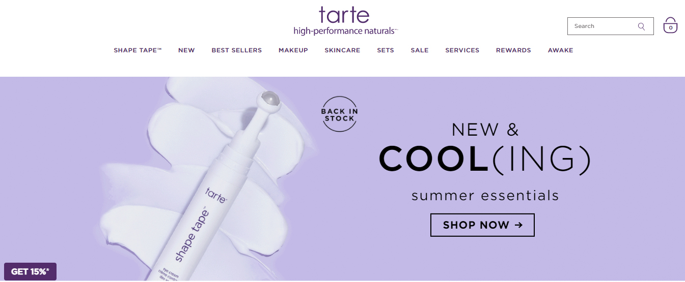
Tarte built their audience on TikTok and Instagram and their Shopify store is built to receive that traffic and convert it quickly. The store assumes shoppers already know the brand and removes friction at every step of the purchase path.
What they do right
- Countdown timers on limited-edition drops and sale bundles create deadline pressure without permanent discounting
- Shade quiz embedded directly on foundation product pages (not a separate page) reduces the click path to a recommendation
- Customer photos (UGC) appear between editorial photography in the product gallery, mixing aspirational and real-world visuals
- “As seen on TikTok” collection page captures high-intent social-referred traffic and converts it with familiar product context
8. MECCA (Multi-brand prestige beauty | Australia)
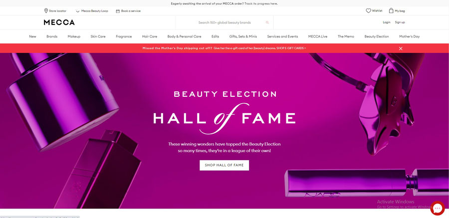
Mecca is Australia’s leading prestige beauty retailer and their Shopify store has to handle one of the most complex navigation challenges in the category: hundreds of brands, thousands of SKUs, and customers who arrive with radically different levels of product knowledge.
What they do right
- Editorial “guides” (The Skincare Edit, The Fragrance Dictionary) sit inside the main navigation alongside brand and category browsing, creating three distinct entry points for three different buyer mindsets
- Loyalty tier status is visible in the header for logged-in users, displaying points balance and next reward milestone
- Product comparison tool works across brands, letting customers put two foundations from different brands side by side
- Beauty quiz routes customers to a filtered collection rather than a single product recommendation, which reduces the feeling of being forced into a choice
9. Rimmel London (Mass market cosmetics | UK / Global)
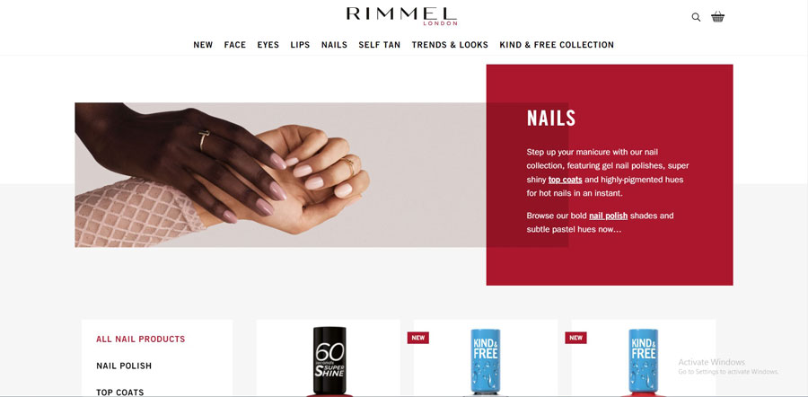
Rimmel’s Shopify store stands out for how it handles color at scale. With hundreds of shades across lipstick, eyeshadow, and foundation, the visual merchandising challenge is significant. Their solution is built around color as a navigation tool, not just a product attribute.
What they do right
- Page section backgrounds shift to match the hero product’s color family (warm pink backdrop for rose-toned lipsticks, cool-toned purple for plum collections)
- Celebrity and brand ambassador imagery is placed at the category level, not just on the homepage, maintaining brand energy throughout the browse experience
- A sale banner with a tiered discount structure (“3 for 2 on selected items”) is persistent across the store rather than limited to a promotional page
- Shade count displayed on collection thumbnails (“48 shades”) before the customer enters a product page sets expectations early
10. OPI (Professional nail care | Global)
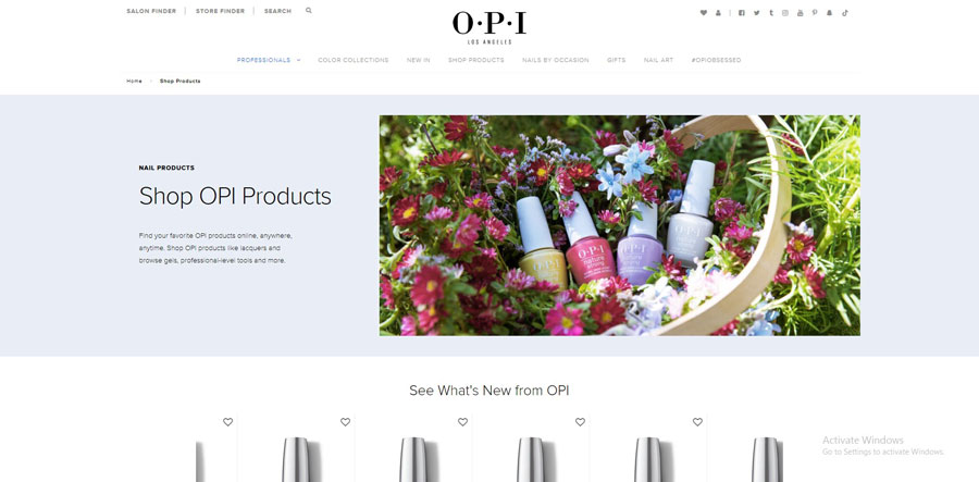
OPI is a masterclass in using product naming as brand identity. Their nail polish shades have names like “Malaga Wine”, “Bubble Bath”, and “I’m Not Really a Waitress”, and the entire store is built around these names as a browsing and discovery tool.
What they do right
- Shade name search lets customers find colors by name rather than just by visual browsing, which works because OPI names are memorable enough to recall
- Color family filtering (“Nudes & Neutrals”, “Reds”, “Blues & Purples”) organizes a 300+ shade catalog without requiring scroll-heavy browsing
- Salon locator embedded directly in the store navigation, driving offline purchase consideration and increasing brand trust for first-time online buyers
- Seasonal collection drops (Holiday, Spring, Summer) create urgency cycles that return customers multiple times per year
11. Fenty Beauty (Inclusive cosmetics | Rihanna | Global)
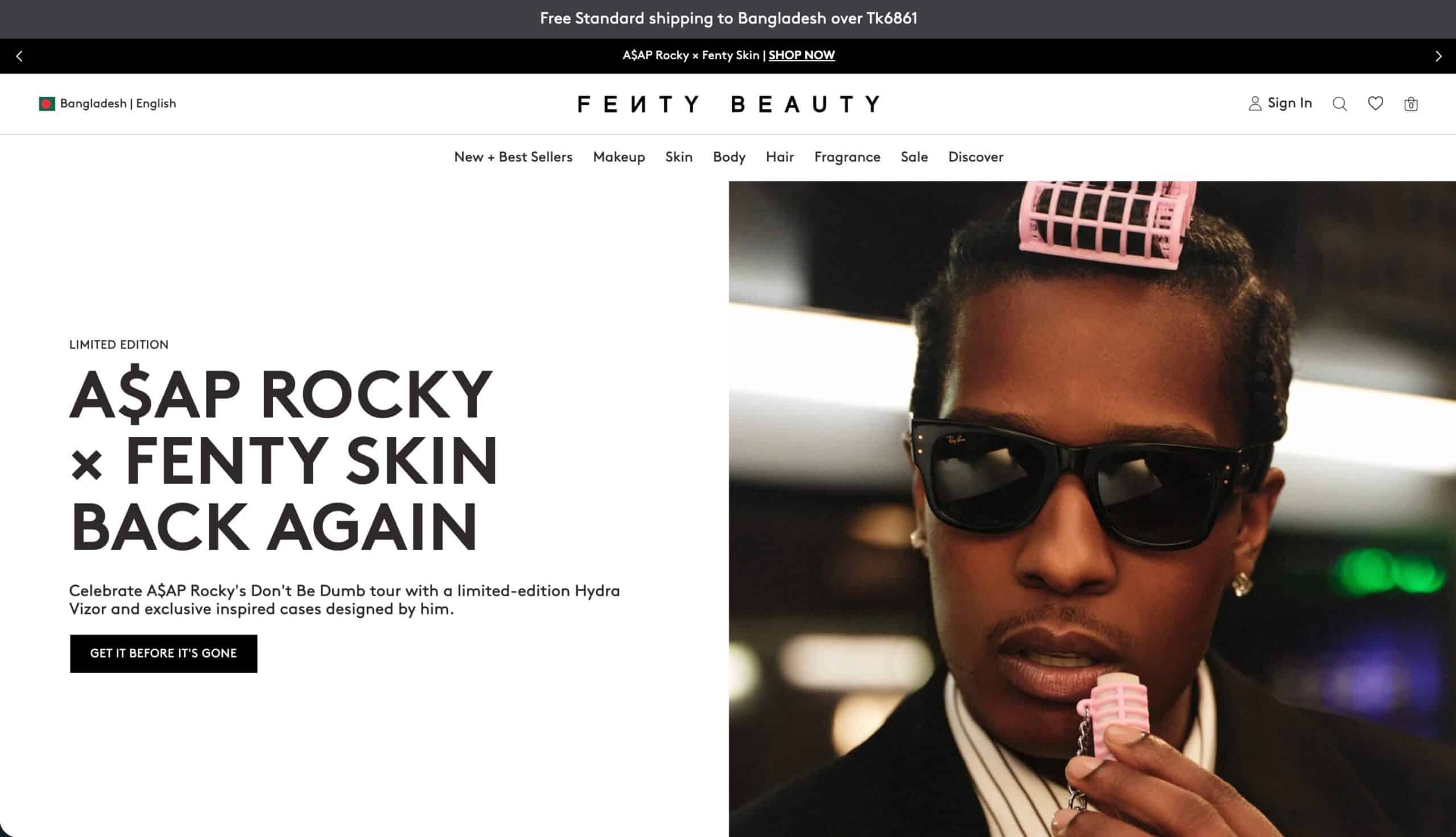
Fenty Beauty launched in 2017 with 40 foundation shades and redefined what inclusive product ranging looks like in beauty. Their Shopify store now supports over 50 foundation shades, a full skincare line, and the most technically advanced shade-matching tool in mass-market beauty.
What they do right
- AI Shade Finder: upload a selfie, get your foundation shade match with undertone explanation (cool, warm, neutral). This single feature addresses the top reason people avoid buying foundation online
- Shade naming uses descriptive codes (“150W Chestnut” not “Light Beige”), making it easier for customers to find their shade across different product lines
- Undertone filter (“Cool”, “Warm”, “Neutral”, “Olive”) sits above the product grid, not inside a dropdown, making filtering a one-click action
- Product swatches show the shade on 5 different skin tones simultaneously, displayed as a row of close-up wrist shots
- Strong editorial video content on product pages showing real application technique, not just flat swatches
12. Glossier (Skincare-first beauty | NYC | Community-driven)
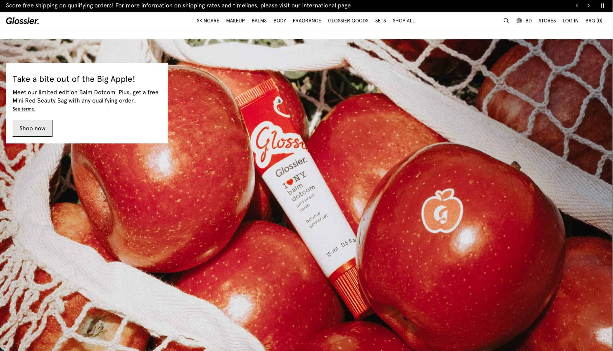
Glossier built a $1.8 billion brand largely on the premise that skincare comes before makeup, and community opinion matters more than advertising. Their Shopify store reflects both. It is one of the cleaner product-page layouts in the beauty category.
What they do right
- Photography uses real skin textures (pores, fine lines visible) rather than heavily retouched imagery, which reads as authentic and reduces post-purchase disappointment
- Routine layering guide shows which products work together in a three-step stack, increasing average order value without a traditional upsell popup
- Customer reviews are the primary social proof mechanism. No paid influencer language appears on product pages, which makes the review section more credible
- Restock notification and waitlist are embedded on sold-out product pages, turning scarcity into a lead capture tool
- Product descriptions use “you”-framed benefit language (“gives you that just-got-good-news glow”) over ingredient lists, keeping the tone conversational
13. Kylie Cosmetics (Social-first cosmetics | Kylie Jenner | Global)
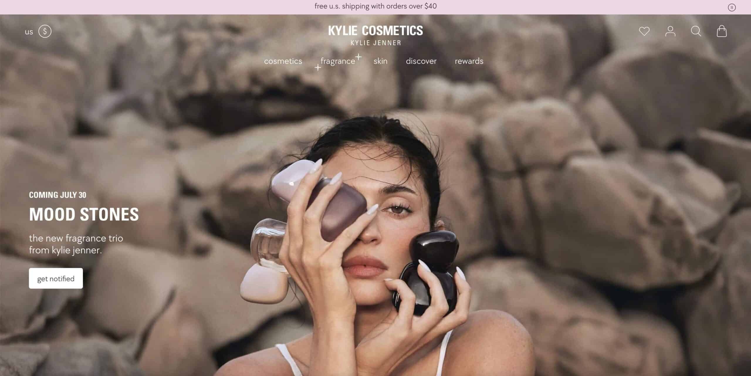
Kylie Cosmetics built its entire launch strategy around social media drops and the store architecture reflects that. Every product launch is treated as an event, and the Shopify store is built to receive high-intent traffic from Instagram and TikTok and convert it fast.
What they do right
- Drop model: limited-edition collections launch with a dedicated landing page, countdown timer, and product tease video, which creates urgency without discounting
- Short-form video on product pages shows the product swatched on multiple skin tones, mirroring the TikTok content format that sent the traffic in the first place
- Organic UGC (customer TikToks and reels) is embedded near the add-to-cart button, providing social proof at the decision point
- Bundle builder allows customers to create a custom lip kit (liner + lip color of their choice), which increases order value and feels personalized
14. Rare Beauty (Mindful makeup | Selena Gomez | US / Global)
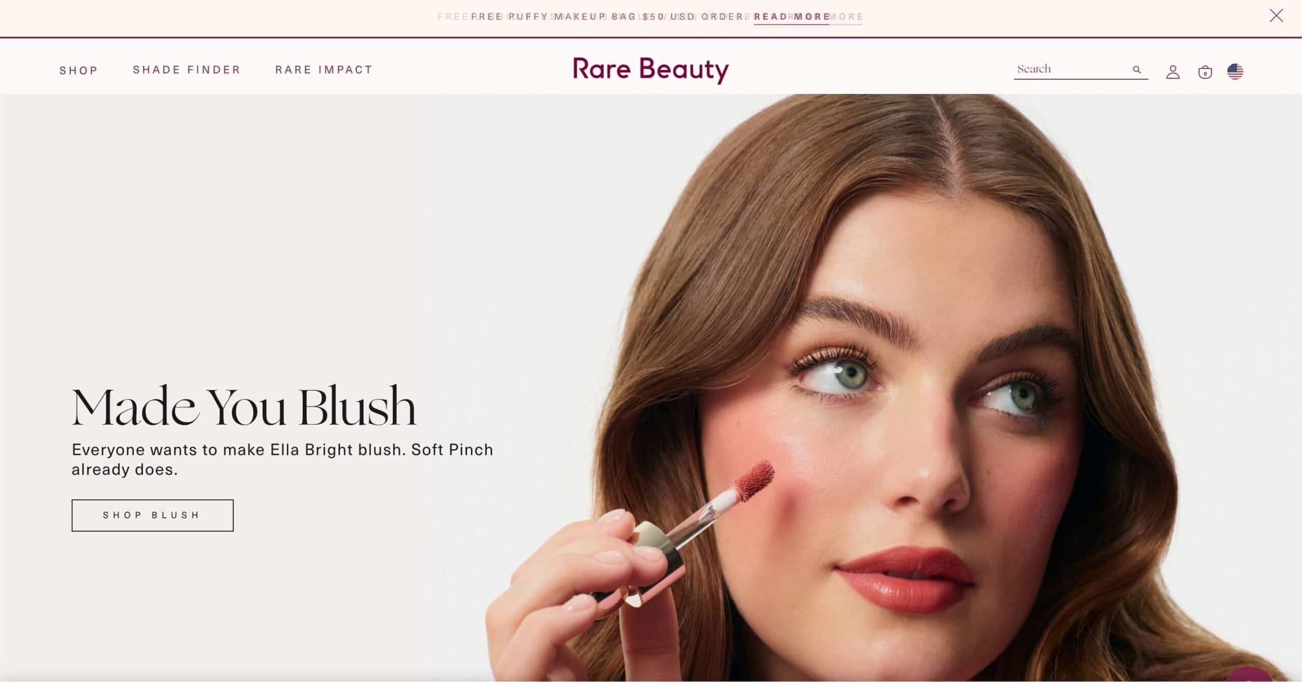
Rare Beauty by Selena Gomez is one of the few beauty brands that has made mental health part of its core product narrative. 1% of all sales go to the Rare Impact Fund for mental health resources. This isn’t a footer footnote; it’s built into the store’s messaging architecture.
What they do right
- “1% to mental health” appears in the site header on every page, making the mission visible at every point in the customer journey, not just on an About page
- Product descriptions deliberately avoid perfection language. The Soft Pinch Blush description says “made to look like you, not a filter”, which speaks directly to the anti-heavy-makeup customer segment
- Lightweight formula positioning (“buildable, not mask-like”) targets people who have been disappointed by heavy makeup products, turning a category pain point into a purchase reason
- The store’s photography uses minimal retouching and shows products on a wide range of skin tones across all product pages, not just on diversity-focused landing pages
15. The Honey Pot (Plant-based feminine and personal care | US | B-Corp)
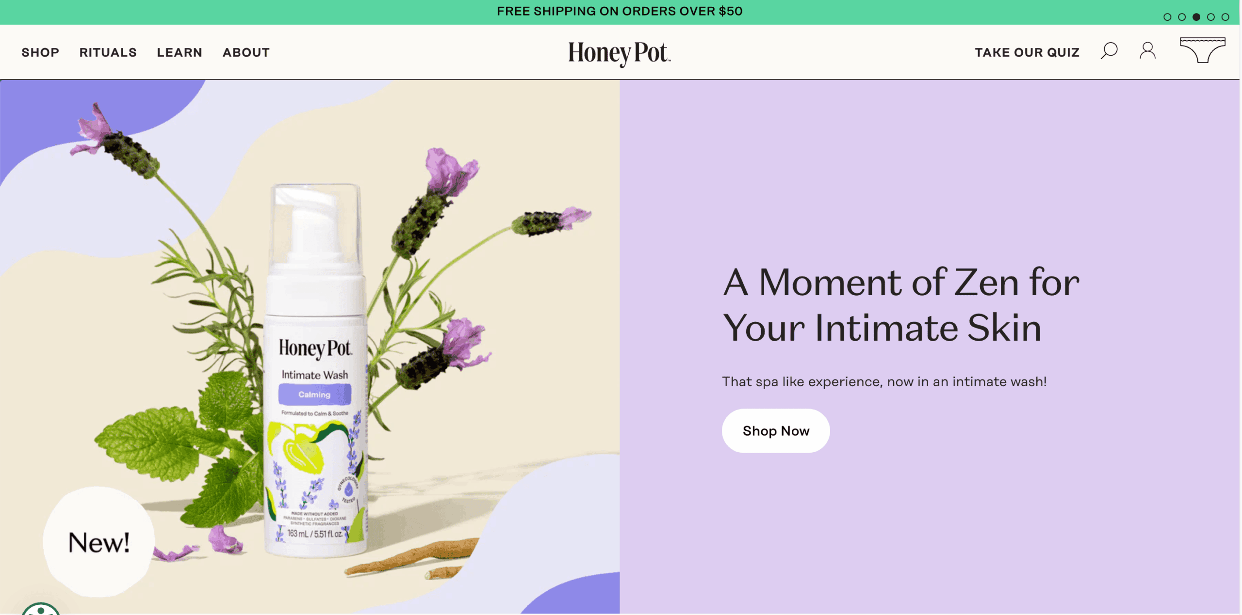
The Honey Pot Company is a plant-based feminine care and personal care brand founded by Bea Dixon. The brand is B-Corp certified and women-of-color-founded, and the Shopify store makes both facts visible early in the customer journey rather than saving them for an About page.
What they do right
- Every product page includes an “ingredient transparency” section that lists each plant-based ingredient and what it does in plain language, not INCI names alone
- Education-first content structure: blog articles about vaginal pH, plant ingredients, and product use cases are linked from product pages, turning content into a purchase driver
- B-Corp certification badge and “women-of-color-founded” flag are placed above the product description, not in the footer, appealing to value-aligned buyers before they read product details
- Subscription model for consumable products (period care, wash) is presented as the primary option with a clear per-unit price comparison, making the subscription math obvious
Design Patterns the Best Beauty Stores Share
After analyzing high-performing Shopify stores, five conversion patterns appear consistently across the best performers. These are not design trends. They are proven conversion architecture decisions that increase engagement, build trust, and improve purchase intent.
Benefit-first hero sections
Top-performing stores lead with the customer’s desired outcome instead of the product name. Headlines communicate the benefit first, while the product name appears as supporting information. A benefit-focused hero consistently outperforms brand-first messaging.
Trust layer before reviews
Certifications, awards, media mentions, and expert endorsements placed between the product description and customer reviews reassure visitors before they continue scrolling. This placement reduces hesitation and increases confidence.
Color used as navigation
Successful stores use background colors and section dividers to guide attention through the page instead of decorating it. Color changes naturally separate benefits, testimonials, FAQs, and purchase sections, improving readability.
Video before image galleries
A short product demonstration video placed before static product images helps shoppers understand the product faster, answers common questions, and reduces purchase uncertainty before they reach reviews.
Routine-based merchandising
Instead of selling products individually, leading stores present them as part of a routine or complete solution. This naturally encourages bundles, cross-sells, and higher average order value.
Inclusive product imagery
Showing products across different skin tones, lifestyles, or real-world scenarios helps more shoppers identify with the product, increasing click-through rates and purchase confidence.
Best Shopify Themes for Beauty Stores
The stores on this list use a range of themes from free to $350. The right choice depends on catalog size, editorial content volume, and whether you need a lookbook or a shade finder built into the theme architecture. See the full breakdown in our guide to the best free Shopify themes.
| Theme | Cost | Best For | Key Beauty Features |
|---|---|---|---|
|
Sense
Free
|
Free | Skincare, wellness, indie beauty brands | Clean product swatches, soft typography, elegant card layouts, and photography-focused product pages. |
|
Refresh
Free
|
Free | Beauty brands focused on storytelling and editorial layouts | Large hero imagery, bold typography, built-in testimonials, and immersive content sections. |
|
Dawn
Free
|
Free | Multi-product beauty stores with limited budgets | Fast performance, clean collection pages, good swatch support, and excellent customization. |
|
Prestige
Paid
|
$350 (one-time) |
Luxury brands and premium editorial experiences | Lookbooks, editorial layouts, video support, premium typography, and advanced color customization. |
|
Showcase
Paid
|
$350 (one-time) |
Visual-first brands with smaller product catalogs | Immersive product galleries, portfolio-style collections, and excellent mobile browsing experience. |
Tip: If you’re using Prestige or Showcase, the built-in lookbook section pairs perfectly with Essential Grid for Pinterest-style product discovery. Follow our complete guide on creating a Shopify lookbook for the full setup.
How to Build a Visual Gallery Like These Stores
The product galleries on the top beauty stores are not built with Shopify’s default collection grid. They use one of three approaches: Essential Grid (app), a custom slider, or an image carousel. Here’s how to build each:
1. Set up a product image carousel for shade browsing: Use the Shopify image carousel to display close-up shade swatches on a single product page. Each slide shows the shade on a different skin tone. This approach works without a dedicated shade-finder app and improves time-on-page significantly.
2. Add a lookbook or lifestyle gallery section: Essential Grid creates a masonry or uniform grid layout for lifestyle photography. Install Essential Grid from the Shopify App Store, add an app block to your theme, and point it at a collection or a manual list of images. Full walkthrough in our Shopify lookbook guide.
3. Set up a video gallery for application content: Product application videos (how to apply, blend, layer) placed in a video carousel on collection and product pages reduce return rates and increase time on product page. Use Shopify’s native video section or the Slider Revolution Sections app for auto-playing hero videos.
4. Add a product slider for “complete the routine” upsells: A horizontal product slider showing complementary products (“pairs well with”) placed below the add-to-cart section increases average order value without using an aggressive popup. Use the Slider Revolution Sections app or EasyBoost to set this up without code.
Image sizing note: Beauty product images should be square (1:1) at a minimum of 2048 × 2048px, saved as WebP, and kept below 300KB. Before uploading, review the recommended Shopify image size specifications for banners, collections, and product thumbnails.
Common Issues with Shopify Beauty Store Setups
Shade swatches display correctly but the main product image doesn’t change
Assign an image to every product variant in Shopify. Open Products, select the product, edit each variant, and attach the corresponding image. Variant swatches only update the gallery when each option has its own assigned media.
Product images look sharp on desktop but blurry on mobile
This usually happens when responsive image markup isn’t being used. Verify your theme outputs images with Shopify’s image_tag and image_url filters so the CDN serves the correct image size for each device automatically.
Skin quiz or shade finder apps aren’t loading on mobile
Many quiz apps are blocked by cookie consent platforms until permission is granted. Check your consent manager and classify the quiz script as Functional instead of Marketing so it can load immediately.
Frequently Asked Questions
What platform do most top beauty brands use for their online store?
Shopify is the most common platform among direct-to-consumer beauty brands, including Fenty Beauty, Glossier, Kylie Cosmetics, Rare Beauty, Tarte, and OPI. Shopify Plus is typically used by brands above $1 million in monthly revenue, while standard Shopify plans cover the majority of indie and mid-market beauty brands.
Which Shopify themes work best for beauty stores?
Sense and Refresh are the strongest free options for beauty and skincare. Sense handles color swatches and product-focused photography well. Refresh suits brands with editorial content and a brand story. For larger catalogs with editorial layout needs, Prestige ($350 one-time) is the most-used paid theme among established beauty brands on Shopify. See our free Shopify themes guide for a full comparison.
Do top Shopify beauty stores use custom themes?
Most do not. Fenty Beauty, Glossier, and Kylie Cosmetics all use modified versions of established themes rather than fully custom builds. The modifications are typically at the section level (custom app blocks, custom liquid snippets) rather than a full theme rewrite. This approach is faster to maintain and easier to update when Shopify releases new features.
What makes beauty store UX different from general ecommerce?
Three things: (1) Shade and variant uncertainty is much higher in beauty than in most product categories, requiring more visual proof (swatches on multiple skin tones, application videos) and quiz/finder tools. (2) Trust signals are more important because customers are applying products to their skin or face, so certifications (cruelty-free, dermatologist tested, ingredient transparency) carry more weight. (3) Repurchase rates are much higher in beauty, which makes subscription UX and loyalty program visibility worth investing in earlier than in most other categories.
Is Shopify good for selling cosmetics and beauty products?
Yes. Shopify handles the requirements specific to beauty well: variant management for shades and sizes, subscription billing for consumables (cleansers, serums, period care), high-resolution image hosting with CDN delivery, and app integrations for shade finders, loyalty programs, and reviews. Shopify Plus adds features like checkout extensibility for custom trust badges and loyalty redemption at checkout, which is used by most Shopify beauty brands above $5M revenue.
Build a Beauty Store Gallery That Converts
Essential Grid and EasyBoost work inside any Shopify theme to create lookbook-style product galleries, video showcases, and product discovery layouts used by leading beauty brands. No coding required.

I’m a digital marketing expert with a deep understanding of Shopify App Store optimization. I contribute insightful articles on Shopify to help businesses thrive online.