
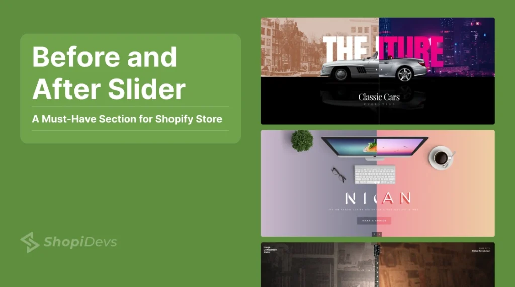
A before-and-after slider lets shoppers drag a handle to compare two images side by side. It is one of the highest-converting visual elements you can add to a Shopify store because it shows product results without requiring the customer to read a word.
The problem is that Shopify’s Dawn theme does not include a native before-and-after slider section. That means most merchants end up searching for the right approach, and the options are not obvious.
There are three ways to add one: using an OS 2.0-compatible app block, using Slider Revolution’s dedicated before-after add-on, or writing a lightweight Liquid and CSS implementation. Each method has a different setup time, cost, and level of customization.
This guide covers all three with step-by-step instructions, screenshots, a real app comparison table, and optimization tips so your slider does not slow your store down.
A Shopify before-after slider lets shoppers compare two images by dragging a handle. Shopify doesn’t include one by default. You can add it with an OS 2.0 app block (easiest), Slider Revolution’s Before After addon (most customizable), or a custom Liquid section (free, requires coding).
Key Takeaways
- Dawn theme has no built-in before-after slider.
- OS 2.0 app blocks offer the fastest no-code setup.
- Slider Revolution provides the most design flexibility.
- Custom Liquid is free but requires theme editing.
- Use WebP images and lazy loading for better performance.
What Is a Before After Slider in Shopify

A before after slider is an interactive section that overlays two images with a draggable divider called a scrubber. Users move the scrubber left or right to reveal more of either image. The technical implementation typically uses a range input element in HTML, CSS absolute positioning for the overlay, and a small JavaScript listener that updates the overlay width in real time.
In the context of a Shopify store, a before after slider is used on product pages, homepages, and landing pages to show transformations: a room before and after furniture placement, skin before and after a serum, a car before and after detailing. It replaces a paragraph of benefit claims with a visual that speaks for itself.
The component is sometimes called an image comparison slider, comparison widget, or split-view slider. All of these refer to the same interactive element.
Why It Works for Online Stores

Before and after sliders work because they make abstract product claims real. Instead of saying a product “improves skin texture,” you show the difference. The interactive drag keeps visitors engaged longer than a static image, which signals quality time on page to search algorithms.
Here is what a well-placed before-and-after slider does for a store:
- Proves product effectiveness. Visual evidence converts better than written claims. A skincare brand showing before and after results on the same product page reduces the need for reviews to do all the persuasion work.
- Increases time on page. The drag interaction keeps users active rather than passive. Active users convert at a higher rate than passive ones.
- Reduces return rates. When customers know what to expect from a product, they are less likely to be disappointed after purchase.
- Works across industries. Beauty, fitness, home decor, automotive, fashion, and food all have before and after stories worth telling visually.
- Pairs with compare at price logic. Showing the visual transformation alongside a sale price compounds the conversion argument.
How To Add Before After Slider Shopify with Slider Revolution?
The before-and-after slider is not a basic feature included in all Shopify themes. While some Shopify themes offer the before-and-after slider option, many popular themes, like Dawn, lack this functionality.
Therefore, merchants and shop owners who do not have technical or coding skills often look for Shopify apps that save time and effort by providing ready-made slider templates and advanced customization tools.
In this regard, the Slider Revolution & Section app is the best available in the Shopify App Store, and you can undoubtedly rely on it.
Method 1: Native OS 2.0 App Block (Fastest Setup)
Several Shopify apps deliver a before-after slider as a native app block in the Shopify theme editor. This means you drag the block into any section of any Online Store 2.0 theme, just as you would add a text or image block. No shortcodes, no page builders, no extra configuration outside the editor.
Apps that support this include Snap: Before and After Slider, AOD Before After Widget, and SupaSlider. Most have a free plan that covers basic use.
Install a before after slider app from the Shopify App Store
Search for “before after slider” in the Shopify App Store. Select an app that shows the OS 2.0 badge confirming it supports native app blocks. Snap, AOD, and SupaSlider all meet this requirement. Install the app and approve any permissions it requests.
Open the Shopify theme editor
In your Shopify admin go to Online Store, then Themes, then click Customize next to your active theme. Navigate to the page where you want the slider to appear.
Add the app block to your page
Click Add section or Add block depending on where you want the slider. Under the Apps section in the block list you will see the before after slider block from the app you installed. Click it to add it to the page.
Upload your before and after images
In the block settings panel on the right, upload your before image and your after image. Use images with the same dimensions, angle, and framing. An inconsistent crop between the two images makes the comparison look amateurish and hurts credibility. See our image size guide for Shopify for recommended dimensions.
Set the starting position and save
Most apps let you set the default scrubber position (commonly 50/50). Set it, preview the result on both desktop and mobile, then click Save.
Method 2: Slider Revolution (Most Customization)

Slider Revolution & Sections is the most feature-complete option for merchants who want full control over style, animation behavior, text overlays, and slide transitions. It ships with a dedicated Before-After add-on and a library of ready-made comparison templates. You do not need to know code to use it.
There are two ways to create a before-after slider in Slider Revolution: start from a blank slider and activate the add-on, or install a ready-made template from the library.
Both methods are covered below.
Step 1: Open Slider Revolution
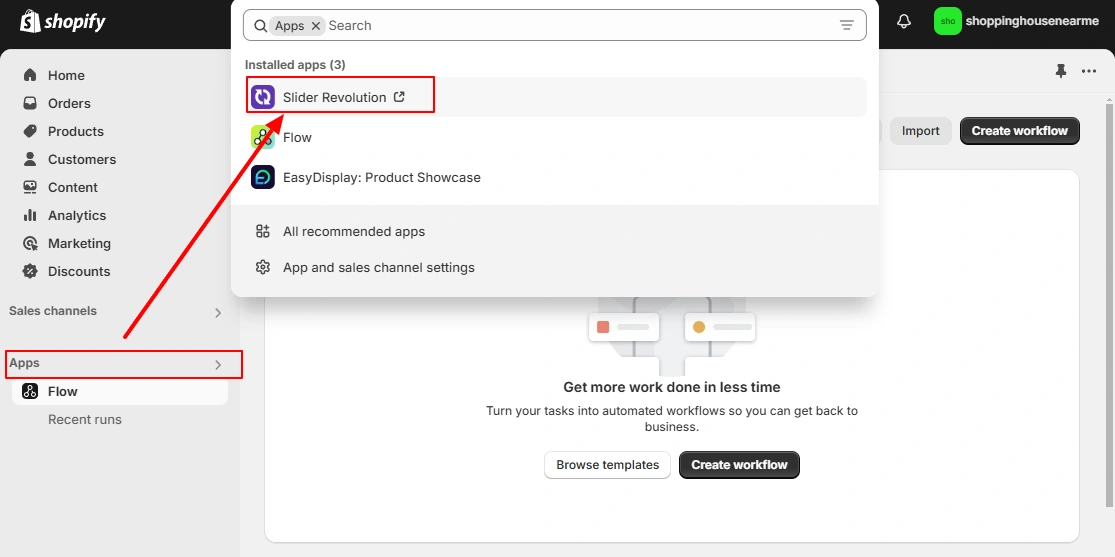
In your Shopify admin, go to Apps and select Slider Revolution. If you have not installed it yet, get it from the Shopify App Store.
Step 2: Create your slider
Slider Revolution gives you two creation paths:
Path A: Blank Slider (Build from Scratch)
1. Select Start from Scratch

On the Slider Revolution dashboard click Start from Scratch. This opens the editor with a blank canvas.
2: Activate Before After Slider Addon
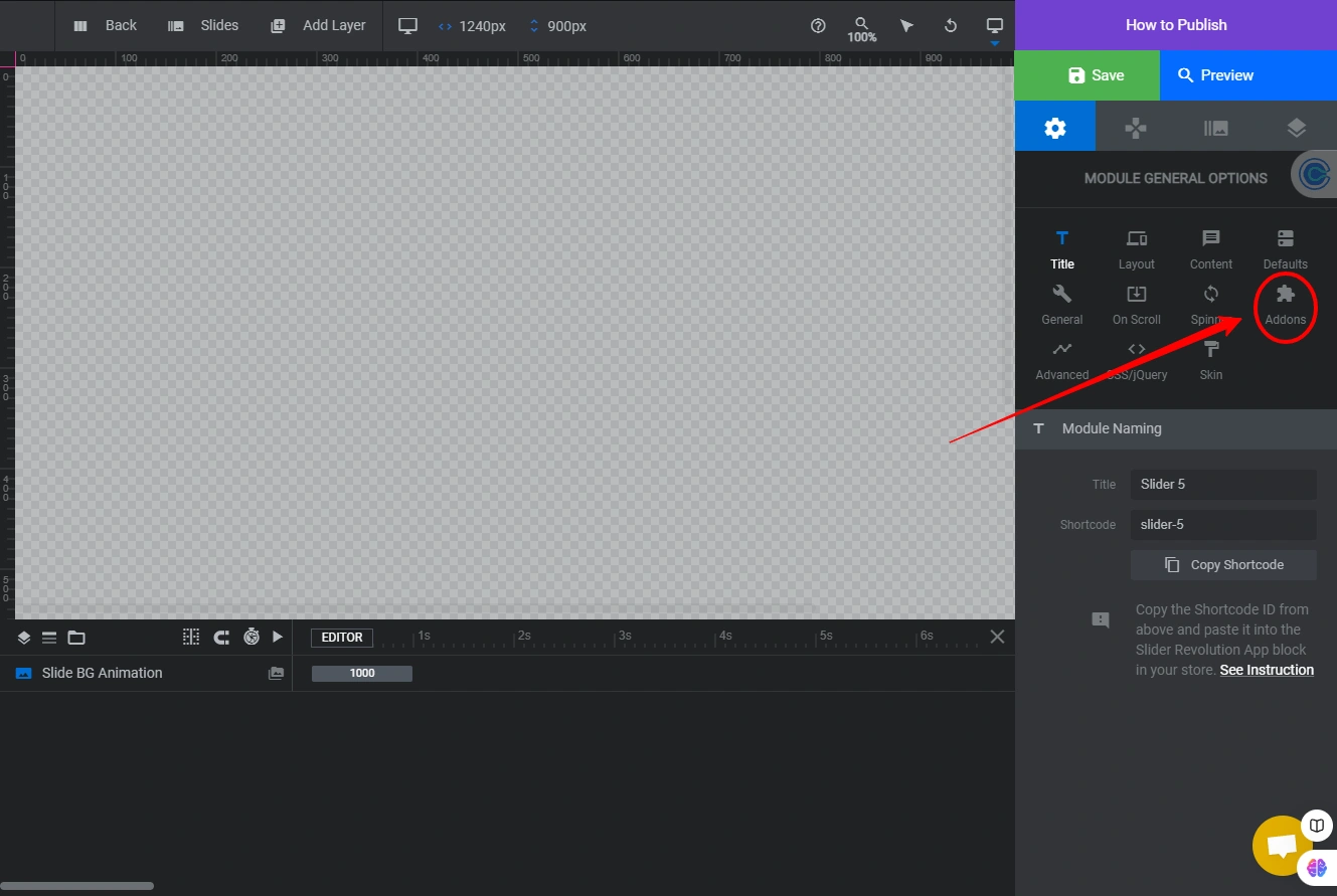
Click the Addons icon on the right sidebar. This opens the addon library.
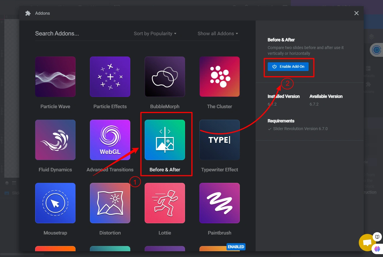
Find the Before & After addon and click Enable Add on.
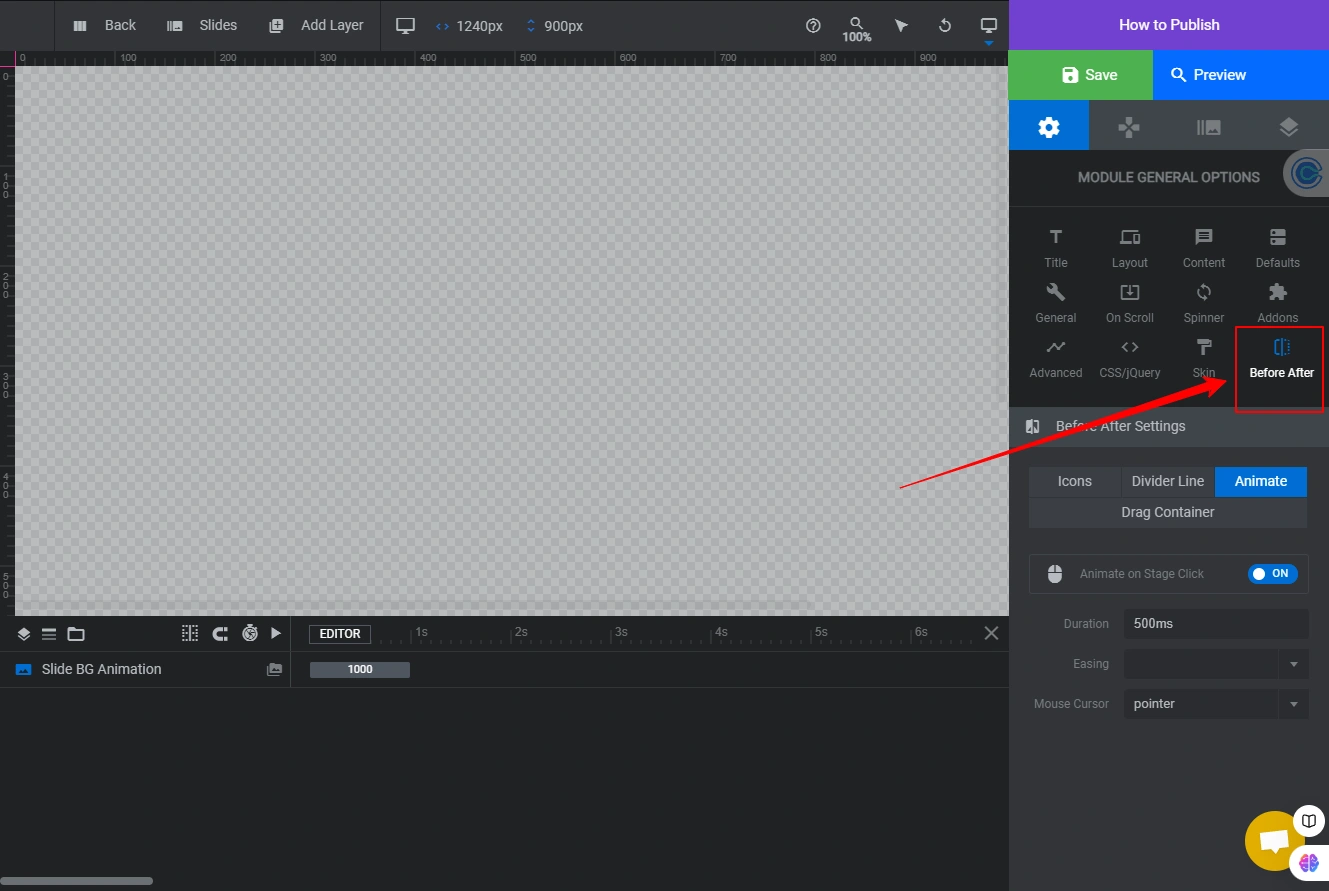
After activation, the Before After settings panel appears on the right side of the editor. This is where you control the scrubber icon, divider line, animation, and drag container behavior.
Path B: Template from Library (Faster)
1. Select a new slider from the template
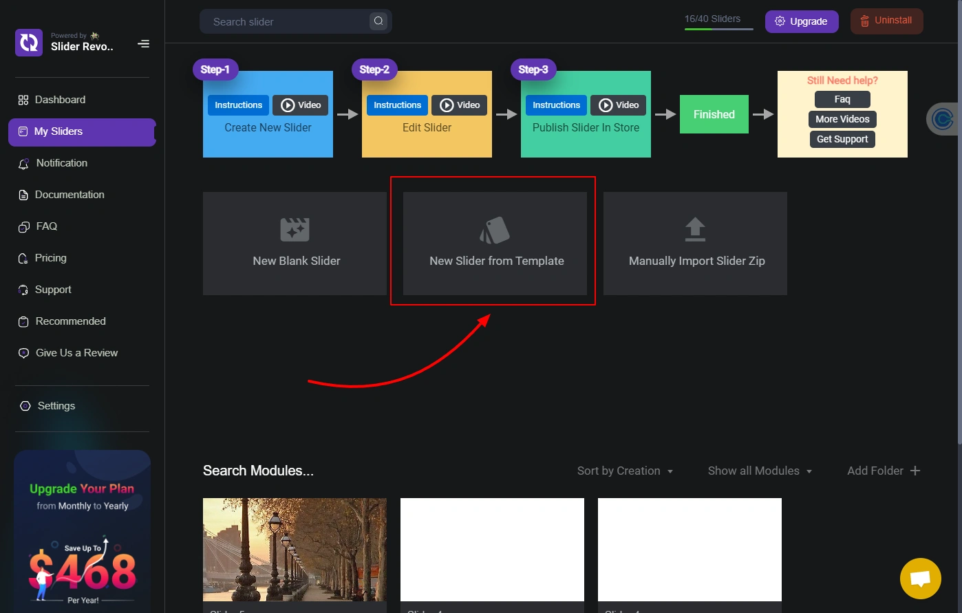
On the Slider Revolution dashboard, click New Slider from Template. This opens the template library.
2: Search for a Before After Template
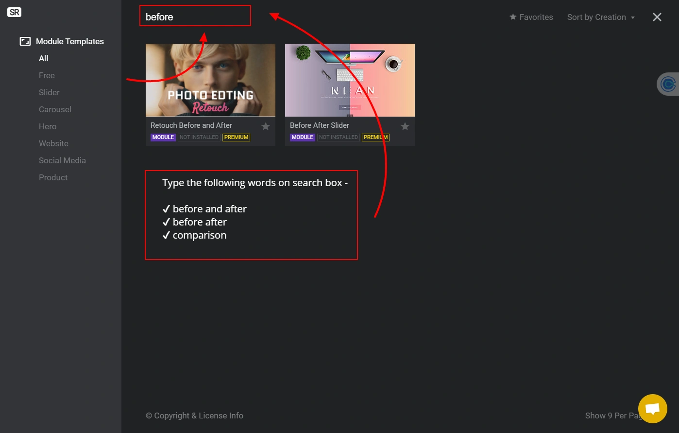
In the search box type before after or comparison to filter relevant templates.
3: Install and Open the Template
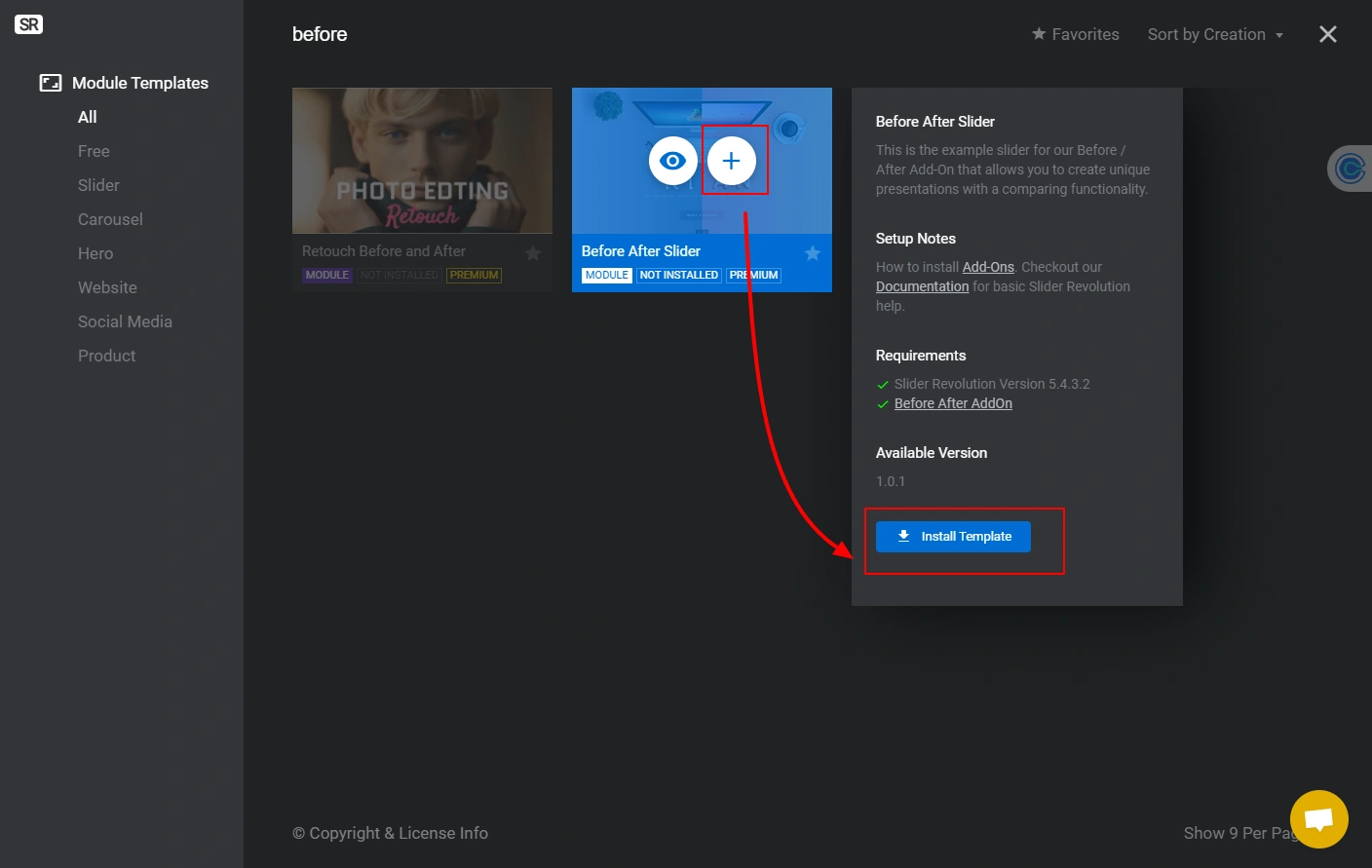
Click the Plus icon on your chosen template and then click Install Template.
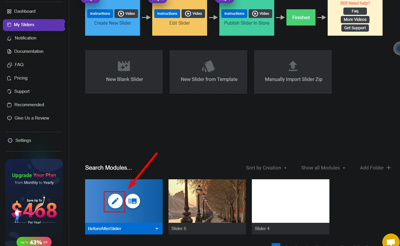
Go to My Sliders and click the Pencil icon to open the template in the editor.
Step 3: Before and after slider settings

Slider Revolution gives you two levels of customization for the before-after slider:
- Module General Options: Click the Settings icon and select Before After. Here you can set the Scrubber Icon, Divider Line style, Animate behavior, and Drag Container dimensions.
- Slide Options: Click the Media icon and select Before After. This controls General Settings, Start and End Animation, Teaser Settings, and Arrow Settings for each individual slide.
Background setup
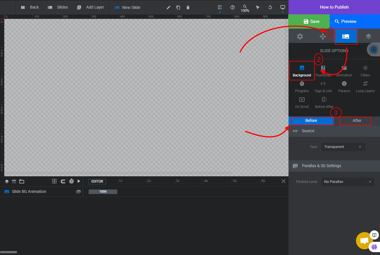
Click the Media icon on the right sidebar, then click Background. Select either the Before or After slide to configure it separately.
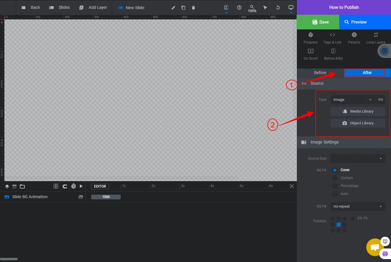
Click the Media icon on the right sidebar, then click Background. Select either the Before or After slide to configure it separately.
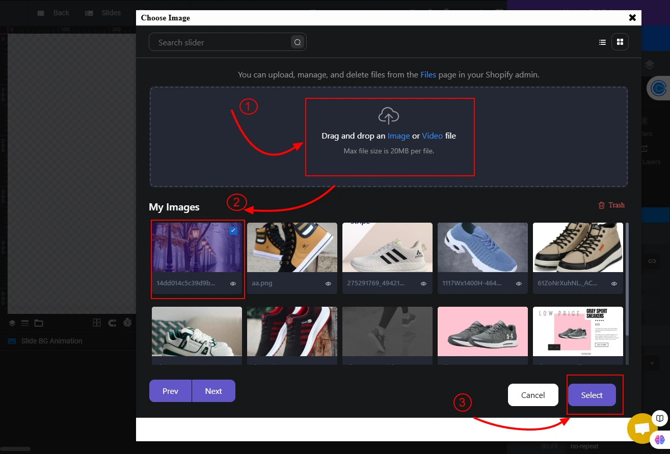
Drag and drop your image into the upload box or click the image text to browse your files. When the upload finishes, select the image from My Images and click Select.

If you prefer a color background instead of an image, set Type to Colored and pick your color from the color picker.

Add Text to a Slide
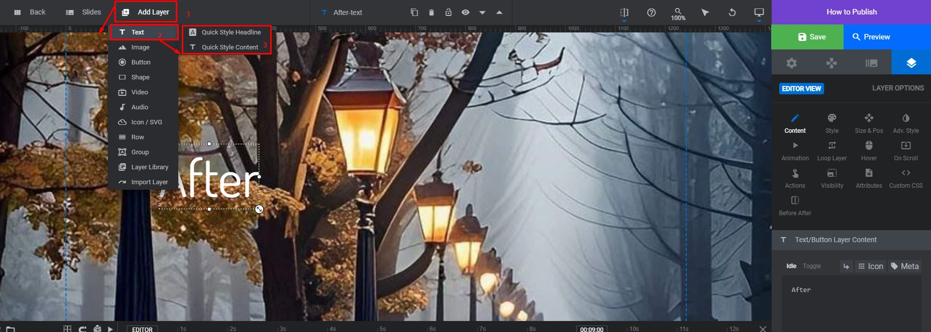
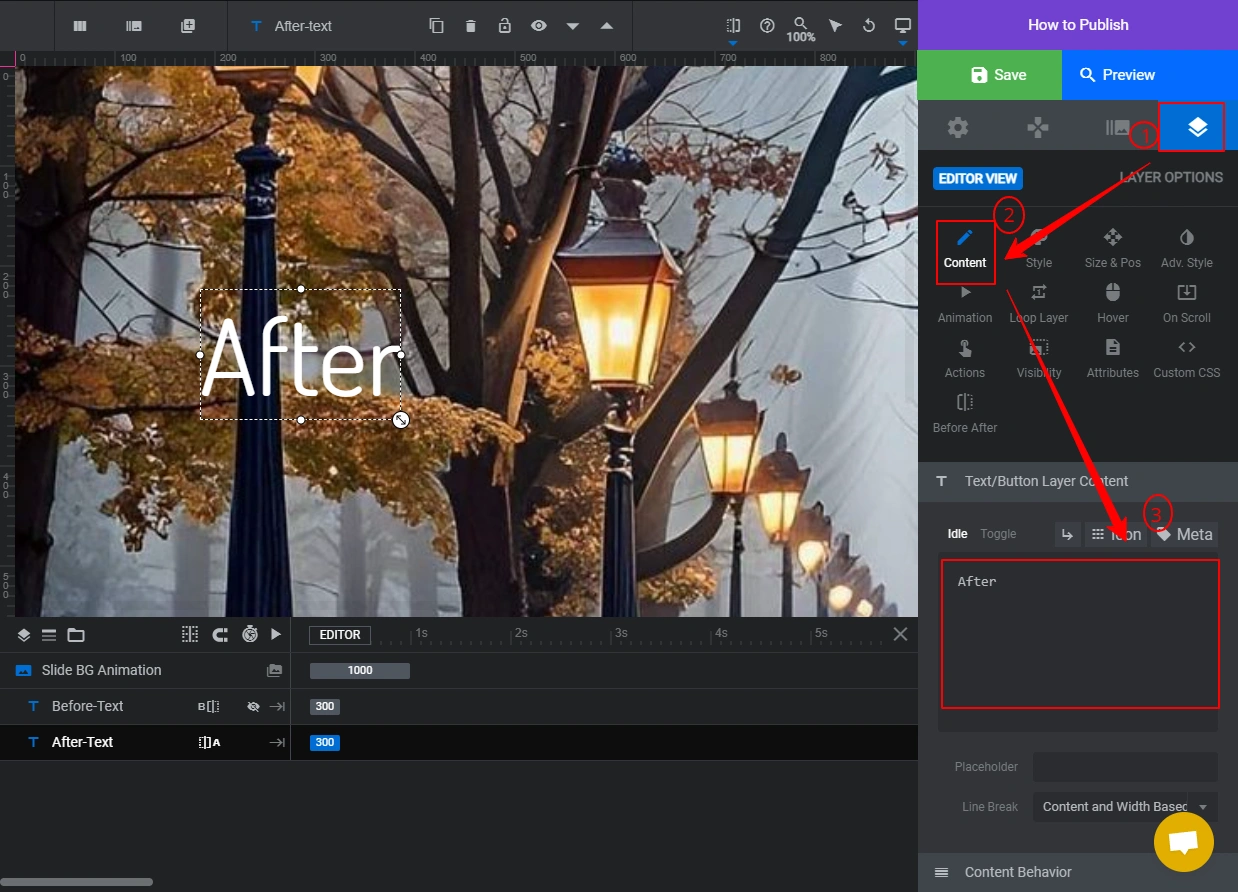
Click Add Layer in the top bar and select Text. Type your label in the Text Box under the Content option. Use text layers to add “Before” and “After” labels that help users understand which state they are seeing.
Add an Image Layer
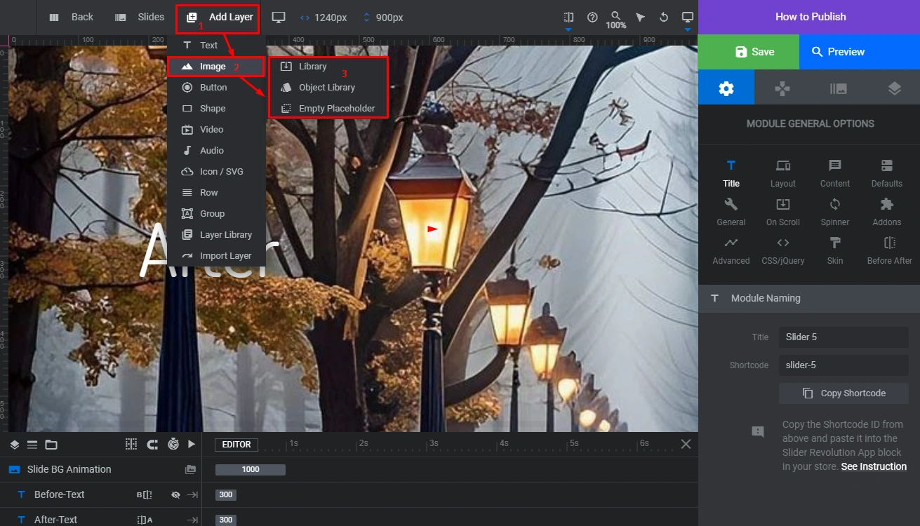
To overlay an image on a slide, click Add Layer, then Image, then Library. Upload your image, select it, and click Select.
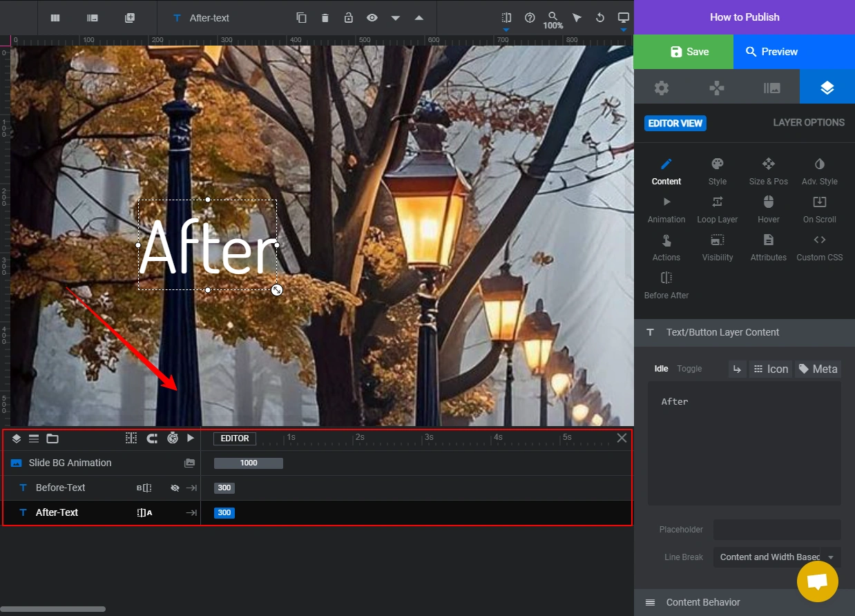
Use the editor controls at the bottom of the page to adjust layer placement, movement direction, sliding duration, and visibility behavior on different devices.
Scrubber Customization
The scrubber is the draggable handle that users move to compare the two images. In a before-after slider, the scrubber is the key interactive element, so its size, style, and position matter for usability.
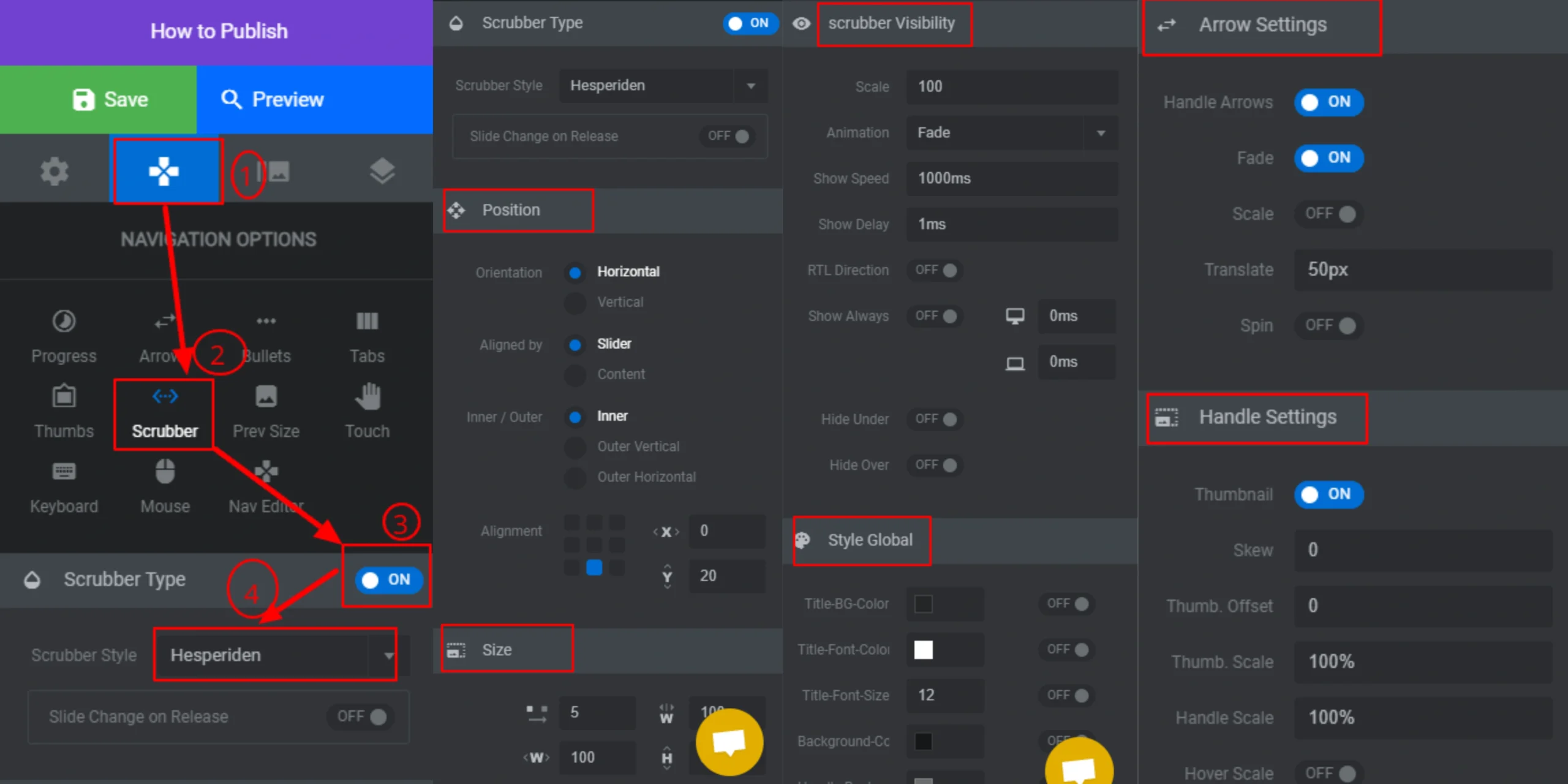
To customize the scrubber, go to Navigation Options on the right sidebar and click Scrubber. Enable the Scrubber Type toggle and select a style. From this panel you can also set Scrubber Position, Size, Visibility, Arrow Settings, and Handle Settings.
Switch Between Slides
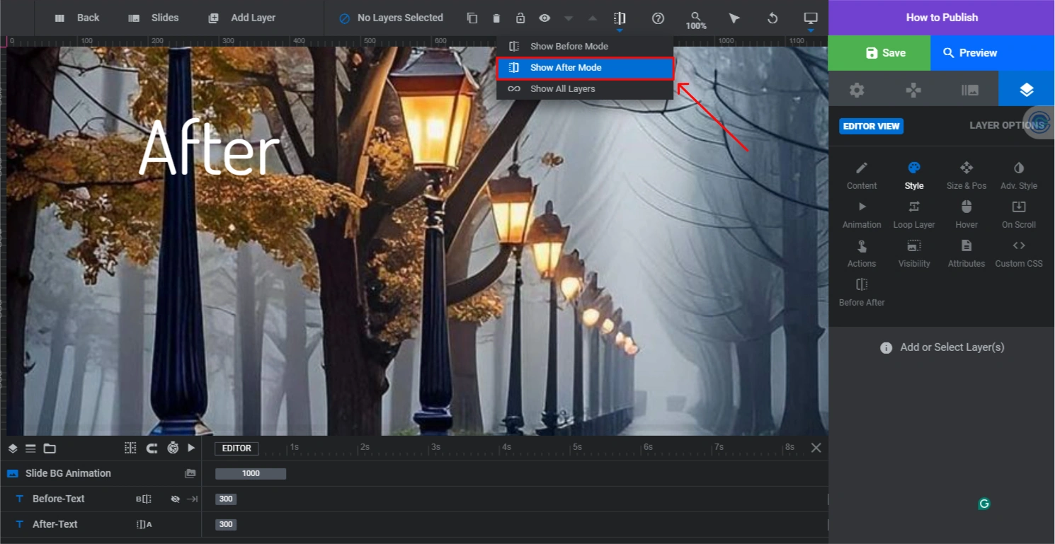
Click the Divided Slider icon in the top bar to toggle between the Before and After slides. Complete the customization for one side, then switch to finish the other.
Design Tip: Use Show All Layers

Enable Show All Layers to see the text layers from both slides at the same time. This makes it easy to match font, size, and position between the Before and After labels so they look consistent when the scrubber moves.
Step 4: Publish the Slider

After saving your slider, copy the Shortcode from the Slider Revolution editor.

In your Shopify admin, go to Online Store, then Themes, then click Customize.
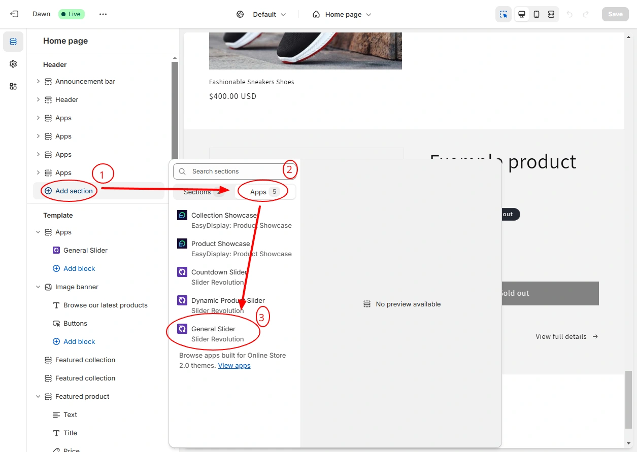
Navigate to the page section where you want the slider. Click Add Section, then select Apps, then choose General Slider.

Paste your shortcode into the Slider Shortcode field in the right panel and click Save. The before after slider will now appear live in your store at that section position.
Output Preview
Method 3: Liquid + CSS Code (No App Required)
If you do not want to add another app to your store, you can build a functional before after slider with Liquid, CSS, and a small JavaScript block. This method has no monthly cost and adds minimal script weight to the page. It requires basic comfort with editing Shopify theme files.
1. Create a new section file in your theme
In your Shopify admin, go to Online Store, then Themes, then click the three-dot menu next to your active theme and choose Edit Code. Under Sections, create a new file called before-after-slider.liquid.
2. Add the slider code
Paste the following code into the new file:
<div class="ba-slider-wrap">
  <img
    class="ba-img ba-before"
    src="{{ section.settings.before_image | img_url: 'master' }}"
    alt="{{ section.settings.before_label | default: 'Before' }}"
    loading="lazy"
  >
  <div class="ba-after-overlay" style="width: 50%;">
    <img
      class="ba-img ba-after"
      src="{{ section.settings.after_image | img_url: 'master' }}"
      alt="{{ section.settings.after_label | default: 'After' }}"
      loading="lazy"
    >
  </div>
  <span class="ba-label ba-label-before">{{ section.settings.before_label | default: 'Before' }}</span>
  <span class="ba-label ba-label-after">{{ section.settings.after_label | default: 'After' }}</span>
  <input class="ba-handle" type="range" min="0" max="100" value="50" aria-label="Image comparison slider">
</div>

<style>
.ba-slider-wrap {
  position: relative;
  display: block;
  overflow: hidden;
  line-height: 0;
  border-radius: 8px;
  user-select: none;
}
.ba-img {
  display: block;
  width: 100%;
  height: auto;
  border-radius: 0;
  margin: 0;
}
.ba-after-overlay {
  position: absolute;
  top: 0; left: 0;
  height: 100%;
  overflow: hidden;
}
.ba-after-overlay .ba-after {
  width: auto;
  max-width: none;
  min-width: 100vw;
}
.ba-label {
  position: absolute;
  top: 12px;
  background: rgba(0,0,0,0.55);
  color: #fff;
  font-size: 12px;
  font-weight: 700;
  padding: 3px 10px;
  border-radius: 4px;
  text-transform: uppercase;
  letter-spacing: 0.5px;
  pointer-events: none;
}
.ba-label-before { left: 12px; }
.ba-label-after { right: 12px; }
.ba-handle {
  position: absolute;
  bottom: 0; left: 0;
  width: 100%;
  height: 100%;
  opacity: 0;
  cursor: ew-resize;
  margin: 0;
}
</style>

<script>
document.querySelectorAll('.ba-handle').forEach(function(handle) {
  handle.addEventListener('input', function() {
    var wrap = this.closest('.ba-slider-wrap');
    wrap.querySelector('.ba-after-overlay').style.width = this.value + '%';
  });
});
</script>

{% schema %}
{
  "name": "Before After Slider",
  "settings": [
    { "type": "image_picker", "id": "before_image", "label": "Before image" },
    { "type": "image_picker", "id": "after_image",  "label": "After image"  },
    { "type": "text", "id": "before_label", "label": "Before label", "default": "Before" },
    { "type": "text", "id": "after_label",  "label": "After label",  "default": "After"  }
  ],
  "presets": [
    { "name": "Before After Slider" }
  ]
}
{% endschema %}3. Add the section to your page
Save the file. Go to Online Store, then Themes, then Customize your active theme. Navigate to the page where you want the slider and click Add Section. You will see Before After Slider in the section list. Add it, upload your before and after images from the section settings panel, and click Save.
App Comparison: Before After Slider Options for Shopify
The table below covers the main before after slider options available in the Shopify App Store. Use it to pick the right tool based on your budget, technical setup, and customization needs. This comparison is separate from the Shopify product slider and image carousel categories, which serve different layout purposes.
If you need a slider that goes beyond simple image comparison and includes animations, text layers, video backgrounds, or multi-slide sequences, Slider Revolution is the right choice. If you need a static, lightweight comparison on one page and want to skip the monthly fee, the custom Liquid method or a free app block works fine.
Where to Place a Before After Slider on Your Shopify Store
Placement determines whether a before after slider drives conversions or just looks good. Put it where visitors are making a purchase decision, not as a decorative element in the footer.
Homepage Hero Section
Works well for brands where the transformation is the core product promise, such as skincare, cleaning products, or home improvement. Place it above the fold so visitors immediately understand the product benefit.
Product Page
Place the slider below the main product gallery and above the description. Visual comparisons often convert better than feature lists. Pair it with a product banner above it.
Landing Page
Use before-after sliders on campaign pages and product launches. Combine them with a countdown banner to add urgency and boost conversions.
You can also add a before after slider to a dedicated results or case study page to build trust before checkout. This works especially well in fitness, beauty, and professional services.
How to Optimize a Before After Slider for Performance
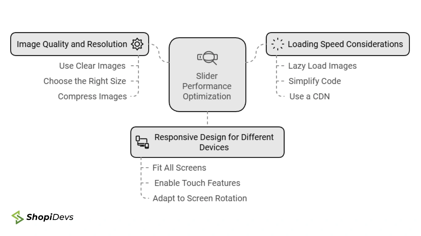
A before after slider loads two images instead of one. If you do not optimize it properly, it will slow your page and hurt your Core Web Vitals score. These are the steps that matter:
1. Use WebP Format and Compress Before Upload
Convert both images to WebP before uploading. WebP files are 25 to 35 percent smaller than JPEG at the same visual quality. Use a tool like TinyPNG or Squoosh to compress the files further. For the slider to look sharp on Retina screens, upload at 2x the intended display width. If the slider displays at 800px wide, upload at 1600px. For full guidance on Shopify image formats, see our image size guide.
2. Add the Loading=”Lazy” Attribute
If your slider is below the fold, add loading=”lazy” to both image tags. This stops the browser from loading the slider images until the user scrolls near them, which improves your Largest Contentful Paint score. The Liquid code example in Method 3 already includes this attribute.
3. Keep Both Images the Same Dimensions
Inconsistent image dimensions between before and after cause layout shifts when the scrubber moves. Always crop both images to the same pixel width and height before uploading. For advice on consistent cropping and aspect ratios, refer to our guide on how to organize products on Shopify.
4. Test on Mobile Before Publishing
Before after sliders depend on drag interaction. On mobile, the user taps and swipes rather than clicks and drags. Test your slider on an actual mobile device, not just the desktop preview in Shopify’s theme editor. Check that the scrubber responds to touch, the labels are readable, and the images do not overflow their container.
5. Set a Meaningful Default Position
The default scrubber position (typically 50/50) tells visitors what they are looking at before they interact. Consider setting it to 65/35 in favor of the “before” image so more of the problem state is visible first. This makes the “after” reveal more impactful when the user drags.
Before After Slider Use Cases by Industry
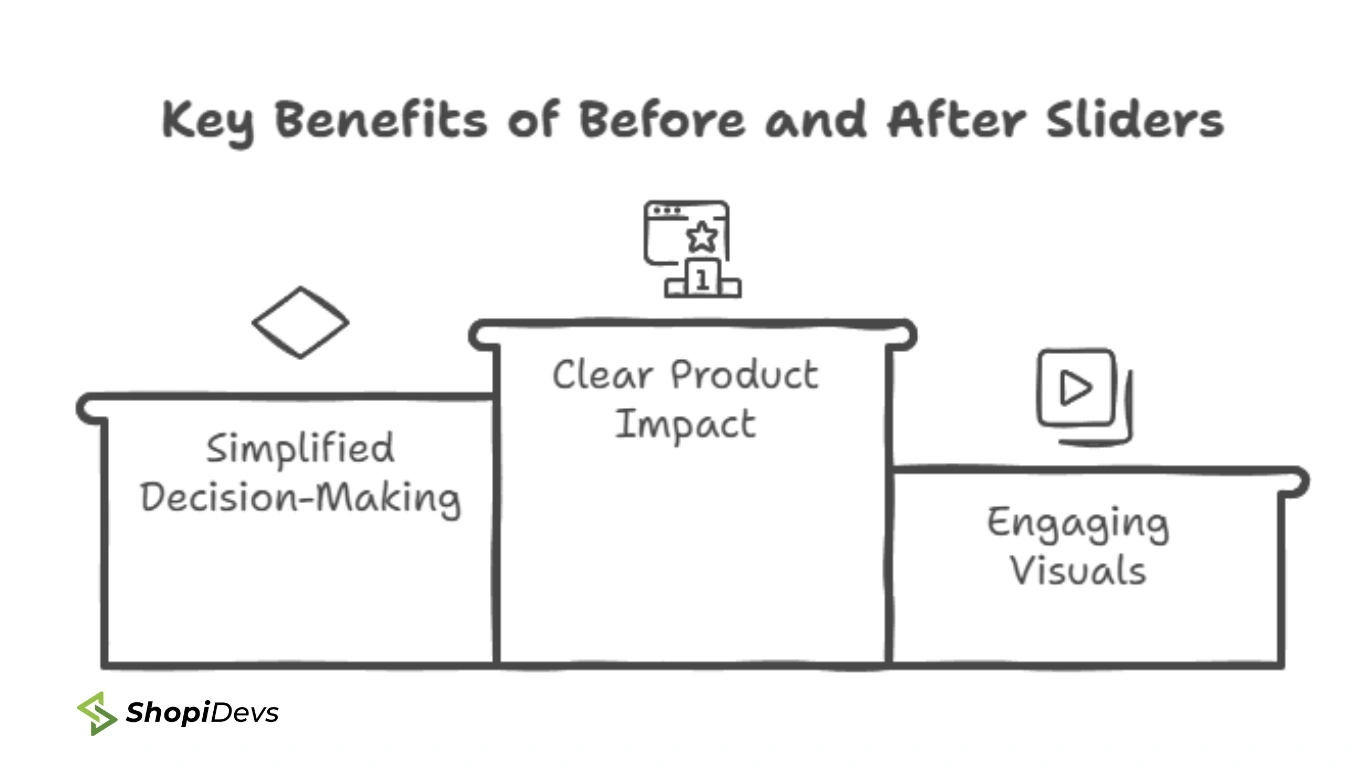
A before after slider applies to any product or service with a visible transformation. Here is how different industries use it:
If your product creates any visible change, a before after slider belongs on your product page. It is more persuasive than a review and faster to read than a paragraph. You can combine it with a video carousel for richer social proof, or use it alongside a photo gallery to give customers multiple angles of the result.
Slider Revolution Before After Templates


Slider Revolution ships with multiple before after and comparison slider templates. Both templates shown above are ready to install and customize with your own images. If you are already using Slider Revolution for a video banner section or video content, you can manage all your slider types from a single app dashboard without adding additional apps.
Add a Before After Slider to Your Shopify Store
Slider Revolution lets you build before after sliders, product carousels, video banners, and announcement sections from one dashboard. No coding required.
Everything built in. No apps to install.
Bundles, promos, a shoppable lookbook and a mega menu ship with the theme. Five EU languages, one-time payment, lifetime updates — and no monthly app fees eating your margin.
Get Snazzy →
Frequently Asked Questions
Does Shopify have a built-in before after slider?
No. Shopify’s default themes, including Dawn, do not include a native before after slider section. You need to add one using an app with an OS 2.0 app block, a dedicated slider app like Slider Revolution, or a custom Liquid and CSS implementation. Some third-party Shopify themes include a comparison slider out of the box, so check your theme documentation before installing an app.
What is the scrubber in a Shopify before after slider?
The scrubber is the draggable handle that divides the before image from the after image. Users move it left or right to reveal more of either state. In Slider Revolution, the scrubber is fully customizable: you can change its icon, size, position, arrow style, and animation behavior. In the custom Liquid method, the scrubber is built on a native HTML range input styled with CSS.
Can I add a before after slider without coding?
Yes. Both Slider Revolution and OS 2.0 app block solutions like Snap and AOD require no code. With Slider Revolution you use the visual editor to upload images, set the scrubber style, and add text overlays. With an app block you simply upload images in the Shopify theme editor. The Liquid and CSS method in Method 3 of this guide is the only approach that involves editing theme files.
Where should I position the before after slider on my Shopify store?
The three highest-converting placements are the homepage hero section, the product page below the main product images, and campaign landing pages. Place it where visitors are actively deciding whether to buy. A before after slider in the footer or on an About page gets far less engagement than one placed directly in the purchase decision flow.
What image size should I use for a before after slider on Shopify?
Both images should be the same pixel dimensions. A width of 1200 to 1600 pixels works well for a full-width slider on desktop. Use WebP format and compress files below 200KB each before uploading. Shopify automatically serves images at the appropriate size for the visitor’s screen, but starting with a large, well-compressed source file ensures quality on all devices. See our complete Shopify image size guide for more detail.

I’m a digital marketing expert with a deep understanding of Shopify App Store optimization. I contribute insightful articles on Shopify to help businesses thrive online.