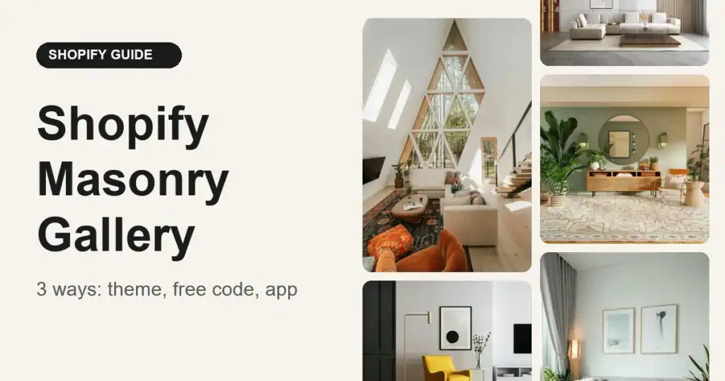
A masonry gallery places images in columns of equal width but unequal height, so tall and wide photos sit together without gaps. On Shopify you can build one with your theme’s own sections, with about 40 lines of free Liquid and CSS, or with a gallery app. The right choice depends on how much control you need and how much you want to maintain.
This guide walks through all three, shows the code for the free method, and states plainly where each one falls short.
Which method should you pick?
| Theme section | Free code | Essential Grid Gallery | |
|---|---|---|---|
| Real masonry layout | Rarely | Yes (CSS columns) | Yes |
| Setup time | 5 minutes | 20-30 minutes | 10-15 minutes |
| Coding needed | No | Yes (copy and paste) | No |
| Lightbox and zoom | Depends on theme | No (you add it) | Yes |
| Filters by collection or tag | No | No | Yes |
| Image order control | Standard grid order | Fills column by column | Drag and drop in the editor |
| Ongoing maintenance | Theme updates handle it | You maintain it | App updates handle it |
| Cost | Free | Free | Free plan available, paid plans for more |
Short version: use your theme if a uniform grid is fine, use the free code if you want a simple masonry gallery and are comfortable in the theme editor, and use an app if you need filters, a lightbox, or shoppable product tags.
What is a masonry gallery, and when does it beat a grid?
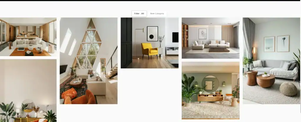
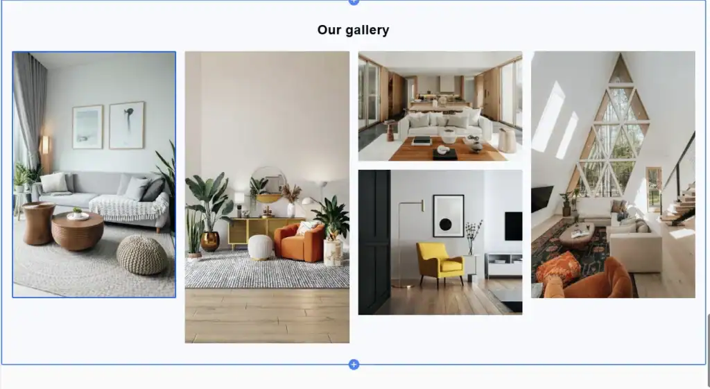
In a standard grid every cell has the same height, so images get cropped to fit. In a masonry layout each image keeps its own proportions and the columns fill from the top, like a Pinterest board.
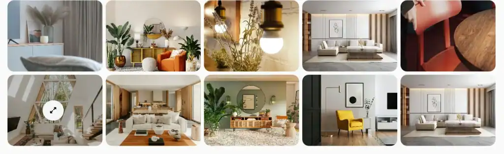
Masonry works best when:
- Your images have mixed orientations (portrait, landscape, square), such as lifestyle photos or customer content.
- You do not want to crop products or people.
- The gallery is about browsing and inspiration, not comparing products side by side.
A uniform grid is still the better choice for product listings where shoppers compare items, because aligned rows are easier to scan.
Method 1: Use your theme’s gallery or image section
Start here, because it costs nothing and needs no code. Open the theme editor, add a section to a page, and look for sections named something like Gallery, Image grid, Collage or Multicolumn.
- In Shopify admin, go to Online Store > Themes > Customize.
- Open the page you want, click Add section, and choose an image or gallery section.
- Add your images and set the number of columns and spacing.
If you use Dawn, Shopify’s free theme, it has no dedicated gallery section, but its Collage section can arrange images and other content blocks into a simple gallery without code. It is a fixed layout, not masonry.
The catch: most themes crop every image to the same ratio, so the result is a grid, not masonry. A few paid themes include a true masonry section, so check your theme’s documentation before assuming. If your theme only offers a uniform grid, move to Method 2 or 3.
Method 2: Build a masonry gallery with free code
This method adds one new section to your theme. It uses CSS columns, which is the simplest way to get a masonry effect and works in all current browsers. Always test on a duplicate of your theme first.
Step 1: Create the section file
- Go to Online Store > Themes, click the three-dot menu next to your theme, and choose Duplicate. Work on the copy.
- On the copy, click Edit code.
- Under Sections, click Add a new section and name it
masonry-gallery. - Replace everything in the file with the code below.
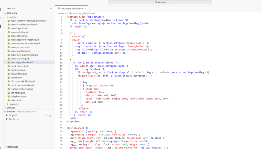
<section class="mg-section">
  {%- if section.settings.heading != blank -%}
    <h2 class="mg-heading">{{ section.settings.heading }}</h2>
  {%- endif -%}

  <div
    class="mg"
    style="
      --mg-cols-mobile: {{ section.settings.columns_mobile }};
      --mg-cols-tablet: {{ section.settings.columns_tablet }};
      --mg-cols-desktop: {{ section.settings.columns_desktop }};
      --mg-gap: {{ section.settings.gap }}px;
    "
  >
    {%- for block in section.blocks -%}
      {%- assign img = block.settings.image -%}
      {%- if img != blank -%}
        {%- assign alt_text = block.settings.alt | default: img.alt | default: section.settings.heading -%}
        <figure class="mg__item" {{ block.shopify_attributes }}>
          {{
            img
            | image_url: width: 900
            | image_tag:
              loading: 'lazy',
              widths: '400, 600, 900',
              sizes: '(min-width: 990px) 25vw, (min-width: 750px) 33vw, 50vw',
              alt: alt_text
          }}
        </figure>
      {%- endif -%}
    {%- endfor -%}
  </div>
</section>

{% stylesheet %}
  .mg-section { padding: 40px 20px; }
  .mg-heading { margin: 0 0 24px; text-align: center; }
  .mg { column-count: var(--mg-cols-mobile); column-gap: var(--mg-gap); }
  .mg__item { margin: 0 0 var(--mg-gap); break-inside: avoid; }
  .mg__item img { display: block; width: 100%; height: auto; }
  @media (min-width: 750px) { .mg { column-count: var(--mg-cols-tablet); } }
  @media (min-width: 990px) { .mg { column-count: var(--mg-cols-desktop); } }
{% endstylesheet %}

{% schema %}
{
  "name": "Masonry gallery",
  "settings": [
    { "type": "text", "id": "heading", "label": "Heading", "default": "Our gallery" },
    { "type": "range", "id": "columns_desktop", "label": "Columns on desktop", "min": 2, "max": 6, "step": 1, "default": 4 },
    { "type": "range", "id": "columns_tablet", "label": "Columns on tablet", "min": 2, "max": 4, "step": 1, "default": 3 },
    { "type": "range", "id": "columns_mobile", "label": "Columns on mobile", "min": 1, "max": 3, "step": 1, "default": 2 },
    { "type": "range", "id": "gap", "label": "Gap between images", "min": 0, "max": 40, "step": 4, "unit": "px", "default": 16 }
  ],
  "blocks": [
    {
      "type": "image",
      "name": "Image",
      "limit": 40,
      "settings": [
        { "type": "image_picker", "id": "image", "label": "Image" },
        { "type": "text", "id": "alt", "label": "Alt text", "info": "Describe the image for screen readers and search engines." }
      ]
    }
  ],
  "presets": [
    { "name": "Masonry gallery", "blocks": [ { "type": "image" }, { "type": "image" }, { "type": "image" }, { "type": "image" } ] }
  ]
}
{% endschema %}
We tested this section on a Dawn-based theme in November 2026.
Step 2: Add the section to a page
- Open Customize on the duplicated theme and go to the page you want.
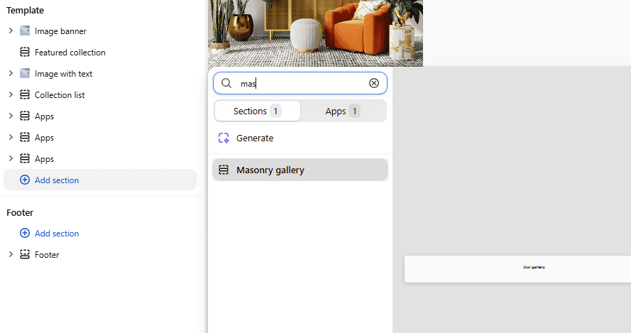
- Click Add section and choose Masonry gallery.
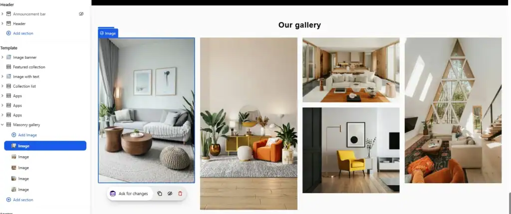
- Add image blocks and upload your photos. Fill in the alt text for each.
- Adjust the columns and gap, then preview on desktop and mobile.
The drawbacks of the free code method
The code is short, but it has real limits. Know them before you publish it:
- Images fill columns, not rows. CSS columns place image 1, 2, 3 down the first column, then continue in the second. Shoppers read left to right, so the visual order differs from the order you set. If sequence matters (a lookbook story, a ranked list), this is a problem.
- No lightbox or zoom. Images are not clickable. You would need extra JavaScript or another section.
- No filters. You cannot filter by collection, tag or category.
- No cropping control. Images keep their natural ratio, so one very tall image can dominate a column. You have to prepare images yourself.
- You maintain it. A theme update or a switch to a new theme can break or remove the section. You need to re-add it and re-test.
- Images only. This version does not pull products, collections, videos or Instagram posts.
- Native CSS masonry is not a safe replacement yet. CSS has a native masonry layout in development, but browser support is not universal. Check MDN’s masonry layout page before relying on it. CSS columns are the dependable option today.
Method 3: Use Essential Grid Gallery
Essential Grid Gallery is our Shopify app for building image, video and product galleries. It supports even grids and masonry layouts with custom spacing, which covers the gaps in the free code: lightbox, filters and image sources beyond manual uploads. See the app page for the full feature list.
Step 1: Install the app and create a gallery
- Install Essential Grid Gallery from the Shopify App Store.
- Complete the app’s setup steps, including Enable App Embed.
- On the dashboard, click Start from Scratch to build your own gallery, or Use a Template to start from a ready-made masonry design (see step 2).
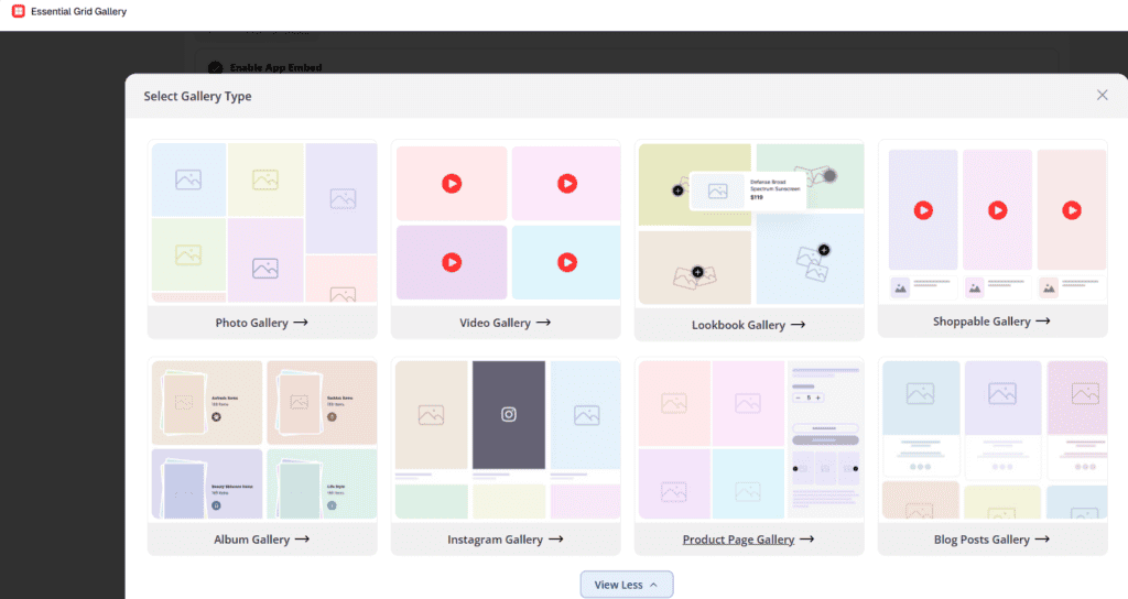
- If you start from scratch, choose Photo Gallery in the Select Gallery Type window. The other types are Video, Lookbook, Shoppable, Album, Instagram, Product Page and Blog Posts.
Step 2: Choose a masonry template
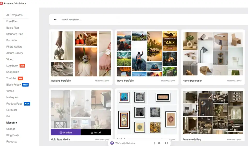
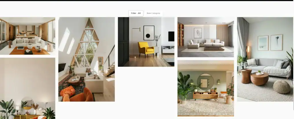
In the template library, open the Masonry category in the left menu. Masonry templates carry a “Masonry Layout” label, for example Wedding Portfolio, Travel Portfolio, Home Decoration and Furniture Gallery. Click Preview to try one, or Install to use it.
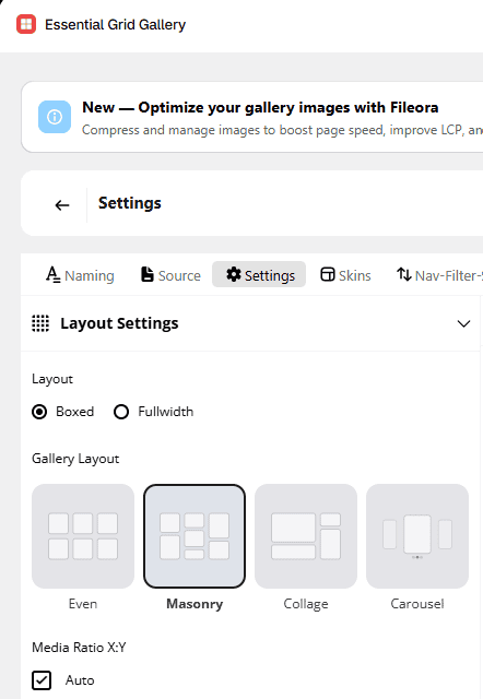
You can switch layouts at any time. Open the Settings tab, go to Layout Settings, and under Gallery Layout choose Masonry. The other options are Even, Collage and Carousel. The Columns setting in the same tab controls how many columns the gallery uses. To leave an empty space in the layout, add a Blank Item in the next step.
Step 3: Add your content
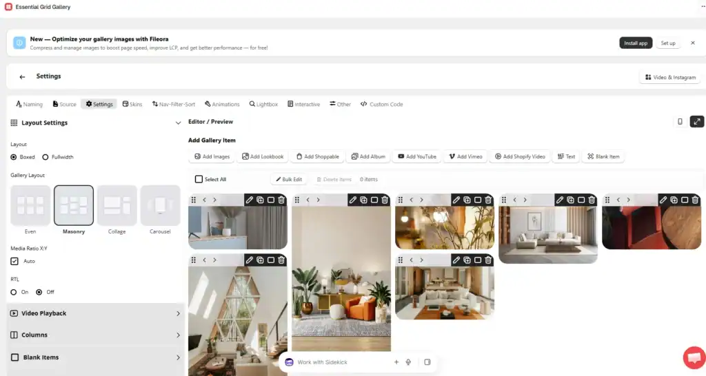
Use the Add Gallery Item buttons to add images, lookbooks, shoppable items, albums, YouTube, Vimeo or Shopify videos, text blocks, or blank items. A blank item adds an empty placeholder cell, which helps when you want breathing room in the layout. Drag items to reorder them. The free plan includes one gallery with up to 12 images, so you can build and test a masonry gallery before paying for anything.
Step 4: Style it
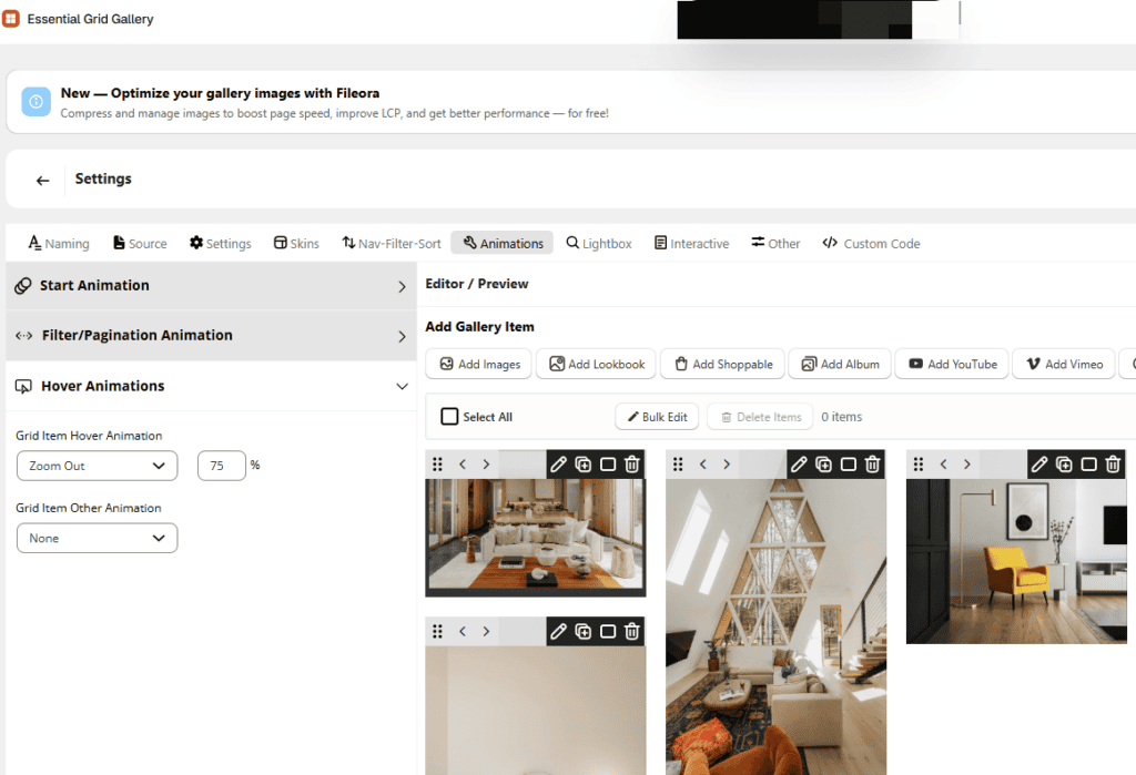
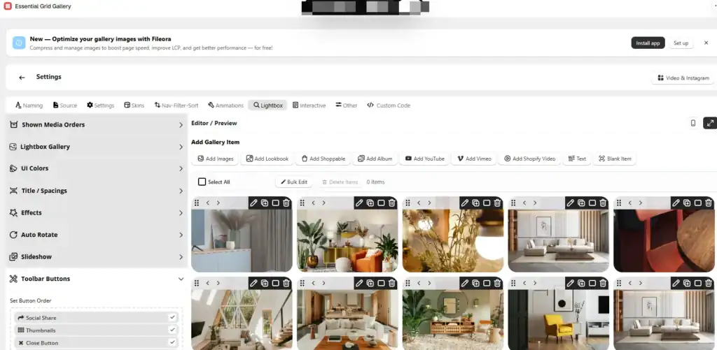
Pick a look in the Skins tab. For hover effects, open Animations > Hover Animations and choose a grid item hover animation. We used Zoom Out at 75%. The Lightbox tab controls the full-screen popup, with swipe navigation and captions.
Step 5: Add filters (optional)
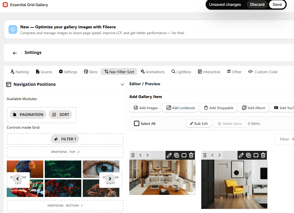
Filters let shoppers narrow the gallery by collection, tag or category, which is useful when one page holds several product types or styles. Open the Nav-Filter-Sort tab and drag the Filter module into one of the drop zones. Pagination and Sort modules work the same way. To put an image in a category, hover over it in the editor and click Edit Element, then assign its categories there.
Step 6: Publish it on a page
The quickest way is inside the app: on the Naming tab, pick a page under Publish To and click Publish. If you prefer to place the gallery yourself, use the theme editor:
- Go to Online Store > Themes > Customize.
- Open the page, add an Apps section, click Add block, and choose Essential Grid Gallery. Then select your gallery.
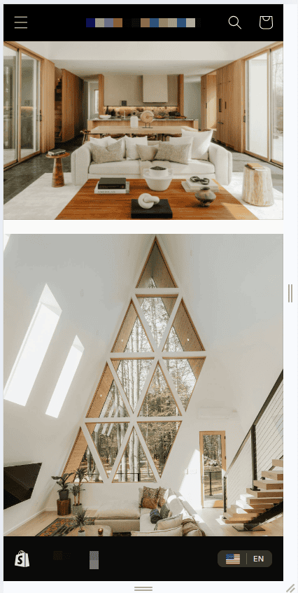
- Save and preview on desktop and mobile.
What to know before choosing the app
- Masonry is available on the Free plan, which includes one gallery with up to 12 images.
- Paid plans unlock more galleries and unlimited images. Check the current plans on the App Store listing, because pricing changes.
- It is an app, so it adds a dependency to your store. Keep an eye on page speed after installing it, as you would with any app.
Make your masonry gallery fast and mobile-friendly
A masonry gallery is image-heavy, so speed matters more than the layout itself.
- Size images before uploading. Around 1,200-1,600px on the long edge is enough for most galleries. See our Shopify image size guide for exact dimensions.
- Use lazy loading. The free code above sets
loading="lazy". Do not lazy-load the first row of images above the fold, since that can slow the first paint. - Set width and height. The
image_tagfilter in the code adds them, which reserves space and prevents the page from jumping as images load. - Use fewer columns on mobile. Two columns is a good default. One column makes the page long, and three makes images too small to read.
- Write real alt text. Describe what is in each image. It helps accessibility and image search.
- Compress. Use WebP where possible, and run images through a compressor before upload.
Common mistakes
- Using masonry for product comparison pages, where an aligned grid works better.
- Mixing very different image styles (flat product shots next to lifestyle photos), which makes the gallery look cluttered.
- Skipping mobile testing. Column flow can change the order shoppers see.
- Uploading full-size camera images and relying on the theme to shrink them.
Frequently asked questions
What is a masonry layout in Shopify?
It is a gallery layout where images keep their natural proportions and are packed into columns, so there are no empty gaps between uneven images. Shopify themes do not always include it by default, so you add it with a custom section or an app.
Does Shopify have a built-in masonry gallery?
Most Shopify themes include an image grid or gallery section, but it usually crops images to one ratio. A few themes include a true masonry section, so check your theme’s documentation.
Does a masonry gallery slow down my store?
Not by itself. Slowdowns come from large, uncompressed images and too many images loaded at once. Resize and compress images, use lazy loading, and test your page with PageSpeed Insights.
Can I add a lightbox or filters to the free code version?
Not without more code. The section in this guide shows images only. If you need a lightbox or filters, you would add custom JavaScript or use an app such as Essential Grid Gallery.
Can I show products in a masonry layout?
Yes, but the code in this guide shows uploaded images, not products. A product masonry needs a section that loops over a collection, or an app that supports product galleries. Keep in mind that aligned grids are usually better for comparing products.
Will masonry work on mobile?
Yes. Set fewer columns on mobile (two works well). Test the order of images on a phone, because column layouts fill from the top of each column.
Conclusion
Use your theme’s gallery if a uniform grid is enough. Use the free code if you want a simple masonry gallery and are happy to maintain it. Use an app when you need a lightbox, filters or product tags, or when you want to avoid editing theme code.
Want to try the app route? Install Essential Grid Gallery free or see the full feature list.