Animating Grid Start, Filter/Pagination, and Hover Events

Table of Contents
- Animations
- Start Animation
- Filter/Pagination Animation
- Hover Animations
- Next: Lightbox
Animations
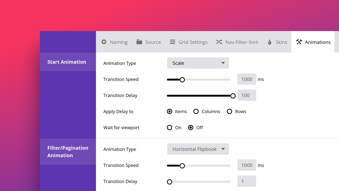
The Animations tab allows you to configure three types of animation in Essential Grid: start animations, filter & pagination animations, and hover animations:

Start Animation
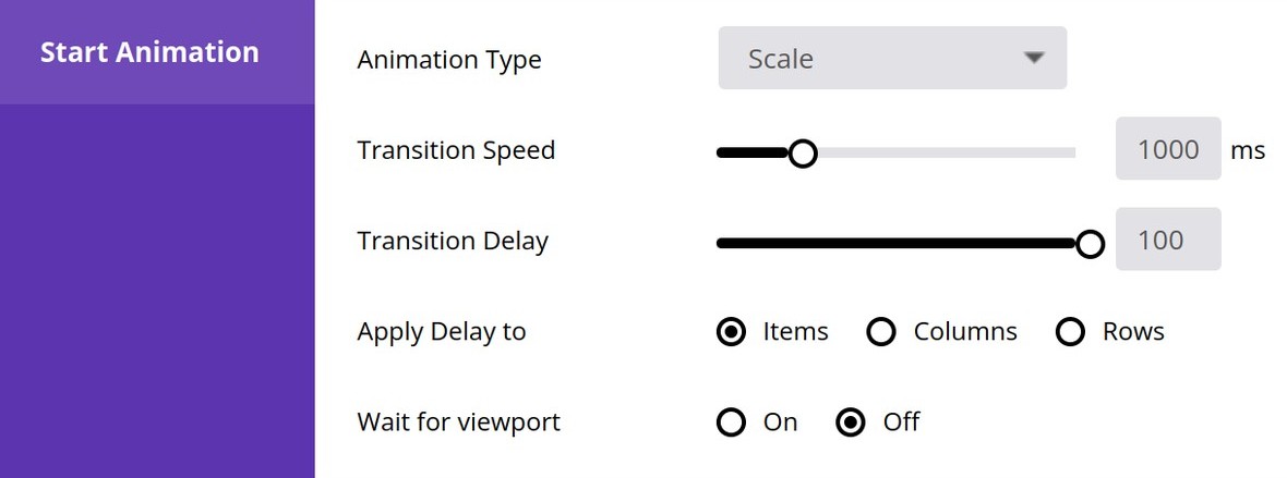
The Start Animation panel lets you control the way items animate into the grid when the page first loads:

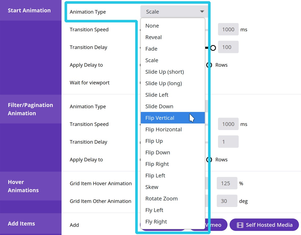
Select one of the available animations from the Animation Type drop down list:

And use the Transition Speed option to set how long, in milliseconds, that animation should take to play out:

f you set Animation Type to anything other than None or Reveal, three additional options will appear, described as follows.
Use the Transition Delay option to stagger the appearance of grid items. Drag the slider to the right to increase the delay between items appearing, and to the left to decrease the delay:

Use the Apply Delay to option to set whether staggered loading makes the grid appear one item at a time, one column at a time, or one row at a time:

Set the Wait for viewport option to On if you wish to ensure the starting animations don’t play until the grid is visible:

Filter/Pagination Animation
The Filter/Pagination Animation panel is just like the Start Animation panel, except it applies to how items should animate when filtering is applied to a grid, or when a paginated grid moves from one page to another:

The only differences are a different collection of settings for the Animation Types option, and the absence of a Wait for viewport option. Otherwise, everything else is the same.
Hover Animations
The Hover Animations panel allows you to configure how grid items should animate when one of them is hovered over.
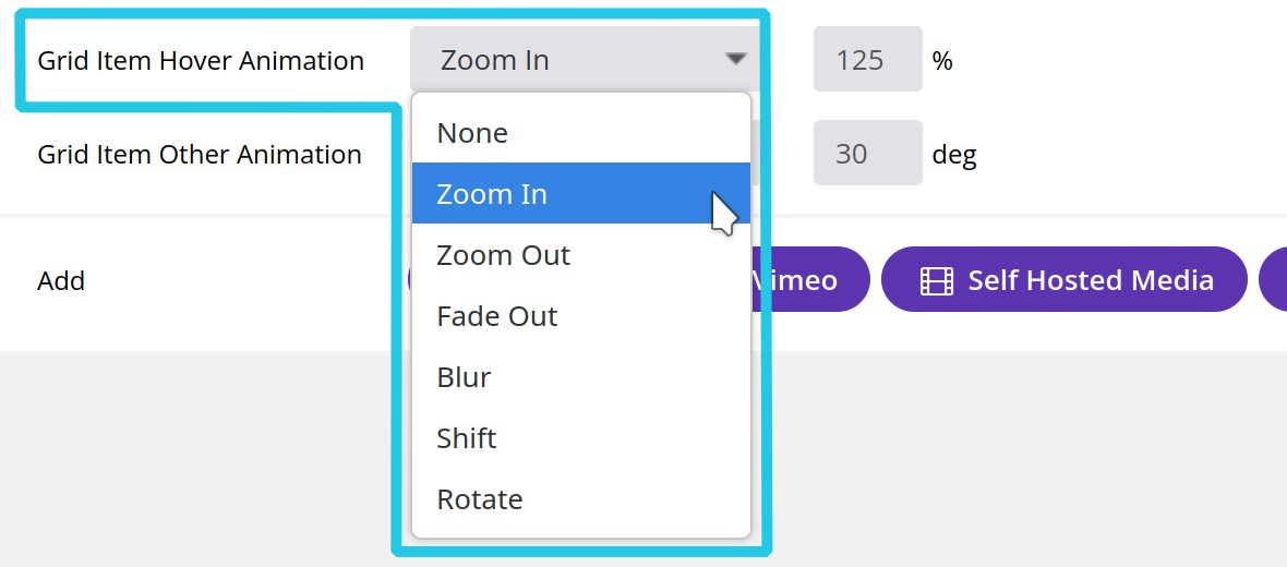
There are two main options available: Grid Item Hover Animation, which controls the animation of the item being hovered over, and Grid Item Other Animation, which controls the animation of all the items not being hovered over:


Zoom In and Zoom Out both have an accompanying percentage based field where you can set the amount by which the item should grow or shrink, respectively:

Blur has a pixel based field where you can set the size of the blur effect:

Shift has a drop down option where you can select whether you want the item to move up, down, left or right, as well as a pixel based field where you can set the distance it should move:

And finally Rotate has a field where you can enter how many degrees you want the item to rotate. Enter a positive number to rotate the item clockwise, or a negative number to rotate it counter clockwise:


