

Your products are there. Customers just aren’t seeing them. A grid layout buries everything below the fold, and most shoppers don’t scroll that far. A product slider puts your best items front and center, lets customers browse without leaving the page, and takes up a fraction of the vertical space.
There are three real ways to add a Shopify product slider: using the Dawn theme’s built-in carousel, writing custom Liquid code, or using an app. Each takes a different amount of time and technical skill.
This guide covers all three, with free code for the custom method, step-by-step screenshots for every approach, and a straight comparison so you can pick the right one for your store.
To add a product slider on Shopify, you have three main options: (1) use the Dawn theme’s built-in Featured Collection section with “Enable Carousel on Desktop” turned on. It takes about 5 minutes and requires no code. (2) add a custom Liquid section using the free Swiper.js-based code in this guide. It takes about 15 minutes and offers full customization. (3) install the Slider Revolution app and deploy a ready-made product slider template. It takes about 10 minutes, includes 300+ templates, and requires no coding.
Key Takeaways
- The Dawn theme’s Featured Collection includes a built-in carousel toggle, making it the fastest way to create a product slider if you’re already using the Dawn theme.
- The custom Liquid method uses Swiper.js directly from a CDN, so there is no npm installation or build process. It works with virtually any Shopify theme.
- The free code includes hover image swap, sale badge logic, navigation arrows, pagination dots, autoplay, looping, and Theme Editor settings for customization.
- Dawn’s built-in carousel only works on desktop and does not provide a mobile slider experience.
- For fully responsive product sliders with advanced layouts and animations, choose either the custom Liquid solution or Slider Revolution.
- EasyBoost: Product Showcase is the simplest app-based option. Install the app, configure the slider, paste the widget ID, and you’re done.
Which Method Is Right for You?
Method 01: Shopify Dawn Theme Built-in Carousel (Fastest — No Code)
If you’re running the Shopify Dawn theme and just need a simple product carousel, you don’t need any code. The Featured Collection section has a built-in slider toggle. Set up takes about 5 minutes.
Important limitation: The Dawn Featured Collection carousel is desktop-only. It does not display as a slider on mobile or tablet devices. If you need a fully responsive product slider across all screen sizes, use either the Custom Liquid method or the Slider Revolution method instead.
Step 1: Upload Your Products
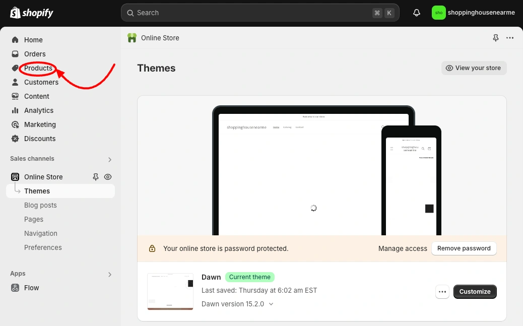
Log in to your Shopify admin. Go to Products from the left sidebar.
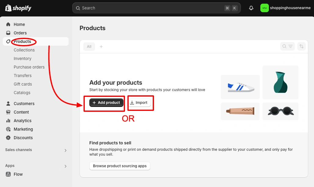
Go to Products > Add Product.
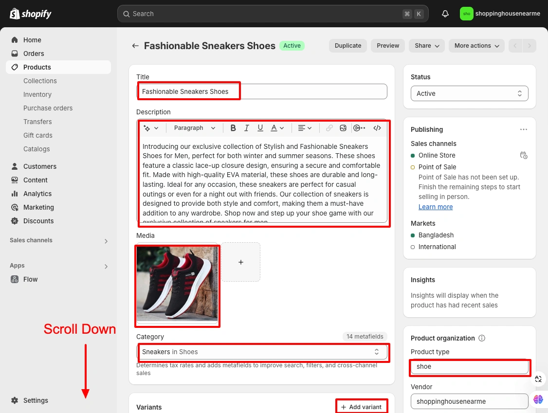
Click Save after filling in the product details.
Step 2: Create a Collection
The product slider pulls from a collection. If you don’t have one yet, create it now.
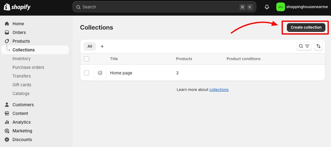
- Go to Products > Collections
- Click Create Collection
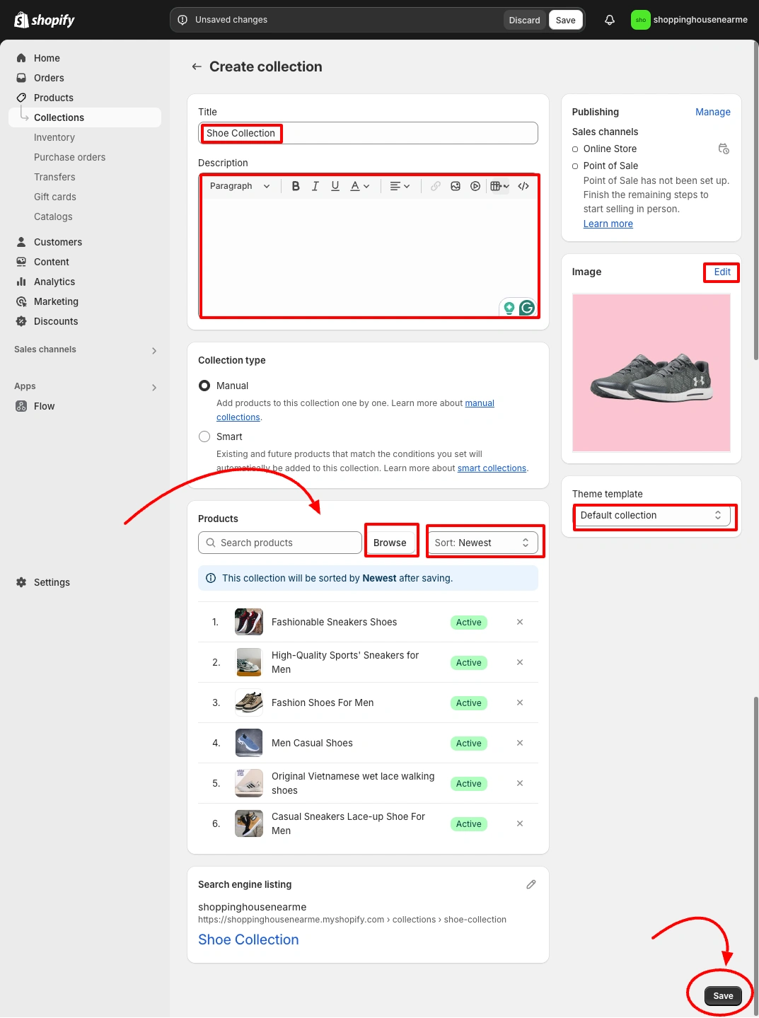
- Enter the Title and Description
- Choose collection type: Manual (add products yourself) or Smart (auto-add based on conditions like tag or price)
- For manual collections, click Browse under Products, select your products, and click Add
- Click Save
Step 3: Open the Theme Editor
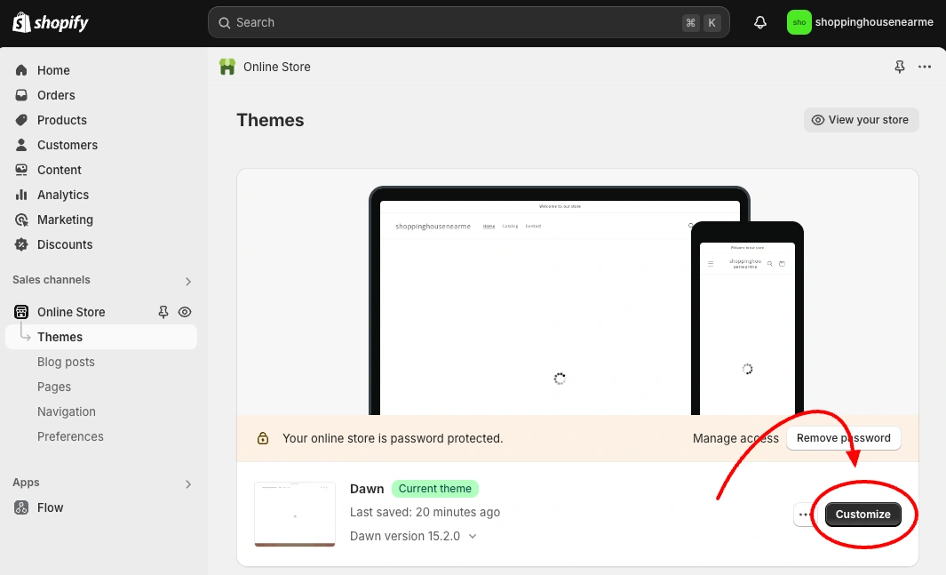
Go to Online Store → Themes. Click Customize next to your Dawn theme.
Step 4: Add the Featured Collection Section
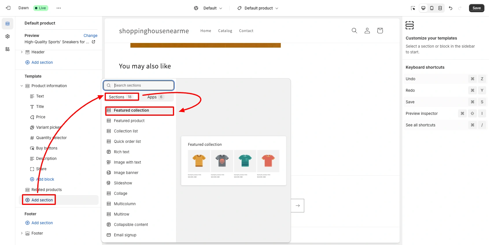
In the Theme Editor, click Add Section from the left panel. Select Featured Collection.
Step 5: Enable the Carousel and Set the Collection

Click on the Featured Collection section in the left panel. Choose your collection.
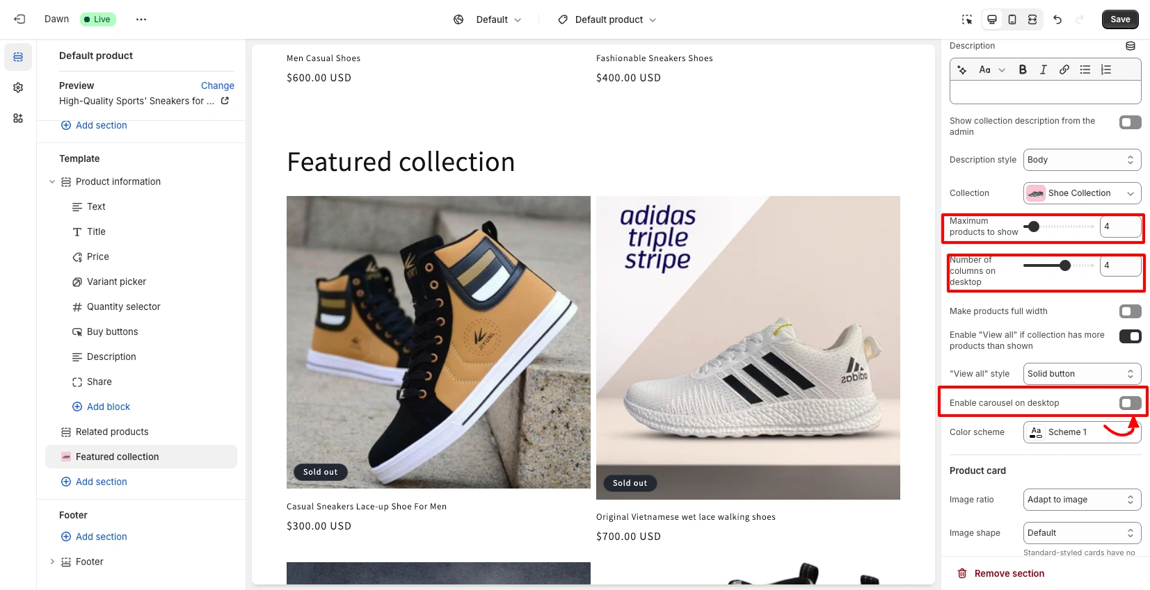
Scroll down to find “Enable Carousel on Desktop”, toggle it on. Set the number of products to display per row. Click Save.
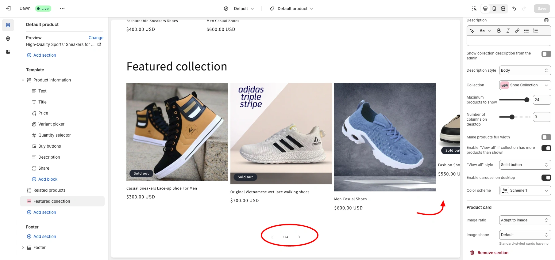
Your product carousel is now live on desktop.
Method 2: Custom Liquid Code, Free Swiper.js Product Slider
This method gives you a fully responsive, mobile-ready Shopify product slider using Swiper.js loaded from CDN. You get hover image swap, sale price display, nav arrows, dot pagination, autoplay, loop, and full color/style control via the Theme Editor schema — all in a single Liquid file.
Back up your theme before editing code
Syncora automatically backs up your entire Shopify store, including theme files, products, orders, and customer data. Free plan available.
Step 1: Copy the Free Product Slider Liquid Code
Copy the complete code below. It includes the Liquid template, CSS, Swiper.js integration, JavaScript init logic, and the full Theme Editor schema.
{% liquid
  assign slider_id = 'shopidevs-product-slider-' | append: section.id
  assign chosen_collection = collections[section.settings.collection]
  assign products_limit = section.settings.products_to_show
%}

<section class="shopidevs-product-slider-section" id="{{ slider_id }}">
  <div class="page-width">
    {% if section.settings.heading != blank %}
      <div class="shopidevs-product-slider__header">
        <h2 class="shopidevs-product-slider__title">{{ section.settings.heading | escape }}</h2>

        {% if section.settings.show_view_all and chosen_collection != blank %}
          <a class="shopidevs-product-slider__view-all" href="{{ chosen_collection.url }}">
            View all
          </a>
        {% endif %}
      </div>
    {% endif %}

    {% if chosen_collection != blank and chosen_collection.products_count > 0 %}
      <div class="swiper shopidevs-product-slider js-shopidevs-swiper-{{ section.id }}">
        <div class="swiper-wrapper">
          {% for product in chosen_collection.products limit: products_limit %}
            <div class="swiper-slide">
              <div class="shopidevs-product-card">
                <a href="{{ product.url }}" class="shopidevs-product-card__image-link">
                  <div class="shopidevs-product-card__image-wrap">
                    {% if product.featured_image %}
                      {{
                        product.featured_image
                        | image_url: width: 900
                        | image_tag:
                          loading: 'lazy',
                          widths: '240, 360, 480, 640, 800, 900',
                          sizes: '(min-width: 990px) calc((100vw - 120px) / 4), (min-width: 750px) calc((100vw - 80px) / 2), 80vw',
                          class: 'shopidevs-product-card__image shopidevs-product-card__image--primary',
                          alt: product.featured_image.alt | escape
                      }}
                    {% else %}
                      {{ 'product-1' | placeholder_svg_tag: 'shopidevs-product-card__image shopidevs-product-card__image--primary placeholder-svg' }}
                    {% endif %}

                    {% assign hover_image = product.images[1] %}
                    {% if hover_image != blank %}
                      {{
                        hover_image
                        | image_url: width: 900
                        | image_tag:
                          loading: 'lazy',
                          widths: '240, 360, 480, 640, 800, 900',
                          sizes: '(min-width: 990px) calc((100vw - 120px) / 4), (min-width: 750px) calc((100vw - 80px) / 2), 80vw',
                          class: 'shopidevs-product-card__image shopidevs-product-card__image--hover',
                          alt: hover_image.alt | escape
                      }}
                    {% endif %}
                  </div>
                </a>

                <div class="shopidevs-product-card__content">
                  <a href="{{ product.url }}" class="shopidevs-product-card__title">
                    {{ product.title | escape }}
                  </a>

                  {% if section.settings.show_vendor and product.vendor != blank %}
                    <div class="shopidevs-product-card__vendor">{{ product.vendor | escape }}</div>
                  {% endif %}

                  {% if section.settings.show_price %}
                    <div class="shopidevs-product-card__price">
                      {% if product.compare_at_price > product.price %}
                        <span class="shopidevs-product-card__price--sale">
                          {{ product.price | money }}
                        </span>
                        <span class="shopidevs-product-card__price--compare">
                          {{ product.compare_at_price | money }}
                        </span>
                      {% else %}
                        <span>{{ product.price | money }}</span>
                      {% endif %}
                    </div>
                  {% endif %}

                  {% if section.settings.show_button %}
                    <a href="{{ product.url }}" class="shopidevs-product-card__button">
                      {{ section.settings.button_label | escape }}
                    </a>
                  {% endif %}
                </div>
              </div>
            </div>
          {% endfor %}
        </div>

        {% if section.settings.show_arrows %}
          <button class="shopidevs-product-slider__nav shopidevs-product-slider__nav--prev" aria-label="Previous slide" type="button">
            ←
          </button>
          <button class="shopidevs-product-slider__nav shopidevs-product-slider__nav--next" aria-label="Next slide" type="button">
            →
          </button>
        {% endif %}

        {% if section.settings.show_dots %}
          <div class="shopidevs-product-slider__pagination"></div>
        {% endif %}
      </div>
    {% else %}
      <div class="shopidevs-product-slider__empty">
        Choose a collection with products to display the slider.
      </div>
    {% endif %}
  </div>
</section>

<link rel="stylesheet" href="https://cdn.jsdelivr.net/npm/swiper@12/swiper-bundle.min.css">

<style>
  #{{ slider_id }} {
    margin-top: {{ section.settings.margin_top }}px;
    margin-bottom: {{ section.settings.margin_bottom }}px;
  }

  #{{ slider_id }} .shopidevs-product-slider__header {
    display: flex;
    align-items: center;
    justify-content: space-between;
    gap: 16px;
    margin-bottom: 20px;
  }

  #{{ slider_id }} .shopidevs-product-slider__title {
    margin: 0;
    font-size: 28px;
    line-height: 1.2;
  }

  #{{ slider_id }} .shopidevs-product-slider__view-all {
    text-decoration: none;
    font-size: 14px;
  }

  #{{ slider_id }} .shopidevs-product-slider {
    position: relative;
    overflow: hidden;
    width: 100%;
    padding-bottom: 36px;
  }

  #{{ slider_id }} .swiper-wrapper {
    align-items: stretch;
  }

  #{{ slider_id }} .swiper-slide {
    height: auto;
    box-sizing: border-box;
  }

  #{{ slider_id }} .shopidevs-product-card {
    background: #fff;
    border: 1px solid rgba(0,0,0,0.08);
    border-radius: 14px;
    overflow: hidden;
    height: 100%;
    display: flex;
    flex-direction: column;
  }

  #{{ slider_id }} .shopidevs-product-card__image-link {
    display: block;
    text-decoration: none;
  }

  #{{ slider_id }} .shopidevs-product-card__image-wrap {
    position: relative;
    width: 100%;
    aspect-ratio: 1 / 1;
    overflow: hidden;
    background: #f7f7f7;
  }

  #{{ slider_id }} .shopidevs-product-card__image {
    position: absolute;
    inset: 0;
    width: 100%;
    height: 100%;
    object-fit: cover;
    display: block;
    transition: opacity 0.35s ease, transform 0.35s ease;
  }

  #{{ slider_id }} .shopidevs-product-card__image--primary {
    opacity: 1;
    z-index: 1;
  }

  #{{ slider_id }} .shopidevs-product-card__image--hover {
    opacity: 0;
    z-index: 2;
  }

  #{{ slider_id }} .shopidevs-product-card:hover .shopidevs-product-card__image--hover {
    opacity: 1;
  }

  #{{ slider_id }} .shopidevs-product-card:hover .shopidevs-product-card__image--primary {
    opacity: 0;
  }

  #{{ slider_id }} .shopidevs-product-card:hover .shopidevs-product-card__image {
    transform: scale(1.03);
  }

  #{{ slider_id }} .shopidevs-product-card__content {
    padding: 14px;
  }

  #{{ slider_id }} .shopidevs-product-card__title {
    display: block;
    text-decoration: none;
    color: inherit;
    font-weight: 600;
    margin-bottom: 8px;
    line-height: 1.4;
  }

  #{{ slider_id }} .shopidevs-product-card__vendor {
    font-size: 13px;
    opacity: 0.75;
    margin-bottom: 8px;
  }

  #{{ slider_id }} .shopidevs-product-card__price {
    margin-bottom: 12px;
    font-size: 15px;
  }

  #{{ slider_id }} .shopidevs-product-card__price--sale {
    font-weight: 700;
    margin-right: 8px;
  }

  #{{ slider_id }} .shopidevs-product-card__price--compare {
    text-decoration: line-through;
    opacity: 0.65;
  }

  #{{ slider_id }} .shopidevs-product-card__button {
    display: inline-block;
    text-decoration: none;
    padding: 10px 14px;
    border-radius: 8px;
    border: 1px solid {{ section.settings.button_border_color }};
    background: {{ section.settings.button_bg_color }};
    color: {{ section.settings.button_text_color }};
    transition: all 0.25s ease;
  }

  #{{ slider_id }} .shopidevs-product-card__button:hover {
    background: {{ section.settings.button_hover_bg_color }};
    color: {{ section.settings.button_hover_text_color }};
    border-color: {{ section.settings.button_hover_bg_color }};
  }

  #{{ slider_id }} .shopidevs-product-slider__nav {
    position: absolute;
    top: 42%;
    transform: translateY(-50%);
    z-index: 3;
    width: 42px;
    height: 42px;
    border-radius: 999px;
    border: 1px solid rgba(0,0,0,0.15);
    background: #fff;
    cursor: pointer;
    display: flex;
    align-items: center;
    justify-content: center;
  }

  #{{ slider_id }} .shopidevs-product-slider__nav--prev {
    left: 8px;
  }

  #{{ slider_id }} .shopidevs-product-slider__nav--next {
    right: 8px;
  }

  #{{ slider_id }} .shopidevs-product-slider__pagination {
    margin-top: 18px;
    text-align: center;
  }

  #{{ slider_id }} .shopidevs-product-slider__empty {
    padding: 20px;
    border: 1px dashed rgba(0,0,0,0.2);
    border-radius: 12px;
  }

  @media screen and (max-width: 749px) {
    #{{ slider_id }} .shopidevs-product-slider__title {
      font-size: 22px;
    }

    #{{ slider_id }} .shopidevs-product-slider__nav {
      display: none;
    }
  }
</style>

<script src="https://cdn.jsdelivr.net/npm/swiper@12/swiper-bundle.min.js" defer></script>

<script>
  (function() {
    const sliderRootId = '{{ slider_id }}';
    const sliderSelector = '#' + sliderRootId + ' .js-shopidevs-swiper-{{ section.id }}';
    let shopidevsSwiperInstance;

    function initShopiDevsSwiper() {
      const sliderEl = document.querySelector(sliderSelector);
      if (!sliderEl || typeof Swiper === 'undefined') return;

      if (shopidevsSwiperInstance && typeof shopidevsSwiperInstance.destroy === 'function') {
        shopidevsSwiperInstance.destroy(true, true);
      }

      shopidevsSwiperInstance = new Swiper(sliderEl, {
        loop: {{ section.settings.enable_loop }},
        {% if section.settings.auto_rotate %}
        autoplay: {
          delay: {{ section.settings.autoplay_delay | times: 1000 }},
          disableOnInteraction: false
        },
        {% endif %}
        observer: true,
        observeParents: true,
        watchOverflow: true,
        spaceBetween: 16,
        slidesPerView: 1.2,
        breakpoints: {
          750: {
            slidesPerView: 2.2
          },
          990: {
            slidesPerView: {{ section.settings.desktop_columns }}
          }
        },
        {% if section.settings.show_arrows %}
        navigation: {
          nextEl: '#{{ slider_id }} .shopidevs-product-slider__nav--next',
          prevEl: '#{{ slider_id }} .shopidevs-product-slider__nav--prev'
        },
        {% endif %}
        {% if section.settings.show_dots %}
        pagination: {
          el: '#{{ slider_id }} .shopidevs-product-slider__pagination',
          clickable: true
        },
        {% endif %}
        on: {
          init: function() {
            this.update();
          }
        }
      });

      setTimeout(function() {
        if (shopidevsSwiperInstance) {
          shopidevsSwiperInstance.update();
        }
      }, 300);
    }

    function waitForSwiperAndInit(retryCount) {
      if (typeof Swiper !== 'undefined') {
        initShopiDevsSwiper();
      } else if (retryCount < 20) {
        setTimeout(function() {
          waitForSwiperAndInit(retryCount + 1);
        }, 150);
      }
    }

    document.addEventListener('DOMContentLoaded', function() {
      waitForSwiperAndInit(0);
    });

    document.addEventListener('shopify:section:load', function(event) {
      if (event.target && event.target.querySelector('.js-shopidevs-swiper-{{ section.id }}')) {
        waitForSwiperAndInit(0);
      }
    });

    document.addEventListener('shopify:section:reorder', function() {
      waitForSwiperAndInit(0);
    });

    document.addEventListener('shopify:section:select', function(event) {
      if (event.target && event.target.querySelector('.js-shopidevs-swiper-{{ section.id }}')) {
        setTimeout(function() {
          if (shopidevsSwiperInstance) {
            shopidevsSwiperInstance.update();
          } else {
            waitForSwiperAndInit(0);
          }
        }, 250);
      }
    });

    window.addEventListener('resize', function() {
      if (shopidevsSwiperInstance) {
        shopidevsSwiperInstance.update();
      }
    });
  })();
</script>

{% schema %}
{
  "name": "ShopiDevs-Product-Slider",
  "settings": [
    {
      "type": "text",
      "id": "heading",
      "label": "Heading",
      "default": "Featured products"
    },
    {
      "type": "collection",
      "id": "collection",
      "label": "Collection"
    },
    {
      "type": "range",
      "id": "products_to_show",
      "label": "Products to show",
      "min": 4,
      "max": 20,
      "step": 1,
      "default": 8
    },
    {
      "type": "range",
      "id": "desktop_columns",
      "label": "Products visible on desktop",
      "min": 2,
      "max": 5,
      "step": 1,
      "default": 4
    },
    {
      "type": "checkbox",
      "id": "show_price",
      "label": "Show price",
      "default": true
    },
    {
      "type": "checkbox",
      "id": "show_vendor",
      "label": "Show vendor",
      "default": false
    },
    {
      "type": "checkbox",
      "id": "show_button",
      "label": "Show button",
      "default": true
    },
    {
      "type": "text",
      "id": "button_label",
      "label": "Button label",
      "default": "Shop now"
    },
    {
      "type": "color",
      "id": "button_bg_color",
      "label": "Button background color",
      "default": "#ffffff"
    },
    {
      "type": "color",
      "id": "button_text_color",
      "label": "Button text color",
      "default": "#111111"
    },
    {
      "type": "color",
      "id": "button_border_color",
      "label": "Button border color",
      "default": "#dddddd"
    },
    {
      "type": "color",
      "id": "button_hover_bg_color",
      "label": "Button hover background color",
      "default": "#111111"
    },
    {
      "type": "color",
      "id": "button_hover_text_color",
      "label": "Button hover text color",
      "default": "#ffffff"
    },
    {
      "type": "checkbox",
      "id": "show_view_all",
      "label": "Show View all link",
      "default": true
    },
    {
      "type": "checkbox",
      "id": "show_arrows",
      "label": "Show arrows",
      "default": true
    },
    {
      "type": "checkbox",
      "id": "show_dots",
      "label": "Show dots",
      "default": true
    },
    {
      "type": "checkbox",
      "id": "enable_loop",
      "label": "Enable loop",
      "default": false
    },
    {
      "type": "checkbox",
      "id": "auto_rotate",
      "label": "Auto rotate",
      "default": false
    },
    {
      "type": "range",
      "id": "autoplay_delay",
      "label": "Auto rotate speed (seconds)",
      "min": 3,
      "max": 10,
      "step": 1,
      "default": 5
    },
    {
      "type": "range",
      "id": "margin_top",
      "label": "Top spacing",
      "min": 0,
      "max": 100,
      "step": 4,
      "default": 32
    },
    {
      "type": "range",
      "id": "margin_bottom",
      "label": "Bottom spacing",
      "min": 0,
      "max": 100,
      "step": 4,
      "default": 32
    }
  ],
  "presets": [
    {
      "name": "ShopiDevs-Product-Slider"
    }
  ]
}
{% endschema %}Step 2: Go to the Theme Code Editor
- Log in to Shopify Admin
- Go to Online Store → Themes
- Click the ellipsis (…) menu next to your active theme
- Click “Edit code”
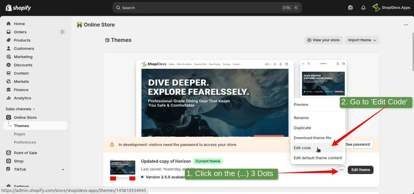
Step 3: Create a New Liquid Section File
- Open the Sections folder in the left file tree
- Click Add a new section
- Select Liquid as the file type
- Name it
shopidevs-product-slider - Click Done
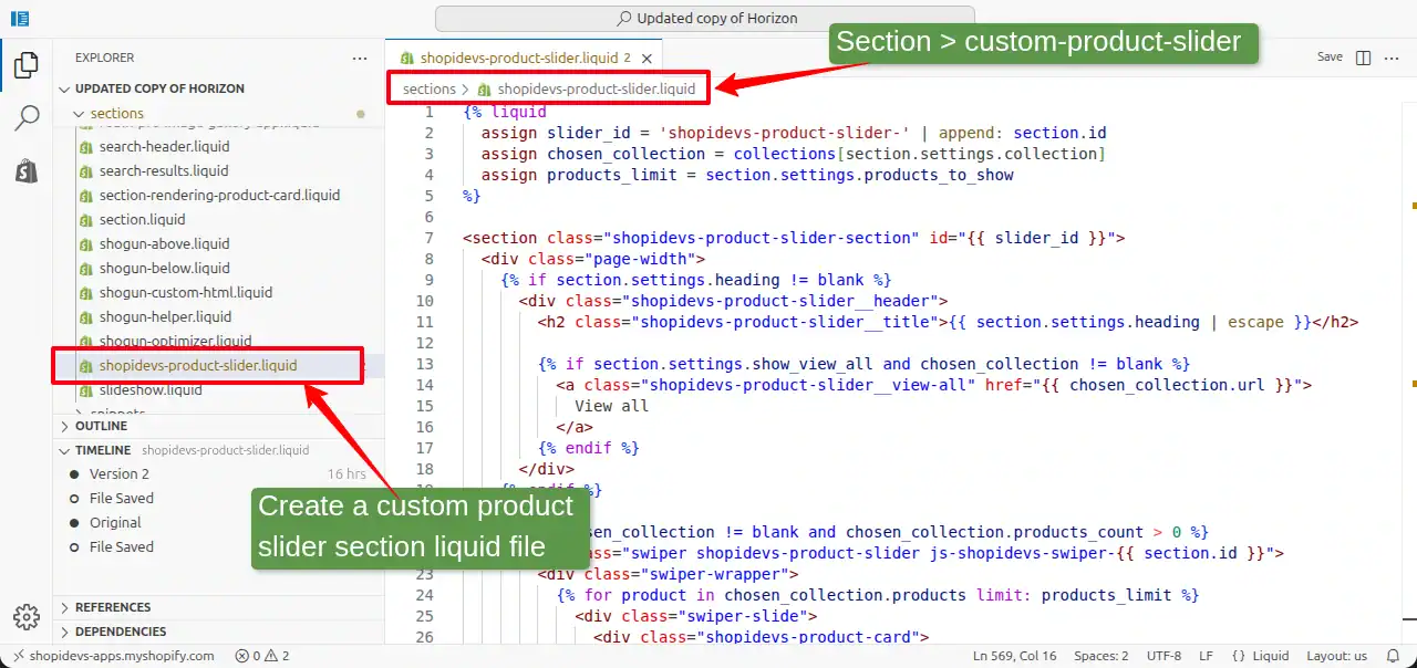
Step 4: Paste the Code and Save
- Clear any default code in the new file
- Paste the code you copied in Step 1
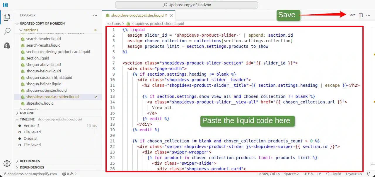
Step 5: Go to “Theme Editor”
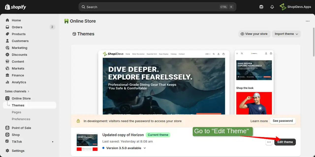
- Click Edit Theme or go to Online Store → Themes → Customize.
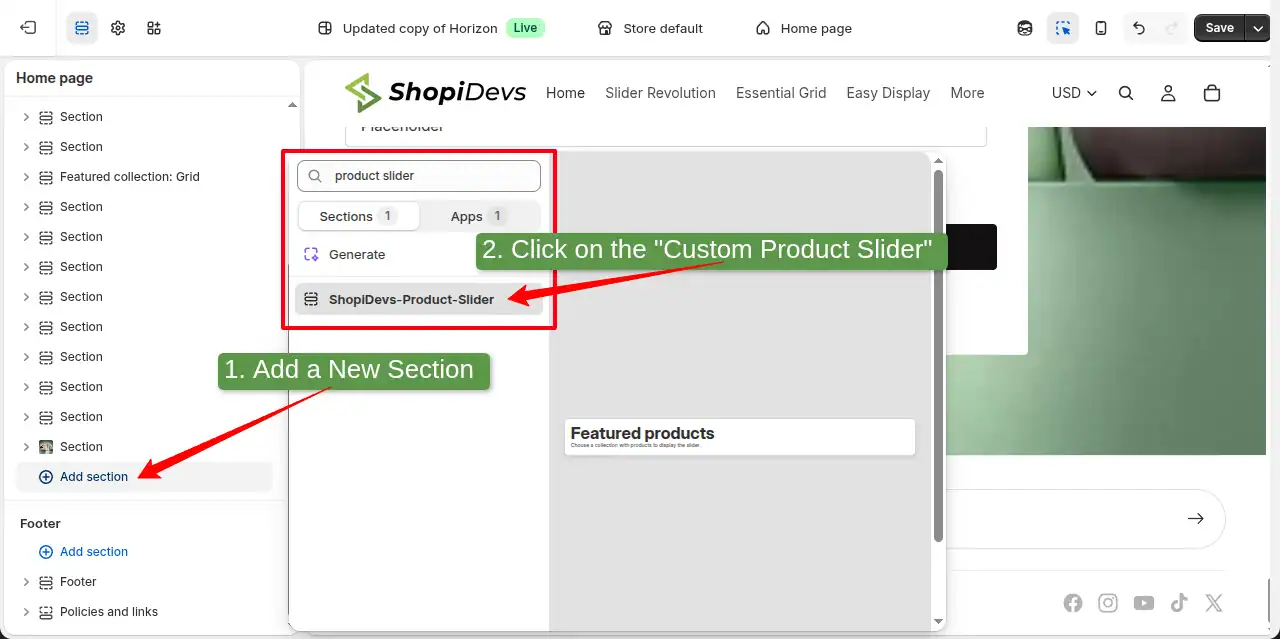
Step 6: Add the Custom Product Slider Section
- Click Add Section (‘+’ icon) in the left panel
- Search for or scroll to find “ShopiDevs-Product-Slider”
- Click it to add the section to your page
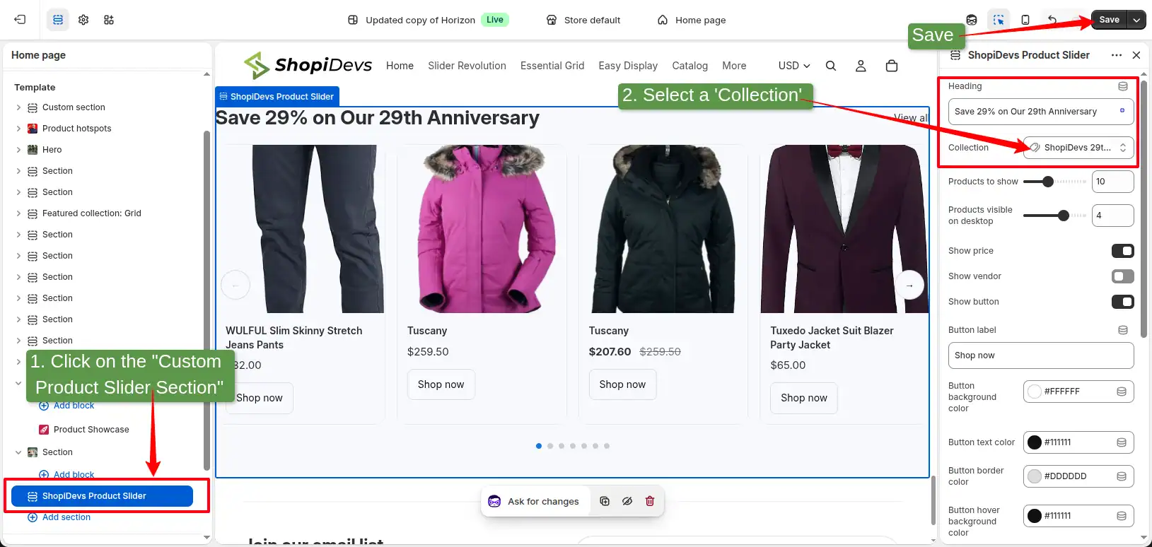
Step 7: Assign a Collection and Configure Settings
- Select the ShopiDevs-Product-Slider section in the left panel
- Choose a collection from the Collection dropdown
- Adjust columns, button colors, heading, and other settings to match your brand
- Enable or disable arrows, dots, loop, and autoplay as needed
- Click Save
Here’s what the finished custom product slider looks like on a live storefront:
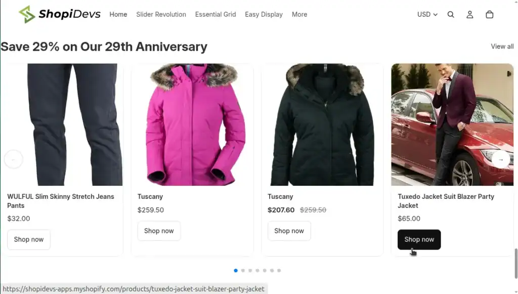
This free product slider loads Swiper 12 directly from a CDN, giving you responsive breakpoints (1.2 slides on mobile, 2.2 on tablet, configurable desktop layouts), touch and swipe support, optional looping, autoplay, navigation arrows, and pagination dots. Everything is connected to the Shopify Theme Editor, so you can customize the slider without manually editing the code.
Method 3: Slider Revolution App, 300+ Product Slider Template
If you want a visually polished product slider without writing code, Slider Revolution & Sections is the right choice. It gives you 300+ design templates, including static and dynamic product sliders, all customizable through a visual drag-and-drop editor.

Step 1: Install Slider Revolution from the Shopify App Store
Go to Apps in your Shopify Admin. Search for “Slider Revolution & Sections” and click Install.
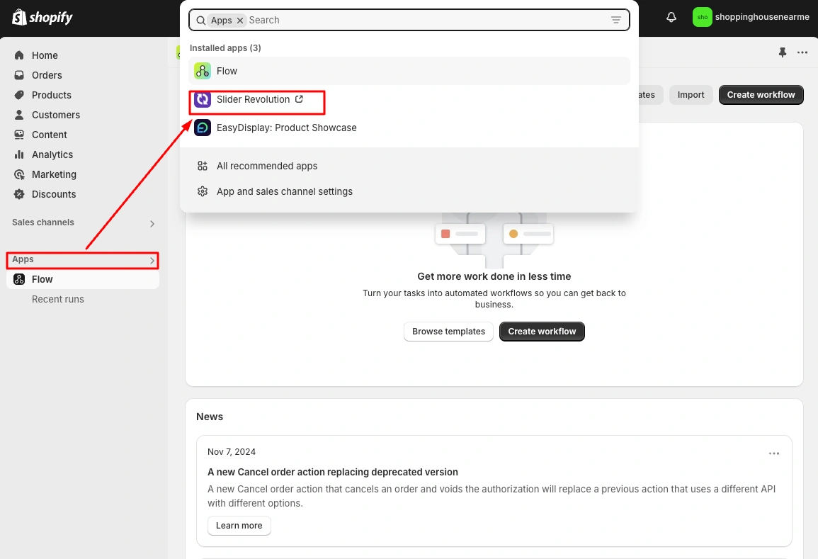
Step 2: Choose a Product Slider Template
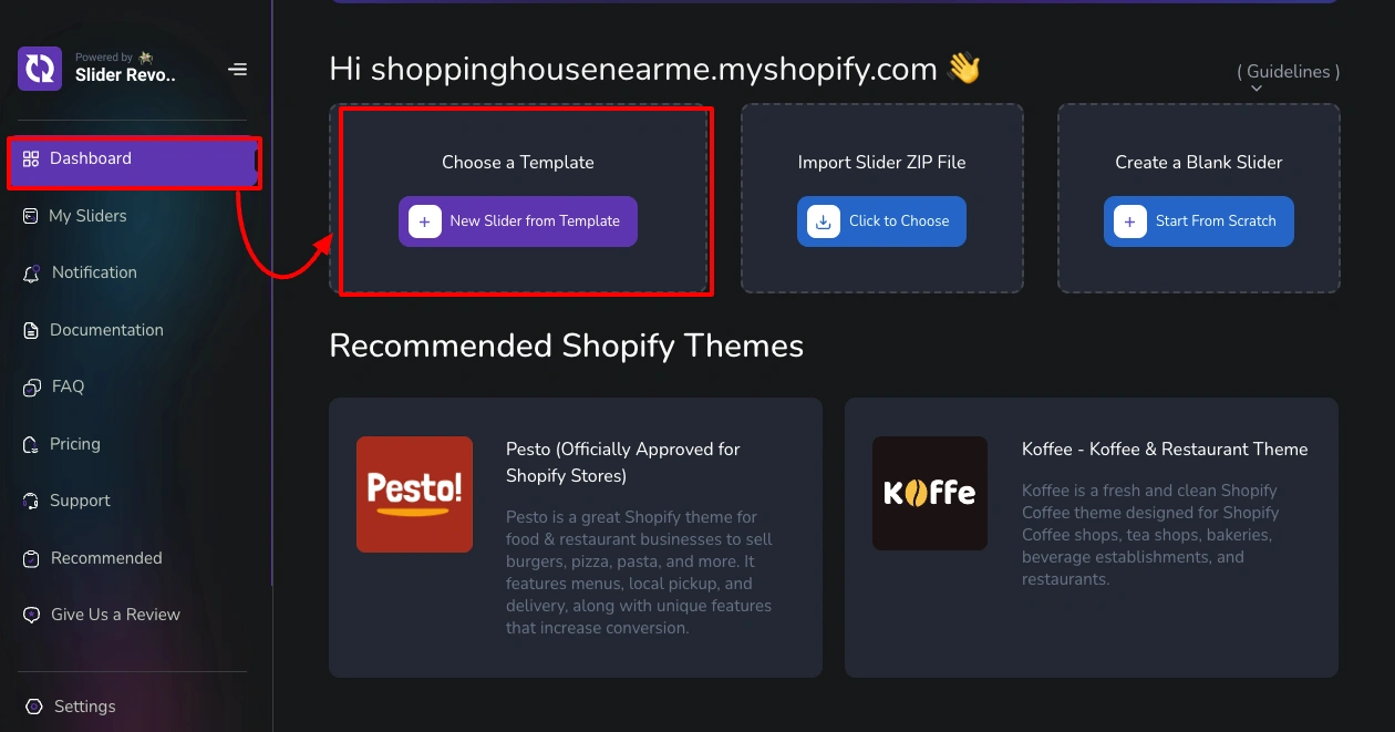
From the Slider Revolution dashboard, click “New Slider from Template”.
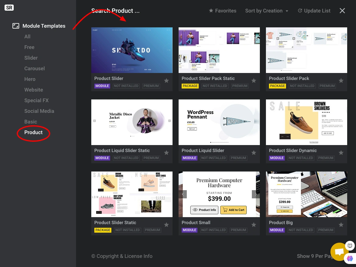
Browse the template library, 300+ options including dynamic product sliders that pull live product data.
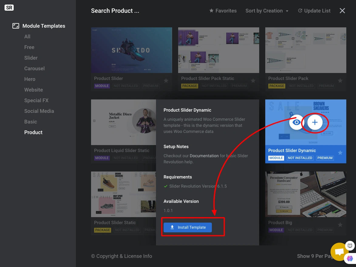
Click the (+) Install Template button on your chosen template.
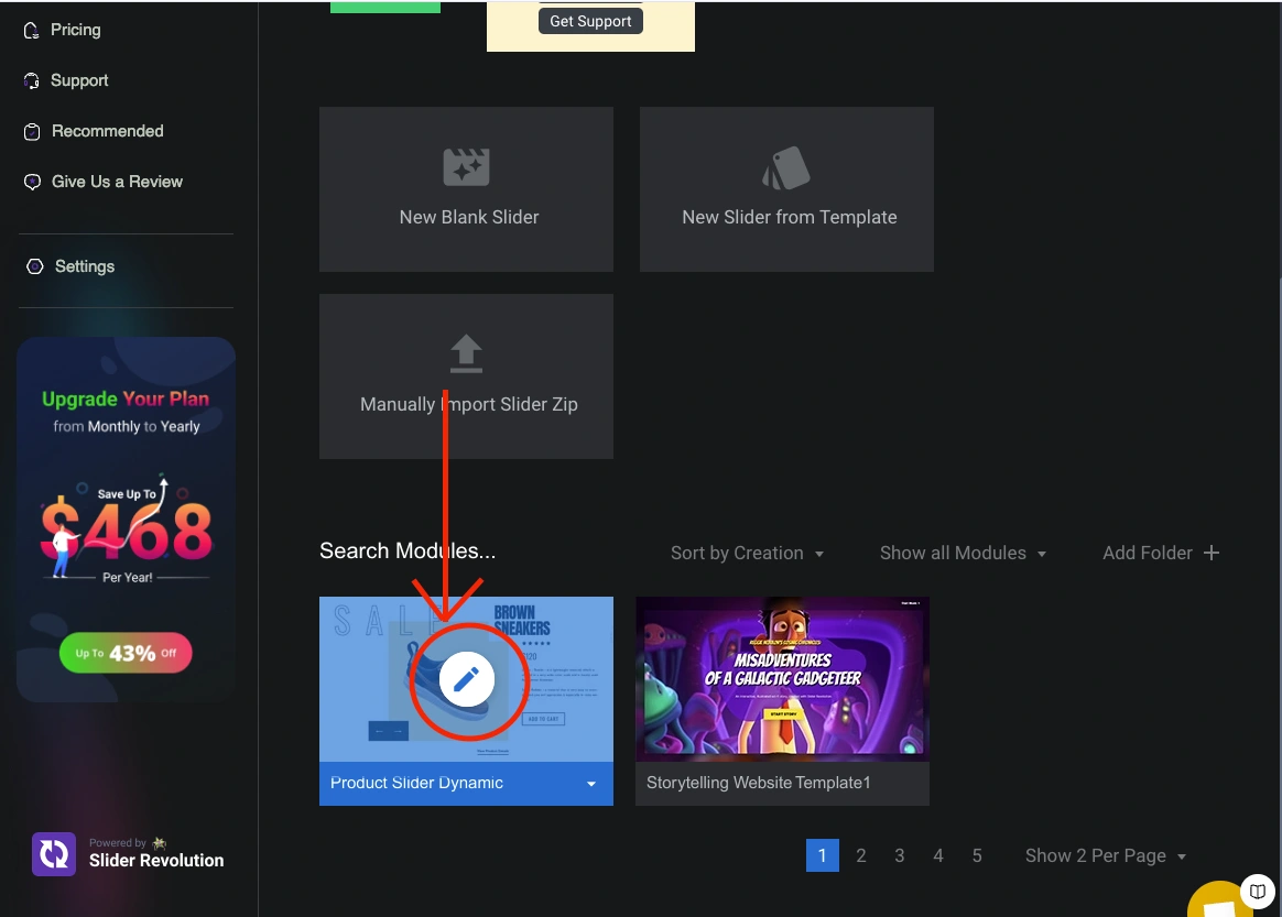
Click the Pencil icon to open the visual editor.

Customize the template, text, images, layout, animations, colors, and product data connections are all editable here.
Step 3: Copy the Shortcode and Publish to Your Store
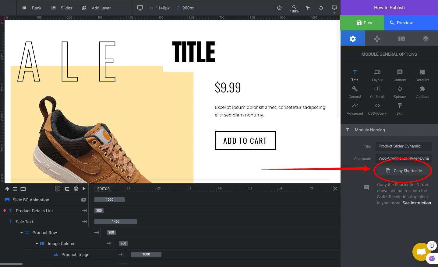
Click Save in the editor. Then copy the Shortcode from the How to Publish button.

Go to Online Store → Themes → Customize.
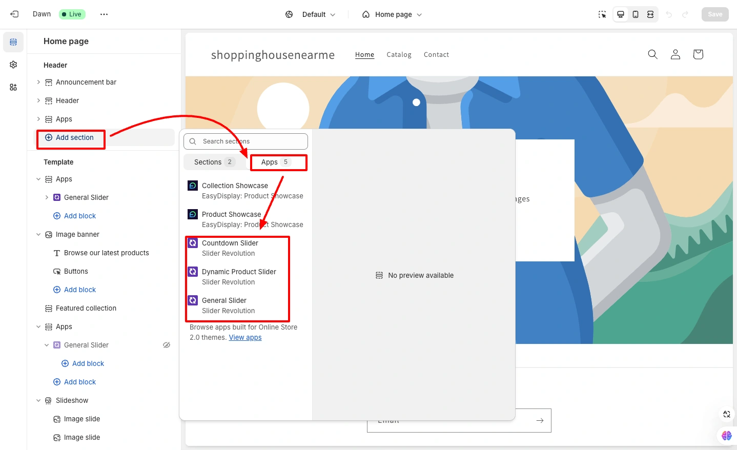
Click Add Section, go to the Apps tab, and choose either General Slider (static product slider) or Dynamic Product Slider (pulls live Shopify product data).

Paste the Shortcode into the Slider Shortcode field. Click Save.
Step 4: Preview the Storefront
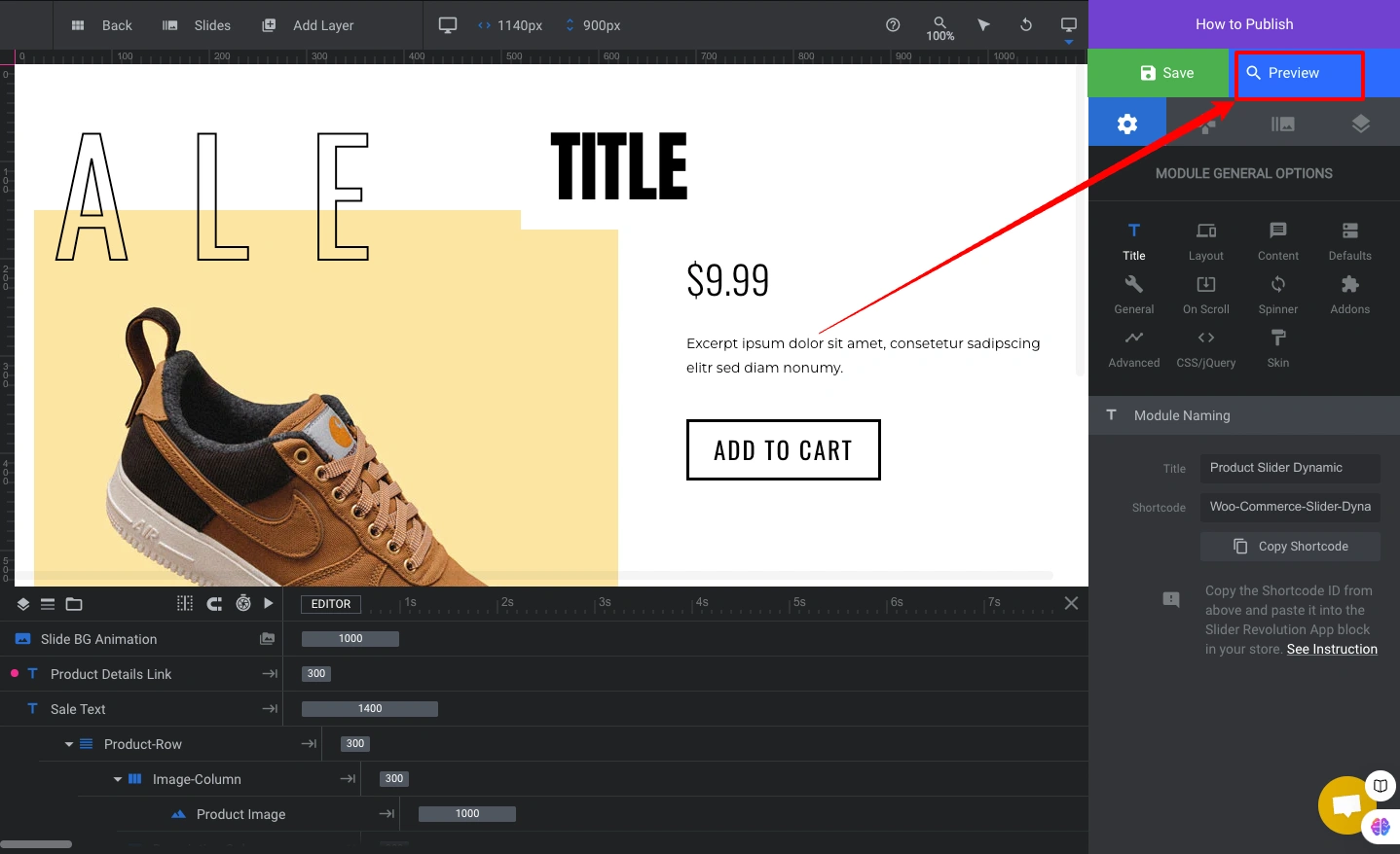
Click Preview to check the slider on your storefront. Verify it displays correctly on desktop and mobile before publishing.
Method 4: EasyBoost: Product Showcase App (Free, Easiest App Setup)
EasyBoost: Product Showcase is ShopiDevs’ own free app for creating product sliders, galleries, and recommended product sections, with no code and no shortcode. Install, configure, copy the Showcase ID, and paste it into your theme.
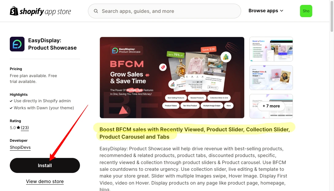
Install: Get EasyBoost: Product Showcase from the Shopify App Store, click Install, done
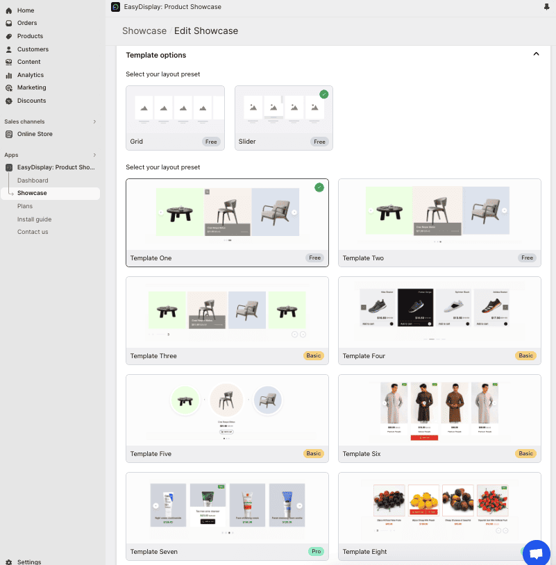
After installing, open the app and click Showcase. Set your title, select products, choose a layout template, and customize the style.
Click Save. You’ll see your showcase listed with a Showcase ID.
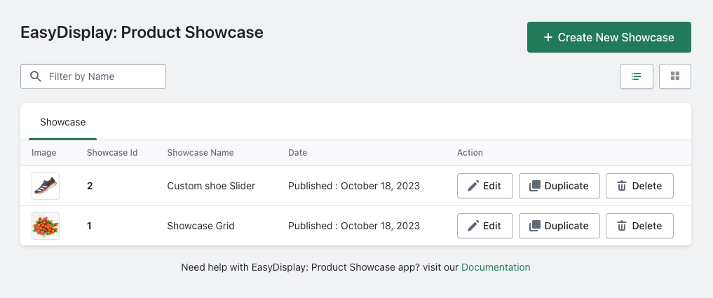
Copy the Showcase ID. Go to Online Store → Themes → Customize. Click Add Block, select Product Showcase under Apps, and paste the ID. Save.
Your product slider is live. For device-specific layout settings (mobile columns, tablet behavior), EasyBoost has a dedicated responsive settings panel; see the responsive settings guide for details.
Check out the video tutorial below to learn how to create a product showcase with the Slider and Gallery app.
Everything built in. No apps to install.
Bundles, promos, a shoppable lookbook and a mega menu ship with the theme. Five EU languages, one-time payment, lifetime updates — and no monthly app fees eating your margin.
Get Snazzy →
Frequently asked questions
What is a Shopify product slider?
A Shopify product slider (also called a product carousel) is a horizontally scrollable section on a Shopify store that displays multiple products in a row, with navigation arrows or swipe gestures to browse through them. It lets merchants showcase featured products, new arrivals, or bestsellers without requiring visitors to scroll through a full grid.
How do I add a product slider to Shopify without an app?
Create a new Liquid section file in your theme’s Sections folder, paste the free Swiper.js-based code from this guide, and save. Then go to Theme Editor, add the new section, assign a collection, and save. The slider is fully mobile-responsive and configurable through the Theme Editor without any additional code editing.
Does the Shopify Dawn theme have a built-in product slider?
Yes. The Dawn theme’s Featured Collection section includes an “Enable Carousel on Desktop” toggle. When turned on, products scroll horizontally instead of wrapping into a grid. However, this built-in carousel only works on desktop — it does not function as a slider on mobile or tablet devices.
Which is the best Shopify product slider app?
Slider Revolution & Sections is the most feature-complete option: 300+ design templates, dynamic product data integration, visual drag-and-drop editor, and both free and paid plans. EasyBoost: Product Showcase is the best choice if you want the simplest setup with no shortcodes. For developers who want full control with no app dependency, the free custom Liquid code in this guide (Swiper.js-based) is the most flexible option.
Is a product slider good for Shopify SEO?
Product sliders themselves are neutral for SEO, what matters is how they’re implemented. The custom Liquid code in this guide uses lazy loading, descriptive alt attributes, and proper image_url/image_tag Liquid filters that generate srcset for responsive images. This follows Shopify’s performance best practices. Avoid sliders that load all product images eagerly or that use JavaScript-rendered content invisible to crawlers.
Will a product slider slow down my Shopify store?
The custom Liquid code method uses Swiper.js loaded from CDN with a deferred script tag, and all product images use lazy loading. The performance impact is minimal. For Slider Revolution and EasyBoost, each loads additional app scripts, run a PageSpeed Insights test after adding any app to your store to check Core Web Vitals impact, particularly Largest Contentful Paint if the slider is above the fold.
Can I show sale prices and hover images in the Shopify product slider?
Yes, the free custom Liquid code includes both features. Sale price logic checks if product.compare_at_price > product.price and displays both the sale price and the original strikethrough price. Hover image swap uses product.images[1] as the hover state with a CSS opacity transition. Both are included in the code and work automatically when your products have the relevant data set.
Ready to showcase your products?
Build beautiful product sliders in minutes with ready-made templates, or launch lightweight product showcases with EasyBoost. Both apps offer free plans and require no coding.

Jakaria is an SEO Content Writer in Shopify, Ecommerce, WordPress, and Tech Industry with 5+ years of experience. He specialises in developing engaging, helpful content by simplifying complex topics into an amazing story for B2B, SaaS, and Shopify businesses. He’s also passionate about staying updated on growth marketing strategies and Shopify trends.