This article will show you how to customize your contents using the Item Skin Editor in Essential Grid
Table of Contents
- Item Based Content
- Icons/Buttons
- Custom HTML
- Products
Item Based Content
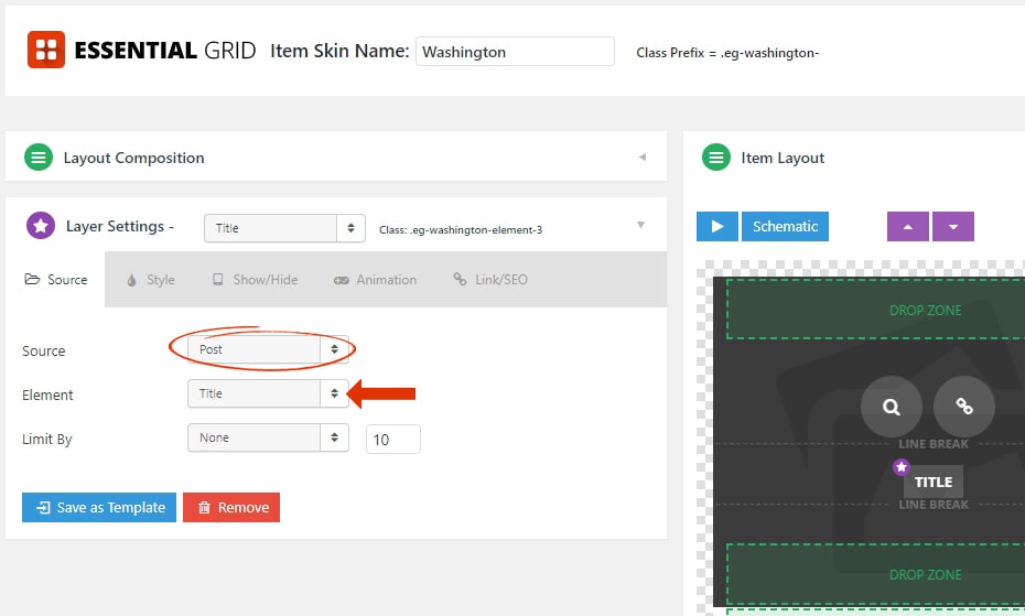
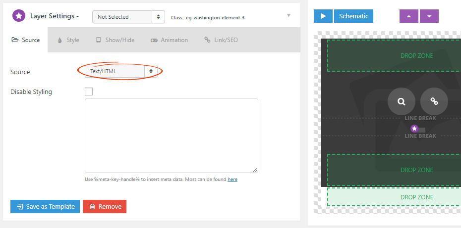
When building your grids you’ll be given the choose to populate them with post-based content of custom content. And the content sources for custom grid’s all mimic everything that’s available for traditional post-based grids. For the following example, we’ll set the first skin element to “Post -> Title”, and then populate this title for our custom grid items.

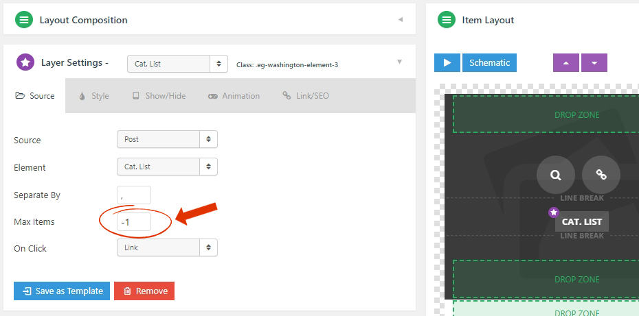
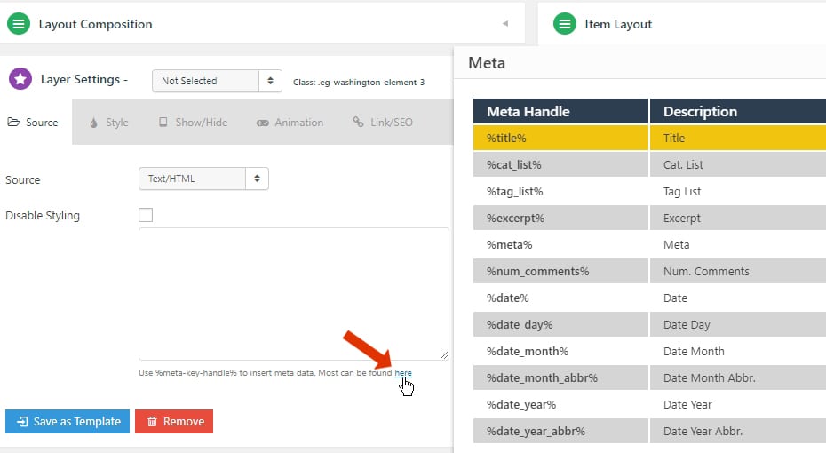
2. Cat. List – The categories assigned to the post/item. These will be hyperlinked by default, you can choose to limit the number of categories shown using this option:
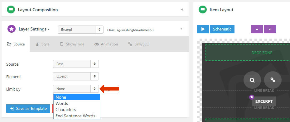
4. Excerpt – Displays the post content that is assigned to the post. Check out this link that explains more about how Excerpt works in WordPress. The excerpt can also be limited by words, characters, and end sentence words shown using this option:
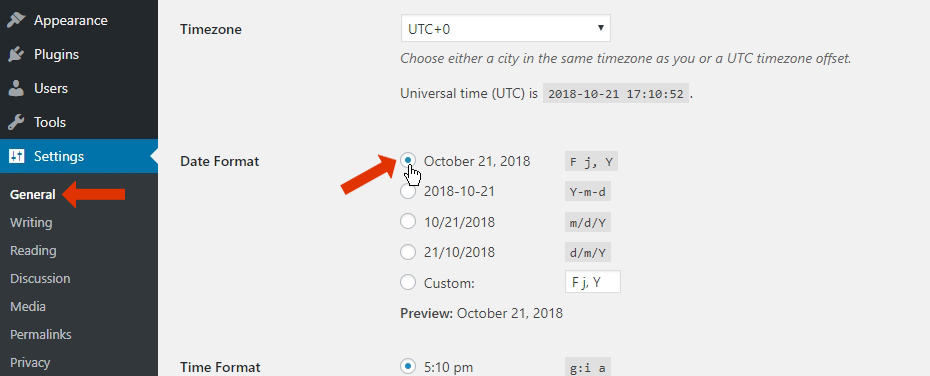
8. Date Day/Month/Month Abbr./Year/Year Abbr./Modified – This element allows you to display the dates in multiple formats and the modified date of the post.
9. Author Name/Website/Posts Page/Avatar – This element allows you to display the post author’s information and avatar sizes.
10. Post ID/URL/Content – Displays the Post ID, Post URL, Post Contents of the Post.
11. Alias – Displays the alias of the Post. Eg. essential-grid-from-themepunch
12. Caption – This element is similar to the “Post Content Element”
13. Likes (Posts)/Likes/Dislikes/Favourites/Retweets/Views/Playlist Item Count/Channel Title – This element will allow you to display information from your “Social Stream“.
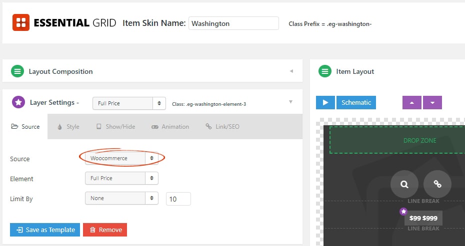
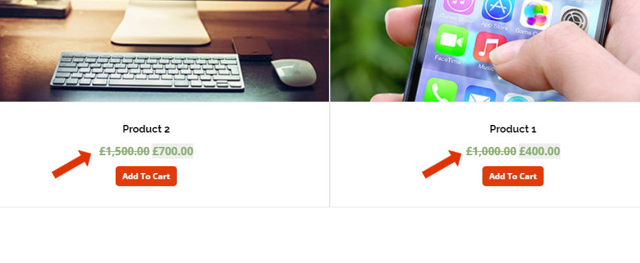
1. Full Price. – Displays the product “Full Price” with discounts.
2. Single Price/without currency – Displays the product price without the discount or currency.
3. In Stock – Displays the product stock quantity.
4. Text/Star Rating – Displays the text or star rating of the product.
5. Categories – Displays the product categories.
6. Add to Cart URL / Button – Displays the Add to Cart URL or a button. Eg. myproducts/?add-to-cart=110
Additional Advanced Modifications
Only Include In-Stock Products in Grid
Auto-populate Products Category page with Essential Grid
