Best Shopify Developers Provide Complete Shopify eCommerce Solutions!
Our experienced developers are passionate about developing premium Shopify themes and apps that elevate the looks and performance of your eCommerce store to the next level.
Our experienced developers are passionate about developing premium Shopify themes and apps that elevate the looks and performance of your eCommerce store to the next level.
A team consisting of the best Shopify developers with years of experience aims to make your Shopify journey effortless and make your eCommerce store grow beyond expectations. We continuously offer you the best Shopify eCommerce solutions with themes and apps to help you reach your business goals.
We develop themes by following the standard coding structure of Shopify. Our Brator Shopify Auto Parts Theme is compatible with Shopify online store 2.0 and you will get a smooth integration using the theme in your Shopify store.
We offer premium customer support through client management experience. We ensure not to make customers wait longer or struggle to solve issues using our products. Customers love us because of our fast and effective support system.
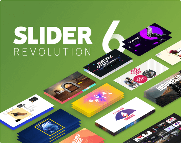
We build Shopify apps that uplift the performance of Shopify stores and convert more users to actual customers. As the best subscription app for Shopify, our Shopify Slider revolution 6 is super popular in the Shopify app store with 4.9 rating.
Best Shopify themes and apps created by best Shopify developers. Our team has been working relentlessly for years to introduce you to the latest Shopify themes & apps.
Shopify Slider Revolution 6 is the most powerful Shopify slider app to attract customers with stunning visuals. You can shape your imagination into reality with 600+ eye-catchy templates and 20+ addons. It helps you create sliders such as Shopify product slider, image slider, collection slider, carousel, hero banner, video slider, and many more within a few minutes without even writing a single line code.
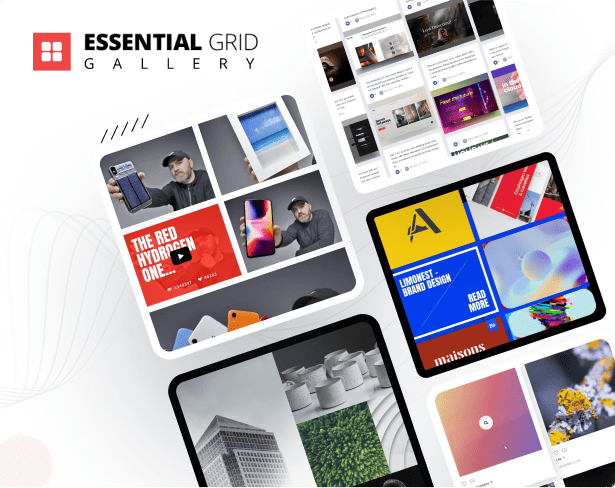
The Essential Grid Gallery, a Shopify app, enhances your website with stunning image and video galleries, including content from social media platforms like Instagram, YouTube, and more. It simplifies gallery creation and design with user-friendly templates for a standout Shopify website.
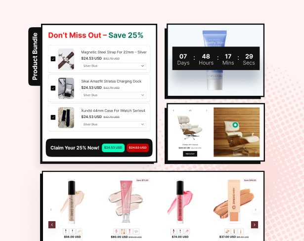
EasyBoost app lets you create eye-catching product sliders, sales bundles, recommendations, and carousels on any page with just a few clicks. Choose a template, select your products, and hit publish. It’s that easy! Showcase bundles that increase AOV, highlight best-sellers with an “Add to Cart” button, and engage shoppers with attractive layouts. Whether it’s your product page, homepage, or blog, EasyBoost helps you boost sales effortlessly. Try it today!
Syncora: Backup & Restore keeps your Shopify store safe with real-time, automatic backups of products, orders, themes, blogs, videos, files, and more. Quickly restore data with a user-friendly interface and secure your data with Google Drive integration. Safeguard your store from unexpected changes or data loss, ensuring business continuity. Easily recover, undo, migration or transfer your data, including videos, whenever needed. With Syncora, your store’s most critical data is always protected.

Pesto is an ideal Shopify theme for food and restaurant businesses. It simplifies selling items like burgers, pizza, pasta, and coffee, offering features such as menus, local pickup, delivery, and smooth sales. Plus, it includes a countdown banner, Hero section, product categories, customer reviews, in-menu promos, menu drawer, and quick search options, enhancing the shopping experience for your customers.”

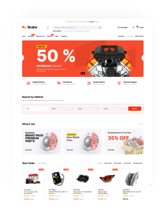
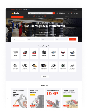
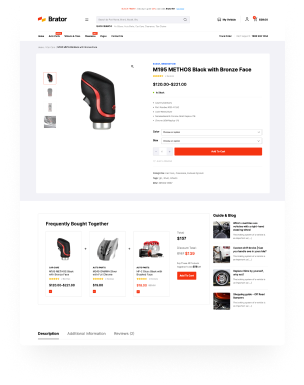
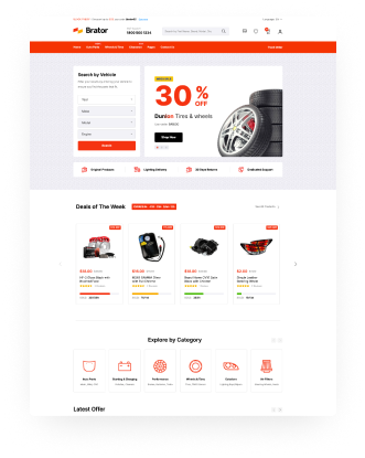
Brator Shopify Theme is an eye-catching, clean, and modern responsive Shopify auto parts theme. This customizable Shopify theme is perfectly designed and organized for auto parts business sites. You can easily modify and extend the theme layouts. Theme included two clean homepage layouts with two different header styles and 15+ variant inner pages.


Subscribe to our newsletter and never miss our Products latest offer news and useful shopify tips & tricks.
For business inquiries, collaboration, jointly work or want to say hi, Contact us by Email: [email protected]
We use cookies to improve your experience on our site. By using our site, you consent to cookies.
Manage your cookie preferences below:
Essential cookies enable basic functions and are necessary for the proper function of the website.
These cookies are needed for adding comments on this website.
Statistics cookies collect information anonymously. This information helps us understand how visitors use our website.
Google Analytics is a powerful tool that tracks and analyzes website traffic for informed marketing decisions.
Service URL: business.safety.google (opens in a new window)
Marketing cookies are used to follow visitors to websites. The intention is to show ads that are relevant and engaging to the individual user.
Facebook Pixel is a web analytics service that tracks and reports website traffic.
Service URL: www.facebook.com (opens in a new window)